Page Summary
-
Ensure games adapt to various screen sizes and orientations, using pillarboxing or letterboxing if full responsiveness isn't possible, and avoid triggering scrollbars within the canvas.
-
Maintain clear rendering across different screen resolutions by avoiding blurry or pixelated assets, and ensure that game UI elements like text and icons scale appropriately on both low and high-resolution screens.
-
Use font sizes, weights, and color contrast ratios that ensure legibility across different devices, following guidelines of a minimum of 4.5:1 contrast ratio for text under 18pt, and 3:1 for all other text.
-
Design touch targets to be at least 48x48 dp with 8 dp spacing, use unique styles for each button state (enabled, disabled, hover, focused, pressed), and support keyboard input for all gameplay controls and navigation.
-
Include a minimal tutorial or onboarding level for new players to learn gameplay basics, clearly communicate the game's pause state with a "paused" label and resume option, and provide an end-of-game message for games with finite levels.
The following design best practices help ensure an optimal experience for users playing your game on YouTube across different devices and platforms.
Aside from the operating system components, the Playables experience primarily consists of three components:
- Playables actions
- Game canvas
- Menus and dialogs

These game design best practices provide recommendations for how to build your game for the game canvas.
Game resizing
Ensure that games adapt appropriately to different screen sizes and orientations by considering these practices.
Resize the game and adapt the UI to the size and aspect ratio of the canvas.
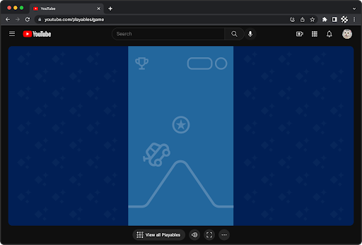
Use pillarboxing or letterboxing if the game can't be fully responsive to the game canvas size and aspect ratio.
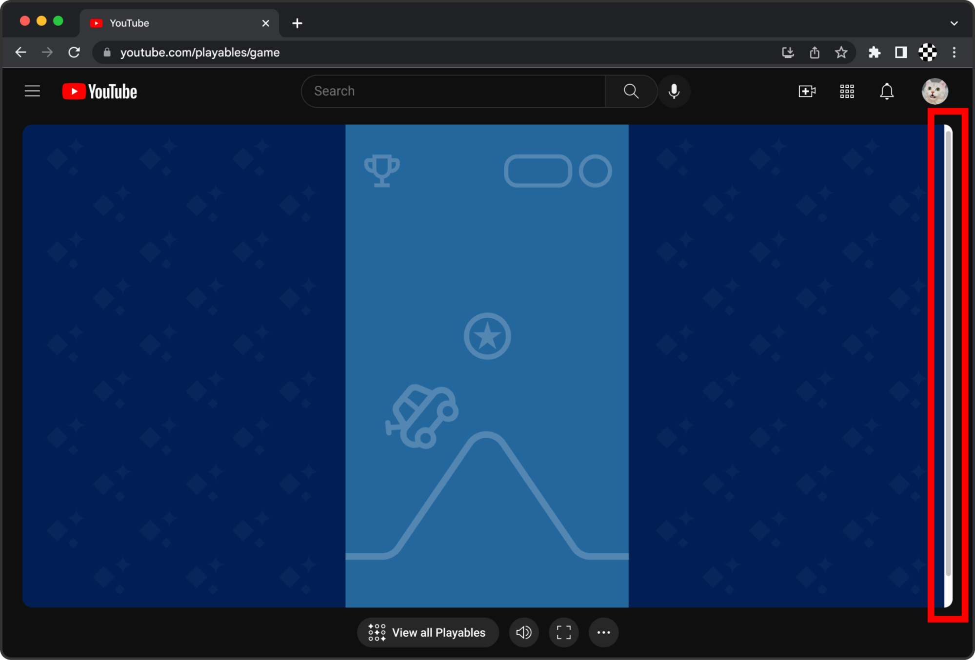
Avoid triggering scrollbars. Scrollbars negatively affect both gameplay and general navigation. Fill the canvas without resulting in the game becoming scrollable within the canvas. Scrollbars are OK for intentional scrolling, for example when scrolling through a long vertical list within the game UI. Ideally, games are fully responsive to the viewport.
Game scaling
Render clearly (not blurry, pixelated, or stretched) across different screen resolutions.
Ensure that the game UI (texts, icons) scales appropriately when rendered on both lower resolution screens (such as 360x800 mobile devices) and higher resolution screens (such as 3840x2560 desktop monitors).

Avoid low-resolution rasterized assets that appear blurry when scaled to large screens.
Typography
Ensure legibility across devices and screen sizes.
The texts appearing within the game such as buttons, menus, and speech bubbles need to be legible across different devices and screen sizes. This can be achieved by scaling and adapting the text automatically or by offering users a setting to adjust font size.
If the text is smaller than 18pt, or if the text is bold and smaller than 14pt, set the color contrast ratio to at least 4.5:1.
For all other text, set the color contrast ratio to at least 3:1.
For general reference, see WCAG2.1.
 |
 |
| Use large font sizes with enough weight and contrast for legibility. In this example, the contrast ratio is 4.48:1. | Avoid small font sizes and low contrast colors. In this example, the contrast ratio is 3.07:1. |
Interaction
This section covers best practices around user interactions and related elements.
Touch targets
Make touch targets large enough for easier interaction.
Ensure that touch targets are at least 48x48 dp with at least 8 dp of space between targets (see Material Design Guidelines) for easier interaction.
In this example, the visually rendered button is 24 dp, while the invisible touch target includes 12 dp around the icon to achieve the 48x48 dp touch target.

Add padding around icons and buttons to increase touch target size.
Buttons
Use unique styles for each button state:
- Enabled
- Disabled
- Hover (for non-touch input devices)
- Focused
- Pressed
Aim to differentiate buttons by hierarchy as well. For example, primary versus secondary action buttons in a Start menu (see Google Material 2 Design Guidelines for buttons).
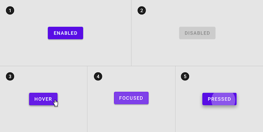
Unique styles that distinguish each button state
Keyboard input
To increase the accessibility of the game across devices and users, support keyboard input for all gameplay controls and screen navigation in addition to touch and mouse input.
For games that support keyboard input, allow users to close any in-game menus and dialogs using the Esc key. This is in addition to having a visual close button (for example, an X icon at the top corner). Common examples of modals or dialogs are Settings menu, Pause menu, error messages, and Help info pop-ups.
Avoid mapping any actions to the long-press of the Esc key, as this is used for exiting fullscreen mode on desktop web browsers.
For games that have keypress listeners registered: don't use preventDefault()
with Esc key events. When in fullscreen in Safari, this causes the
key press event to be consumed by the game without exiting fullscreen.
Haptics
When appropriate, it is recommended to use haptic feedback (vibrations) to make your games feel more fun and immersive.
Key game moments
This section covers key moments in a game that create a great experience for the player.
Tutorial
Include a brief tutorial or onboarding level to help new players.
Onboarding ensures that users learn the basic gameplay and game essentials to proceed with and enjoy the game.
Since Playables are intended to be quick and approachable for users to start playing, aim to keep the onboarding as minimal as possible. While not all games require a tutorial, most games benefit from some form of onboarding. Consider the key mechanics, rules, and skills that the player needs to know to successfully play and enjoy the game.
Tutorials can be in the following format:
- Set of screens at the beginning of the game (or more ideally, presented contextually throughout the game when appropriate)
- Actual tutorial level that the user plays through
Pause
Clearly communicate the game state to the user.
Clearly communicate to the user when the game is paused and how the user can resume the game. Avoid causing the user to think that the game has frozen or crashed.

Clearly label the game state as "paused" and provide a clear action (button) to resume the game.
Game end
Communicate to the user that they have completed the last level or they have finished the game.
If the game has a definitive end (for example, a finite number of levels), clearly communicate that fact to the user. This avoids causing the user to think that the game is broken or frozen. Ideally, the game celebrates and congratulates the player for completing the game.
Audio
The game can contain separate volume controls for effects, speech, and background music. Controls can consist of sliders to adjust volume or a mute toggle for each or both.

Accessibility
Accessibility in design allows users of diverse abilities to play and enjoy your game.
Unlike web and software design, industry standard accessibility guidelines for game design don't exist. For a good resource with additional guidelines on inclusive game design, see Game accessibility guidelines. We recommend that you consider how these guidelines can be applied to your game's design.