
সূচী
-
Action(বার্তা) -
Action.ActionParameter(বার্তা) -
Action.Interaction(enum) -
Action.LoadIndicator(enum) -
BorderStyle(বার্তা) -
BorderStyle.BorderType(enum) -
Button(বার্তা) -
Button.Type(enum) -
ButtonList(বার্তা) -
Card(বার্তা) -
Card.CardAction(বার্তা) -
Card.CardFixedFooter(বার্তা) -
Card.CardHeader(বার্তা) -
Card.DisplayStyle(এনাম) -
Card.DividerStyle(এনাম) -
Card.NestedWidget(বার্তা) -
Card.Section(বার্তা) -
Card.Visibility(enum) -
Carousel(বার্তা) -
Carousel.CarouselCard(বার্তা) -
Chip(বার্তা) -
ChipList(বার্তা) -
ChipList.Layout(এনাম) -
CollapseControl(বার্তা) -
Columns(বার্তা) -
Columns.Column(বার্তা) -
Columns.Column.HorizontalSizeStyle(enum) -
Columns.Column.VerticalAlignment(enum) -
Columns.Column.Widgets(বার্তা) -
Condition(বার্তা) -
Condition.ExpressionDataCondition(বার্তা) -
Condition.ExpressionDataCondition.ConditionType(enum) -
DataSourceConfig(বার্তা) -
DateTimePicker(বার্তা) -
DateTimePicker.DateTimePickerType(enum) -
DecoratedText(বার্তা) -
DecoratedText.SwitchControl(বার্তা) -
DecoratedText.SwitchControl.ControlType(এনাম) -
Divider(বার্তা) -
EventAction(বার্তা) -
EventAction.CommonWidgetAction(বার্তা) -
EventAction.CommonWidgetAction.UpdateVisibilityAction(বার্তা) -
ExpressionData(বার্তা) -
Grid(বার্তা) -
Grid.GridItem(বার্তা) -
Grid.GridItem.GridItemLayout(enum) -
Icon(বার্তা) -
Image(বার্তা) -
ImageComponent(বার্তা) -
ImageCropStyle(বার্তা) -
ImageCropStyle.ImageCropType(এনাম) -
MaterialIcon(বার্তা) -
OnClick(বার্তা) -
OpenLink(বার্তা) -
OpenLink.OnClose(enum) -
OpenLink.OpenAs(এনাম) -
OverflowMenu(বার্তা) -
OverflowMenu.OverflowMenuItem(বার্তা) -
SelectionInput(বার্তা) -
SelectionInput.PlatformDataSource(বার্তা) -
SelectionInput.PlatformDataSource.CommonDataSource(enum) -
SelectionInput.SelectionItem(বার্তা) -
SelectionInput.SelectionType(এনাম) -
Suggestions(বার্তা) -
Suggestions.SuggestionItem(বার্তা) -
TextInput(বার্তা) -
TextInput.Type(এনাম) -
TextParagraph(বার্তা) -
TextParagraph.TextSyntax(enum) -
Trigger(বার্তা) -
Validation(বার্তা) -
Validation.InputType(এনাম) -
Widget(বার্তা) -
Widget.HorizontalAlignment(এনাম) -
Widget.ImageType(এনাম) -
Widget.VerticalAlignment(enum)
পদক্ষেপ
একটি অ্যাকশন যা ফর্ম সাবমিট করা হলে তার আচরণ বর্ণনা করে। উদাহরণস্বরূপ, ফর্মটি পরিচালনা করার জন্য আপনি একটি অ্যাপস স্ক্রিপ্ট কল করতে পারেন। অ্যাকশনটি ট্রিগার হলে, ফর্মের ভ্যালুগুলো সার্ভারে পাঠানো হয়।

 গুগল চ্যাট অ্যাপ এবং গুগল ওয়ার্কস্পেস অ্যাড-অনগুলির জন্য উপলব্ধ।
| ক্ষেত্র | |
|---|---|
function | একটি কাস্টম ফাংশন যা ধারণকারী এলিমেন্টটি ক্লিক করা হলে বা অন্য কোনোভাবে সক্রিয় হলে চালু হয়। ব্যবহারের উদাহরণের জন্য, 'ফর্ম ডেটা পড়ুন' দেখুন। |
parameters[] | কর্ম পরামিতিগুলির তালিকা। |
load_indicator | অ্যাকশনটি কল করার সময় যে লোডিং ইন্ডিকেটরটি প্রদর্শিত হয়, তা নির্দিষ্ট করে। |
persist_values | কাজটি সম্পন্ন হওয়ার পর ফর্মের মানগুলো স্থায়ী থাকবে কিনা তা নির্দেশ করে। এর ডিফল্ট মান হলো যদি |
interaction | ঐচ্ছিক। ডায়ালগ খোলার সময় প্রয়োজন। ব্যবহারকারীর সাথে কোনো ইন্টারঅ্যাকশনের জবাবে কী করতে হবে, যেমন ব্যবহারকারী কার্ড মেসেজে কোনো বাটনে ক্লিক করলে। অনির্দিষ্ট থাকলে, অ্যাপটি স্বাভাবিকভাবে কোনো একটি একটি
|
required_widgets[] | ঐচ্ছিক। একটি বৈধ সাবমিশনের জন্য এই অ্যাকশনটির যে উইজেটগুলোর প্রয়োজন, সেগুলোর নাম দিয়ে এই তালিকাটি পূরণ করুন। এই অ্যাকশনটি চালু করার সময় এখানে তালিকাভুক্ত উইজেটগুলিতে কোনো মান না থাকলে, ফর্ম জমা দেওয়ার প্রক্রিয়াটি বাতিল হয়ে যায়।
|
all_widgets_are_required | ঐচ্ছিক। যদি এটি সত্য হয়, তাহলে এই পদক্ষেপের জন্য সমস্ত উইজেট আবশ্যক বলে বিবেচিত হবে।
|
অ্যাকশনপ্যারামিটার
অ্যাকশন মেথড কল করার সময় সরবরাহ করার জন্য স্ট্রিং প্যারামিটারগুলোর তালিকা। উদাহরণস্বরূপ, তিনটি স্নুজ বাটনের কথা ভাবুন: এখনই স্নুজ করুন, একদিনের জন্য স্নুজ করুন, অথবা আগামী সপ্তাহের জন্য স্নুজ করুন। আপনি স্ট্রিং প্যারামিটারগুলোর তালিকায় স্নুজের ধরন এবং স্নুজের সময় পাস করে action method = snooze() ব্যবহার করতে পারেন।
আরও জানতে CommonEventObject দেখুন।
গুগল চ্যাট অ্যাপ এবং গুগল ওয়ার্কস্পেস অ্যাড-অনগুলির জন্য উপলব্ধ।
| ক্ষেত্র | |
|---|---|
key | অ্যাকশন স্ক্রিপ্টের প্যারামিটারের নাম। |
value | প্যারামিটারটির মান। |
মিথস্ক্রিয়া
ঐচ্ছিক। ডায়ালগ খোলার সময় প্রয়োজন।
ব্যবহারকারীর সাথে কোনো ইন্টারঅ্যাকশনের জবাবে কী করতে হবে, যেমন ব্যবহারকারী কার্ড মেসেজে কোনো বাটনে ক্লিক করলে।
অনির্দিষ্ট থাকলে, অ্যাপটি স্বাভাবিকভাবে কোনো একটি action সম্পাদন করে—যেমন কোনো লিঙ্ক খোলা বা কোনো ফাংশন চালানো।
একটি interaction নির্দিষ্ট করার মাধ্যমে, অ্যাপটি বিশেষ ইন্টারেক্টিভ উপায়ে সাড়া দিতে পারে। উদাহরণস্বরূপ, interaction OPEN_DIALOG এ সেট করলে, অ্যাপটি একটি ডায়ালগ খুলতে পারে।
নির্দিষ্ট করা থাকলে, লোডিং ইন্ডিকেটর দেখানো হয় না। কোনো অ্যাড-অনের জন্য নির্দিষ্ট করা হলে, সম্পূর্ণ কার্ডটি সরিয়ে ফেলা হয় এবং ক্লায়েন্টে কিছুই দেখানো হয় না।
গুগল চ্যাট অ্যাপের জন্য উপলব্ধ, কিন্তু গুগল ওয়ার্কস্পেস অ্যাড-অনের জন্য অনুপলব্ধ।
| এনাম | |
|---|---|
INTERACTION_UNSPECIFIED | পূর্বনির্ধারিত মান। action স্বাভাবিকভাবে সম্পাদিত হবে। |
OPEN_DIALOG | একটি ডায়ালগ খোলে, যা হলো একটি উইন্ডোযুক্ত, কার্ড-ভিত্তিক ইন্টারফেস এবং চ্যাট অ্যাপগুলো ব্যবহারকারীদের সাথে আলাপচারিতার জন্য এটি ব্যবহার করে। শুধুমাত্র কার্ড মেসেজের বাটন-ক্লিকের প্রতিক্রিয়ায় চ্যাট অ্যাপে এটি সমর্থিত। কোনো অ্যাড-অনের জন্য নির্দিষ্ট করা হলে, সম্পূর্ণ কার্ডটি মুছে ফেলা হয় এবং ক্লায়েন্টে কিছুই দেখানো হয় না।
|
লোড ইন্ডিকেটর
অ্যাকশনটি কল করার সময় যে লোডিং ইন্ডিকেটরটি প্রদর্শিত হয়, তা নির্দিষ্ট করে।
গুগল চ্যাট অ্যাপ এবং গুগল ওয়ার্কস্পেস অ্যাড-অনগুলির জন্য উপলব্ধ।
| এনাম | |
|---|---|
SPINNER | কন্টেন্ট লোড হচ্ছে বোঝাতে একটি স্পিনার প্রদর্শন করে। |
NONE | কিছুই প্রদর্শিত হচ্ছে না। |
বর্ডারস্টাইল
একটি কার্ড বা উইজেটের বর্ডারের স্টাইল অপশন, যার মধ্যে বর্ডারের ধরন এবং রঙ অন্তর্ভুক্ত।
গুগল চ্যাট অ্যাপ এবং গুগল ওয়ার্কস্পেস অ্যাড-অনগুলির জন্য উপলব্ধ।
| ক্ষেত্র | |
|---|---|
type | সীমানার ধরণ। |
stroke_color | টাইপটি স্ট্রোকের রঙ নির্ধারণ করতে, উদাহরণস্বরূপ, নিম্নলিখিতটি রঙটিকে তার সর্বোচ্চ তীব্রতায় লালে সেট করে: স্ট্রোক রঙের জন্য |
corner_radius | বর্ডারের জন্য কোণার ব্যাসার্ধ। |
বর্ডারটাইপ
উইজেটগুলিতে প্রয়োগ করা বর্ডারের প্রকারভেদ নির্দেশ করে।
গুগল চ্যাট অ্যাপ এবং গুগল ওয়ার্কস্পেস অ্যাড-অনগুলির জন্য উপলব্ধ।
| এনাম | |
|---|---|
BORDER_TYPE_UNSPECIFIED | ব্যবহার করবেন না। অনির্দিষ্ট। |
NO_BORDER | কোনো সীমান্ত নেই। |
STROKE | পূর্বনির্ধারিত মান। রূপরেখা। |
বোতাম
একটি টেক্সট, আইকন, অথবা টেক্সট ও আইকন সহ বাটন, যেটিতে ব্যবহারকারীরা ক্লিক করতে পারেন। গুগল চ্যাট অ্যাপে এর একটি উদাহরণের জন্য, ‘একটি বাটন যোগ করুন’ দেখুন।
একটি ইমেজকে ক্লিকযোগ্য বাটনে পরিণত করতে, একটি ImageImageComponentonClick অ্যাকশন সেট করুন।
গুগল চ্যাট অ্যাপ এবং গুগল ওয়ার্কস্পেস অ্যাড-অনগুলির জন্য উপলব্ধ।
| ক্ষেত্র | |
|---|---|
text | বাটনের ভিতরে লেখাটি প্রদর্শিত হয়েছে। |
icon | বাটনের ভিতরে একটি আইকন প্রদর্শিত হয়। যদি |
color | ঐচ্ছিক। বাটনের রঙ। এটি সেট করা হলে, বাটনের বাটনের রঙ সেট করতে, উদাহরণস্বরূপ, নিম্নলিখিতটি রঙটিকে তার সর্বোচ্চ তীব্রতায় লালে সেট করে: বাটনের রঙের জন্য |
on_click | আবশ্যক। ব্যবহারকারী বোতামে ক্লিক করলে যে কাজটি সম্পাদন করতে হবে, যেমন একটি হাইপারলিঙ্ক খোলা বা একটি কাস্টম ফাংশন চালানো। |
disabled | যদি |
alt_text | অ্যাক্সেসিবিলিটির জন্য ব্যবহৃত বিকল্প টেক্সট। বর্ণনামূলক টেক্সট সেট করুন যা ব্যবহারকারীদের জানিয়ে দেবে বাটনটি কী কাজ করে। উদাহরণস্বরূপ, যদি কোনো বাটন একটি হাইপারলিঙ্ক খোলে, তাহলে আপনি লিখতে পারেন: "একটি নতুন ব্রাউজার ট্যাব খোলে এবং https://developers.google.com/workspace/chat-এ থাকা গুগল চ্যাট ডেভেলপার ডকুমেন্টেশনে নিয়ে যায়" । |
type | ঐচ্ছিক। বাটনের ধরণ। সেট না করা থাকলে, বাটনের ধরণ ডিফল্টভাবে |
প্রকার
ঐচ্ছিক। বাটনের ধরণ । যদি color ক্ষেত্রটি সেট করা থাকে, তাহলে type বাধ্যতামূলকভাবে FILLED হবে।
গুগল চ্যাট অ্যাপের জন্য উপলব্ধ, কিন্তু গুগল ওয়ার্কস্পেস অ্যাড-অনের জন্য অনুপলব্ধ।
| এনাম | |
|---|---|
TYPE_UNSPECIFIED | ব্যবহার করবেন না। অনির্দিষ্ট। |
OUTLINED | আউটলাইন করা বাটনগুলো হলো মাঝারি গুরুত্বের বাটন। এগুলোতে সাধারণত এমন সব অ্যাকশন থাকে যা গুরুত্বপূর্ণ, কিন্তু কোনো চ্যাট অ্যাপ বা অ্যাড-অনের প্রধান অ্যাকশন নয়। |
FILLED | একটি ফিল্ড বাটনের কন্টেইনারটি একরঙা হয়। এর দৃশ্যমান প্রভাব সবচেয়ে বেশি এবং একটি চ্যাট অ্যাপ বা অ্যাড-অনের গুরুত্বপূর্ণ ও প্রধান কাজের জন্য এটি ব্যবহার করার পরামর্শ দেওয়া হয়। |
FILLED_TONAL | একটি ফিল্ড টোনাল বাটন হলো ফিল্ড এবং আউটলাইনড বাটনের মাঝামাঝি একটি বিকল্প ব্যবস্থা। যেসব ক্ষেত্রে একটি কম গুরুত্বপূর্ণ বাটনের ওপর আউটলাইন বাটনের চেয়ে কিছুটা বেশি জোর দেওয়ার প্রয়োজন হয়, সেখানে এগুলো উপযোগী। |
BORDERLESS | ডিফল্ট অবস্থায় একটি বাটনের কোনো অদৃশ্য কন্টেইনার থাকে না। এটি প্রায়শই সর্বনিম্ন অগ্রাধিকারের কাজগুলোর জন্য ব্যবহৃত হয়, বিশেষ করে যখন একাধিক অপশন দেখানো হয়। |
বাটনলিস্ট
আনুভূমিকভাবে সাজানো বাটনগুলির একটি তালিকা। গুগল চ্যাট অ্যাপে এর একটি উদাহরণের জন্য, ‘একটি বাটন যোগ করুন’ দেখুন।
গুগল চ্যাট অ্যাপ এবং গুগল ওয়ার্কস্পেস অ্যাড-অনগুলির জন্য উপলব্ধ।
| ক্ষেত্র | |
|---|---|
buttons[] | বোতামের একটি সারি। |
কার্ড
গুগল চ্যাট মেসেজ বা গুগল ওয়ার্কস্পেস অ্যাড-অনে প্রদর্শিত একটি কার্ড ইন্টারফেস।
কার্ড একটি নির্দিষ্ট লেআউট, বাটনের মতো ইন্টারেক্টিভ UI এলিমেন্ট এবং ছবির মতো রিচ মিডিয়া সমর্থন করে। বিস্তারিত তথ্য উপস্থাপন করতে, ব্যবহারকারীদের কাছ থেকে তথ্য সংগ্রহ করতে এবং পরবর্তী পদক্ষেপ নিতে তাদের নির্দেশনা দিতে কার্ড ব্যবহার করুন।
কার্ড বিল্ডার ব্যবহার করে কার্ড ডিজাইন করুন এবং প্রিভিউ দেখুন।
কার্ড বিল্ডারটি খুলুনকার্ড তৈরি করার পদ্ধতি জানতে, নিম্নলিখিত ডকুমেন্টেশন দেখুন:
- গুগল চ্যাট অ্যাপের জন্য, একটি কার্ড বা ডায়ালগের উপাদানগুলির ডিজাইন দেখুন।
- Google Workspace অ্যাড-অনগুলির জন্য, কার্ড-ভিত্তিক ইন্টারফেস দেখুন।
দ্রষ্টব্য: আপনি প্রতি কার্ডে সর্বোচ্চ ১০০টি উইজেট যোগ করতে পারবেন। যদি কোনো সেকশনের উইজেটের সংখ্যা বেড়ে মোট সংখ্যা ১০০ ছাড়িয়ে যায়, তাহলে সেই সম্পূর্ণ সেকশন এবং তার পরবর্তী সমস্ত সেকশন উপেক্ষা করা হবে। এই সীমাটি গুগল চ্যাট অ্যাপের কার্ড মেসেজ ও ডায়ালগ এবং গুগল ওয়ার্কস্পেস অ্যাড-অনের কার্ড—উভয়ের ক্ষেত্রেই প্রযোজ্য।
উদাহরণ: গুগল চ্যাট অ্যাপের জন্য কার্ড বার্তা
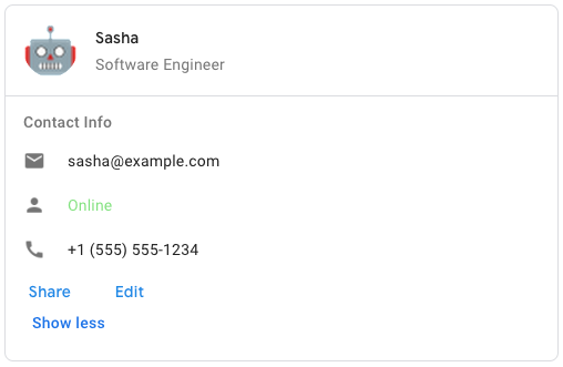
গুগল চ্যাটে নমুনা কার্ড বার্তা তৈরি করতে, নিম্নলিখিত JSON ব্যবহার করুন:
{
  "cardsV2": [
    {
      "cardId": "unique-card-id",
      "card": {
        "header": {
           "title": "Sasha",
           "subtitle": "Software Engineer",
           "imageUrl":
           "https://developers.google.com/workspace/chat/images/quickstart-app-avatar.png",
           "imageType": "CIRCLE",
           "imageAltText": "Avatar for Sasha"
         },
         "sections": [
           {
             "header": "Contact Info",
             "collapsible": true,
             "uncollapsibleWidgetsCount": 1,
             "widgets": [
               {
                 "decoratedText": {
                   "startIcon": {
                     "knownIcon": "EMAIL"
                   },
                   "text": "sasha@example.com"
                 }
               },
               {
                 "decoratedText": {
                   "startIcon": {
                     "knownIcon": "PERSON"
                   },
                   "text": "<font color=\"#80e27e\">Online</font>"
                 }
               },
               {
                 "decoratedText": {
                   "startIcon": {
                     "knownIcon": "PHONE"
                   },
                   "text": "+1 (555) 555-1234"
                 }
               },
               {
                 "buttonList": {
                   "buttons": [
                     {
                       "text": "Share",
                       "onClick": {
                        "openLink": {
                           "url": "https://example.com/share"
                         }
                       }
                     },
                     {
                       "text": "Edit",
                       "onClick": {
                         "action": {
                           "function": "goToView",
                           "parameters": [
                             {
                               "key": "viewType",
                               "value": "EDIT"
                             }
                           ]
                         }
                       }
                     }
                   ]
                 }
               }
             ]
           }
         ]
       }
    }
  ]
}
| ক্ষেত্র | |
|---|---|
header | কার্ডের হেডার। একটি হেডারে সাধারণত একটি প্রধান ছবি এবং একটি শিরোনাম থাকে। হেডার সবসময় কার্ডের শীর্ষে প্রদর্শিত হয়। |
sections[] | এতে উইজেটের একটি সংগ্রহ রয়েছে। প্রতিটি বিভাগের নিজস্ব, ঐচ্ছিক হেডার আছে। বিভাগগুলো একটি রেখা বিভাজক দ্বারা দৃশ্যত পৃথক করা থাকে। গুগল চ্যাট অ্যাপে একটি উদাহরণের জন্য, ‘একটি কার্ডের বিভাগ সংজ্ঞায়িত করুন ’ দেখুন। |
section_divider_style | হেডার, সেকশন ও ফুটারের মধ্যবর্তী বিভাজক শৈলী। |
card_actions[] | কার্ডের কার্যকলাপসমূহ। কার্যকলাপগুলো কার্ডের টুলবার মেনুতে যোগ করা হয়।
উদাহরণস্বরূপ, নিম্নলিখিত JSON-টি |
name | কার্ডের নাম। কার্ড নেভিগেশনে কার্ড শনাক্তকারী হিসেবে ব্যবহৃত হয়।
|
fixed_footer | এই কার্ডের নীচে স্থির ফুটারটি দেখানো হয়েছে।
|
display_style | গুগল ওয়ার্কস্পেস অ্যাড-অন-এ, এটি
|
peek_card_header | প্রাসঙ্গিক বিষয়বস্তু প্রদর্শন করার সময়, পিক কার্ড হেডারটি একটি প্লেসহোল্ডার হিসেবে কাজ করে, যাতে ব্যবহারকারী হোমপেজের কার্ডগুলো এবং প্রাসঙ্গিক কার্ডগুলোর মধ্যে সামনে এগিয়ে যেতে পারেন।
|
expression_data[] | কার্ডটির জন্য এক্সপ্রেশন ডেটা। Google Workspace Studio-এর কার্যকারিতা বর্ধনকারী Google Workspace অ্যাড-অনগুলির জন্য উপলব্ধ। Google Chat অ্যাপগুলির জন্য অনুপলব্ধ। |
কার্ডঅ্যাকশন
কার্ড অ্যাকশন হলো কার্ডটির সাথে যুক্ত কাজটি। উদাহরণস্বরূপ, একটি ইনভয়েস কার্ডে ইনভয়েস ডিলিট করা, ইনভয়েস ইমেল করা, বা ব্রাউজারে ইনভয়েসটি খোলার মতো অ্যাকশন অন্তর্ভুক্ত থাকতে পারে।
গুগল ওয়ার্কস্পেস অ্যাড-অনগুলির জন্য উপলব্ধ, কিন্তু গুগল চ্যাট অ্যাপগুলির জন্য অনুপলব্ধ।
| ক্ষেত্র | |
|---|---|
action_label | যে লেবেলটি অ্যাকশন মেনু আইটেম হিসেবে প্রদর্শিত হয়। |
on_click | এই অ্যাকশন আইটেমটির জন্য |
কার্ডফিক্সডফুটার
একটি স্থায়ী (স্টিকি) ফুটার যা কার্ডের নীচে প্রদর্শিত হয়।
primaryButton বা secondaryButton নির্দিষ্ট না করে fixedFooter সেট করলে একটি ত্রুটি দেখা দেয়।
চ্যাট অ্যাপের ক্ষেত্রে, আপনি ডায়ালগে ফিক্সড ফুটার ব্যবহার করতে পারেন, কিন্তু কার্ড মেসেজে নয়। গুগল চ্যাট অ্যাপের একটি উদাহরণের জন্য, ‘অ্যাড এ পারসিস্টেন্ট ফুটার’ দেখুন।
গুগল চ্যাট অ্যাপ এবং গুগল ওয়ার্কস্পেস অ্যাড-অনগুলির জন্য উপলব্ধ।
কার্ডহেডার
এটি একটি কার্ড হেডার নির্দেশ করে। গুগল চ্যাট অ্যাপে এর একটি উদাহরণের জন্য, ‘হেডার যোগ করুন’ দেখুন।
গুগল চ্যাট অ্যাপ এবং গুগল ওয়ার্কস্পেস অ্যাড-অনগুলির জন্য উপলব্ধ।
| ক্ষেত্র | |
|---|---|
title | আবশ্যক। কার্ড হেডারের শিরোনাম। হেডারের একটি নির্দিষ্ট উচ্চতা রয়েছে: যদি শিরোনাম এবং উপ-শিরোনাম উভয়ই উল্লেখ করা হয়, তবে প্রতিটি এক লাইনে স্থান পাবে। যদি শুধু শিরোনাম উল্লেখ করা হয়, তবে সেটি উভয় লাইনেই স্থান পাবে। |
subtitle | কার্ড হেডারের উপশিরোনাম। নির্দিষ্ট করা থাকলে, এটি |
image_type | ছবিটি ক্রপ করতে ব্যবহৃত আকৃতি।
|
image_url | কার্ড হেডারে থাকা ছবিটির HTTPS URL। |
image_alt_text | এই ছবিটির বিকল্প লেখাটি অ্যাক্সেসিবিলিটির জন্য ব্যবহৃত হয়। |
প্রদর্শন শৈলী
গুগল ওয়ার্কস্পেস অ্যাড-অন-এ, একটি কার্ড কীভাবে প্রদর্শিত হবে তা এটি নির্ধারণ করে।
গুগল ওয়ার্কস্পেস অ্যাড-অনগুলির জন্য উপলব্ধ, কিন্তু গুগল চ্যাট অ্যাপগুলির জন্য অনুপলব্ধ।
| এনাম | |
|---|---|
DISPLAY_STYLE_UNSPECIFIED | ব্যবহার করবেন না। অনির্দিষ্ট। |
PEEK | কার্ডের হেডারটি সাইডবারের নীচে প্রদর্শিত হয় এবং স্ট্যাকের বর্তমান শীর্ষ কার্ডটিকে আংশিকভাবে ঢেকে রাখে। হেডারে ক্লিক করলে কার্ডটি কার্ড স্ট্যাকে যুক্ত হয়ে যায়। যদি কার্ডটির কোনো হেডার না থাকে, তবে তার পরিবর্তে একটি জেনারেটেড হেডার ব্যবহৃত হয়। |
REPLACE | ডিফল্ট মান। কার্ড স্ট্যাকের উপরের কার্ডটির ভিউ প্রতিস্থাপন করে কার্ডটি দেখানো হয়। |
বিভাজক শৈলী
কার্ডের বিভাজক শৈলী। বর্তমানে এটি শুধুমাত্র কার্ডের বিভিন্ন অংশের মধ্যে বিভাজক হিসেবে ব্যবহৃত হয়।
গুগল চ্যাট অ্যাপ এবং গুগল ওয়ার্কস্পেস অ্যাড-অনগুলির জন্য উপলব্ধ।
| এনাম | |
|---|---|
DIVIDER_STYLE_UNSPECIFIED | ব্যবহার করবেন না। অনির্দিষ্ট। |
SOLID_DIVIDER | ডিফল্ট বিকল্প। একটি নিরেট বিভাজক রেন্ডার করুন। |
NO_DIVIDER | সেট করা থাকলে, কোনো ডিভাইডার রেন্ডার করা হয় না। এই স্টাইলটি লেআউট থেকে ডিভাইডারটিকে সম্পূর্ণরূপে সরিয়ে দেয়। এর ফলাফল একেবারেই কোনো ডিভাইডার যোগ না করার সমতুল্য। |
নেস্টেডউইজেট
উইজেটগুলির একটি তালিকা যা একটি ধারণকারী লেআউটে, যেমন একটি CarouselCard , প্রদর্শন করা যেতে পারে। গুগল চ্যাট অ্যাপের জন্য উপলব্ধ, কিন্তু গুগল ওয়ার্কস্পেস অ্যাড-অনের জন্য অনুপলব্ধ।
| ক্ষেত্র | |
|---|---|
ইউনিয়ন ফিল্ড | |
text_paragraph | একটি টেক্সট প্যারাগ্রাফ উইজেট। |
button_list | একটি বাটন তালিকা উইজেট। |
image | একটি ইমেজ উইজেট। |
বিভাগ
একটি সেকশনে উইজেটগুলোর একটি সংগ্রহ থাকে, যেগুলো নির্দিষ্ট করার ক্রমানুসারে উল্লম্বভাবে রেন্ডার করা হয়।
গুগল চ্যাট অ্যাপ এবং গুগল ওয়ার্কস্পেস অ্যাড-অনগুলির জন্য উপলব্ধ।
| ক্ষেত্র | |
|---|---|
header | সেকশনের শীর্ষে প্রদর্শিত টেক্সট। সাধারণ HTML ফরম্যাট করা টেক্সট সমর্থন করে। টেক্সট ফরম্যাটিং সম্পর্কে আরও তথ্যের জন্য, Google Chat অ্যাপে টেক্সট ফরম্যাটিং এবং Google Workspace অ্যাড-অনে টেক্সট ফরম্যাটিং দেখুন। |
widgets[] | সেকশনটির সমস্ত উইজেট। এতে অবশ্যই অন্তত একটি উইজেট থাকতে হবে। |
collapsible | এই অংশটি ভাঁজযোগ্য কিনা তা নির্দেশ করে। সংকোচনযোগ্য বিভাগগুলো কিছু বা সমস্ত উইজেট লুকিয়ে রাখে, কিন্তু ব্যবহারকারীরা ' আরও দেখান' (Show more) এ ক্লিক করে বিভাগটি প্রসারিত করার মাধ্যমে লুকানো উইজেটগুলো আবার দেখতে পারেন। ব্যবহারকারীরা 'কম দেখান' (Show less) এ ক্লিক করে উইজেটগুলো পুনরায় লুকাতে পারেন। কোন উইজেটগুলো লুকানো থাকবে তা নির্ধারণ করতে, |
uncollapsible_widgets_count | যেসব উইজেট কোনো সেকশন সংকুচিত করার পরেও দৃশ্যমান থাকে, তাদের সংখ্যা। উদাহরণস্বরূপ, যখন একটি বিভাগে পাঁচটি উইজেট থাকে এবং |
id | যে সেকশনটি পরিবর্তন করা হবে, সেটিকে শনাক্ত করার জন্য নির্ধারিত একটি অনন্য আইডি। আইডিটির অক্ষর সংখ্যা ৬৪-এর মধ্যে সীমাবদ্ধ এবং এটি Google Workspace Studio-এর কার্যকারিতা বর্ধনকারী Google Workspace অ্যাড-অনগুলির জন্য উপলব্ধ। Google Chat অ্যাপগুলির জন্য অনুপলব্ধ। |
collapse_control | ঐচ্ছিক। সেকশনটির এক্সপ্যান্ড এবং কলাপস বাটন নির্ধারণ করুন। এই বাটনটি শুধুমাত্র তখনই দেখানো হবে যখন সেকশনটি কলাপসিবল হবে। এই ফিল্ডটি সেট করা না থাকলে, ডিফল্ট বাটনটি ব্যবহৃত হবে। |
দৃশ্যমানতা
কোনো UI উপাদান দৃশ্যমান হবে নাকি অদৃশ্য থাকবে তা নির্দিষ্ট করে।
Google Workspace Studio-এর কার্যকারিতা বর্ধনকারী Google Workspace অ্যাড-অনগুলির জন্য উপলব্ধ। Google Chat অ্যাপগুলির জন্য অনুপলব্ধ।
| এনাম | |
|---|---|
VISIBILITY_UNSPECIFIED | দৃশ্যমানতা অনির্দিষ্ট। ব্যবহার করবেন না। |
VISIBLE | UI উপাদানটি দৃশ্যমান। |
HIDDEN | UI উপাদানটি লুকানো আছে। |
ক্যারোসেল
ক্যারোসেল, যা স্লাইডার নামেও পরিচিত, উইজেটগুলির একটি তালিকা ঘুরিয়ে স্লাইডশো আকারে প্রদর্শন করে এবং এতে থাকা বাটনগুলির মাধ্যমে আগের বা পরের উইজেটে যাওয়া যায়।
উদাহরণস্বরূপ, এটি একটি ক্যারোসেলের JSON উপস্থাপনা, যাতে তিনটি টেক্সট প্যারাগ্রাফ উইজেট রয়েছে।
{
  "carouselCards": [
    {
      "widgets": [
        {
          "textParagraph": {
            "text": "First text paragraph in carousel",
          }
        }
      ]
    },
    {
      "widgets": [
        {
          "textParagraph": {
            "text": "Second text paragraph in carousel",
          }
        }
      ]
    },
    {
      "widgets": [
        {
          "textParagraph": {
            "text": "Third text paragraph in carousel",
          }
        }
      ]
    }
  ]
}
গুগল চ্যাট অ্যাপের জন্য উপলব্ধ, কিন্তু গুগল ওয়ার্কস্পেস অ্যাড-অনের জন্য অনুপলব্ধ।
| ক্ষেত্র | |
|---|---|
carousel_cards[] | ক্যারোসেলে অন্তর্ভুক্ত কার্ডগুলোর একটি তালিকা। |
ক্যারোসেলকার্ড
একটি কার্ড যা ক্যারোসেল আইটেম হিসেবে প্রদর্শন করা যায়। গুগল চ্যাট অ্যাপের জন্য উপলব্ধ, কিন্তু গুগল ওয়ার্কস্পেস অ্যাড-অনের জন্য অনুপলব্ধ।
| ক্ষেত্র | |
|---|---|
widgets[] | ক্যারোসেল কার্ডে প্রদর্শিত উইজেটগুলোর একটি তালিকা। উইজেটগুলো নির্দিষ্ট করার ক্রম অনুসারে প্রদর্শিত হয়। |
footer_widgets[] | ক্যারোসেল কার্ডের নীচে উইজেটগুলির একটি তালিকা প্রদর্শিত হয়। উইজেটগুলি যে ক্রমে নির্দিষ্ট করা হয়েছে, সেই ক্রমেই প্রদর্শিত হয়। |
চিপ
একটি টেক্সট, আইকন, অথবা টেক্সট ও আইকন উভয়ই থাকতে পারে এমন একটি চিপ, যেটিতে ব্যবহারকারীরা ক্লিক করতে পারেন।
গুগল চ্যাট অ্যাপ এবং গুগল ওয়ার্কস্পেস অ্যাড-অনগুলির জন্য উপলব্ধ।
| ক্ষেত্র | |
|---|---|
icon | আইকন চিত্র। যদি |
label | চিপের ভিতরে লেখাটি প্রদর্শিত হয়েছিল। |
on_click | ঐচ্ছিক। ব্যবহারকারী চিপটিতে ক্লিক করলে যে কাজটি করা হবে, যেমন একটি হাইপারলিঙ্ক খোলা বা একটি কাস্টম ফাংশন চালানো। |
enabled | চিপটি সক্রিয় অবস্থায় আছে কিনা এবং ব্যবহারকারীর কার্যকলাপে সাড়া দেয় কিনা। ডিফল্ট মান ' |
disabled | চিপটি নিষ্ক্রিয় অবস্থায় আছে কিনা এবং ব্যবহারকারীর কার্যকলাপ উপেক্ষা করছে কিনা। এর ডিফল্ট মান হলো |
alt_text | অ্যাক্সেসিবিলিটির জন্য ব্যবহৃত বিকল্প টেক্সট। বর্ণনামূলক টেক্সট সেট করুন যা ব্যবহারকারীদের জানিয়ে দেবে চিপটি কী কাজ করে। উদাহরণস্বরূপ, যদি একটি চিপ কোনো হাইপারলিঙ্ক খোলে, তাহলে লিখুন: "একটি নতুন ব্রাউজার ট্যাব খোলে এবং https://developers.google.com/workspace/chat-এ থাকা গুগল চ্যাট ডেভেলপার ডকুমেন্টেশনে নিয়ে যায়" । |
চিপলিস্ট
আনুভূমিকভাবে সাজানো চিপগুলির একটি তালিকা, যা আনুভূমিকভাবে স্ক্রল করতে পারে অথবা পরবর্তী লাইনে চলে যেতে পারে।
গুগল চ্যাট অ্যাপ এবং গুগল ওয়ার্কস্পেস অ্যাড-অনগুলির জন্য উপলব্ধ।
| ক্ষেত্র | |
|---|---|
layout | নির্দিষ্ট চিপ তালিকা বিন্যাস। |
chips[] | চিপের একটি বিন্যাস। |
লেআউট
চিপ তালিকার বিন্যাস।
| এনাম | |
|---|---|
LAYOUT_UNSPECIFIED | ব্যবহার করবেন না। অনির্দিষ্ট। |
WRAPPED | ডিফল্ট মান। পর্যাপ্ত আনুভূমিক স্থান না থাকলে চিপ তালিকাটি পরবর্তী লাইনে চলে যায়। |
HORIZONTAL_SCROLLABLE | উপলব্ধ জায়গায় না ধরলে চিপগুলো আনুভূমিকভাবে সরে যায়। |
কলাপসকন্ট্রোল
সম্প্রসারণ এবং সংকোচন নিয়ন্ত্রণ উপস্থাপন করে।
গুগল চ্যাট অ্যাপ এবং গুগল ওয়ার্কস্পেস অ্যাড-অনগুলির জন্য উপলব্ধ।
| ক্ষেত্র | |
|---|---|
horizontal_alignment | এক্সপ্যান্ড এবং কলাপস বাটনের আনুভূমিক বিন্যাস। |
expand_button | ঐচ্ছিক। সেকশনটি প্রসারিত করার জন্য একটি কাস্টমাইজযোগ্য বাটন নির্ধারণ করুন। expand_button এবং collapse_button উভয় ফিল্ডই অবশ্যই সেট করতে হবে। শুধুমাত্র একটি ফিল্ড সেট করা হলে তা কার্যকর হবে না। এই ফিল্ডটি সেট করা না থাকলে, ডিফল্ট বাটনটি ব্যবহৃত হবে। |
collapse_button | ঐচ্ছিক। সেকশনটি সংকুচিত করার জন্য একটি কাস্টমাইজযোগ্য বাটন নির্ধারণ করুন। expand_button এবং collapse_button উভয় ফিল্ডই অবশ্যই সেট করতে হবে। শুধুমাত্র একটি ফিল্ড সেট করা থাকলে তা কার্যকর হবে না। এই ফিল্ডটি সেট করা না থাকলে, ডিফল্ট বাটনটি ব্যবহৃত হবে। |
কলাম
Columns উইজেটটি একটি কার্ড বা ডায়ালগে সর্বোচ্চ ২টি কলাম প্রদর্শন করে। আপনি প্রতিটি কলামে উইজেট যোগ করতে পারেন; উইজেটগুলো নির্দিষ্ট করা ক্রমানুসারে প্রদর্শিত হয়। গুগল চ্যাট অ্যাপে একটি উদাহরণের জন্য, ‘কলামে কার্ড এবং ডায়ালগ প্রদর্শন’ দেখুন।
প্রতিটি কলামের উচ্চতা অপেক্ষাকৃত লম্বা কলামটির দ্বারা নির্ধারিত হয়। উদাহরণস্বরূপ, যদি প্রথম কলামটি দ্বিতীয় কলামের চেয়ে লম্বা হয়, তবে উভয় কলামের উচ্চতাই হবে প্রথম কলামের সমান। যেহেতু প্রতিটি কলামে ভিন্ন ভিন্ন সংখ্যক উইজেট থাকতে পারে, তাই আপনি সারি নির্ধারণ করতে বা কলামগুলোর মধ্যে উইজেট সারিবদ্ধ করতে পারবেন না।
কলামগুলো পাশাপাশি প্রদর্শিত হয়। আপনি HorizontalSizeStyle ফিল্ডটি ব্যবহার করে প্রতিটি কলামের প্রস্থ নিজের মতো করে সাজিয়ে নিতে পারেন। যদি ব্যবহারকারীর স্ক্রিনের প্রস্থ খুব কম হয়, তাহলে দ্বিতীয় কলামটি প্রথমটির নিচে চলে আসে:
- ওয়েবে, স্ক্রিনের প্রস্থ ৪৮০ পিক্সেল বা তার কম হলে দ্বিতীয় কলামটি র্যাপ হয়।
- iOS ডিভাইসগুলিতে, স্ক্রিনের প্রস্থ ৩০০ পয়েন্ট বা তার কম হলে দ্বিতীয় কলামটি র্যাপ হয়।
- অ্যান্ড্রয়েড ডিভাইসগুলিতে, স্ক্রিনের প্রস্থ ৩২০ ডিপি-র সমান বা তার কম হলে দ্বিতীয় কলামটি র্যাপ হয়।
দুইটির বেশি কলাম বা সারি অন্তর্ভুক্ত করতে Grid
গুগল চ্যাট অ্যাপ এবং গুগল ওয়ার্কস্পেস অ্যাড-অনগুলির জন্য উপলব্ধ। যে অ্যাড-অন UI-গুলি কলাম সমর্থন করে, সেগুলি হলো:
- ইমেল ড্রাফট থেকে ব্যবহারকারীরা অ্যাড-অনটি খুললে এই ডায়ালগটি প্রদর্শিত হয়।
- গুগল ক্যালেন্ডার ইভেন্টের 'অ্যাড অ্যাটাচমেন্ট ' মেনু থেকে ব্যবহারকারীরা অ্যাড-অনটি খুললে এই ডায়ালগ বক্সটি প্রদর্শিত হয়।
| ক্ষেত্র | |
|---|---|
column_items[] | কলামের একটি অ্যারে। আপনি একটি কার্ড বা ডায়ালগে সর্বোচ্চ ২টি কলাম অন্তর্ভুক্ত করতে পারেন। |
কলাম
একটি স্তম্ভ।
| ক্ষেত্র | |
|---|---|
horizontal_size_style | একটি কলাম কার্ডের প্রস্থ জুড়ে কীভাবে থাকবে তা নির্দিষ্ট করে। |
horizontal_alignment | উইজেটগুলো কোনো কলামের বামে, ডানে, নাকি কেন্দ্রে সারিবদ্ধ হবে তা নির্দিষ্ট করে। |
vertical_alignment | উইজেটগুলো কোনো কলামের উপরে, নীচে, নাকি কেন্দ্রে সারিবদ্ধ হবে তা নির্দিষ্ট করে। |
widgets[] | একটি কলামে অন্তর্ভুক্ত উইজেটসমূহের একটি অ্যারে। উইজেটগুলো নির্দিষ্ট করার ক্রম অনুসারে প্রদর্শিত হয়। |
হরাইজন্টালসাইজস্টাইল
একটি কলাম কার্ডের প্রস্থ জুড়ে কীভাবে বিস্তৃত হবে তা নির্দিষ্ট করে। প্রতিটি কলামের প্রস্থ তার HorizontalSizeStyle এবং কলামের ভেতরের উইজেটগুলোর প্রস্থ উভয়ের উপর নির্ভর করে।
| এনাম | |
|---|---|
HORIZONTAL_SIZE_STYLE_UNSPECIFIED | ব্যবহার করবেন না। অনির্দিষ্ট। |
FILL_AVAILABLE_SPACE | ডিফল্ট মান। কলামটি কার্ডের প্রস্থের সর্বোচ্চ ৭০% পর্যন্ত উপলব্ধ স্থান পূরণ করে। যদি উভয় কলামই FILL_AVAILABLE_SPACE এ সেট করা থাকে, তাহলে প্রতিটি কলাম স্থানের ৫০% পূরণ করে। |
FILL_MINIMUM_SPACE | কলামটি সর্বনিম্ন পরিমাণ জায়গা পূরণ করে এবং কার্ডের প্রস্থের ৩০%-এর বেশি হয় না। |
উল্লম্ব সারিবদ্ধকরণ
উইজেটগুলো কোনো কলামের উপরে, নীচে, নাকি কেন্দ্রে সারিবদ্ধ হবে তা নির্দিষ্ট করে।
| এনাম | |
|---|---|
VERTICAL_ALIGNMENT_UNSPECIFIED | ব্যবহার করবেন না। অনির্দিষ্ট। |
CENTER | ডিফল্ট মান। উইজেটগুলোকে একটি কলামের কেন্দ্রে সারিবদ্ধ করে। |
TOP | উইজেটগুলোকে কলামের শীর্ষে সারিবদ্ধ করে। |
BOTTOM | উইজেটগুলোকে কলামের শেষে সারিবদ্ধ করে। |
উইজেট
সমর্থিত উইজেটগুলো যা আপনি একটি কলামে অন্তর্ভুক্ত করতে পারেন।
| ক্ষেত্র | |
|---|---|
ইউনিয়ন ফিল্ড | |
text_paragraph | |
image | |
decorated_text | |
button_list | |
text_input | |
selection_input | |
date_time_picker | |
chip_list | |
অবস্থা
এমন একটি অবস্থাকে বোঝায় যা কোনো একটি কাজ শুরু করতে ব্যবহার করা যেতে পারে।
Google Workspace Studio-এর কার্যকারিতা বর্ধনকারী Google Workspace অ্যাড-অনগুলির জন্য উপলব্ধ। Google Chat অ্যাপগুলির জন্য অনুপলব্ধ।
| ক্ষেত্র | |
|---|---|
action_rule_id | অ্যাকশনরুলটির অনন্য শনাক্তকারী। |
ইউনিয়ন ফিল্ড condition । এই condition নিম্নলিখিতগুলির মধ্যে কেবল একটি হতে পারে: | |
expression_data_condition | যে অবস্থাটি এক্সপ্রেশন ডেটা দ্বারা নির্ধারিত হয়। |
এক্সপ্রেশন ডেটা কন্ডিশন
এমন একটি অবস্থাকে বোঝায় যা CEL ব্যবহার করে মূল্যায়ন করা হয়।
Google Workspace Studio-এর কার্যকারিতা বর্ধনকারী Google Workspace অ্যাড-অনগুলির জন্য উপলব্ধ। Google Chat অ্যাপগুলির জন্য অনুপলব্ধ।
| ক্ষেত্র | |
|---|---|
condition_type | অবস্থার ধরণ। |
শর্তের ধরণ
অবস্থার ধরণ।
| এনাম | |
|---|---|
CONDITION_TYPE_UNSPECIFIED | অনির্দিষ্ট অবস্থার ধরণ। |
EXPRESSION_EVALUATION_SUCCESS | অভিব্যক্তি মূল্যায়ন সফল হয়েছে। |
EXPRESSION_EVALUATION_FAILURE | অভিব্যক্তি মূল্যায়ন অসফল ছিল। |
ডেটাসোর্সকনফিগ
একটি কনফিগারেশন অবজেক্ট যা একটি উইজেটের জন্য ডেটা সোর্সগুলো কনফিগার করতে সাহায্য করে।
গুগল চ্যাট অ্যাপ এবং গুগল ওয়ার্কস্পেস স্টুডিও-এর কার্যকারিতা বর্ধনকারী গুগল ওয়ার্কস্পেস অ্যাড-অনগুলির জন্য উপলব্ধ।
| ক্ষেত্র | |
|---|---|
ইউনিয়ন ফিল্ড data_source হলো ডেটা সোর্স। data_source নিম্নলিখিতগুলির মধ্যে কেবল একটি হতে পারে: | |
remote_data_source | ডেটাটি একটি দূরবর্তী ডেটা সরবরাহকারীর কাছ থেকে এসেছে। |
platform_data_source | ডেটাটি একটি গুগল ওয়ার্কস্পেস অ্যাপ্লিকেশন থেকে নেওয়া হয়েছে। |
min_characters_trigger | এই ডেটা প্রোভাইডারটি সক্রিয় হওয়ার (অর্থাৎ, ফলাফল দেখানো শুরু করার) আগে ব্যবহারকারীকে ন্যূনতম যতগুলো অক্ষর প্রবেশ করাতে হবে। |
ডেটটাইমপিকার
ব্যবহারকারীদের একটি তারিখ, একটি সময়, অথবা তারিখ ও সময় উভয়ই ইনপুট করার সুযোগ দেয়। ফর্ম সাবমিশন ভ্যালিডেশন সমর্থন করে। যখন Action.all_widgets_are_required কে true সেট করা হয় অথবা এই উইজেটটি Action.required_widgets এ নির্দিষ্ট করা থাকে, তখন কোনো মান নির্বাচন না করা পর্যন্ত সাবমিশন অ্যাকশনটি ব্লক করা থাকে। গুগল চ্যাট অ্যাপে একটি উদাহরণের জন্য, “ব্যবহারকারীকে একটি তারিখ এবং সময় বেছে নিতে দিন” দেখুন।
ব্যবহারকারীরা টেক্সট ইনপুট করতে পারেন অথবা পিকার ব্যবহার করে তারিখ ও সময় নির্বাচন করতে পারেন। যদি ব্যবহারকারীরা কোনো ভুল তারিখ বা সময় ইনপুট করেন, তাহলে পিকারটি একটি এরর দেখায়, যা ব্যবহারকারীকে তথ্যটি সঠিকভাবে ইনপুট করার জন্য অনুরোধ করে।
গুগল চ্যাট অ্যাপ এবং গুগল ওয়ার্কস্পেস অ্যাড-অনগুলির জন্য উপলব্ধ।
| ক্ষেত্র | |
|---|---|
name | ফর্ম ইনপুট ইভেন্টে ফর্ম ইনপুট নিয়ে কাজ করার বিস্তারিত বিবরণের জন্য, ‘ফর্ম ডেটা গ্রহণ’ দেখুন। |
label | যে লেখাটি ব্যবহারকারীদের একটি তারিখ, একটি সময়, অথবা তারিখ ও সময় উভয়ই ইনপুট করতে বলে। উদাহরণস্বরূপ, যদি ব্যবহারকারীরা একটি অ্যাপয়েন্টমেন্ট নির্ধারণ করেন, তাহলে |
type | উইজেটটি তারিখ, সময়, অথবা তারিখ ও সময় উভয়ই ইনপুট করা সমর্থন করে কিনা। |
value_ms_epoch | উইজেটে প্রদর্শিত ডিফল্ট মান, যা ইউনিক্স ইপক টাইম থেকে মিলিসেকেন্ডে পরিমাপ করা হয়। পিকারের প্রকারভেদের (
|
timezone_offset_date | UTC থেকে টাইম জোন অফসেট নির্দেশকারী সংখ্যা, যা মিনিটে পরিমাপ করা হয়। যদি সেট করা থাকে, তাহলে |
on_change_action | ব্যবহারকারী |
ইউনিয়ন ফিল্ড data_source । তারিখ ও সময় উপস্থাপনের জন্য নির্দিষ্ট করা ডেটা সোর্স। data_source নিম্নলিখিতগুলির মধ্যে কেবল একটি হতে পারে: | |
host_app_data_source | ডেটার এমন উৎস যা কোনো গুগল ওয়ার্কস্পেস হোস্ট অ্যাপ্লিকেশনের জন্য স্বতন্ত্র, যেমন জিমেইল ইমেল, গুগল ক্যালেন্ডার ইভেন্ট বা গুগল চ্যাট বার্তা। Google Workspace Studio-এর কার্যকারিতা বর্ধনকারী Google Workspace অ্যাড-অনগুলির জন্য উপলব্ধ। Google Chat অ্যাপগুলির জন্য অনুপলব্ধ। |
তারিখ ও সময় পিকারের ধরন
DateTimePicker উইজেটে তারিখ এবং সময়ের ফরম্যাট। এটি নির্ধারণ করে যে ব্যবহারকারীরা একটি তারিখ, একটি সময়, নাকি তারিখ এবং সময় উভয়ই ইনপুট করতে পারবে।
গুগল চ্যাট অ্যাপ এবং গুগল ওয়ার্কস্পেস অ্যাড-অনগুলির জন্য উপলব্ধ।
| এনাম | |
|---|---|
DATE_AND_TIME | ব্যবহারকারীরা একটি তারিখ ও সময় ইনপুট করেন। |
DATE_ONLY | ব্যবহারকারীরা একটি তারিখ ইনপুট করেন। |
TIME_ONLY | ব্যবহারকারীরা একটি সময় ইনপুট করেন। |
সজ্জিত পাঠ্য
একটি উইজেট যা টেক্সটের সাথে ঐচ্ছিক অলঙ্করণ প্রদর্শন করে, যেমন টেক্সটের উপরে বা নীচে একটি লেবেল, টেক্সটের সামনে একটি আইকন, একটি সিলেকশন উইজেট, অথবা টেক্সটের পরে একটি বাটন। গুগল চ্যাট অ্যাপে একটি উদাহরণের জন্য, ‘অলঙ্করণমূলক টেক্সট সহ টেক্সট প্রদর্শন’ দেখুন।
গুগল চ্যাট অ্যাপ এবং গুগল ওয়ার্কস্পেস অ্যাড-অনগুলির জন্য উপলব্ধ।
| ক্ষেত্র | |
|---|---|
icon | |
start_icon | টেক্সটের সামনে প্রদর্শিত আইকনটি। |
start_icon_vertical_alignment | ঐচ্ছিক। স্টার্ট আইকনের উল্লম্ব বিন্যাস। সেট না করা হলে, আইকনটি উল্লম্বভাবে কেন্দ্রে থাকবে।
|
top_label | |
top_label_text |
|
text | আবশ্যক। মূল পাঠ্য। সাধারণ ফরম্যাটিং সমর্থন করে। টেক্সট ফরম্যাটিং সম্পর্কে আরও তথ্যের জন্য, Google Chat অ্যাপে টেক্সট ফরম্যাটিং এবং Google Workspace অ্যাড-অনগুলিতে টেক্সট ফরম্যাটিং দেখুন। |
content_text |
|
wrap_text | টেক্সট র্যাপ করার সেটিং। যদি শুধুমাত্র |
bottom_label | যে লেখাটি |
bottom_label_text |
|
on_click | ব্যবহারকারীরা |
ইউনিয়ন ফিল্ড control । একটি বাটন, সুইচ, চেকবক্স বা ছবি যা decoratedText ' উইজেটের টেক্সটের ডানদিকে প্রদর্শিত হয়। control নিম্নলিখিতগুলির মধ্যে কেবল একটি হতে পারে: | |
button | এমন একটি বাটন, যেটিতে ক্লিক করে ব্যবহারকারী কোনো কাজ সম্পন্ন করতে পারেন। |
switch_control | একটি সুইচ উইজেট, যেটিতে ক্লিক করে ব্যবহারকারী এর অবস্থা পরিবর্তন করতে এবং কোনো একটি কাজ শুরু করতে পারেন। |
end_icon | লেখাটির পরে একটি আইকন প্রদর্শিত হয়। অন্তর্নির্মিত এবং কাস্টম আইকন সমর্থন করে। |
সুইচকন্ট্রোল
একটি টগল-স্টাইলের সুইচ অথবা একটি decoratedText উইজেটের ভিতরে থাকা একটি চেকবক্স।
গুগল চ্যাট অ্যাপ এবং গুগল ওয়ার্কস্পেস অ্যাড-অনগুলির জন্য উপলব্ধ।
শুধুমাত্র decoratedText উইজেটে সমর্থিত।
| ক্ষেত্র | |
|---|---|
name | ফর্ম ইনপুট ইভেন্টে সুইচ উইজেটটি যে নামে শনাক্ত করা হয়। ফর্ম ইনপুট নিয়ে কাজ করার বিস্তারিত বিবরণের জন্য, ‘ফর্ম ডেটা গ্রহণ’ দেখুন। |
value | ব্যবহারকারীর প্রবেশ করানো মান, যা ফর্ম ইনপুট ইভেন্টের অংশ হিসেবে ফেরত আসে। ফর্ম ইনপুট নিয়ে কাজ করার বিস্তারিত বিবরণের জন্য, ‘ফর্ম ডেটা গ্রহণ’ দেখুন। |
selected | |
on_change_action | সুইচের অবস্থা পরিবর্তিত হলে যে কাজটি সম্পাদন করতে হবে, যেমন কোন ফাংশনটি চালানো হবে। |
control_type | ইউজার ইন্টারফেসে সুইচটি যেভাবে প্রদর্শিত হয়।
|
নিয়ন্ত্রণ প্রকার
ইউজার ইন্টারফেসে সুইচটি যেভাবে প্রদর্শিত হয়।
গুগল চ্যাট অ্যাপ এবং গুগল ওয়ার্কস্পেস অ্যাড-অনগুলির জন্য উপলব্ধ।
| এনাম | |
|---|---|
SWITCH | একটি টগল-স্টাইলের সুইচ। |
CHECKBOX | CHECK_BOX এর প্রচলনের কারণে এটি অপ্রচলিত হয়ে গেছে। |
CHECK_BOX | একটি চেকবক্স। |
বিভাজক
এই প্রকারে কোনো ক্ষেত্র নেই।
উইজেটগুলোর মধ্যে একটি বিভাজক হিসেবে একটি অনুভূমিক রেখা প্রদর্শন করে। গুগল চ্যাট অ্যাপে একটি উদাহরণের জন্য, “উইজেটগুলোর মধ্যে একটি অনুভূমিক বিভাজক যোগ করুন” দেখুন।
গুগল চ্যাট অ্যাপ এবং গুগল ওয়ার্কস্পেস অ্যাড-অনগুলির জন্য উপলব্ধ।
উদাহরণস্বরূপ, নিম্নলিখিত JSON একটি ডিভাইডার তৈরি করে:
"divider": {}
ইভেন্টঅ্যাকশন
এটি এমন একটি ক্রিয়াকে বোঝায় যা কোনো UI উপাদানের উপর সম্পাদন করা যায়।
Google Workspace Studio-এর কার্যকারিতা বর্ধনকারী Google Workspace অ্যাড-অনগুলির জন্য উপলব্ধ। Google Chat অ্যাপগুলির জন্য অনুপলব্ধ।
| ক্ষেত্র | |
|---|---|
action_rule_id | অ্যাকশনরুলটির অনন্য শনাক্তকারী। |
post_event_triggers[] | EventAction কার্যকর হওয়ার পর যে ট্রিগারগুলো সক্রিয় হবে তার তালিকা। |
সংঘের মাঠ পর্যায়ের action । সম্পাদন করার কার্যক্রম। action নিম্নলিখিতগুলির মধ্যে কেবল একটি হতে পারে: | |
common_widget_action | সাধারণ উইজেট অ্যাকশন। |
কমনউইজেটঅ্যাকশন
এমন একটি ক্রিয়াকে বোঝায় যা কোনো উইজেটের জন্য নির্দিষ্ট নয়।
Google Workspace Studio-এর কার্যকারিতা বর্ধনকারী Google Workspace অ্যাড-অনগুলির জন্য উপলব্ধ। Google Chat অ্যাপগুলির জন্য অনুপলব্ধ।
| ক্ষেত্র | |
|---|---|
সংঘের মাঠ পর্যায়ের action । সম্পাদন করার কার্যক্রম। action নিম্নলিখিতগুলির মধ্যে কেবল একটি হতে পারে: | |
update_visibility_action | একটি উইজেটের দৃশ্যমানতা আপডেট করার ক্রিয়া। |
UpdateVisibilityAction
এটি এমন একটি ক্রিয়াকে বোঝায় যা কোনো উইজেটের দৃশ্যমানতা হালনাগাদ করে।
Google Workspace Studio-এর কার্যকারিতা বর্ধনকারী Google Workspace অ্যাড-অনগুলির জন্য উপলব্ধ। Google Chat অ্যাপগুলির জন্য অনুপলব্ধ।
| ক্ষেত্র | |
|---|---|
visibility | নতুন দৃশ্যমানতা। |
এক্সপ্রেশন ডেটা
এটি সেই ডেটাকে উপস্থাপন করে যা কোনো এক্সপ্রেশন মূল্যায়ন করতে ব্যবহৃত হয়।
Google Workspace Studio-এর কার্যকারিতা বর্ধনকারী Google Workspace অ্যাড-অনগুলির জন্য উপলব্ধ। Google Chat অ্যাপগুলির জন্য অনুপলব্ধ।
| ক্ষেত্র | |
|---|---|
id | ExpressionData-এর অনন্য শনাক্তকারী। |
expression | অসংকলিত অভিব্যক্তি। |
conditions[] | এক্সপ্রেশন মূল্যায়নের ফলাফল দ্বারা নির্ধারিত শর্তাবলীর তালিকা। |
event_actions[] | যেসব কাজে ExpressionData ব্যবহার করা যায় তার তালিকা। |
গ্রিড
আইটেমের একটি সংগ্রহ সহ একটি গ্রিড প্রদর্শন করে। আইটেমগুলিতে শুধুমাত্র টেক্সট বা ছবি থাকতে পারে। রেসপন্সিভ কলামের জন্য, অথবা টেক্সট বা ছবির চেয়ে বেশি কিছু অন্তর্ভুক্ত করতে, Columns
A grid supports any number of columns and items. The number of rows is determined by items divided by columns. A grid with 10 items and 2 columns has 5 rows. A grid with 11 items and 2 columns has 6 rows.
Available for Google Chat apps and Google Workspace add-ons.
For example, the following JSON creates a 2 column grid with a single item:
"grid": {
  "title": "A fine collection of items",
  "columnCount": 2,
  "borderStyle": {
    "type": "STROKE",
    "cornerRadius": 4
  },
  "items": [
    {
      "image": {
        "imageUri": "https://www.example.com/image.png",
        "cropStyle": {
          "type": "SQUARE"
        },
        "borderStyle": {
          "type": "STROKE"
        }
      },
      "title": "An item",
      "textAlignment": "CENTER"
    }
  ],
  "onClick": {
    "openLink": {
      "url": "https://www.example.com"
    }
  }
}
| ক্ষেত্র | |
|---|---|
title | The text that displays in the grid header. |
items[] | The items to display in the grid. |
border_style | The border style to apply to each grid item. |
column_count | The number of columns to display in the grid. A default value is used if this field isn't specified, and that default value is different depending on where the grid is shown (dialog versus companion). |
on_click | This callback is reused by each individual grid item, but with the item's identifier and index in the items list added to the callback's parameters. |
গ্রিডআইটেম
Represents an item in a grid layout. Items can contain text, an image, or both text and an image.
Available for Google Chat apps and Google Workspace add-ons.
| ক্ষেত্র | |
|---|---|
id | A user-specified identifier for this grid item. This identifier is returned in the parent grid's |
image | The image that displays in the grid item. |
title | The grid item's title. |
subtitle | The grid item's subtitle. |
layout | The layout to use for the grid item. |
GridItemLayout
Represents the various layout options available for a grid item.
Available for Google Chat apps and Google Workspace add-ons.
| এনাম | |
|---|---|
GRID_ITEM_LAYOUT_UNSPECIFIED | Don't use. Unspecified. |
TEXT_BELOW | The title and subtitle are shown below the grid item's image. |
TEXT_ABOVE | The title and subtitle are shown above the grid item's image. |
আইকন
An icon displayed in a widget on a card. For an example in Google Chat apps, see Add an icon .
Supports built-in and custom icons.
Available for Google Chat apps and Google Workspace add-ons.
| ক্ষেত্র | |
|---|---|
alt_text | Optional. A description of the icon used for accessibility. If unspecified, the default value If the icon is set in a |
image_type | The crop style applied to the image. In some cases, applying a |
Union field icons . The icon displayed in the widget on the card. icons can be only one of the following: | |
known_icon | Display one of the built-in icons provided by Google Workspace. For example, to display an airplane icon, specify For a full list of supported icons, see built-in icons . |
icon_url | Display a custom icon hosted at an HTTPS URL. উদাহরণস্বরূপ: Supported file types include |
material_icon | Display one of the Google Material Icons . For example, to display a checkbox icon , use
|
ছবি
An image that is specified by a URL and can have an onClick action. For an example, see Add an image .
Available for Google Chat apps and Google Workspace add-ons.
| ক্ষেত্র | |
|---|---|
image_url | The HTTPS URL that hosts the image. উদাহরণস্বরূপ: |
on_click | When a user clicks the image, the click triggers this action. |
alt_text | The alternative text of this image that's used for accessibility. |
ImageComponent
Represents an image.
Available for Google Chat apps and Google Workspace add-ons.
| ক্ষেত্র | |
|---|---|
image_uri | The image URL. |
alt_text | The accessibility label for the image. |
crop_style | The crop style to apply to the image. |
border_style | The border style to apply to the image. |
ImageCropStyle
Represents the crop style applied to an image.
Available for Google Chat apps and Google Workspace add-ons.
For example, here's how to apply a 16:9 aspect ratio:
cropStyle {
 "type": "RECTANGLE_CUSTOM",
 "aspectRatio": 16/9
}
| ক্ষেত্র | |
|---|---|
type | The crop type. |
aspect_ratio | The aspect ratio to use if the crop type is For example, here's how to apply a 16:9 aspect ratio: |
ImageCropType
Represents the crop style applied to an image.
Available for Google Chat apps and Google Workspace add-ons.
| এনাম | |
|---|---|
IMAGE_CROP_TYPE_UNSPECIFIED | Don't use. Unspecified. |
SQUARE | Default value. Applies a square crop. |
CIRCLE | Applies a circular crop. |
RECTANGLE_CUSTOM | Applies a rectangular crop with a custom aspect ratio. Set the custom aspect ratio with aspectRatio . |
RECTANGLE_4_3 | Applies a rectangular crop with a 4:3 aspect ratio. |
MaterialIcon
A Google Material Icon , which includes over 2500+ options.
For example, to display a checkbox icon with customized weight and grade, write the following:
{
  "name": "check_box",
  "fill": true,
  "weight": 300,
  "grade": -25
}
Available for Google Chat apps and unavailable for Google Workspace add-ons.
| ক্ষেত্র | |
|---|---|
name | The icon name defined in the Google Material Icon , for example, |
fill | Whether the icon renders as filled. Default value is false. To preview different icon settings, go to Google Font Icons and adjust the settings under Customize . |
weight | The stroke weight of the icon. Choose from {100, 200, 300, 400, 500, 600, 700}. If absent, default value is 400. If any other value is specified, the default value is used. To preview different icon settings, go to Google Font Icons and adjust the settings under Customize . |
grade | Weight and grade affect a symbol's thickness. Adjustments to grade are more granular than adjustments to weight and have a small impact on the size of the symbol. Choose from {-25, 0, 200}. If absent, default value is 0. If any other value is specified, the default value is used. To preview different icon settings, go to Google Font Icons and adjust the settings under Customize . |
অনক্লিক
Represents how to respond when users click an interactive element on a card, such as a button.
Available for Google Chat apps and Google Workspace add-ons.
| ক্ষেত্র | |
|---|---|
Union field | |
action | If specified, an action is triggered by this |
open_link | If specified, this |
open_dynamic_link_action | An add-on triggers this action when the action needs to open a link. This differs from the
|
card | A new card is pushed to the card stack after clicking if specified.
|
overflow_menu | If specified, this |
OpenLink
Represents an onClick event that opens a hyperlink.
Available for Google Chat apps and Google Workspace add-ons.
| ক্ষেত্র | |
|---|---|
url | The URL to open. HTTP URLs are converted to HTTPS. |
open_as | How to open a link.
|
on_close | Whether the client forgets about a link after opening it, or observes it until the window closes.
|
OnClose
What the client does when a link opened by an OnClick action is closed.
Implementation depends on client platform capabilities. For example, a web browser might open a link in a pop-up window with an OnClose handler.
If both OnOpen and OnClose handlers are set, and the client platform can't support both values, OnClose takes precedence.
Available for Google Workspace add-ons and unavailable for Google Chat apps.
| এনাম | |
|---|---|
NOTHING | Default value. The card doesn't reload; nothing happens. |
RELOAD | Reloads the card after the child window closes. If used in conjunction with |
OpenAs
When an OnClick action opens a link, then the client can either open it as a full-size window (if that's the frame used by the client), or an overlay (such as a pop-up). The implementation depends on the client platform capabilities, and the value selected might be ignored if the client doesn't support it. FULL_SIZE is supported by all clients.
Available for Google Workspace add-ons and unavailable for Google Chat apps.
| এনাম | |
|---|---|
FULL_SIZE | The link opens as a full-size window (if that's the frame used by the client). |
OVERLAY | The link opens as an overlay, such as a pop-up. |
OverflowMenu
A widget that presents a pop-up menu with one or more actions that users can invoke. For example, showing non-primary actions in a card. You can use this widget when actions don't fit in the available space. To use, specify this widget in the OnClick action of widgets that support it. For example, in a Button .
Available for Google Chat apps and Google Workspace add-ons.
| ক্ষেত্র | |
|---|---|
items[] | Required. The list of menu options. |
OverflowMenuItem
An option that users can invoke in an overflow menu.
Available for Google Chat apps and Google Workspace add-ons.
| ক্ষেত্র | |
|---|---|
start_icon | The icon displayed in front of the text. |
text | Required. The text that identifies or describes the item to users. |
on_click | Required. The action invoked when a menu option is selected. This |
disabled | Whether the menu option is disabled. Defaults to false. |
SelectionInput
A widget that creates one or more UI items that users can select. Supports form submission validation for dropdown and multiselect menus only. When Action.all_widgets_are_required is set to true or this widget is specified in Action.required_widgets , the submission action is blocked unless a value is selected. For example, a dropdown menu or checkboxes. You can use this widget to collect data that can be predicted or enumerated. For an example in Google Chat apps, see Add selectable UI elements .
Chat apps can process the value of items that users select or input. For details about working with form inputs, see Receive form data .
To collect undefined or abstract data from users, use the TextInput widget.
Available for Google Chat apps and Google Workspace add-ons.
| ক্ষেত্র | |
|---|---|
name | Required. The name that identifies the selection input in a form input event. For details about working with form inputs, see Receive form data . |
label | The text that appears above the selection input field in the user interface. Specify text that helps the user enter the information your app needs. For example, if users are selecting the urgency of a work ticket from a drop-down menu, the label might be "Urgency" or "Select urgency". |
type | The type of items that are displayed to users in a |
items[] | An array of selectable items. For example, an array of radio buttons or checkboxes. Supports up to 100 items. |
on_change_action | If specified, the form is submitted when the selection changes. If not specified, you must specify a separate button that submits the form. For details about working with form inputs, see Receive form data . |
multi_select_min_query_length | For multiselect menus, the number of text characters that a user inputs before the menu returns suggested selection items. If unset, the multiselect menu uses the following default values:
|
data_source_configs[] | Optional. The data source configs for the selection control. This field provides more fine-grained control over the data source. If specified, the Available for Google Workspace add-ons that extend Google Workspace Studio. Available for the |
multi_select_max_selected_items | For multiselect menus, the maximum number of items that a user can select. Minimum value is 1 item. If unspecified, defaults to 3 items. |
hint_text | Optional. Text that appears below the selection input field meant to assist users by prompting them to enter a certain value. This text is always visible. Available for Google Workspace add-ons that extend Google Workspace Studio. Unavailable for Google Chat apps. |
Union field
| |
external_data_source | An external data source, such as a relational database. |
platform_data_source | A data source from Google Workspace. |
PlatformDataSource
For a SelectionInput
Available for Google Chat apps and unavailable for Google Workspace add-ons.
| ক্ষেত্র | |
|---|---|
Union field data_source . The data source. data_source can be only one of the following: | |
common_data_source | A data source shared by all Google Workspace applications, such as users in a Google Workspace organization. |
host_app_data_source | A data source that's unique to a Google Workspace host application, such spaces in Google Chat. This field supports the Google API Client Libraries but isn't available in the Cloud Client Libraries. To learn more, see Install the client libraries . |
CommonDataSource
A data source shared by all Google Workspace applications .
Available for Google Chat apps and unavailable for Google Workspace add-ons.
| এনাম | |
|---|---|
UNKNOWN | Default value. Don't use. |
USER | Google Workspace users. The user can only view and select users from their Google Workspace organization. |
SelectionItem
An item that users can select in a selection input, such as a checkbox or switch. Supports up to 100 items.
Available for Google Chat apps and Google Workspace add-ons.
| ক্ষেত্র | |
|---|---|
text | The text that identifies or describes the item to users. |
value | The value associated with this item. The client should use this as a form input value. For details about working with form inputs, see Receive form data . |
selected | Whether the item is selected by default. If the selection input only accepts one value (such as for radio buttons or a dropdown menu), only set this field for one item. |
bottom_text | For multiselect menus, a text description or label that's displayed below the item's |
Union field start_icon . For multiselect menus, the URL for the icon displayed next to the item's text field. Supports PNG and JPEG files. Must be an HTTPS URL. For example, https://developers.google.com/workspace/chat/images/quickstart-app-avatar.png . start_icon can be only one of the following: | |
start_icon_uri | |
SelectionType
The format for the items that users can select. Different options support different types of interactions. For example, users can select multiple checkboxes, but can only select one item from a dropdown menu.
Each selection input supports one type of selection. Mixing checkboxes and switches, for example, isn't supported.
Available for Google Chat apps and Google Workspace add-ons.
| এনাম | |
|---|---|
CHECK_BOX | A set of checkboxes. Users can select one or more checkboxes. |
RADIO_BUTTON | A set of radio buttons. Users can select one radio button. |
SWITCH | A set of switches. Users can turn on one or more switches. |
DROPDOWN | A dropdown menu. Users can select one item from the menu. For Google Chat apps, you can populate items using a dynamic data source and autosuggest items as users type in the menu. For example, users can start typing the name of a Google Chat space and the widget autosuggests the space. To dynamically populate items for a dropdown menu, use one of the following types of data sources:
For examples of how to implement dropdown menus for Chat apps, see Add a dropdown menu and Dynamically populate drop-down menus .
|
MULTI_SELECT | A menu with a text box. Users can type and select one or more items. For Google Workspace add-ons, you must populate items using a static array of For Google Chat apps, you can also populate items using a dynamic data source and autosuggest items as users type in the menu. For example, users can start typing the name of a Google Chat space and the widget autosuggests the space. To dynamically populate items for a multiselect menu, use one of the following types of data sources:
For examples of how to implement multiselect menus for Chat apps, see Add a multiselect menu .
|
পরামর্শ
Suggested values that users can enter. These values appear when users click inside the text input field. As users type, the suggested values dynamically filter to match what the users have typed.
For example, a text input field for programming language might suggest Java, JavaScript, Python, and C++. When users start typing Jav , the list of suggestions filters to show Java and JavaScript .
Suggested values help guide users to enter values that your app can make sense of. When referring to JavaScript, some users might enter javascript and others java script . Suggesting JavaScript can standardize how users interact with your app.
When specified, TextInput.type is always SINGLE_LINE , even if it's set to MULTIPLE_LINE .
Available for Google Chat apps and Google Workspace add-ons.
| ক্ষেত্র | |
|---|---|
items[] | A list of suggestions used for autocomplete recommendations in text input fields. |
SuggestionItem
One suggested value that users can enter in a text input field.
Available for Google Chat apps and Google Workspace add-ons.
| ক্ষেত্র | |
|---|---|
ইউনিয়ন ক্ষেত্রের | |
text | The value of a suggested input to a text input field. This is equivalent to what users enter themselves. |
TextInput
A field in which users can enter text. Supports suggestions and on-change actions. Supports form submission validation. When Action.all_widgets_are_required is set to true or this widget is specified in Action.required_widgets , the submission action is blocked unless a value is entered. For an example in Google Chat apps, see Add a field in which a user can enter text .
Chat apps receive and can process the value of entered text during form input events. For details about working with form inputs, see Receive form data .
When you need to collect undefined or abstract data from users, use a text input. To collect defined or enumerated data from users, use the SelectionInput widget.
Available for Google Chat apps and Google Workspace add-ons.
| ক্ষেত্র | |
|---|---|
name | The name by which the text input is identified in a form input event. For details about working with form inputs, see Receive form data . |
label | The text that appears above the text input field in the user interface. Specify text that helps the user enter the information your app needs. For example, if you are asking someone's name, but specifically need their surname, write Required if |
hint_text | Text that appears below the text input field meant to assist users by prompting them to enter a certain value. This text is always visible. Required if |
value | The value entered by a user, returned as part of a form input event. For details about working with form inputs, see Receive form data . |
type | How a text input field appears in the user interface. For example, whether the field is single or multi-line. |
on_change_action | What to do when a change occurs in the text input field. For example, a user adding to the field or deleting text. Examples of actions to take include running a custom function or opening a dialog in Google Chat. |
initial_suggestions | Suggested values that users can enter. These values appear when users click inside the text input field. As users type, the suggested values dynamically filter to match what the users have typed. For example, a text input field for programming language might suggest Java, JavaScript, Python, and C++. When users start typing Suggested values help guide users to enter values that your app can make sense of. When referring to JavaScript, some users might enter When specified,
|
auto_complete_action | Optional. Specify what action to take when the text input field provides suggestions to users who interact with it. If unspecified, the suggestions are set by If specified, the app takes the action specified here, such as running a custom function.
|
validation | Specify the input format validation necessary for this text field.
|
placeholder_text | Text that appears in the text input field when the field is empty. Use this text to prompt users to enter a value. For example,
|
Union field | |
host_app_data_source | A data source that's unique to a Google Workspace host application, such as Gmail emails, Google Calendar events, or Google Chat messages. Available for Google Workspace add-ons that extend Google Workspace Studio. Unavailable for Google Chat apps. |
প্রকার
How a text input field appears in the user interface. For example, whether it's a single line input field, or a multi-line input. If initialSuggestions is specified, type is always SINGLE_LINE , even if it's set to MULTIPLE_LINE .
Available for Google Chat apps and Google Workspace add-ons.
| এনাম | |
|---|---|
SINGLE_LINE | The text input field has a fixed height of one line. |
MULTIPLE_LINE | The text input field has a fixed height of multiple lines. |
TextParagraph
A paragraph of text that supports formatting. For an example in Google Chat apps, see Add a paragraph of formatted text . For more information about formatting text, see Formatting text in Google Chat apps and Formatting text in Google Workspace add-ons .
Available for Google Chat apps and Google Workspace add-ons.
| ক্ষেত্র | |
|---|---|
text | The text that's shown in the widget. |
max_lines | The maximum number of lines of text that are displayed in the widget. If the text exceeds the specified maximum number of lines, the excess content is concealed behind a show more button. If the text is equal or shorter than the specified maximum number of lines, a show more button isn't displayed. The default value is 0, in which case all context is displayed. Negative values are ignored. |
text_syntax | The syntax of the text. If not set, the text is rendered as HTML.
|
TextSyntax
Syntax to use for formatting text.
Available for Google Chat apps and unavailable for Google Workspace add-ons.
| এনাম | |
|---|---|
TEXT_SYNTAX_UNSPECIFIED | The text is rendered as HTML if unspecified. |
HTML | The text is rendered as HTML. This is the default value. |
MARKDOWN | The text is rendered as Markdown. |
ট্রিগার
Represents a trigger.
Available for Google Workspace add-ons that extend Google Workspace Studio. Unavailable for Google Chat apps.
| ক্ষেত্র | |
|---|---|
action_rule_id | The unique identifier of the ActionRule. |
বৈধতা
Represents the necessary data for validating the widget it's attached to.
Available for Google Chat apps and Google Workspace add-ons.
| ক্ষেত্র | |
|---|---|
character_limit | Specify the character limit for text input widgets. Note that this is only used for text input and is ignored for other widgets.
|
input_type | Specify the type of the input widgets.
|
InputType
The type of the input widget.
| এনাম | |
|---|---|
INPUT_TYPE_UNSPECIFIED | Unspecified type. Do not use. |
TEXT | Regular text that accepts all characters. |
INTEGER | An integer value. |
FLOAT | A float value. |
EMAIL | An email address. |
EMOJI_PICKER | A emoji selected from system-provided emoji picker. |
উইজেট
Each card is made up of widgets.
A widget is a composite object that can represent one of text, images, buttons, and other object types.
| ক্ষেত্র | |
|---|---|
horizontal_alignment | Specifies whether widgets align to the left, right, or center of a column. |
id | A unique ID assigned to the widget that's used to identify the widget to be mutated. The ID has a character limit of 64 characters and should be in the format of Available for Google Workspace add-ons that extend Google Workspace Studio. Unavailable for Google Chat apps. |
visibility | Specifies whether the widget is visible or hidden. The default value is Available for Google Workspace add-ons that extend Google Workspace Studio. Unavailable for Google Chat apps. |
event_actions[] | Specifies the event actions that can be performed on the widget. Available for Google Workspace add-ons that extend Google Workspace Studio. Unavailable for Google Chat apps. |
Union field data . A widget can only have one of the following items. You can use multiple widget fields to display more items. data can be only one of the following: | |
text_paragraph | Displays a text paragraph. Supports simple HTML formatted text. For more information about formatting text, see Formatting text in Google Chat apps and Formatting text in Google Workspace add-ons . For example, the following JSON creates a bolded text: |
image | একটি ছবি প্রদর্শন করে। For example, the following JSON creates an image with alternative text: |
decorated_text | Displays a decorated text item. For example, the following JSON creates a decorated text widget showing email address: |
button_list | A list of buttons. For example, the following JSON creates two buttons. The first is a blue text button and the second is an image button that opens a link: |
text_input | Displays a text box that users can type into. For example, the following JSON creates a text input for an email address: As another example, the following JSON creates a text input for a programming language with static suggestions: |
selection_input | Displays a selection control that lets users select items. Selection controls can be checkboxes, radio buttons, switches, or dropdown menus. For example, the following JSON creates a dropdown menu that lets users choose a size: |
date_time_picker | Displays a widget that lets users input a date, time, or date and time. For example, the following JSON creates a date time picker to schedule an appointment: |
divider | Displays a horizontal line divider between widgets. For example, the following JSON creates a divider: |
grid | Displays a grid with a collection of items. A grid supports any number of columns and items. The number of rows is determined by the upper bounds of the number items divided by the number of columns. A grid with 10 items and 2 columns has 5 rows. A grid with 11 items and 2 columns has 6 rows.
For example, the following JSON creates a 2 column grid with a single item: |
columns | Displays up to 2 columns. To include more than 2 columns, or to use rows, use the For example, the following JSON creates 2 columns that each contain text paragraphs: |
carousel | A carousel contains a collection of nested widgets. For example, this is a JSON representation of a carousel that contains two text paragraphs. |
chip_list | A list of chips. For example, the following JSON creates two chips. The first is a text chip and the second is an icon chip that opens a link: |
অনুভূমিক সারিবদ্ধকরণ
Specifies whether widgets align to the left, right, or center of a column.
Available for Google Chat apps and unavailable for Google Workspace add-ons.
| এনাম | |
|---|---|
HORIZONTAL_ALIGNMENT_UNSPECIFIED | Don't use. Unspecified. |
START | Default value. Aligns widgets to the start position of the column. For left-to-right layouts, aligns to the left. For right-to-left layouts, aligns to the right. |
CENTER | Aligns widgets to the center of the column. |
END | Aligns widgets to the end position of the column. For left-to-right layouts, aligns widgets to the right. For right-to-left layouts, aligns widgets to the left. |
ImageType
The shape used to crop the image.
Available for Google Chat apps and Google Workspace add-ons.
| এনাম | |
|---|---|
SQUARE | Default value. Applies a square mask to the image. For example, a 4x3 image becomes 3x3. |
CIRCLE | Applies a circular mask to the image. For example, a 4x3 image becomes a circle with a diameter of 3. |
উল্লম্ব সারিবদ্ধকরণ
Represents vertical alignment attribute.
| এনাম | |
|---|---|
VERTICAL_ALIGNMENT_UNSPECIFIED | Unspecified type. Do not use. |
TOP | Alignment to the top position. |
MIDDLE | Alignment to the middle position. |
BOTTOM | Alignment to the bottom position. |