本文將說明如何遵循 Glass 樣式,以及實作常見的 UI 最佳做法,進而提升使用者體驗。涵蓋下列 UI 元素:
主題
建議您使用的 Glass 主題具有下列特徵:
- 以全螢幕顯示活動,不含動作列。
- 套用純黑色背景。
- 設定顏色邊緣效果的較淺顏色。
- 套用白色文字顏色。
以下是 Glass 的建議主題設定:
 <style name="AppTheme" parent="Theme.AppCompat.NoActionBar">
   <item name="android:windowBackground">@android:color/black</item>
   <item name="android:colorEdgeEffect">@android:color/white</item>
   <item name="android:textColor">@android:color/white</item>
 </style>
XML 版面配置
以下是片段可擴充的兩種基本資訊卡版面配置:
主要版面配置
這個版面配置會定義建議的標準邊框間距和資訊卡頁尾。在空白的
FrameLayout 中輸入自己的檢視畫面。
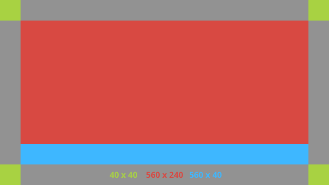
以下是 XML 版面配置範例:
<?xml version="1.0" encoding="utf-8"?>
<androidx.constraintlayout.widget.ConstraintLayout
    xmlns:android="http://schemas.android.com/apk/res/android"
    xmlns:app="http://schemas.android.com/apk/res-auto"
    android:id="@+id/layout"
    android:layout_width="match_parent"
    android:layout_height="match_parent">

  <FrameLayout
      android:id="@+id/body_layout"
      android:layout_width="0dp"
      android:layout_height="0dp"
      android:layout_margin="@dimen/glass_card_margin"
      app:layout_constraintBottom_toTopOf="@id/footer"
      app:layout_constraintEnd_toEndOf="parent"
      app:layout_constraintStart_toStartOf="parent"
      app:layout_constraintTop_toTopOf="parent">

    <!-- Put your widgets inside this FrameLayout. -->

  </FrameLayout>

  <!-- The footer view will grow to fit as much content as possible while the
         timestamp view keeps its width. If the footer text is too long, it
         will be ellipsized with a 40dp margin between it and the timestamp. -->

  <TextView
      android:id="@+id/footer"
      android:layout_width="0dp"
      android:layout_height="wrap_content"
      android:layout_marginStart="@dimen/glass_card_margin"
      android:layout_marginEnd="@dimen/glass_card_margin"
      android:layout_marginBottom="@dimen/glass_card_margin"
      android:ellipsize="end"
      android:singleLine="true"
      android:textAppearance="?android:attr/textAppearanceSmall"
      app:layout_constraintBottom_toBottomOf="parent"
      app:layout_constraintEnd_toStartOf="@id/timestamp"
      app:layout_constraintStart_toStartOf="parent" />

  <TextView
      android:id="@+id/timestamp"
      android:layout_width="0dp"
      android:layout_height="wrap_content"
      android:layout_marginEnd="@dimen/glass_card_margin"
      android:layout_marginBottom="@dimen/glass_card_margin"
      android:ellipsize="end"
      android:singleLine="true"
      android:textAlignment="viewEnd"
      android:textAppearance="?android:attr/textAppearanceSmall"
      app:layout_constraintBottom_toBottomOf="parent"
      app:layout_constraintEnd_toEndOf="parent" />

</androidx.constraintlayout.widget.ConstraintLayout>
左欄版面配置
這個版面配置會定義左欄的寬度為三分之一,右欄的寬度為三分之二,形式為兩個
FrameLayout 類別,您可以將檢視區塊放入其中。請參考下圖範例。
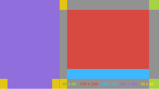
以下是 XML 版面配置範例:
<?xml version="1.0" encoding="utf-8"?>
<androidx.constraintlayout.widget.ConstraintLayout
    xmlns:android="http://schemas.android.com/apk/res/android"
    xmlns:app="http://schemas.android.com/apk/res-auto"
    android:layout_width="match_parent"
    android:layout_height="match_parent">

  <FrameLayout
      android:id="@+id/left_column"
      android:layout_width="0dp"
      android:layout_height="match_parent"
      android:background="#303030"
      app:layout_constraintBottom_toBottomOf="parent"
      app:layout_constraintStart_toStartOf="parent"
      app:layout_constraintTop_toTopOf="parent"
      app:layout_constraintWidth_percent=".333">

    <!-- Put widgets for the left column inside this FrameLayout. -->

  </FrameLayout>

  <FrameLayout
      android:id="@+id/right_column"
      android:layout_width="0dp"
      android:layout_height="0dp"
      android:layout_marginTop="@dimen/glass_card_two_column_margin"
      android:layout_marginStart="@dimen/glass_card_two_column_margin"
      android:layout_marginBottom="@dimen/glass_card_two_column_margin"
      android:layout_marginEnd="@dimen/glass_card_margin"
      app:layout_constraintBottom_toTopOf="@id/footer"
      app:layout_constraintEnd_toEndOf="parent"
      app:layout_constraintStart_toEndOf="@id/left_column"
      app:layout_constraintTop_toTopOf="parent">

    <!-- Put widgets for the right column inside this FrameLayout. -->

  </FrameLayout>

  <!-- The footer view will grow to fit as much content as possible while the
         timestamp view keeps its width. If the footer text is too long, it
         will be ellipsized with a 40dp margin between it and the timestamp. -->

  <TextView
      android:id="@+id/footer"
      android:layout_width="0dp"
      android:layout_height="wrap_content"
      android:layout_marginStart="@dimen/glass_card_margin"
      android:layout_marginEnd="@dimen/glass_card_margin"
      android:layout_marginBottom="@dimen/glass_card_margin"
      android:ellipsize="end"
      android:singleLine="true"
      android:textAppearance="?android:attr/textAppearanceSmall"
      app:layout_constraintBottom_toBottomOf="parent"
      app:layout_constraintEnd_toStartOf="@id/timestamp"
      app:layout_constraintStart_toEndOf="@id/left_column" />

  <TextView
      android:id="@+id/timestamp"
      android:layout_width="0dp"
      android:layout_height="wrap_content"
      android:layout_marginEnd="@dimen/glass_card_margin"
      android:layout_marginBottom="@dimen/glass_card_margin"
      android:ellipsize="end"
      android:singleLine="true"
      android:textAlignment="viewEnd"
      android:textAppearance="?android:attr/textAppearanceSmall"
      app:layout_constraintBottom_toBottomOf="parent"
      app:layout_constraintEnd_toEndOf="parent" />

</androidx.constraintlayout.widget.ConstraintLayout>
標準尺寸
搭配先前的版面配置或您自己的版面配置使用下列項目,即可建立符合 Glass 標準樣式的檔案。在 Android 專案中,將這個檔案建立為 res/values/dimens.xml。
<?xml version="1.0" encoding="utf-8"?>
<resources>

  <!-- The recommended margin for the top, left, and right edges of a card. -->
  <dimen name="glass_card_margin">40dp</dimen>

  <!-- The recommended margin between the bottom of the card and the footer. -->
  <dimen name="glass_card_footer_margin">50dp</dimen>

  <!-- The recommended margin for the left column of the two-column card. -->
  <dimen name="glass_card_two_column_margin">30dp</dimen>

</resources>
選單
建議您使用
RecyclerView 建構選單。這些檔案應以 Android Studio 專案資源中的標準 Android 選單檔案為基礎。Android 可讓您覆寫標準選單建立作業,並以自己的實作項目取代。步驟如下:
- 使用
RecyclerView建立版面配置,並將其設為Activity的檢視畫面。 - 設定
RecyclerView及其轉接器,以使用新建立的選單項目集合。 - 覆寫
onCreateOptionsMenu方法。- 將選單膨脹,然後為每個選單項目將新元素加入集合。
- 在配接器上呼叫
notifyDataSetChanged方法。
Kotlin
    override fun onCreateOptionsMenu(menu: Menu): Boolean {
        val menuResource = intent
            .getIntExtra(EXTRA_MENU_KEY, EXTRA_MENU_ITEM_DEFAULT_VALUE)
        if (menuResource != EXTRA_MENU_ITEM_DEFAULT_VALUE) {
            menuInflater.inflate(menuResource, menu)
            for (i in 0 until menu.size()) {
                val menuItem = menu.getItem(i)
                menuItems.add(
                    GlassMenuItem(
                        menuItem.itemId, menuItem.icon,
                        menuItem.title.toString()
                    )
                )
                adapter.notifyDataSetChanged()
            }
        }
        return super.onCreateOptionsMenu(menu)
    }
Java
    @Override
    public boolean onCreateOptionsMenu(Menu menu) {
      final int menuResource = getIntent()
          .getIntExtra(EXTRA_MENU_KEY, EXTRA_MENU_ITEM_DEFAULT_VALUE);
      if (menuResource != EXTRA_MENU_ITEM_DEFAULT_VALUE) {
        final MenuInflater inflater = getMenuInflater();
        inflater.inflate(menuResource, menu);

        for (int i = 0; i < menu.size(); i++) {
          final MenuItem menuItem = menu.getItem(i);
          menuItems.add(
              new GlassMenuItem(menuItem.getItemId(), menuItem.getIcon(),
                  menuItem.getTitle().toString()));
          adapter.notifyDataSetChanged();
        }
      }
      return super.onCreateOptionsMenu(menu);
    }
- 一併使用
OnScrollListener和LayoutManager和SnapHelper,判斷已選取哪個選項。 - 監聽
TAP手勢,處理選單項目選取事件。 - 建立
Intent,其中包含所選選單項目的相關資訊。 - 為這項活動設定結果並完成。
- 從要顯示選單的片段或活動呼叫
startActivityForResult。 請使用TAP手勢。 - 覆寫呼叫片段或活動中的
onActivityResult,處理所選的選單項目。
指南規範
以下是設定選單版面配置的建議:
- 文字大小:
64sp - 背景顏色:
#96000000 - 使用 Material icons,大小為
64dpx64dp - 將
windowIsTranslucent主題旗標設為true
下圖是自訂選單版面的範例:
如要瞭解實作詳情,請參閱資訊卡範例應用程式。
可滑動切換的頁面
Glass 螢幕和觸控板會一起運作,以便利的方式顯示可滑動的資訊卡。您可以使用標準 Android
ViewPager API,在活動中建構可滑動的頁面。