Page Summary
-
This document provides guidelines for following Glass style and implementing UI best practices to optimize user experience.
-
The recommended Glass theme uses a solid-black background, white text, and displays activities full-screen without an action bar.
-
Two basic XML card layouts are suggested: a main layout with standard padding and footer, and a left column layout dividing the screen into a one-third left and two-thirds right section.
-
Menus are ideally built using RecyclerView, overriding standard Android menu creation to use custom layouts and handling selection through gestures.
-
Swipeable pages can be created using the standard Android ViewPager API for convenient card navigation.
This document goes over how to follow Glass style and implement common UI best practices that can optimize your user's experience. It covers the following UI elements:
Theme
The Glass theme we suggest you use has the following characteristics:
- Displays activities full-screen with no action bar.
- Applies a solid-black background.
- Sets the color lighter for the color edge effect.
- Applies a white text color.
The following are the recommended theme settings for Glass:
 <style name="AppTheme" parent="Theme.AppCompat.NoActionBar">
   <item name="android:windowBackground">@android:color/black</item>
   <item name="android:colorEdgeEffect">@android:color/white</item>
   <item name="android:textColor">@android:color/white</item>
 </style>
XML layouts
Here are the two basic card layouts that your fragments can inflate:
Main layout
This layout defines the suggested standard padding and footer for a card. Put your own views in
the empty
FrameLayout.
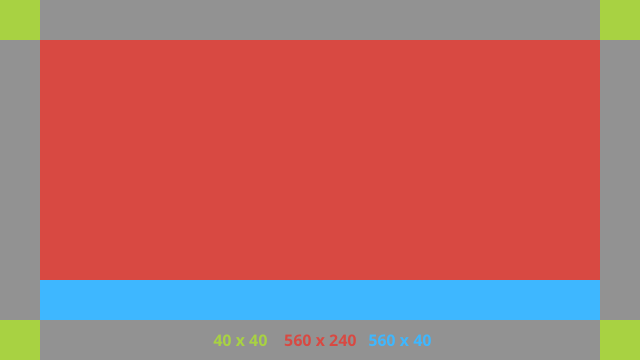
Here is an example XML layout:
<?xml version="1.0" encoding="utf-8"?>
<androidx.constraintlayout.widget.ConstraintLayout
    xmlns:android="http://schemas.android.com/apk/res/android"
    xmlns:app="http://schemas.android.com/apk/res-auto"
    android:id="@+id/layout"
    android:layout_width="match_parent"
    android:layout_height="match_parent">

  <FrameLayout
      android:id="@+id/body_layout"
      android:layout_width="0dp"
      android:layout_height="0dp"
      android:layout_margin="@dimen/glass_card_margin"
      app:layout_constraintBottom_toTopOf="@id/footer"
      app:layout_constraintEnd_toEndOf="parent"
      app:layout_constraintStart_toStartOf="parent"
      app:layout_constraintTop_toTopOf="parent">

    <!-- Put your widgets inside this FrameLayout. -->

  </FrameLayout>

  <!-- The footer view will grow to fit as much content as possible while the
         timestamp view keeps its width. If the footer text is too long, it
         will be ellipsized with a 40dp margin between it and the timestamp. -->

  <TextView
      android:id="@+id/footer"
      android:layout_width="0dp"
      android:layout_height="wrap_content"
      android:layout_marginStart="@dimen/glass_card_margin"
      android:layout_marginEnd="@dimen/glass_card_margin"
      android:layout_marginBottom="@dimen/glass_card_margin"
      android:ellipsize="end"
      android:singleLine="true"
      android:textAppearance="?android:attr/textAppearanceSmall"
      app:layout_constraintBottom_toBottomOf="parent"
      app:layout_constraintEnd_toStartOf="@id/timestamp"
      app:layout_constraintStart_toStartOf="parent" />

  <TextView
      android:id="@+id/timestamp"
      android:layout_width="0dp"
      android:layout_height="wrap_content"
      android:layout_marginEnd="@dimen/glass_card_margin"
      android:layout_marginBottom="@dimen/glass_card_margin"
      android:ellipsize="end"
      android:singleLine="true"
      android:textAlignment="viewEnd"
      android:textAppearance="?android:attr/textAppearanceSmall"
      app:layout_constraintBottom_toBottomOf="parent"
      app:layout_constraintEnd_toEndOf="parent" />

</androidx.constraintlayout.widget.ConstraintLayout>
Left column layout
This layout defines a one-third width left column and two-thirds width right column in the form
of two
FrameLayout classes that you can put your views into. Reference the following
picture to see an example.
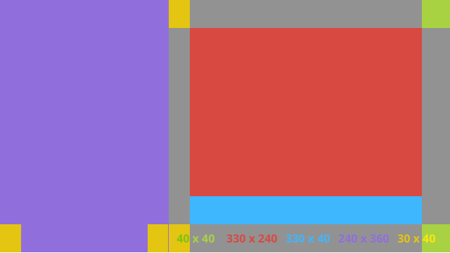
Here is an example XML layout:
<?xml version="1.0" encoding="utf-8"?>
<androidx.constraintlayout.widget.ConstraintLayout
    xmlns:android="http://schemas.android.com/apk/res/android"
    xmlns:app="http://schemas.android.com/apk/res-auto"
    android:layout_width="match_parent"
    android:layout_height="match_parent">

  <FrameLayout
      android:id="@+id/left_column"
      android:layout_width="0dp"
      android:layout_height="match_parent"
      android:background="#303030"
      app:layout_constraintBottom_toBottomOf="parent"
      app:layout_constraintStart_toStartOf="parent"
      app:layout_constraintTop_toTopOf="parent"
      app:layout_constraintWidth_percent=".333">

    <!-- Put widgets for the left column inside this FrameLayout. -->

  </FrameLayout>

  <FrameLayout
      android:id="@+id/right_column"
      android:layout_width="0dp"
      android:layout_height="0dp"
      android:layout_marginTop="@dimen/glass_card_two_column_margin"
      android:layout_marginStart="@dimen/glass_card_two_column_margin"
      android:layout_marginBottom="@dimen/glass_card_two_column_margin"
      android:layout_marginEnd="@dimen/glass_card_margin"
      app:layout_constraintBottom_toTopOf="@id/footer"
      app:layout_constraintEnd_toEndOf="parent"
      app:layout_constraintStart_toEndOf="@id/left_column"
      app:layout_constraintTop_toTopOf="parent">

    <!-- Put widgets for the right column inside this FrameLayout. -->

  </FrameLayout>

  <!-- The footer view will grow to fit as much content as possible while the
         timestamp view keeps its width. If the footer text is too long, it
         will be ellipsized with a 40dp margin between it and the timestamp. -->

  <TextView
      android:id="@+id/footer"
      android:layout_width="0dp"
      android:layout_height="wrap_content"
      android:layout_marginStart="@dimen/glass_card_margin"
      android:layout_marginEnd="@dimen/glass_card_margin"
      android:layout_marginBottom="@dimen/glass_card_margin"
      android:ellipsize="end"
      android:singleLine="true"
      android:textAppearance="?android:attr/textAppearanceSmall"
      app:layout_constraintBottom_toBottomOf="parent"
      app:layout_constraintEnd_toStartOf="@id/timestamp"
      app:layout_constraintStart_toEndOf="@id/left_column" />

  <TextView
      android:id="@+id/timestamp"
      android:layout_width="0dp"
      android:layout_height="wrap_content"
      android:layout_marginEnd="@dimen/glass_card_margin"
      android:layout_marginBottom="@dimen/glass_card_margin"
      android:ellipsize="end"
      android:singleLine="true"
      android:textAlignment="viewEnd"
      android:textAppearance="?android:attr/textAppearanceSmall"
      app:layout_constraintBottom_toBottomOf="parent"
      app:layout_constraintEnd_toEndOf="parent" />

</androidx.constraintlayout.widget.ConstraintLayout>
Standard dimensions
Use the following in conjunction with the previous layouts or your own layouts to create a file
that adheres to Glass' standard style. Create this file as res/values/dimens.xml
in your Android project.
<?xml version="1.0" encoding="utf-8"?>
<resources>

  <!-- The recommended margin for the top, left, and right edges of a card. -->
  <dimen name="glass_card_margin">40dp</dimen>

  <!-- The recommended margin between the bottom of the card and the footer. -->
  <dimen name="glass_card_footer_margin">50dp</dimen>

  <!-- The recommended margin for the left column of the two-column card. -->
  <dimen name="glass_card_two_column_margin">30dp</dimen>

</resources>
Menus
We suggest you use
RecyclerView to build menus. They should be based on the standard
Android menu file from Android Studio project resources. Android allows you to override the standard
menu creation and replace it with your implementation. To do so, follow these steps:
- Create the layout with
RecyclerViewand set it as the view for yourActivity. - Set
RecyclerViewand its adapter to use the newly created collection of menu items. - Override the
onCreateOptionsMenumethod.- Inflate your menu and add your new element to the collection for each menu item.
- Call the
notifyDataSetChangedmethod on the adapter.
Kotlin
    override fun onCreateOptionsMenu(menu: Menu): Boolean {
        val menuResource = intent
            .getIntExtra(EXTRA_MENU_KEY, EXTRA_MENU_ITEM_DEFAULT_VALUE)
        if (menuResource != EXTRA_MENU_ITEM_DEFAULT_VALUE) {
            menuInflater.inflate(menuResource, menu)
            for (i in 0 until menu.size()) {
                val menuItem = menu.getItem(i)
                menuItems.add(
                    GlassMenuItem(
                        menuItem.itemId, menuItem.icon,
                        menuItem.title.toString()
                    )
                )
                adapter.notifyDataSetChanged()
            }
        }
        return super.onCreateOptionsMenu(menu)
    }
Java
    @Override
    public boolean onCreateOptionsMenu(Menu menu) {
      final int menuResource = getIntent()
          .getIntExtra(EXTRA_MENU_KEY, EXTRA_MENU_ITEM_DEFAULT_VALUE);
      if (menuResource != EXTRA_MENU_ITEM_DEFAULT_VALUE) {
        final MenuInflater inflater = getMenuInflater();
        inflater.inflate(menuResource, menu);

        for (int i = 0; i < menu.size(); i++) {
          final MenuItem menuItem = menu.getItem(i);
          menuItems.add(
              new GlassMenuItem(menuItem.getItemId(), menuItem.getIcon(),
                  menuItem.getTitle().toString()));
          adapter.notifyDataSetChanged();
        }
      }
      return super.onCreateOptionsMenu(menu);
    }
- Use
OnScrollListenertogether withLayoutManagerandSnapHelperto determine which option has been selected. - Listen for a
TAPgesture to handle the menu item selection event. - Create an
Intentwith information about the selected menu item. - Set a result for this activity and finish it.
- Call
startActivityForResultfrom the fragment or activity where you want to have a menu. Use aTAPgesture for this purpose. - Override the
onActivityResultin the calling fragment or activity to handle the selected menu item.
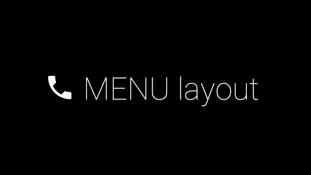
Guidelines
The following is a list of suggestions for how to set up your menu layout:
- Text size:
64sp - Background color:
#96000000 - Use Material icons
with the size of
64dpx64dp - Set the
windowIsTranslucenttheme flag totrue
The following image is an example of a customized menu layout:
Review the Card sample app for implementation details.
Swipeable pages
The Glass display and touchpad work together to display swipeable cards in a convenient way. You
can build swipeable pages in your activity with the standard Android
ViewPager API.
Visit the Screen slide
training documentation for more information on how to use Android
ViewPager to scroll through cards or screens.