
マテリアル コンポーネント(MDC)は、デベロッパーがマテリアル デザインを実装する際に役立ちます。Google のエンジニアと UX デザイナーのチームが作成した MDC には、美しく機能的な UI コンポーネントが多数含まれており、Android、iOS、ウェブ、Flutter に利用可能です。 material.io/develop |

Codelab MDC-101 では、2 つのマテリアル コンポーネント(MDC)(テキスト フィールドと、インクの波紋付きのボタン)を使用してログインページを作成しました。今度は、この基礎にナビゲーション、構造、データを追加していきましょう。
作成するアプリの概要
この Codelab では、衣類と生活雑貨を販売する e コマースアプリ Shrine のホーム画面を作成します。これには次のものが含まれます。
- トップ アプリバー
- 商品が並んだグリッドリスト
この Codelab の MDC-Android コンポーネント
- AppBarLayout
- MaterialCardView
必要なもの
- Android 開発に関する基本的な知識
- Android Studio (まだお持ちでない場合はこちらからダウンロードしてください)
- Android Emulator または Android デバイス(Android Studio から入手可能)
- サンプルコード(次の手順を参照)
Android アプリ作成のご経験についてお答えください。
MDC-101 から続行する場合
MDC-101 を完了していれば、コードはこの Codelab 用に準備されています。ステップ 3: トップ アプリバーを追加するに進んでください。
ゼロから始める
Codelab のスターター アプリをダウンロードする
スターター アプリは material-components-android-codelabs-102-starter/kotlin ディレクトリにあります。開始する前に、必ずそのディレクトリに cd してください。
GitHub からクローンを作成する
GitHub からこの Codelab のクローンを作成するには、次のコマンドを実行します。
git clone https://github.com/material-components/material-components-android-codelabs
cd material-components-android-codelabs/
git checkout 102-starter
Android Studio にスターター コードを読み込む
- 設定ウィザードが終了し、[Welcome to Android Studio] ウィンドウが表示されたら、[Open an existing Android Studio project] をクリックします。サンプルコードをインストールしたディレクトリに移動し、[kotlin -> shrine](または、パソコンで shrine を検索)を選択して Shipping プロジェクトを開きます。
- Android Studio がプロジェクトをビルドして同期するまで待ちます。進捗状況は、Android Studio ウィンドウ下部のアクティビティ インジケーターに表示されます。
- この時点では、Android SDK やビルドツール(以下に示すものなど)が不足しているため、Android Studio でビルドエラーが発生する場合があります。Android Studio の指示に従って、それをインストール/更新して、プロジェクトを同期させます。

プロジェクトの依存関係を追加する
プロジェクトには、MDC Android サポート ライブラリへの依存関係が必要です。ダウンロードしたサンプルコードにはこの依存関係がすでにリストされているはずですが、次の手順で確認することをおすすめします。
appモジュールのbuild.gradleファイルに移動し、MDC Android への依存関係がdependenciesブロックに含まれていることを確認します。
api 'com.google.android.material:material:1.1.0-alpha06'
- (省略可)必要に応じて、
build.gradleファイルを編集して次の依存関係を追加し、プロジェクトを同期します。
dependencies {
    api 'com.google.android.material:material:1.1.0-alpha06'
    implementation 'androidx.legacy:legacy-support-v4:1.0.0'
    implementation 'com.android.volley:volley:1.1.1'
    implementation 'com.google.code.gson:gson:2.8.5'
    implementation "org.jetbrains.kotlin:kotlin-stdlib-jdk7:1.3.21"
    testImplementation 'junit:junit:4.12'
    androidTestImplementation 'androidx.test:core:1.1.0'
    androidTestImplementation 'androidx.test.ext:junit:1.1.0'
    androidTestImplementation 'androidx.test:runner:1.2.0-alpha05'
    androidTestImplementation 'androidx.test.espresso:espresso-core:3.2.0-alpha05'
}
スターター アプリを実行する
|

完了しました。MDC-101 Codelab で作成した Shrine のログインページが表示されます。
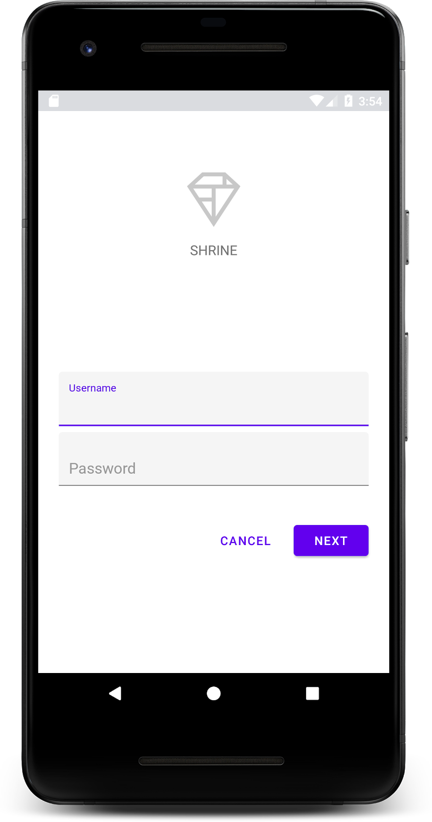
ログイン画面が正常に表示されたので、アプリに商品を追加してみましょう。
ログイン ページが閉じると、ホーム画面が表示され、「You did it!」という画面が表示されます。優れたが、今のところユーザーは何もできず、アプリ内のどこにいるのかわからない状態です。そこで、ナビゲーションを追加します。
マテリアル デザインには、高度なユーザビリティを実現するナビゲーション パターンがあります。特に目立つコンポーネントの 1 つが、トップ アプリバーです。
ナビゲーションを提供し、ユーザーが他のアクションにすばやくアクセスできるように、トップ アプリバーを追加しましょう。
AppBar ウィジェットを追加する
shr_product_grid_fragment.xml で、「You did it!」を含む <LinearLayout> ブロックを削除します。TextView を次のコードに置き換えます。
shr_product_grid_fragment.xml
<com.google.android.material.appbar.AppBarLayout
   android:layout_width="match_parent"
   android:layout_height="wrap_content">

   <androidx.appcompat.widget.Toolbar
       android:id="@+id/app_bar"
       style="@style/Widget.Shrine.Toolbar"
       android:layout_width="match_parent"
       android:layout_height="?attr/actionBarSize"
       app:title="@string/shr_app_name" />
</com.google.android.material.appbar.AppBarLayout>
shr_product_grid_fragment.xml は次のようになります。
shr_product_grid_fragment.xml
<?xml version="1.0" encoding="utf-8"?>
<FrameLayout xmlns:android="http://schemas.android.com/apk/res/android"
   xmlns:app="http://schemas.android.com/apk/res-auto"
   xmlns:tools="http://schemas.android.com/tools"
   android:layout_width="match_parent"
   android:layout_height="match_parent"
   tools:context=".ProductGridFragment">

   <com.google.android.material.appbar.AppBarLayout
       android:layout_width="match_parent"
       android:layout_height="wrap_content">

       <androidx.appcompat.widget.Toolbar
           android:id="@+id/app_bar"
           style="@style/Widget.Shrine.Toolbar"
           android:layout_width="match_parent"
           android:layout_height="?attr/actionBarSize"
           app:title="@string/shr_app_name" />
   </com.google.android.material.appbar.AppBarLayout>

</FrameLayout>
アプリバーは多くの場合、タイトルの横にボタンがあります。アプリにメニュー アイコンを追加しましょう。
ナビゲーション アイコンを追加する
shr_product_grid_fragment.xml で、レイアウトに追加した Toolbar XML コンポーネントに次のコードを追加します。
shr_product_grid_fragment.xml
app:navigationIcon="@drawable/shr_menu"shr_product_grid_fragment.xml は次のようになります。
shr_product_grid_fragment.xml
<?xml version="1.0" encoding="utf-8"?>
<FrameLayout xmlns:android="http://schemas.android.com/apk/res/android"
   xmlns:app="http://schemas.android.com/apk/res-auto"
   xmlns:tools="http://schemas.android.com/tools"
   android:layout_width="match_parent"
   android:layout_height="match_parent"
   tools:context=".ProductGridFragment">

   <com.google.android.material.appbar.AppBarLayout
       android:layout_width="match_parent"
       android:layout_height="wrap_content">

       <androidx.appcompat.widget.Toolbar
           android:id="@+id/app_bar"
           style="@style/Widget.Shrine.Toolbar"
           android:layout_width="match_parent"
           android:layout_height="?attr/actionBarSize"
           app:navigationIcon="@drawable/shr_menu"
           app:title="@string/shr_app_name" />
   </com.google.android.material.appbar.AppBarLayout>

</FrameLayout>
アクション ボタンを追加して上部のアプリバーのスタイルを設定する
アプリバーの末尾にボタンを追加することもできます。Android では、これらはアクション ボタンと呼ばれます。トップ アプリバーのスタイルを設定し、そのメニューにアクション ボタンをプログラムで追加します。
ProductGridFragment.kt の onCreateView 関数で、setSupportActionBar を使用して activity の Toolbar を ActionBar として使用するように設定します。これは、inflater でビューを作成した後に実行できます。
ProductGridFragment.kt
override fun onCreateView(
       inflater: LayoutInflater, container: ViewGroup?, savedInstanceState: Bundle?): View? {
   // Inflate the layout for this fragment with the ProductGrid theme
   val view = inflater.inflate(R.layout.shr_product_grid_fragment, container, false)

   // Set up the toolbar.
   (activity as AppCompatActivity).setSupportActionBar(view.app_bar)

   return view;
}次に、ツールバーを設定するために変更したメソッドの直下に、onCreateOptionsMenu をオーバーライドして shr_toolbar_menu.xml の内容をツールバーに読み込みます。
ProductGridFragment.kt
override fun onCreateOptionsMenu(menu: Menu, menuInflater: MenuInflater) {
   menuInflater.inflate(R.menu.shr_toolbar_menu, menu)
   super.onCreateOptionsMenu(menu, menuInflater)
}最後に、ProductGridFragment.kt で onCreate() をオーバーライドし、super() を呼び出した後、true を使用して setHasOptionMenu を呼び出します。
ProductGridFragment.kt
override fun onCreate(savedInstanceState: Bundle?) {
   super.onCreate(savedInstanceState)
   setHasOptionsMenu(true)
}
上記のコード スニペットでは、XML レイアウトのアプリバーをこのアクティビティのアクションバーとして設定しています。コールバック onCreateOptionsMenu は、メニューとして使用するものをアクティビティに伝えます。この場合、R.menu.shr_toolbar_menu のメニュー項目がアプリバーに配置されます。メニュー ファイルには、「検索」と「フィルタ」の 2 つの項目が含まれています。
shr_toolbar_menu.xml
<?xml version="1.0" encoding="utf-8"?>
<menu xmlns:android="http://schemas.android.com/apk/res/android"
   xmlns:app="http://schemas.android.com/apk/res-auto">
   <item
       android:id="@+id/search"
       android:icon="@drawable/shr_search"
       android:title="@string/shr_search_title"
       app:showAsAction="always" />
   <item
       android:id="@+id/filter"
       android:icon="@drawable/shr_filter"
       android:title="@string/shr_filter_title"
       app:showAsAction="always" />
</menu>変更後、ProductGridFragment.kt ファイルは次のようになります。
ProductGridFragment.kt
package com.google.codelabs.mdc.kotlin.shrine

import android.os.Bundle
import android.view.LayoutInflater
import android.view.Menu
import android.view.MenuInflater
import android.view.View
import android.view.ViewGroup
import androidx.appcompat.app.AppCompatActivity
import androidx.fragment.app.Fragment
import androidx.recyclerview.widget.GridLayoutManager
import com.google.codelabs.mdc.kotlin.shrine.network.ProductEntry
import kotlinx.android.synthetic.main.shr_product_grid_fragment.view.*

class ProductGridFragment : Fragment() {

   override fun onCreate(savedInstanceState: Bundle?) {
       super.onCreate(savedInstanceState)
       setHasOptionsMenu(true)
   }

   override fun onCreateView(
           inflater: LayoutInflater, container: ViewGroup?, savedInstanceState: Bundle?): View? {
       // Inflate the layout for this fragment with the ProductGrid theme
       val view = inflater.inflate(R.layout.shr_product_grid_fragment, container, false)

       // Set up the tool bar
       (activity as AppCompatActivity).setSupportActionBar(view.app_bar)

       return view;
   }

   override fun onCreateOptionsMenu(menu: Menu, menuInflater: MenuInflater) {
       menuInflater.inflate(R.menu.shr_toolbar_menu, menu)
       super.onCreateOptionsMenu(menu, menuInflater)
   }
}
ビルドして実行します。ホーム画面は次のようになります。
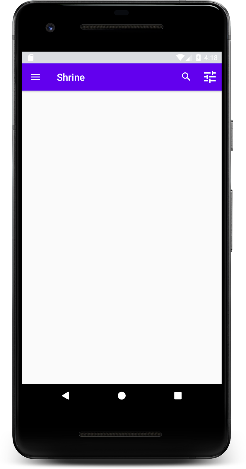
ツールバーに、ナビゲーション アイコン、タイトル、右側の 2 つのアクション アイコンが表示されます。ツールバーには、コンテンツとは別のレイヤにあることを示す微妙な影を使用して高度も表示されます。
アプリの構造がある程度できたので、コンテンツをカードに入れて整理しましょう。
カードを追加する
まずは、トップ アプリバーの下にカードを 1 つ追加しましょう。カードには、画像、タイトル、セカンダリ テキストのラベルの領域が必要です。AppBarLayout の下の shr_product_grid_fragment.xml に以下を追加します。
shr_product_grid_fragment.xml
<com.google.android.material.card.MaterialCardView
   android:layout_width="160dp"
   android:layout_height="180dp"
   android:layout_marginBottom="16dp"
   android:layout_marginLeft="16dp"
   android:layout_marginRight="16dp"
   android:layout_marginTop="70dp"
   app:cardBackgroundColor="?attr/colorPrimaryDark"
   app:cardCornerRadius="4dp">

   <LinearLayout
       android:layout_width="match_parent"
       android:layout_height="wrap_content"
       android:layout_gravity="bottom"
       android:background="#FFFFFF"
       android:orientation="vertical"
       android:padding="8dp">

       <TextView
           android:layout_width="match_parent"
           android:layout_height="wrap_content"
           android:padding="2dp"
           android:text="@string/shr_product_title"
           android:textAppearance="?attr/textAppearanceHeadline6" />

       <TextView
           android:layout_width="match_parent"
           android:layout_height="wrap_content"
           android:padding="2dp"
           android:text="@string/shr_product_description"
           android:textAppearance="?attr/textAppearanceBody2" />
   </LinearLayout>
</com.google.android.material.card.MaterialCardView>
ビルドして実行します。
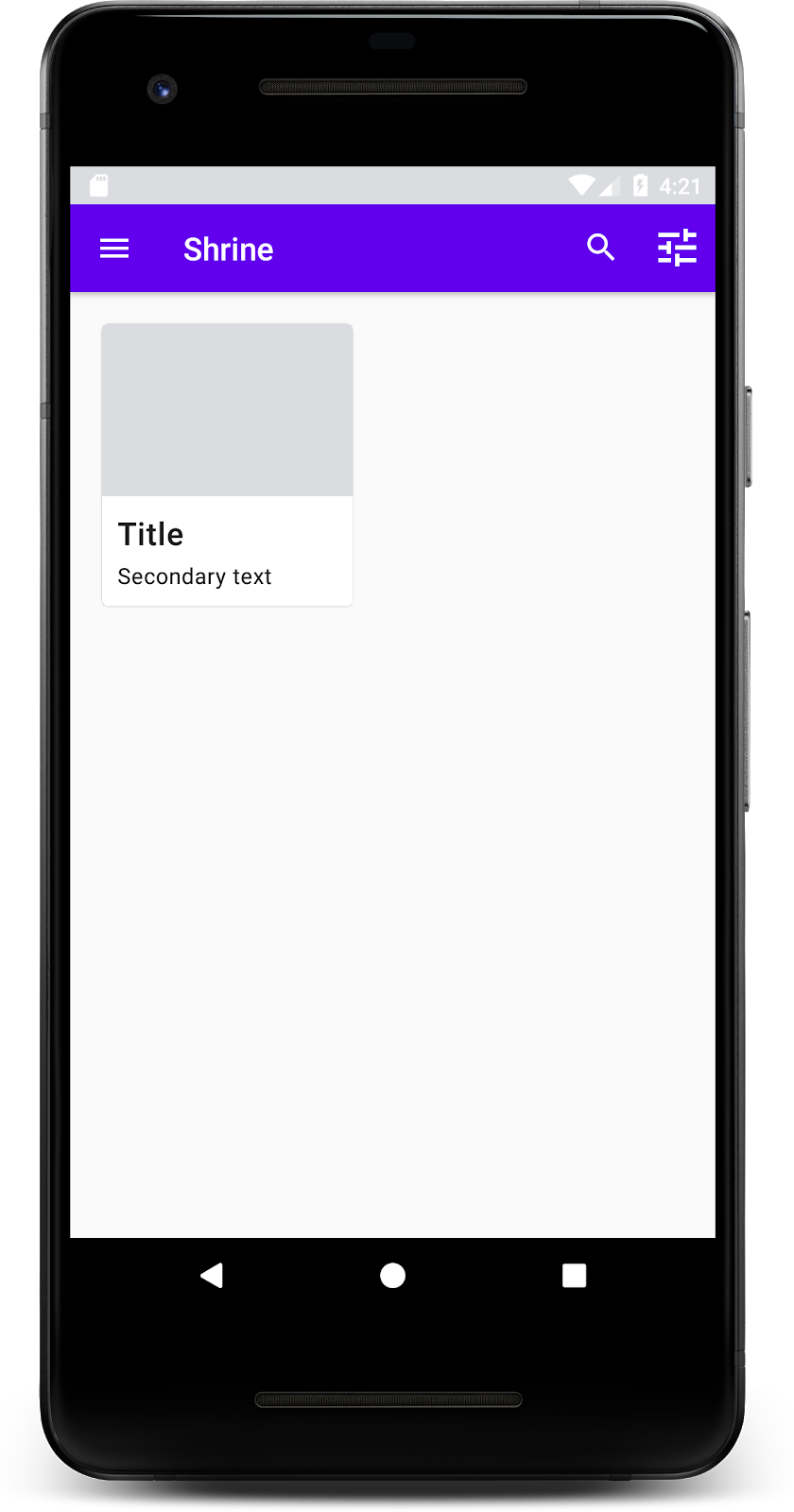
このプレビューでは、角の丸い、影付き(カードの高度を表します)のカードが、左端からインセットされて表示されます。この要素全体を「コンテナ」といいます。コンテナを除き、その中の要素はすべてオプションです。
コンテナには、見出し、サムネイルまたはアバター、小見出し、分割線、さらにはボタンやアイコンを追加できます。たとえば、先ほど作成したカードには、LinearLayout 内に 2 つの TextView(タイトル用とセカンダリ テキスト用)が含まれており、カードの下部に配置されています。
カードは通常、他のカードと一緒にコレクションで表示されます。この Codelab の次のセクションでは、コレクションとしてグリッド形式でレイアウトします。
複数のカードが画面に表示されている場合は、1 つまたは複数のコレクションにグループ化されます。グリッド内のカードは同一平面上にあります。つまり、カードは互いに 1 つの静止高度を共有します(選択されるかドラッグされる場合を除きますが、この Codelab ではそのようなことは行いません)。
カードのグリッドを設定する
Google が提供した shr_product_card.xml ファイルをご覧ください。
shr_product_card.xml
<?xml version="1.0" encoding="utf-8"?>
<com.google.android.material.card.MaterialCardView xmlns:android="http://schemas.android.com/apk/res/android"
   xmlns:app="http://schemas.android.com/apk/res-auto"
   android:layout_width="match_parent"
   android:layout_height="wrap_content"
   app:cardBackgroundColor="@android:color/white"
   app:cardElevation="2dp"
   app:cardPreventCornerOverlap="true">

   <LinearLayout
       android:layout_width="match_parent"
       android:layout_height="wrap_content"
       android:orientation="vertical">

       <com.android.volley.toolbox.NetworkImageView
           android:id="@+id/product_image"
           android:layout_width="match_parent"
           android:layout_height="@dimen/shr_product_card_image_height"
           android:background="?attr/colorPrimaryDark"
           android:scaleType="centerCrop" />

       <LinearLayout
           android:layout_width="match_parent"
           android:layout_height="wrap_content"
           android:orientation="vertical"
           android:padding="16dp">

           <TextView
               android:id="@+id/product_title"
               android:layout_width="match_parent"
               android:layout_height="wrap_content"
               android:text="@string/shr_product_title"
               android:textAppearance="?attr/textAppearanceHeadline6" />

           <TextView
               android:id="@+id/product_price"
               android:layout_width="match_parent"
               android:layout_height="wrap_content"
               android:text="@string/shr_product_description"
               android:textAppearance="?attr/textAppearanceBody2" />
       </LinearLayout>
   </LinearLayout>
</com.google.android.material.card.MaterialCardView>
このカード レイアウトには、画像を含むカード(この場合は NetworkImageView。URL から画像を読み込んで表示できます)と 2 つの TextViews が含まれています。
次に、Google が提供した ProductCardRecyclerViewAdapter を確認します。ProductGridFragment と同じパッケージにあります。
ProductCardRecyclerViewAdapter.kt
package com.google.codelabs.mdc.kotlin.shrine

import android.view.LayoutInflater
import android.view.ViewGroup
import androidx.recyclerview.widget.RecyclerView

import com.google.codelabs.mdc.kotlin.shrine.network.ProductEntry

/**
* Adapter used to show a simple grid of products.
*/
class ProductCardRecyclerViewAdapter(private val productList: List<ProductEntry>) : RecyclerView.Adapter<ProductCardViewHolder>() {

   override fun onCreateViewHolder(parent: ViewGroup, viewType: Int): ProductCardViewHolder {
       val layoutView = LayoutInflater.from(parent.context).inflate(R.layout.shr_product_card, parent, false)
       return ProductCardViewHolder(layoutView)
   }

   override fun onBindViewHolder(holder: ProductCardViewHolder, position: Int) {
       // TODO: Put ViewHolder binding code here in MDC-102
   }

   override fun getItemCount(): Int {
       return productList.size
   }
}
上記のアダプター クラスは、グリッドのコンテンツを管理します。各ビューが指定されたコンテンツをどのように処理するかを決定するために、まもなく onBindViewHolder() のコードを記述します。
同じパッケージで、ProductCardViewHolder も確認できます。このクラスには、カードのレイアウトに影響するビューが格納されるため、後で変更できます。
package com.google.codelabs.mdc.kotlin.shrine

import android.view.View
import androidx.recyclerview.widget.RecyclerView

class ProductCardViewHolder(itemView: View) //TODO: Find and store views from itemView
   : RecyclerView.ViewHolder(itemView)
グリッドを設定するには、まず shr_product_grid_fragment.xml からプレースホルダ MaterialCardView を削除します。次に、カードのグリッドを表すコンポーネントを追加します。この場合、RecyclerView を使用します。AppBarLayout XML コンポーネントの下の shr_product_grid_fragment.xml に RecyclerView コンポーネントを追加します。
shr_product_grid_fragment.xml
<androidx.core.widget.NestedScrollView
   android:layout_width="match_parent"
   android:layout_height="match_parent"
   android:layout_marginTop="56dp"
   android:background="@color/productGridBackgroundColor"
   android:paddingStart="@dimen/shr_product_grid_spacing"
   android:paddingEnd="@dimen/shr_product_grid_spacing"
   app:layout_behavior="@string/appbar_scrolling_view_behavior">

   <androidx.recyclerview.widget.RecyclerView
       android:id="@+id/recycler_view"
       android:layout_width="match_parent"
       android:layout_height="match_parent" />

</androidx.core.widget.NestedScrollView>
shr_product_grid_fragment.xml は次のようになります。
shr_product_grid_fragment.xml
<?xml version="1.0" encoding="utf-8"?>
<FrameLayout xmlns:android="http://schemas.android.com/apk/res/android"
   xmlns:app="http://schemas.android.com/apk/res-auto"
   xmlns:tools="http://schemas.android.com/tools"
   android:layout_width="match_parent"
   android:layout_height="match_parent"
   tools:context=".ProductGridFragment">

   <com.google.android.material.appbar.AppBarLayout
       android:layout_width="match_parent"
       android:layout_height="wrap_content">

       <androidx.appcompat.widget.Toolbar
           android:id="@+id/app_bar"
           style="@style/Widget.Shrine.Toolbar"
           android:layout_width="match_parent"
           android:layout_height="?attr/actionBarSize"
           app:navigationIcon="@drawable/shr_menu"
           app:title="@string/shr_app_name" />
   </com.google.android.material.appbar.AppBarLayout>

   <androidx.core.widget.NestedScrollView
       android:layout_width="match_parent"
       android:layout_height="match_parent"
       android:layout_marginTop="56dp"
       android:background="@color/productGridBackgroundColor"
       android:paddingStart="@dimen/shr_product_grid_spacing"
       android:paddingEnd="@dimen/shr_product_grid_spacing"
       app:layout_behavior="@string/appbar_scrolling_view_behavior">

       <androidx.recyclerview.widget.RecyclerView
           android:id="@+id/recycler_view"
           android:layout_width="match_parent"
           android:layout_height="match_parent" />

   </androidx.core.widget.NestedScrollView>

</FrameLayout>最後に、onCreateView() で、setUpToolbar(view) を呼び出した後、return ステートメントの前に、ProductGridFragment.kt に RecyclerView 初期化コードを追加します。
ProductGridFragment.kt
override fun onCreateView(
       inflater: LayoutInflater, container: ViewGroup?, savedInstanceState: Bundle?): View? {
   // Inflate the layout for this fragment with the ProductGrid theme
   val view = inflater.inflate(R.layout.shr_product_grid_fragment, container, false)

   // Set up the toolbar.
   (activity as AppCompatActivity).setSupportActionBar(view.app_bar)

   // Set up the RecyclerView
   view.recycler_view.setHasFixedSize(true)
   view.recycler_view.layoutManager = GridLayoutManager(context, 2, RecyclerView.VERTICAL, false)
   val adapter = ProductCardRecyclerViewAdapter(
           ProductEntry.initProductEntryList(resources))
   view.recycler_view.adapter = adapter
   val largePadding = resources.getDimensionPixelSize(R.dimen.shr_product_grid_spacing)
   val smallPadding = resources.getDimensionPixelSize(R.dimen.shr_product_grid_spacing_small)
   view.recycler_view.addItemDecoration(ProductGridItemDecoration(largePadding, smallPadding))

   return view;
}
上記のコード スニペットには、RecyclerView を設定するために必要な初期化手順が含まれています。これには、RecyclerView のレイアウト マネージャーの設定、RecyclerView のアダプターの初期化と設定が含まれます。
ProductGridFragment.kt ファイルは次のようになります。
ProductGridFragment.kt
package com.google.codelabs.mdc.kotlin.shrine

import android.os.Bundle
import android.view.LayoutInflater
import android.view.Menu
import android.view.MenuInflater
import android.view.View
import android.view.ViewGroup
import androidx.appcompat.app.AppCompatActivity
import androidx.fragment.app.Fragment
import androidx.recyclerview.widget.GridLayoutManager
import androidx.recyclerview.widget.RecyclerView
import com.google.codelabs.mdc.kotlin.shrine.network.ProductEntry
import kotlinx.android.synthetic.main.shr_product_grid_fragment.view.*

class ProductGridFragment : Fragment() {

   override fun onCreate(savedInstanceState: Bundle?) {
       super.onCreate(savedInstanceState)
       setHasOptionsMenu(true)
   }

   override fun onCreateView(
           inflater: LayoutInflater, container: ViewGroup?, savedInstanceState: Bundle?): View? {
       // Inflate the layout for this fragment with the ProductGrid theme
       val view = inflater.inflate(R.layout.shr_product_grid_fragment, container, false)

       // Set up the toolbar.
       (activity as AppCompatActivity).setSupportActionBar(view.app_bar)

       // Set up the RecyclerView
       view.recycler_view.setHasFixedSize(true)
       view.recycler_view.layoutManager = GridLayoutManager(context, 2, RecyclerView.VERTICAL, false)
       val adapter = ProductCardRecyclerViewAdapter(
               ProductEntry.initProductEntryList(resources))
       view.recycler_view.adapter = adapter
       val largePadding = resources.getDimensionPixelSize(R.dimen.shr_product_grid_spacing)
       val smallPadding = resources.getDimensionPixelSize(R.dimen.shr_product_grid_spacing_small)
       view.recycler_view.addItemDecoration(ProductGridItemDecoration(largePadding, smallPadding))

       return view;
   }

   override fun onCreateOptionsMenu(menu: Menu, menuInflater: MenuInflater) {
       menuInflater.inflate(R.menu.shr_toolbar_menu, menu)
       super.onCreateOptionsMenu(menu, menuInflater)
   }
}
ビルドして実行します。
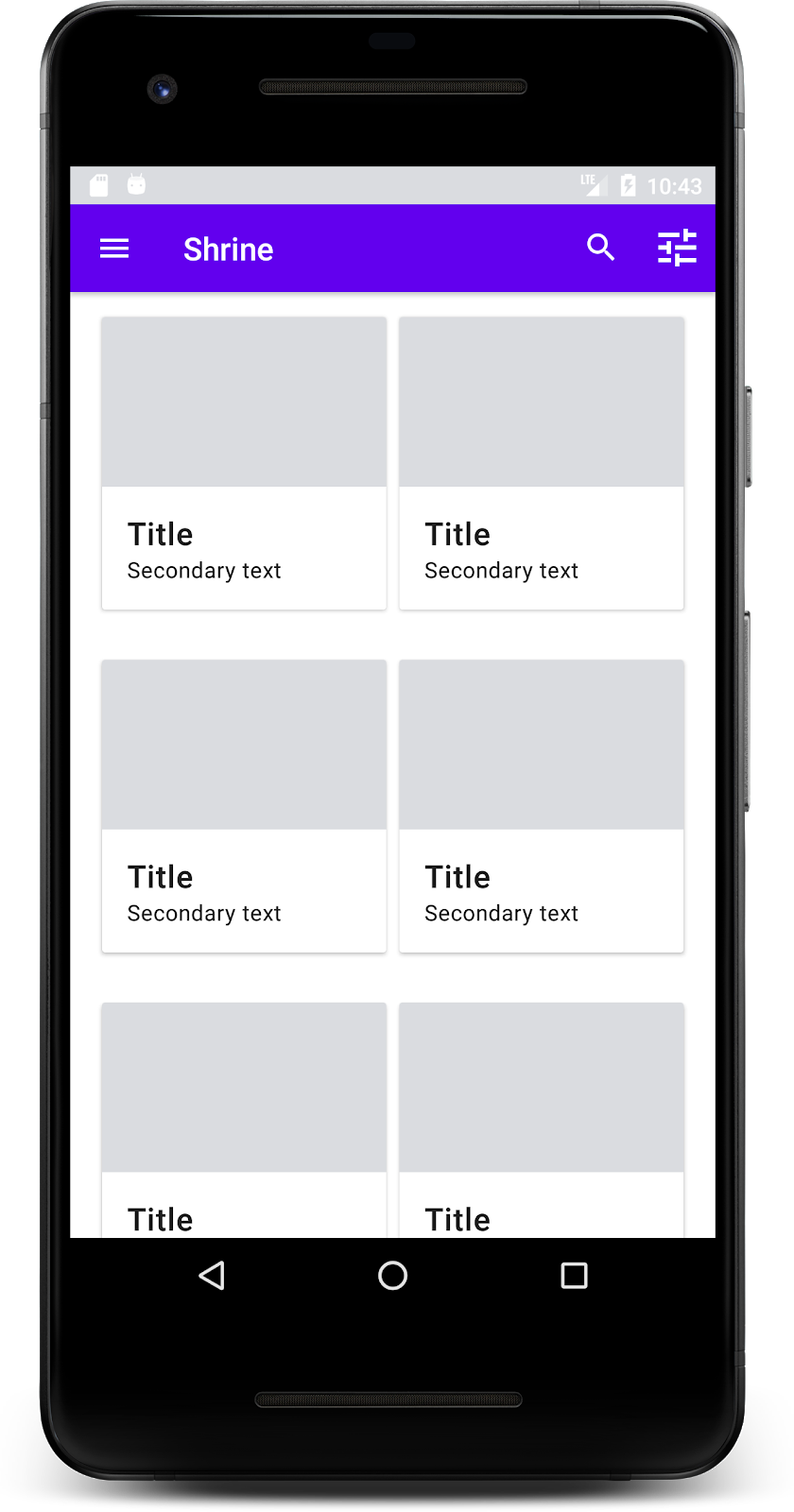
カードが追加されました。まだ何も表示されていないので、商品データを追加しましょう。
画像とテキストを追加する
各カードに画像、商品名、価格を追加します。ViewHolder 抽象化は各カードのビューを保持します。ViewHolder に、次のように 3 つのビューを追加します。
ProductCardViewHolder.kt
package com.google.codelabs.mdc.kotlin.shrine

import android.view.View
import android.widget.TextView
import androidx.recyclerview.widget.RecyclerView

import com.android.volley.toolbox.NetworkImageView

class ProductCardViewHolder(itemView: View) : RecyclerView.ViewHolder(itemView) {

   var productImage: NetworkImageView = itemView.findViewById(R.id.product_image)
   var productTitle: TextView = itemView.findViewById(R.id.product_title)
   var productPrice: TextView = itemView.findViewById(R.id.product_price)
}以下に示すように、ProductCardRecyclerViewAdapter の onBindViewHolder() メソッドを更新して、各商品ビューのタイトル、価格、商品画像を設定します。
ProductCardRecyclerViewAdapter.kt
override fun onBindViewHolder(holder: ProductCardViewHolder, position: Int) {
   if (position < productList.size) {
       val product = productList[position]
       holder.productTitle.text = product.title
       holder.productPrice.text = product.price
       ImageRequester.setImageFromUrl(holder.productImage, product.url)
   }
}上記のコードは、ViewHolder を使用して、各カードの処理方法を RecyclerView のアダプタに伝えます。
ここでは、各 ViewHolder の TextView にテキストデータを設定し、ImageRequester を呼び出して URL から画像を取得します。ImageRequester は、便宜上提供しているクラスで、Volley ライブラリを使用しています(これはこの Codelab の範囲外ですが、ご自由にコードをご覧ください)。
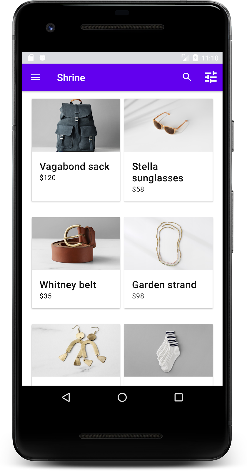
ビルドして実行します。
これで、商品がアプリに表示されるようになりました。
アプリに、ログイン画面からホーム画面に移動して商品を表示する基本的なフローができました。ほんの数行のコードで、タイトルと 3 つのボタンがあるトップ アプリバーと、アプリのコンテンツを表示するカードのグリッドを追加しました。ホーム画面は、基本的な構造と実用的なコンテンツを備えた、シンプルかつ機能的なものになりました。
次のステップ
トップ アプリバー、カード、テキスト フィールド、ボタンにより、MDC-Android ライブラリの 4 つのコア マテリアル デザイン コンポーネントを使用しました。MDC-Android カタログには、さらに多くのコンポーネントがあります。
アプリは完全に機能しますが、まだ特定のブランドやスタイルを表現していません。MDC-103: 色、形状、高度、タイプによるマテリアル デザインのテーマ設定では、これらのコンポーネントのスタイルをカスタマイズして、鮮やかでモダンなブランドを表現します。