你可以自訂投放功能 小工具 設定顏色、設定按鈕、文字和縮圖樣式 以及選擇要顯示的按鈕類型。
自訂小工具主題
Cast 架構小工具支援 Apple UIAppearance 通訊協定, UIKit 變更應用程式中小工具的外觀,例如位置或 按鈕邊框。請使用這項通訊協定來設定 Cast 架構小工具的樣式 符合現有的應用程式樣式
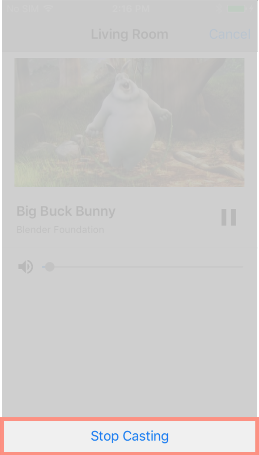
投放按鈕範例
GCKUICastButton.appearance().tintColor = UIColor.gray
[GCKUICastButton appearance].tintColor = [UIColor grayColor];
直接自訂小工具
直接使用小工具的父類別屬性自訂小工具。例如:
常見的做法是
GCKUICastButton敬上
透過
tintColor:。
資源。
投放按鈕範例
castButton.tintColor = UIColor.gray
castButton.tintColor = [UIColor grayColor];
選擇控制器按鈕
展開的控制器類別
(GCKUIExpandedMediaControlsViewController)。
以及迷你控制器類別
(GCKUIMiniMediaControlsViewController)
包含按鈕列,用戶端可以設定要呈現哪些按鈕
。這兩個類別均符合以下條件:
GCKUIMediaButtonBarProtocol。
迷你控制器列有 3 個可設定的按鈕版位:
SLOT  SLOT  SLOT
  1     2     3
展開的控制器列有一個固定的播放/暫停按鈕 長條中間加上 4 個可設定的版位:
SLOT  SLOT  PLAY/PAUSE  SLOT  SLOT
  1     2     BUTTON      3     4
應用程式可以透過以下項目,取得展開控制器的參照:
-[defaultExpandedMediaControlsViewController] 項資源
GCKCastContext
建立迷你控制器
-[createMiniMediaControlsViewController]。
每個版位可包含架構按鈕、自訂按鈕 或空白架構控制按鈕清單的定義如下:
| 按鈕類型 | 說明 |
|---|---|
GCKUIMediaButtonTypeNone |
不要在這個版位放置按鈕 |
GCKUIMediaButtonTypeCustom |
自訂按鈕 |
GCKUIMediaButtonTypePlayPauseToggle |
切換播放與暫停 |
GCKUIMediaButtonTypeSkipPrevious |
跳到佇列中的上一個項目 |
GCKUIMediaButtonTypeSkipNext |
跳到佇列中的下一個項目 |
GCKUIMediaButtonTypeRewind30Seconds |
倒轉 30 秒 |
GCKUIMediaButtonTypeForward30Seconds |
快轉 30 秒 |
GCKUIMediaButtonTypeMuteToggle |
將遠端網路接收器設為靜音及取消靜音 |
GCKUIMediaButtonTypeClosedCaptions |
開啟對話方塊,讓您選取文字和音軌 |
各按鈕功能的詳細說明:
GCKUIMediaButtonBarProtocol.h敬上
請使用
GCKUIMediaButtonBarProtocol:
如要在列中新增架構按鈕,只需呼叫
-[setButtonType:atIndex:]。如要在列中加入自訂按鈕,應用程式必須呼叫
buttonType的-[setButtonType:atIndex:]已設為GCKUIMediaButtonTypeCustom,然後呼叫-[setCustomButton:atIndex:]傳遞相同索引的UIButton。
將自訂樣式套用至 iOS 應用程式
Cast iOS SDK 可讓您設定字型、顏色和圖片的樣式 iOS 傳送端中預設小工具的 UI 元素,賦予 檢視畫面的外觀與風格是否與應用程式其餘部分相符
下一節將說明如何將自訂樣式套用至 或一組小工具。
將樣式套用至小工具的 UI 元素
本程序使用範例,將 將迷你控制器設為紅色
查看檢視畫面與樣式表格 即可找出所需小工具或小工具群組的檢視畫面名稱 調整樣式群組名稱會標示 ▼。
範例:
miniController小工具檢視畫面找出要變更的屬性名稱 所列相應樣式類別中的屬性清單 資料表。
範例:
bodyTextColor是GCKUIStyleAttributesMiniController類別編寫程式碼。
範例:
// Get the shared instance of GCKUIStyle
let castStyle = GCKUIStyle.sharedInstance()
// Set the property of the desired cast widget.
castStyle.castViews.mediaControl.miniController.bodyTextColor = UIColor.red
// Refresh all currently visible views with the assigned styles.
castStyle.apply()
// Get the shared instance of GCKUIStyle.
GCKUIStyle *castStyle = [GCKUIStyle sharedInstance];
// Set the property of the desired cast widget.
castStyle.castViews.mediaControl.miniController.bodyTextColor = [UIColor redColor];
// Refresh all currently visible views with the assigned styles.
[castStyle applyStyle];
使用這個模式將任何樣式套用至任何小工具的任何 UI 元素。
檢視畫面與樣式表格
此表格顯示七個小工具檢視畫面和三個群組 (以 ▼ 標示) 所有可套用樣式的位置
| 檢視表名稱 | 類型 | 樣式類別 |
|---|---|---|
▼ castViews |
群組 | GCKUIStyleAttributesCastViews |
▼ deviceControl |
群組 | GCKUIStyleAttributesDeviceControl |
deviceChooser |
小工具 | GCKUIStyleAttributesDeviceChooser |
noDevicesAvailableController |
小工具 | GCKUIStyleAttributesNoDevicesAvailableController |
▼ connectionController |
群組 | GCKUIStyleAttributesConnectionController |
navigation |
小工具 | GCKUIStyleAttributesConnectionNavigation |
toolbar |
小工具 | GCKUIStyleAttributesConnectionToolbar |
▼ mediaControl |
群組 | GCKUIStyleAttributesMediaControl |
miniController |
小工具 | GCKUIStyleAttributesMiniController |
expandedController |
小工具 | GCKUIStyleAttributesExpandedController |
trackSelector |
小工具 | GCKUIStyleAttributesTrackSelector |
instructions |
小工具 | GCKUIStyleAttributesInstructions |
樣式階層
GCKUIStyle
單例模式是所有樣式設定的 API 進入點。其中包含以下屬性:
castViews 是樣式階層的根
如下圖所示;這張圖顯示了
資料檢視和群組 (如上一個表格所示)。
你可以將樣式套用至單一小工具或一組小工具。 樣式階層有三個小工具群組:castViews、deviceControl、 以及 mediaControl 和 mediaControl每個群組的矩形都包含小工具。 將樣式套用至群組後,該樣式就會套用至該群組中的所有小工具。
舉例來說,castViews 群組可讓您將樣式套用至所有小工具,並
deviceControl 群組可讓您將樣式套用到該裝置的三部裝置
控制小工具instructions 小工具不屬於任何群組。
| castViews | ||||||||||
| deviceControl | mediaControl | |||||||||
操作說明 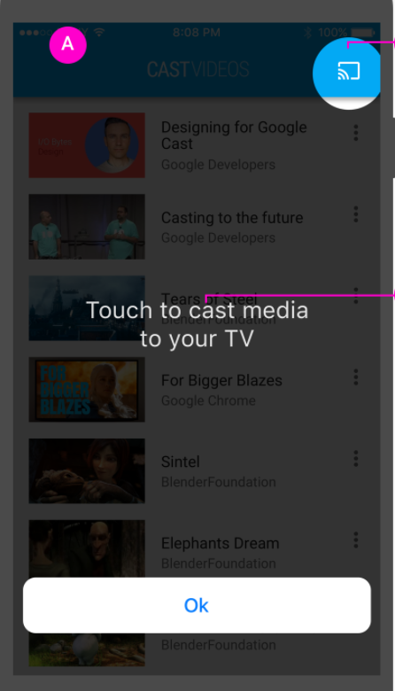 |
裝置 選擇工具  |
no DevicesAvailable 畫面 
|
連線 控制器  |
迷你 控制器 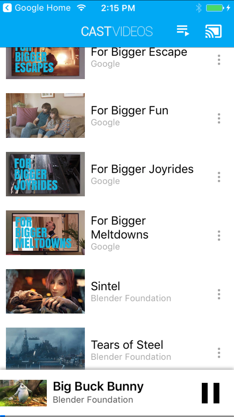 |
已展開 控制器  |
軌道 選取器 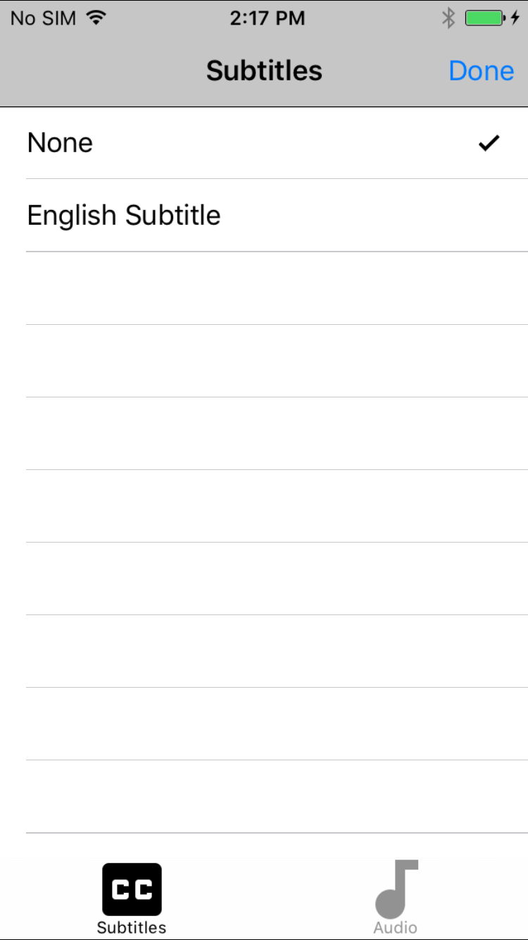 |
||||
導覽 / 工具列 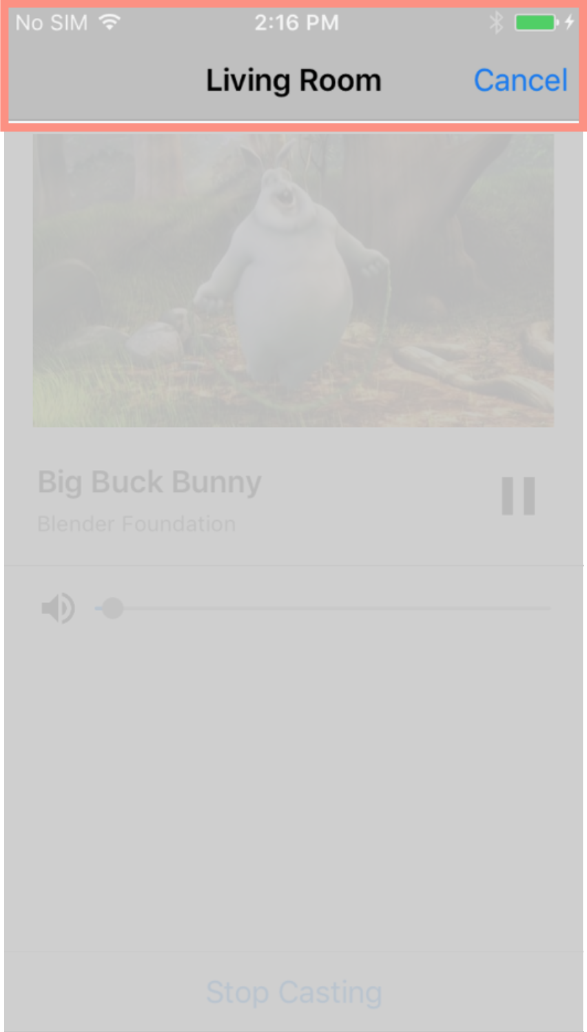
 |
||||||||||
附註:如這張圖中顯示的小工具名稱,應顯示在兩行中
寫成一個字,一行文字,不得使用空格。例如:
device Chooser 應寫入 deviceChooser。將遊標懸停在圖片上即可放大
具體做法是指示 Kubernetes 建立並維護
一或多個代表這些 Pod 的物件