Page Summary
-
Data visualization tools like Data Studio help effectively communicate data insights from Ads Data Hub.
-
Ads Data Hub integrates with Data Studio, allowing direct viewing of query results in Data Studio.
-
The tutorial guides users on running templated queries in Ads Data Hub and visualizing results in Data Studio.
-
Before starting, users need access to an Ads Data Hub account with query running permissions.
-
A specific example of creating a column chart with a calculated field in Data Studio is provided.
Data visualization tools can help you make sense of the data that you get out of Ads Data Hub. Additionally, reports containing graphs and other such visual representations often communicate trends and insights about your data more effectively than numbers can alone.
Data Studio is a free tool for creating charts and interactive data visualizations. Ads Data Hub integrates natively with Data Studio, making it easy to view your results in Data Studio. After running a query in Ads Data Hub, you can open the results directly into Data Studio.
Objectives
This tutorial will teach you how to:
- Run a templated query in Ads Data Hub.
- Open your query results in Data Studio.
- Create a report using Data Studio.
Before you begin
In order to successfully accomplish all the steps in this tutorial, you’ll need to have:
- Access to an Ads Data Hub account.
- Permission to run queries in that Ads Data Hub account.
Generate results to visualize
This section will guide you through running the Google Ads Demographics query. If you choose to use a different query, the steps in “Visualize results” below won’t apply.
- Navigate to the Ads Data Hub UI.
- Click + Create query.
- Under “Analysis”, click Choose template.
- Click Run next to “Demographics” in the Google Ads section.
- Under “Destination table”, enter information for the dataset that you want to write your results to.
- Under “Date range”, select the dates over which you want to query.
- Click Run.
Visualize results
- Navigate to the Jobs page.
- Click the job that you just ran.
- Open the Explore dropdown.
- Click Explore with Data Studio.
Create a column chart using a calculated field
- Optionally, click the title at the top of the page to change the name of your report.
- In the “Chart” menu, click Bar.
- The
gender_idfield should already be selected under “Dimension”, but if not, add it. - Under “Breakdown dimension", click Add dimension.
- Select
age_group_idfrom the menu.
- Select
- Under “Metric”, click Record count.
- Click Create field.
- Give the field a name, such as
aggregated_users. - In formula, enter
SUM(aggregated_users). - Click Apply.
- Give the field a name, such as
- Click Create field.
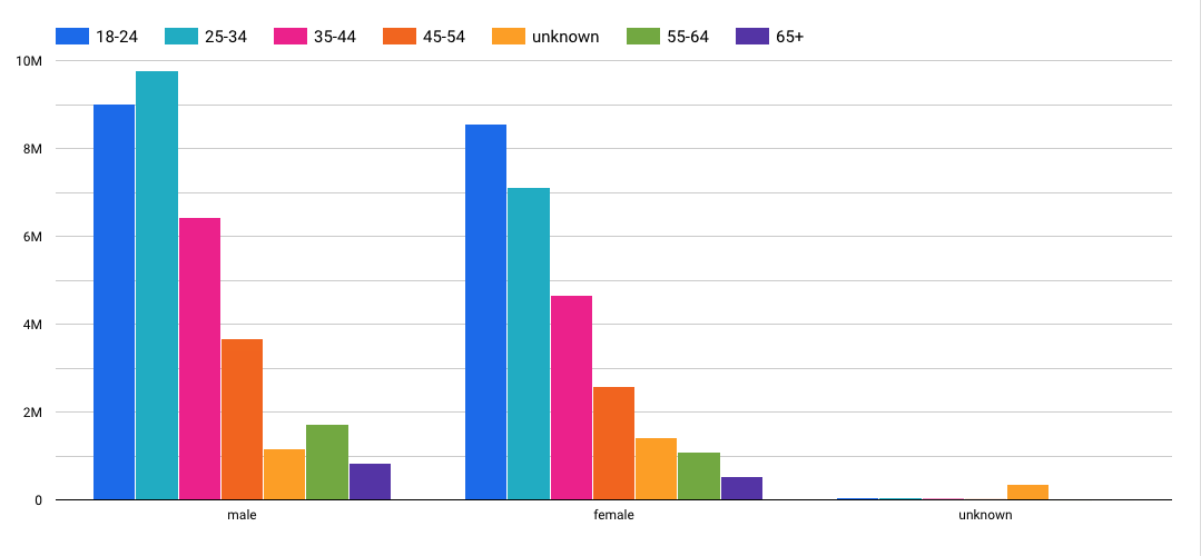
- You should now have a report that resembles the one below:

What’s next
- Learn how to share Data Studio reports.
