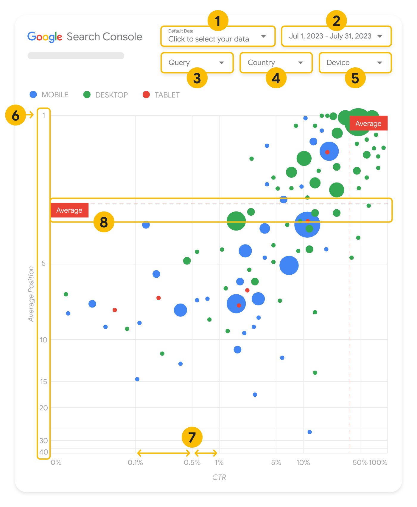
Improving SEO with a Search Console bubble chart
Analyzing Search performance data is always a challenge, but even more so when you have plenty of long-tail queries, which are harder to visualize and understand. A bubble chart can help you understand which queries are performing well for your site, and which could be improved.
If you'd like to test the techniques discussed here, you can use this template, connect to your data, and play with the chart settings.
If you haven't read connecting Search Console to Looker Studio and monitoring Search traffic with Looker Studio, consider checking them out to understand more about what you can do with Search Console in Looker Studio.
Understanding the chart
A bubble chart is a great visualization when you have multiple metrics and dimensions because it enables you to see relationships and patterns in your data more effectively. In the example shown here, you can see click-through rate (CTR), average position, and clicks for the query and device dimensions in one view.
This section goes into detail on some of the chart elements to clarify what the chart shows, and what it doesn't.
Data source
The bubble chart shown in this page uses the Site Impression table available through the Search Console data source, which includes Search performance data aggregated by site and queries.
Filters and data controls
There are five customization options in the chart to help you control your data effectively:
- Data control: Choose the Search Console property you'd like to analyze.
- Date range: Choose the date range you'd like to see in the report; by default you'll see the last 28 days.
- Query: Include or exclude queries to focus on. You can filter your data similar to how you do it in Search Console.
- Country: Include or exclude countries.
- Device: Include or exclude device categories.
Axes
The axes in the chart are average position (y-axis) and site CTR (x-axis). There are three significant transformations in the axes:
- Reverse y-axis direction: Since the y-axis shows average position, inverting it means that 1 is at the top. For most charts, the best position is in the top right corner, so it is more intuitive to invert the y-axis when using it to display average position.
- Log scale: Using a logarithmic scale for both axes enables you to have a better understanding of queries that are in the extremities of the chart (very low CTR, average position, or both).
- Reference lines: The reference line is very helpful to highlight values that are above or below a certain threshold. Looking at the average, median, or a certain percentile can call attention to deviations from the pattern.
Bubbles
Each bubble in the chart represents a single query, with the following style properties:
- Size: Using the number of clicks as the bubble size helps you see in a glance which queries are driving the bulk of the traffic—the larger the bubble the more traffic the query generates.
- Color: Using the device category as the bubble color helps you understand the differences between mobile and desktop Search performance. You can use any dimension as the color, but as the number of values increases, the harder it is to recognize patterns.
Analyzing the data
The goal of this visualization is to help surface query optimization opportunities. The chart shows query performance, where the y-axis represents average position, the x-axis represents CTR the bubble size represents total number of clicks, and the bubble color represents device category.
The red Average dashed reference lines show the average for each of the axes, which split the chart into quadrants, showing four types of query performance. Your quadrants are likely to look different than the one shared in this post; they'll depend on how your site queries are distributed.
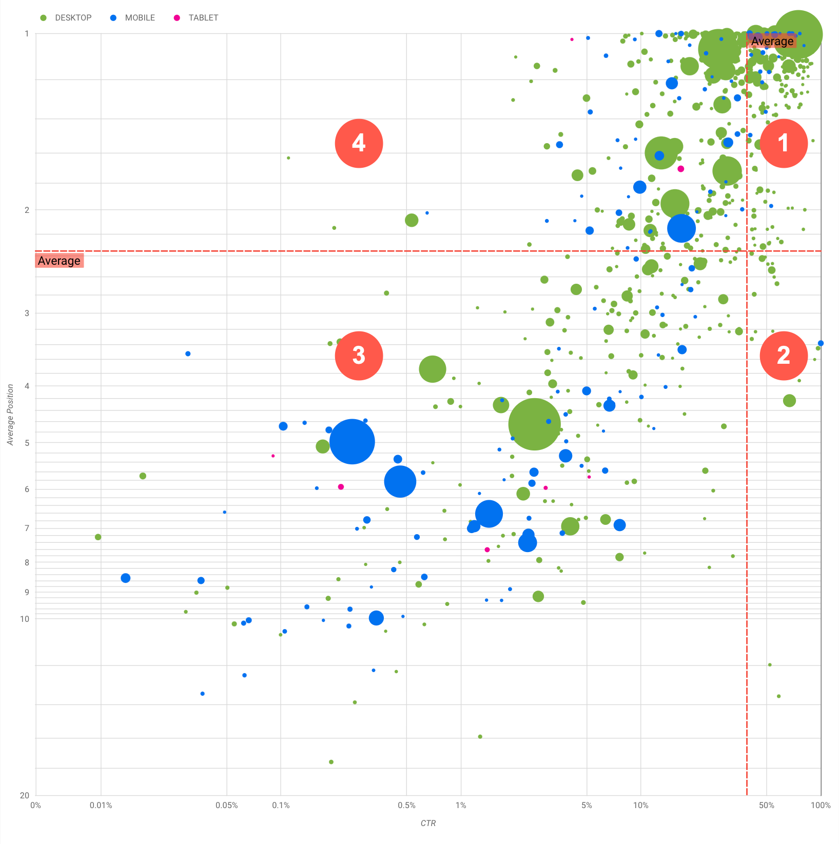
The chart shows four groups of queries, which you can analyze to help you decide where to invest your time when optimizing your Google Search performance.
- Top position, high CTR: There's not much you need to do for those; you're doing a great job already.
- Low position, high CTR: Those queries seem relevant to users; the queries get a high CTR
even when ranking lower
than the average query on your website. If the query average position moves up, it could have a
significant impact on your performance—focus on improving SEO for these queries. For example,
a top query in quadrant 2 for a gardening website could be "how to build a wooden shed."
Check if you have a page about this already, and proceed in two ways:
- If you don't have a page, consider creating one to centralize all the info you have in the website about the subject.
- If you do have a page, consider adding content to better address that user need.
- Low position, low CTR: When looking at queries with low CTR (both with low and top
position), it's especially interesting to look at the bubble sizes to understand which queries
have a low CTR but are still driving significant traffic. While the queries in this
quadrant might seem unworthy of your effort, they can be divided into two main groups:
- Related queries: If the query in question is important to you, it's a good start to have it appearing in Search already. Prioritize these queries over queries that are not appearing in Search results at all, as they'll be easier to optimize.
- Unrelated queries: If your site doesn't cover content related to this query, maybe it's a good opportunity to fine tune your content or focus on queries that will bring relevant traffic.
- Top position, low CTR: Those queries might have a low CTR for various reasons. Check the
largest bubbles to find signs of the following:
- Your competitors may have structured data markup and are showing up with rich results, which might attract users to click their results instead of yours. Consider optimizing for the most common visual elements in Google Search.
- You may have optimized, or be "accidentally" ranking, for a query that users are not interested in relation to your site. This might not be an issue for you, in which case you can ignore those queries. If you prefer people not to find you through those queries (for example, they contain offensive words), try to fine-tune your content to remove mentions that could be seen as synonyms or related queries to the one bringing traffic.
- People may have already found the information they needed, for example your company's opening hours, address, or phone number. Check the queries that were used and the URLs that contained the information. If one of your website goals is to drive people to your stores, this is working as intended; if you believe that people should visit your website for extra information, you could try to optimize your titles and description to make that clear. See next section for more details.
We haven't mentioned the device categories because they can be used as additional signs of query performance. For example, suppose some queries are more relevant when people are navigating in the street, trying to find a location; in that case, the query might have a high performance on mobile devices, but a low performance on desktop.
Improving SEO for specific queries
Once you find queries that are worth the time and effort, make sure to optimize or create pages related to those queries.
After you find the queries using the visualization shown in this page, you can create a query filter for specific queries using the Search Console user interface, or create a pivot table using Looker Studio; in both ways, you can check all the pages that are receiving traffic for a specific query. After you know the queries you want to optimize and their related URLs, use the SEO starter guide to optimize your content. Here are some tips:
- Ensure that your title elements, description meta tags, and alt attributes are descriptive, specific, and accurate.
- Use heading elements to emphasize important text and help create a hierarchical structure for your content, making it easier for users and search engines to navigate through your document.
- Think about other words that a user might search for to find a piece of your content, for example, synonyms and related queries. You can use the Keyword Planner provided by Google Ads to help you discover new keyword variations and see the approximate search volume for each keyword. You can also use Google Trends to find ideas from rising topics and queries related to your website.