Page Summary
-
Payment vendors must submit six logo variations in PNG and SVG formats for use across Google Pay and Google Play.
-
Logos must adhere to specific size, color, and padding requirements, including variations for dark themes and single-color usage.
-
Google may resize and tint logos for optimal display, so ensure clarity and contrast across variations.
-
File names must follow a specific convention using brand name, dimensions, color, and padding details.
-
Logos should have transparent backgrounds, maximize space within dimensions, and be tested for visibility on light and dark themes.
Overview
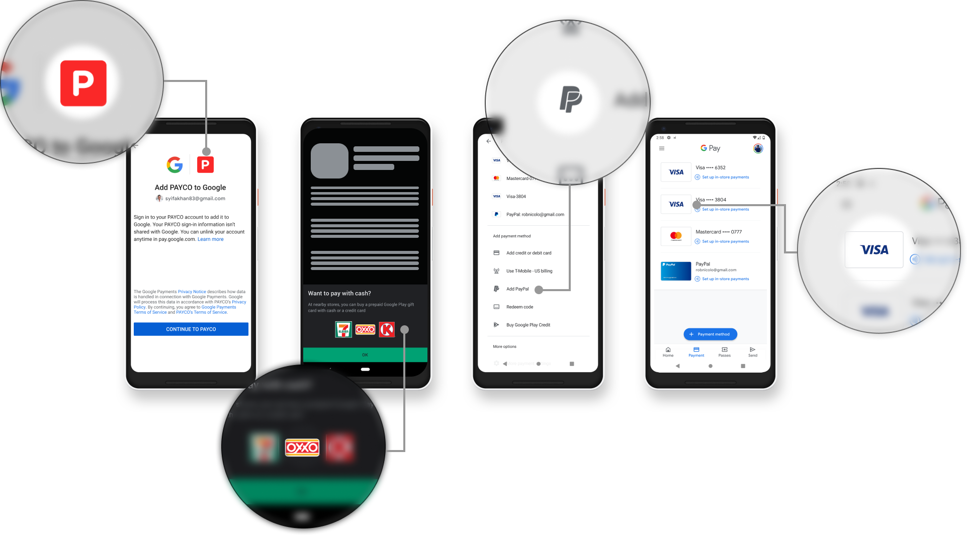
Your logo is your identity and your most interminable and adaptable asset. All payment vendors are required to provide Google with a set of logos to be used in various areas throughout the Google ecosystem. For example, these logos are displayed in various user payment journeys in Google Pay and Google Play where the user needs to choose a Form of Payment (FOP). The illustration below shows such examples:
List of specifications
As a payment vendor, you will provide Google with assets that meet each of the six specifications defined below. Each specification controls the size, color palette, border padding, and other attributes that help provide a versatile, engaging, and human-centric experience in Google's payment flows. Each specification requires two file formats for a total of twelve required image assets.
A list of the six specifications is shown below:
Recommendations and requirements
Recommendations
The following recommendations ensure your logo is clear, sharp, and adaptable to different set of screen sizes and OS themes (e.g. light and dark mode).
- For sharpness and detail, utilize the full asset space so your logo fits to the maximum allowed dimensions.
- When designing your logo, consider how it will look in front of darker backgrounds in Android and iOS's light and dark themes. See Dark theme considerations for further details.
Requirements
Regardless of logo specification, the below requirements are a general set of guidelines that all the logos should adhere to:
- Include a transparent bounding box (a shape that with the same dimensions as the specification's dimensions) with no "stroke" or outline.
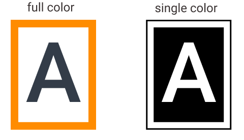
- Ensure your single color logo uses only one color. See Single color logo considerations for more information.
- Export your files with filenames that adhere to the convention in each logo specification.
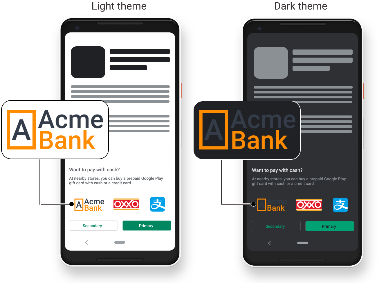
Dark theme considerations
Both the latest versions of Android and iOS support a dark theme that uses a darker color palette for all screens, views, and menus. Native Google Play and Google Pay Android apps also support this theme and correspondingly darken their interfaces when the theme is enabled. Darker screen colors have implications regarding how you choose your logo's colors and overall design. Multicolored logos may be partially or completely unreadable when the background darkens in a dark theme. See the illustration below for an example:
In the illustration above note how the dark gray "Acme" text in the Acme Bank logo almost disppears when the background darkens in dark theme. Such dark colors in your multicolored logos should be avoided when they are presented in stand-alone text. For a list of best practices regarding your logo design in dark theme, see Designing your multicolored logo for dark theme.
For more information on dark theme, go here.
Designing your multicolored logo for dark theme
Although programmatic adjustments and tweaks from Google's UX team will assist in making your logos work best in dark theme, following the below best practices will help minimize the number of changes needed, better preserve your logo's original look, and help it blend smoothly with other areas of the screen.
- Use desaturated colors like pastels and shades that incorporate gray and white. Avoid the use of fully saturated colors.
- Use "on" colors such as white and different shades of white.
- Adhere to acceptable constrast ratios between your logo and surrounding areas. For more information about contrast ratios visit w3.org.
- Avoid shadows as they are difficult to see in dark backgrounds.
- Test and experiment your logo design with dark backgrounds.
Single color logo considerations
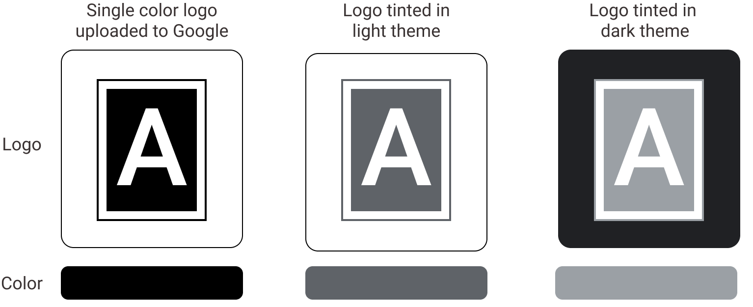
Tinting in light and dark themes
Single color logos are tinted to maintain ideal color contrast ratios with surrounding backgrounds. For example, note how the logo below changes color depending on whether the OS is using light or dark theme:
For more information on acceptable contrast ratios and a11y visit w3.org.
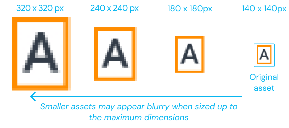
Asset resizing implications
Sizing up
Since your logos need to be adapted to a assortment of screen sizes and
display densities, Google needs to obtain the largest asset size that's utilized
within its apps and websites. For example, the 320 x 320px requirement is
needed because it's Google Play's largest logo display size. Any smaller image
would need to be sized up to fit those dimensions and potentially blur and
distort the image. This blurring occurs mainly in non vector image formats such
as png. Consider the example below where a smaller image is sized up
to 320 x 320px. Note its pixelation and blurriness in the
larger size:
Sizing down
In addition, Google may downsize your logo. For example, a 320 x 320px asset may be resized down to 32 x 32px. This downsize may have implications to finer details in your logo design and should be tested before submitting your asset to Google. Note how the logo shown below retains its overall look when its downsized to a smaller size:
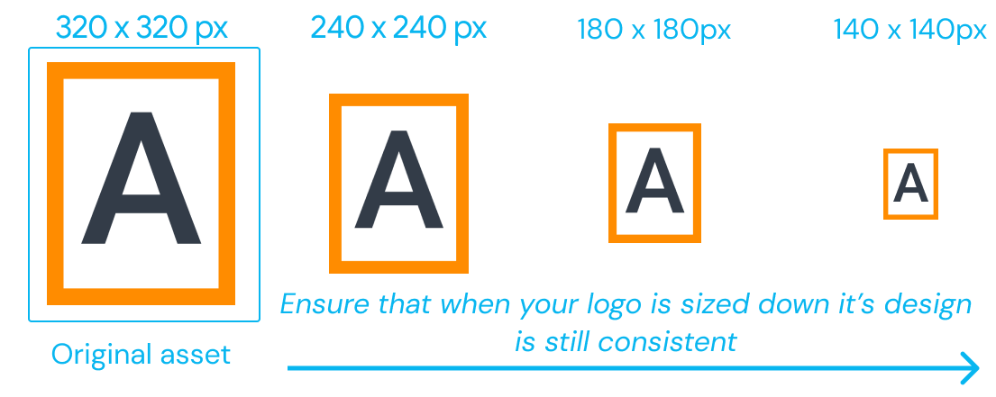
Specification list
The below list details each of the six specifications for your logos. Each
specification is required to be in two file formats: SVG and PNG.
320 x 320px color square
Required attributes
| Total dimensions | 320 x 320px |
| Logo dimensions | 320 x 320px |
| Aspect ratio | 1:1 |
| Padding | none |
| Border | none |
| Color palette | full RGB color |
| Background color | transparent |
Required files
| Format | File name convention | Example |
|---|---|---|
| PNG | [brand]_320x320_color_no_padding.png | acmebank_320x320_color_no_padding.png |
| SVG | [brand]_320x320_color_no_padding.svg | acmebank_320x320_color_no_padding.svg |
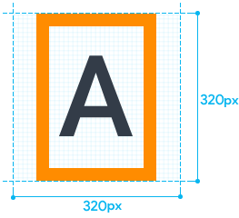
320 x 320px color square with padding


Required attributes
| Total dimensions | 320 x 320px |
| Logo dimensions | 200 x 200px |
| Aspect ratio | 1:1 |
| Padding | 60px |
| Border | none |
| Color palette | full RGB color |
| Background color | transparent |
Required files
| Format | File name convention | Example |
|---|---|---|
| PNG | [brand]_320x320_color_padding.png | acmebank_320x320_color_padding.png |
| SVG | [brand]_320x320_color_padding.svg | acmebank_320x320_color_padding.svg |
1170 x 730px color oblong rectangle

Required attributes
| Total dimensions | 1170 x 730px |
| Logo dimensions | 1170 x 730px |
| Aspect ratio | 8:5 |
| Padding | none |
| Border | none |
| Color palette | full RGB color |
| Background color | transparent |
Required files
| Format | File name convention | Example |
|---|---|---|
| PNG | [brand]_1170x730_color_no_padding.png | acmebank_1170x730_color_no_padding.png |
| SVG | [brand]_1170x730_color_no_padding.svg | acmebank_1170x730_color_no_padding.svg |
1170 x 730px color oblong rectangle with padding

Required attributes
| Total dimensions | 1170 x 730px |
| Logo dimensions | 970 x 530px |
| Aspect ratio | 8:5 |
| Padding | 100px |
| Border | none |
| Color palette | full RGB color |
| Background color | transparent |
Required files
| Format | File name convention | Example |
|---|---|---|
| PNG | [brand]_1170x730_color_padding.png | acmebank_1170x730_color_padding.png |
| SVG | [brand]_1170x730_color_padding.svg | acmebank_1170x730_color_padding.svg |
320 x 320px single color square


Required attributes
| Total dimensions | 320 x 320px |
| Logo dimensions | 320 x 320px |
| Aspect ratio | 1:1 |
| Padding | none |
| Border | none |
| Color palette | black (HEX #000000) |
| Background color | transparent |
Required files
| Format | File name convention | Example |
|---|---|---|
| PNG | [brand]_320x320_single_color_no_padding.png | acmebank_320x320_single_color_no_padding.png |
| SVG | [brand]_320x320_single_color_no_padding.svg | acmebank_320x320_single_color_no_padding.svg |
320 x 320px single color square with padding


Required attributes
| Total dimensions | 320 x 320px |
| Logo dimensions | 200 x 200px |
| Aspect ratio | 1:1 |
| Padding | 60px |
| Border | none |
| Color palette | black (HEX #000000) |
| Background color | transparent |
Required files
| Format | File name convention | Example |
|---|---|---|
| PNG | [brand]_320x320_single_color_padding.png | acmebank_320x320_single_color_padding.png |
| SVG | [brand]_320x320_single_color_padding.svg | acmebank_320x320_single_color_padding.svg |
Uploading your logos
Upload your logo assets using the GSP - LOGOs upload. If your having difficulty accessing or using the form, contact your Technical Engagement Contact or Technical point of contact assigned to your account.