เอกสารนี้จะอธิบายวิธีปฏิบัติตามสไตล์ของ Glass และใช้แนวทางปฏิบัติแนะนำทั่วไปเกี่ยวกับ UI ที่ช่วย เพิ่มประสิทธิภาพประสบการณ์ของผู้ใช้ โดยจะครอบคลุมองค์ประกอบ UI ต่อไปนี้
ธีม
ธีม Glass ที่เราแนะนำให้ใช้มีลักษณะดังนี้
- แสดงกิจกรรมแบบเต็มหน้าจอโดยไม่มีแถบการทำงาน
- ใช้พื้นหลังสีดำทึบ
- ตั้งค่าสีให้สว่างขึ้นสำหรับเอฟเฟกต์ขอบสี
- ใช้สีข้อความสีขาว
การตั้งค่าธีมที่แนะนำสำหรับ Glass มีดังนี้
 <style name="AppTheme" parent="Theme.AppCompat.NoActionBar">
   <item name="android:windowBackground">@android:color/black</item>
   <item name="android:colorEdgeEffect">@android:color/white</item>
   <item name="android:textColor">@android:color/white</item>
 </style>
เลย์เอาต์ XML
เลย์เอาต์การ์ดพื้นฐาน 2 แบบที่ Fragment สามารถขยายได้มีดังนี้
เลย์เอาต์หลัก
เลย์เอาต์นี้กำหนดระยะเว้นขอบมาตรฐานและส่วนท้ายที่แนะนำสำหรับการ์ด ใส่ความคิดเห็นของคุณเองใน
FrameLayout ที่ว่าง
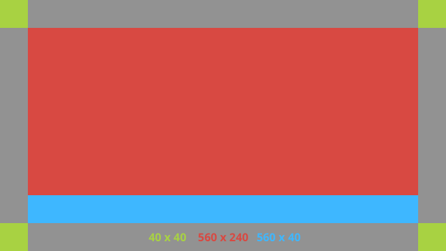
ตัวอย่างเลย์เอาต์ XML มีดังนี้
<?xml version="1.0" encoding="utf-8"?>
<androidx.constraintlayout.widget.ConstraintLayout
    xmlns:android="http://schemas.android.com/apk/res/android"
    xmlns:app="http://schemas.android.com/apk/res-auto"
    android:id="@+id/layout"
    android:layout_width="match_parent"
    android:layout_height="match_parent">

  <FrameLayout
      android:id="@+id/body_layout"
      android:layout_width="0dp"
      android:layout_height="0dp"
      android:layout_margin="@dimen/glass_card_margin"
      app:layout_constraintBottom_toTopOf="@id/footer"
      app:layout_constraintEnd_toEndOf="parent"
      app:layout_constraintStart_toStartOf="parent"
      app:layout_constraintTop_toTopOf="parent">

    <!-- Put your widgets inside this FrameLayout. -->

  </FrameLayout>

  <!-- The footer view will grow to fit as much content as possible while the
         timestamp view keeps its width. If the footer text is too long, it
         will be ellipsized with a 40dp margin between it and the timestamp. -->

  <TextView
      android:id="@+id/footer"
      android:layout_width="0dp"
      android:layout_height="wrap_content"
      android:layout_marginStart="@dimen/glass_card_margin"
      android:layout_marginEnd="@dimen/glass_card_margin"
      android:layout_marginBottom="@dimen/glass_card_margin"
      android:ellipsize="end"
      android:singleLine="true"
      android:textAppearance="?android:attr/textAppearanceSmall"
      app:layout_constraintBottom_toBottomOf="parent"
      app:layout_constraintEnd_toStartOf="@id/timestamp"
      app:layout_constraintStart_toStartOf="parent" />

  <TextView
      android:id="@+id/timestamp"
      android:layout_width="0dp"
      android:layout_height="wrap_content"
      android:layout_marginEnd="@dimen/glass_card_margin"
      android:layout_marginBottom="@dimen/glass_card_margin"
      android:ellipsize="end"
      android:singleLine="true"
      android:textAlignment="viewEnd"
      android:textAppearance="?android:attr/textAppearanceSmall"
      app:layout_constraintBottom_toBottomOf="parent"
      app:layout_constraintEnd_toEndOf="parent" />

</androidx.constraintlayout.widget.ConstraintLayout>
เลย์เอาต์คอลัมน์ซ้าย
เลย์เอาต์นี้กำหนดคอลัมน์ด้านซ้ายที่มีความกว้าง 1 ใน 3 และคอลัมน์ด้านขวาที่มีความกว้าง 2 ใน 3 ในรูปแบบของคลาส 2 คลาส
FrameLayout ที่คุณสามารถใส่มุมมองได้ โปรดดูตัวอย่างในรูปภาพต่อไปนี้
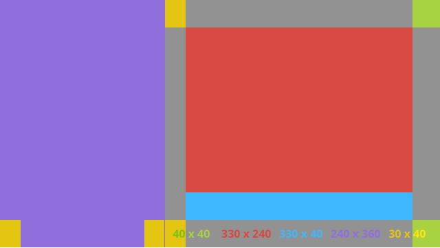
ตัวอย่างเลย์เอาต์ XML มีดังนี้
<?xml version="1.0" encoding="utf-8"?>
<androidx.constraintlayout.widget.ConstraintLayout
    xmlns:android="http://schemas.android.com/apk/res/android"
    xmlns:app="http://schemas.android.com/apk/res-auto"
    android:layout_width="match_parent"
    android:layout_height="match_parent">

  <FrameLayout
      android:id="@+id/left_column"
      android:layout_width="0dp"
      android:layout_height="match_parent"
      android:background="#303030"
      app:layout_constraintBottom_toBottomOf="parent"
      app:layout_constraintStart_toStartOf="parent"
      app:layout_constraintTop_toTopOf="parent"
      app:layout_constraintWidth_percent=".333">

    <!-- Put widgets for the left column inside this FrameLayout. -->

  </FrameLayout>

  <FrameLayout
      android:id="@+id/right_column"
      android:layout_width="0dp"
      android:layout_height="0dp"
      android:layout_marginTop="@dimen/glass_card_two_column_margin"
      android:layout_marginStart="@dimen/glass_card_two_column_margin"
      android:layout_marginBottom="@dimen/glass_card_two_column_margin"
      android:layout_marginEnd="@dimen/glass_card_margin"
      app:layout_constraintBottom_toTopOf="@id/footer"
      app:layout_constraintEnd_toEndOf="parent"
      app:layout_constraintStart_toEndOf="@id/left_column"
      app:layout_constraintTop_toTopOf="parent">

    <!-- Put widgets for the right column inside this FrameLayout. -->

  </FrameLayout>

  <!-- The footer view will grow to fit as much content as possible while the
         timestamp view keeps its width. If the footer text is too long, it
         will be ellipsized with a 40dp margin between it and the timestamp. -->

  <TextView
      android:id="@+id/footer"
      android:layout_width="0dp"
      android:layout_height="wrap_content"
      android:layout_marginStart="@dimen/glass_card_margin"
      android:layout_marginEnd="@dimen/glass_card_margin"
      android:layout_marginBottom="@dimen/glass_card_margin"
      android:ellipsize="end"
      android:singleLine="true"
      android:textAppearance="?android:attr/textAppearanceSmall"
      app:layout_constraintBottom_toBottomOf="parent"
      app:layout_constraintEnd_toStartOf="@id/timestamp"
      app:layout_constraintStart_toEndOf="@id/left_column" />

  <TextView
      android:id="@+id/timestamp"
      android:layout_width="0dp"
      android:layout_height="wrap_content"
      android:layout_marginEnd="@dimen/glass_card_margin"
      android:layout_marginBottom="@dimen/glass_card_margin"
      android:ellipsize="end"
      android:singleLine="true"
      android:textAlignment="viewEnd"
      android:textAppearance="?android:attr/textAppearanceSmall"
      app:layout_constraintBottom_toBottomOf="parent"
      app:layout_constraintEnd_toEndOf="parent" />

</androidx.constraintlayout.widget.ConstraintLayout>
ขนาดมาตรฐาน
ใช้รายการต่อไปนี้ร่วมกับเลย์เอาต์ก่อนหน้าหรือเลย์เอาต์ของคุณเองเพื่อสร้างไฟล์
ที่เป็นไปตามสไตล์มาตรฐานของ Glass สร้างไฟล์นี้เป็น res/values/dimens.xml
ในโปรเจ็กต์ Android
<?xml version="1.0" encoding="utf-8"?>
<resources>

  <!-- The recommended margin for the top, left, and right edges of a card. -->
  <dimen name="glass_card_margin">40dp</dimen>

  <!-- The recommended margin between the bottom of the card and the footer. -->
  <dimen name="glass_card_footer_margin">50dp</dimen>

  <!-- The recommended margin for the left column of the two-column card. -->
  <dimen name="glass_card_two_column_margin">30dp</dimen>

</resources>
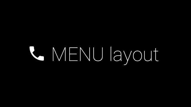
เมนู
เราขอแนะนำให้คุณใช้
RecyclerView เพื่อสร้างเมนู โดยควรใช้ไฟล์เมนู Android มาตรฐาน
จากทรัพยากรโปรเจ็กต์ Android Studio Android ช่วยให้คุณลบล้างการสร้างเมนูมาตรฐาน
และแทนที่ด้วยการติดตั้งใช้งานของคุณได้ โดยทำตามขั้นตอนต่อไปนี้
- สร้างเลย์เอาต์ด้วย
RecyclerViewและตั้งค่าให้เป็นมุมมองสำหรับActivity - ตั้งค่า
RecyclerViewและอแดปเตอร์ให้ใช้คอลเล็กชันรายการเมนูที่สร้างขึ้นใหม่ - ลบล้างเมธอด
onCreateOptionsMenu- ขยายเมนูและเพิ่มองค์ประกอบใหม่ลงในคอลเล็กชันสำหรับแต่ละรายการในเมนู
- เรียกใช้เมธอด
notifyDataSetChangedในอะแดปเตอร์
Kotlin
    override fun onCreateOptionsMenu(menu: Menu): Boolean {
        val menuResource = intent
            .getIntExtra(EXTRA_MENU_KEY, EXTRA_MENU_ITEM_DEFAULT_VALUE)
        if (menuResource != EXTRA_MENU_ITEM_DEFAULT_VALUE) {
            menuInflater.inflate(menuResource, menu)
            for (i in 0 until menu.size()) {
                val menuItem = menu.getItem(i)
                menuItems.add(
                    GlassMenuItem(
                        menuItem.itemId, menuItem.icon,
                        menuItem.title.toString()
                    )
                )
                adapter.notifyDataSetChanged()
            }
        }
        return super.onCreateOptionsMenu(menu)
    }
Java
    @Override
    public boolean onCreateOptionsMenu(Menu menu) {
      final int menuResource = getIntent()
          .getIntExtra(EXTRA_MENU_KEY, EXTRA_MENU_ITEM_DEFAULT_VALUE);
      if (menuResource != EXTRA_MENU_ITEM_DEFAULT_VALUE) {
        final MenuInflater inflater = getMenuInflater();
        inflater.inflate(menuResource, menu);

        for (int i = 0; i < menu.size(); i++) {
          final MenuItem menuItem = menu.getItem(i);
          menuItems.add(
              new GlassMenuItem(menuItem.getItemId(), menuItem.getIcon(),
                  menuItem.getTitle().toString()));
          adapter.notifyDataSetChanged();
        }
      }
      return super.onCreateOptionsMenu(menu);
    }
- ใช้
OnScrollListenerร่วมกับLayoutManagerและSnapHelperเพื่อดูว่ามีการเลือกตัวเลือกใด - ฟังท่าทาง
TAPเพื่อจัดการเหตุการณ์การเลือกรายการในเมนู - สร้าง
Intentพร้อมข้อมูลเกี่ยวกับรายการในเมนูที่เลือก - ตั้งค่าผลลัพธ์สำหรับกิจกรรมนี้และทำให้เสร็จสมบูรณ์
- เรียกใช้
startActivityForResultจาก Fragment หรือกิจกรรมที่คุณต้องการให้มีเมนู ใช้TAPเพื่อวัตถุประสงค์นี้ - ลบล้าง
onActivityResultใน Fragment หรือกิจกรรมที่เรียกใช้เพื่อจัดการรายการเมนูที่เลือก
หลักเกณฑ์
ต่อไปนี้คือรายการคำแนะนำเกี่ยวกับวิธีตั้งค่าเลย์เอาต์เมนู
- ขนาดข้อความ:
64sp - สีพื้นหลัง:
#96000000 - ใช้ไอคอน Material
ที่มีขนาด
64dpx64dp - ตั้งค่าสถานะธีม
windowIsTranslucentเป็นtrue
รูปภาพต่อไปนี้เป็นตัวอย่างเลย์เอาต์เมนูที่ปรับแต่งแล้ว
ดูรายละเอียดการติดตั้งใช้งานได้ที่แอปตัวอย่างการ์ด
หน้าเว็บที่ปัดได้
จอแสดงผลและทัชแพดของ Glass ทำงานร่วมกันเพื่อแสดงการ์ดที่ปัดได้ในรูปแบบที่สะดวก คุณ
สร้างหน้าเว็บที่ปัดได้ในกิจกรรมด้วย Android มาตรฐาน
ViewPager API ได้
ดูข้อมูลเพิ่มเติมเกี่ยวกับวิธีใช้ Android
ViewPager เพื่อเลื่อนดูการ์ดหรือหน้าจอได้ที่เอกสารประกอบการฝึกอบรมการปัดหน้าจอ