이 문서에서는 Glass 스타일을 따르고 사용자의 환경을 최적화할 수 있는 일반적인 UI 권장사항을 구현하는 방법을 설명합니다. 다음 UI 요소를 다룹니다.
테마
사용하는 것이 좋은 Glass 테마에는 다음과 같은 특징이 있습니다.
- 작업 표시줄 없이 활동을 전체 화면으로 표시합니다.
- 단색 검은색 배경을 적용합니다.
- 색상 가장자리 효과의 색상을 더 밝게 설정합니다.
- 흰색 텍스트 색상을 적용합니다.
Glass에 권장되는 테마 설정은 다음과 같습니다.
 <style name="AppTheme" parent="Theme.AppCompat.NoActionBar">
   <item name="android:windowBackground">@android:color/black</item>
   <item name="android:colorEdgeEffect">@android:color/white</item>
   <item name="android:textColor">@android:color/white</item>
 </style>
XML 레이아웃
프래그먼트가 확장할 수 있는 두 가지 기본 카드 레이아웃은 다음과 같습니다.
기본 레이아웃
이 레이아웃은 카드에 권장되는 표준 패딩과 바닥글을 정의합니다. 빈
FrameLayout에 자체 뷰를 넣습니다.
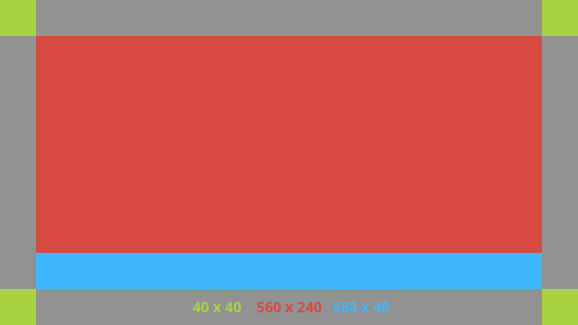
다음은 XML 레이아웃의 예입니다.
<?xml version="1.0" encoding="utf-8"?>
<androidx.constraintlayout.widget.ConstraintLayout
    xmlns:android="http://schemas.android.com/apk/res/android"
    xmlns:app="http://schemas.android.com/apk/res-auto"
    android:id="@+id/layout"
    android:layout_width="match_parent"
    android:layout_height="match_parent">

  <FrameLayout
      android:id="@+id/body_layout"
      android:layout_width="0dp"
      android:layout_height="0dp"
      android:layout_margin="@dimen/glass_card_margin"
      app:layout_constraintBottom_toTopOf="@id/footer"
      app:layout_constraintEnd_toEndOf="parent"
      app:layout_constraintStart_toStartOf="parent"
      app:layout_constraintTop_toTopOf="parent">

    <!-- Put your widgets inside this FrameLayout. -->

  </FrameLayout>

  <!-- The footer view will grow to fit as much content as possible while the
         timestamp view keeps its width. If the footer text is too long, it
         will be ellipsized with a 40dp margin between it and the timestamp. -->

  <TextView
      android:id="@+id/footer"
      android:layout_width="0dp"
      android:layout_height="wrap_content"
      android:layout_marginStart="@dimen/glass_card_margin"
      android:layout_marginEnd="@dimen/glass_card_margin"
      android:layout_marginBottom="@dimen/glass_card_margin"
      android:ellipsize="end"
      android:singleLine="true"
      android:textAppearance="?android:attr/textAppearanceSmall"
      app:layout_constraintBottom_toBottomOf="parent"
      app:layout_constraintEnd_toStartOf="@id/timestamp"
      app:layout_constraintStart_toStartOf="parent" />

  <TextView
      android:id="@+id/timestamp"
      android:layout_width="0dp"
      android:layout_height="wrap_content"
      android:layout_marginEnd="@dimen/glass_card_margin"
      android:layout_marginBottom="@dimen/glass_card_margin"
      android:ellipsize="end"
      android:singleLine="true"
      android:textAlignment="viewEnd"
      android:textAppearance="?android:attr/textAppearanceSmall"
      app:layout_constraintBottom_toBottomOf="parent"
      app:layout_constraintEnd_toEndOf="parent" />

</androidx.constraintlayout.widget.ConstraintLayout>
왼쪽 열 레이아웃
이 레이아웃은 뷰를 배치할 수 있는 두 개의
FrameLayout 클래스 형태로 너비가 1/3인 왼쪽 열과 너비가 2/3인 오른쪽 열을 정의합니다. 다음 그림을 참고하여 예를 확인하세요.
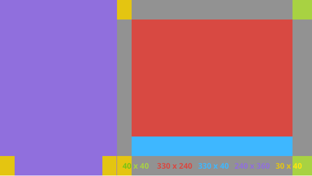
다음은 XML 레이아웃의 예입니다.
<?xml version="1.0" encoding="utf-8"?>
<androidx.constraintlayout.widget.ConstraintLayout
    xmlns:android="http://schemas.android.com/apk/res/android"
    xmlns:app="http://schemas.android.com/apk/res-auto"
    android:layout_width="match_parent"
    android:layout_height="match_parent">

  <FrameLayout
      android:id="@+id/left_column"
      android:layout_width="0dp"
      android:layout_height="match_parent"
      android:background="#303030"
      app:layout_constraintBottom_toBottomOf="parent"
      app:layout_constraintStart_toStartOf="parent"
      app:layout_constraintTop_toTopOf="parent"
      app:layout_constraintWidth_percent=".333">

    <!-- Put widgets for the left column inside this FrameLayout. -->

  </FrameLayout>

  <FrameLayout
      android:id="@+id/right_column"
      android:layout_width="0dp"
      android:layout_height="0dp"
      android:layout_marginTop="@dimen/glass_card_two_column_margin"
      android:layout_marginStart="@dimen/glass_card_two_column_margin"
      android:layout_marginBottom="@dimen/glass_card_two_column_margin"
      android:layout_marginEnd="@dimen/glass_card_margin"
      app:layout_constraintBottom_toTopOf="@id/footer"
      app:layout_constraintEnd_toEndOf="parent"
      app:layout_constraintStart_toEndOf="@id/left_column"
      app:layout_constraintTop_toTopOf="parent">

    <!-- Put widgets for the right column inside this FrameLayout. -->

  </FrameLayout>

  <!-- The footer view will grow to fit as much content as possible while the
         timestamp view keeps its width. If the footer text is too long, it
         will be ellipsized with a 40dp margin between it and the timestamp. -->

  <TextView
      android:id="@+id/footer"
      android:layout_width="0dp"
      android:layout_height="wrap_content"
      android:layout_marginStart="@dimen/glass_card_margin"
      android:layout_marginEnd="@dimen/glass_card_margin"
      android:layout_marginBottom="@dimen/glass_card_margin"
      android:ellipsize="end"
      android:singleLine="true"
      android:textAppearance="?android:attr/textAppearanceSmall"
      app:layout_constraintBottom_toBottomOf="parent"
      app:layout_constraintEnd_toStartOf="@id/timestamp"
      app:layout_constraintStart_toEndOf="@id/left_column" />

  <TextView
      android:id="@+id/timestamp"
      android:layout_width="0dp"
      android:layout_height="wrap_content"
      android:layout_marginEnd="@dimen/glass_card_margin"
      android:layout_marginBottom="@dimen/glass_card_margin"
      android:ellipsize="end"
      android:singleLine="true"
      android:textAlignment="viewEnd"
      android:textAppearance="?android:attr/textAppearanceSmall"
      app:layout_constraintBottom_toBottomOf="parent"
      app:layout_constraintEnd_toEndOf="parent" />

</androidx.constraintlayout.widget.ConstraintLayout>
표준 측정기준
이전 레이아웃 또는 자체 레이아웃과 함께 다음을 사용하여 Glass 표준 스타일을 준수하는 파일을 만드세요. Android 프로젝트에서 이 파일을 res/values/dimens.xml로 만듭니다.
<?xml version="1.0" encoding="utf-8"?>
<resources>

  <!-- The recommended margin for the top, left, and right edges of a card. -->
  <dimen name="glass_card_margin">40dp</dimen>

  <!-- The recommended margin between the bottom of the card and the footer. -->
  <dimen name="glass_card_footer_margin">50dp</dimen>

  <!-- The recommended margin for the left column of the two-column card. -->
  <dimen name="glass_card_two_column_margin">30dp</dimen>

</resources>
메뉴
RecyclerView를 사용하여 메뉴를 빌드하는 것이 좋습니다. Android 스튜디오 프로젝트 리소스의 표준 Android 메뉴 파일을 기반으로 해야 합니다. Android에서는 표준 메뉴 생성을 재정의하고 이를 구현으로 대체할 수 있습니다. 단계는 다음과 같습니다.
-
RecyclerView로 레이아웃을 만들고Activity의 뷰로 설정합니다. - 새로 생성된 메뉴 항목 컬렉션을 사용하도록
RecyclerView및 어댑터를 설정합니다. -
onCreateOptionsMenu메서드를 재정의합니다.- 메뉴를 확장하고 각 메뉴 항목의 컬렉션에 새 요소를 추가합니다.
- 어댑터에서
notifyDataSetChanged메서드를 호출합니다.
Kotlin
    override fun onCreateOptionsMenu(menu: Menu): Boolean {
        val menuResource = intent
            .getIntExtra(EXTRA_MENU_KEY, EXTRA_MENU_ITEM_DEFAULT_VALUE)
        if (menuResource != EXTRA_MENU_ITEM_DEFAULT_VALUE) {
            menuInflater.inflate(menuResource, menu)
            for (i in 0 until menu.size()) {
                val menuItem = menu.getItem(i)
                menuItems.add(
                    GlassMenuItem(
                        menuItem.itemId, menuItem.icon,
                        menuItem.title.toString()
                    )
                )
                adapter.notifyDataSetChanged()
            }
        }
        return super.onCreateOptionsMenu(menu)
    }
자바
    @Override
    public boolean onCreateOptionsMenu(Menu menu) {
      final int menuResource = getIntent()
          .getIntExtra(EXTRA_MENU_KEY, EXTRA_MENU_ITEM_DEFAULT_VALUE);
      if (menuResource != EXTRA_MENU_ITEM_DEFAULT_VALUE) {
        final MenuInflater inflater = getMenuInflater();
        inflater.inflate(menuResource, menu);

        for (int i = 0; i < menu.size(); i++) {
          final MenuItem menuItem = menu.getItem(i);
          menuItems.add(
              new GlassMenuItem(menuItem.getItemId(), menuItem.getIcon(),
                  menuItem.getTitle().toString()));
          adapter.notifyDataSetChanged();
        }
      }
      return super.onCreateOptionsMenu(menu);
    }
-
OnScrollListener을LayoutManager및SnapHelper과 함께 사용하여 선택된 옵션을 확인합니다. TAP동작을 수신 대기하여 메뉴 항목 선택 이벤트를 처리합니다.- 선택한 메뉴 항목에 관한 정보로
Intent을 만듭니다. - 이 활동의 결과를 설정하고 완료합니다.
- 메뉴를 표시할 프래그먼트 또는 활동에서
startActivityForResult를 호출합니다. 이 용도로TAP동작을 사용합니다. - 호출 프래그먼트 또는 활동에서
onActivityResult을 재정의하여 선택한 메뉴 항목을 처리합니다.
가이드라인
다음은 메뉴 레이아웃을 설정하는 방법에 관한 제안사항 목록입니다.
- 텍스트 크기:
64sp - 배경 색상:
#96000000 64dpx64dp크기의 Material icons 사용-
windowIsTranslucent테마 플래그를true로 설정
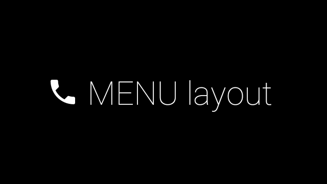
다음 이미지는 맞춤설정된 메뉴 레이아웃의 예입니다.
구현 세부정보는 카드 샘플 앱을 참고하세요.
스와이프 가능한 페이지
Glass 디스플레이와 터치패드는 함께 작동하여 스와이프 가능한 카드를 편리하게 표시합니다. 표준 Android
ViewPager API를 사용하여 활동에서 스와이프 가능한 페이지를 빌드할 수 있습니다.
Android
ViewPager를 사용하여 카드나 화면을 스크롤하는 방법에 관한 자세한 내용은 화면 슬라이드 교육 문서를 참고하세요.