
Tarjeta
Interfaz de tarjeta que se muestra en un mensaje de Google Chat o en un complemento de Google Workspace.
Las tarjetas admiten un diseño definido, elementos de la IU interactivos, como botones, y contenido multimedia enriquecido, como imágenes. Usa tarjetas para presentar información detallada, recopilar información de los usuarios y guiarlos para que realicen el siguiente paso.
Diseña y obtén una vista previa de las tarjetas con Card Builder.
Abrir Card Builder
Para obtener información sobre cómo crear tarjetas, consulta la siguiente documentación:
- En el caso de las apps de Google Chat, consulta Diseña los componentes de una tarjeta o un diálogo.
- En el caso de los complementos de Google Workspace, consulta Interfaces basadas en tarjetas.
Nota: Puedes agregar hasta 100 widgets por tarjeta. Si los widgets de una sección hacen que el recuento total supere los 100, se ignoran toda esa sección y las siguientes. Este límite se aplica tanto a los mensajes de tarjetas como a los diálogos en las apps de Google Chat, y a las tarjetas en los complementos de Google Workspace.
Ejemplo: Mensaje de tarjeta para una app de Google Chat
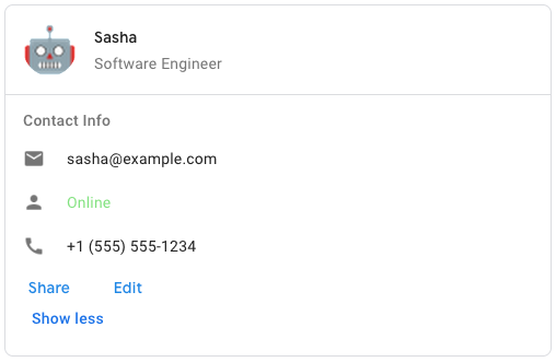
Para crear el mensaje de tarjeta de muestra en Google Chat, usa el siguiente JSON:
{
  "cardsV2": [
    {
      "cardId": "unique-card-id",
      "card": {
        "header": {
           "title": "Sasha",
           "subtitle": "Software Engineer",
           "imageUrl":
           "https://developers.google.com/workspace/chat/images/quickstart-app-avatar.png",
           "imageType": "CIRCLE",
           "imageAltText": "Avatar for Sasha"
         },
         "sections": [
           {
             "header": "Contact Info",
             "collapsible": true,
             "uncollapsibleWidgetsCount": 1,
             "widgets": [
               {
                 "decoratedText": {
                   "startIcon": {
                     "knownIcon": "EMAIL"
                   },
                   "text": "sasha@example.com"
                 }
               },
               {
                 "decoratedText": {
                   "startIcon": {
                     "knownIcon": "PERSON"
                   },
                   "text": "<font color=\"#80e27e\">Online</font>"
                 }
               },
               {
                 "decoratedText": {
                   "startIcon": {
                     "knownIcon": "PHONE"
                   },
                   "text": "+1 (555) 555-1234"
                 }
               },
               {
                 "buttonList": {
                   "buttons": [
                     {
                       "text": "Share",
                       "onClick": {
                        "openLink": {
                           "url": "https://example.com/share"
                         }
                       }
                     },
                     {
                       "text": "Edit",
                       "onClick": {
                         "action": {
                           "function": "goToView",
                           "parameters": [
                             {
                               "key": "viewType",
                               "value": "EDIT"
                             }
                           ]
                         }
                       }
                     }
                   ]
                 }
               }
             ]
           }
         ]
       }
    }
  ]
}
| Representación JSON |
|---|
{ "header": { object ( |
| Campos | |
|---|---|
header
|
Es el encabezado de la tarjeta. Por lo general, un encabezado contiene una imagen principal y un título. Los encabezados siempre aparecen en la parte superior de una tarjeta. |
sections[]
|
Contiene una colección de widgets. Cada sección tiene su propio encabezado opcional. Las secciones están separadas visualmente por una línea divisoria. Para ver un ejemplo en las apps de Google Chat, consulta Cómo definir una sección de una tarjeta. |
sectionDividerStyle
|
Es el estilo del divisor entre el encabezado, las secciones y el pie de página. |
cardActions[]
|
Son las acciones de la tarjeta. Las acciones se agregan al menú de la barra de herramientas de la tarjeta.
Por ejemplo, el siguiente código JSON crea un menú de acciones de tarjeta con las opciones
|
name
|
Nombre de la tarjeta. Se usa como identificador de la tarjeta en la navegación de tarjetas.
|
fixedFooter
|
Es el pie de página fijo que se muestra en la parte inferior de esta tarjeta.
Establecer
|
displayStyle
|
En los complementos de Google Workspace, establece las propiedades de visualización de
|
peekCardHeader
|
Cuando se muestra contenido contextual, el encabezado de la tarjeta de vista previa actúa como marcador de posición para que el usuario pueda navegar hacia adelante entre las tarjetas de la página principal y las tarjetas contextuales.
|
expressionData[]
|
Son los datos de la expresión de la tarjeta. Disponible para los complementos de Google Workspace que extienden Google Workspace Studio. No está disponible para las apps de Google Chat. |
CardHeader
Representa el encabezado de una tarjeta. Para ver un ejemplo en las apps de Google Chat, consulta Cómo agregar un encabezado.

 Disponible para apps de Google Chat y complementos de Google Workspace.
| Representación JSON |
|---|
{
"title": string,
"subtitle": string,
"imageType": enum ( |
| Campos | |
|---|---|
title
|
Obligatorio. Es el título del encabezado de la tarjeta. El encabezado tiene una altura fija: si se especifican un título y un subtítulo, cada uno ocupa una línea. Si solo se especifica el título, este ocupará ambas líneas. |
subtitle
|
Es el subtítulo del encabezado de la tarjeta. Si se especifica, aparece en su propia línea debajo de |
imageType
|
Forma que se usa para recortar la imagen.
|
imageUrl
|
Es la URL HTTPS de la imagen en el encabezado de la tarjeta. |
imageAltText
|
Es el texto alternativo de esta imagen que se usa para la accesibilidad. |
ImageType
Forma que se usa para recortar la imagen.
Disponible para apps de Google Chat y complementos de Google Workspace.
| Enums | |
|---|---|
SQUARE
|
Valor predeterminado Aplica una máscara cuadrada a la imagen. Por ejemplo, una imagen de 4x3 se convierte en 3x3. |
CIRCLE
|
Aplica una máscara circular a la imagen. Por ejemplo, una imagen de 4 x 3 se convierte en un círculo con un diámetro de 3. |
Sección
Una sección contiene una colección de widgets que se renderizan verticalmente en el orden en que se especifican.
Disponible para apps de Google Chat y complementos de Google Workspace.
| Representación JSON |
|---|
{ "header": string, "widgets": [ { object ( |
| Campos | |
|---|---|
header
|
Es el texto que aparece en la parte superior de una sección. Admite texto con formato HTML simple. Para obtener más información sobre el formato de texto, consulta Cómo dar formato al texto en las apps de Google Chat y Cómo dar formato al texto en los complementos de Google Workspace. |
widgets[]
|
Todos los widgets de la sección. Debe contener al menos un widget. |
collapsible
|
Indica si esta sección se puede contraer. Las secciones contraíbles ocultan algunos o todos los widgets, pero los usuarios pueden expandir la sección para revelar los widgets ocultos haciendo clic en Mostrar más. Los usuarios pueden volver a ocultar los widgets haciendo clic en Mostrar menos.
Para determinar qué widgets están ocultos, especifica |
uncollapsibleWidgetsCount
|
Es la cantidad de widgets no contraíbles que permanecen visibles incluso cuando se contrae una sección.
Por ejemplo, cuando una sección contiene cinco widgets y el parámetro |
id
|
Es un ID único asignado a la sección que se usa para identificar la sección que se modificará. El ID tiene un límite de 64 caracteres y debe tener el formato Disponible para los complementos de Google Workspace que extienden Google Workspace Studio. No está disponible para las apps de Google Chat. |
collapseControl
|
Opcional. Define el botón de expansión y contracción de la sección. Este botón solo se mostrará si la sección se puede contraer. Si no se establece este campo, se usa el botón predeterminado. |
Widget
Cada tarjeta está compuesta por widgets.
Un widget es un objeto compuesto que puede representar texto, imágenes, botones y otros tipos de objetos.
| Representación JSON |
|---|
{ "horizontalAlignment": enum ( |
| Campos | |
|---|---|
horizontalAlignment
|
Especifica si los widgets se alinean a la izquierda, a la derecha o al centro de una columna. |
id
|
Es un ID único asignado al widget que se usa para identificar el widget que se modificará. El ID tiene un límite de 64 caracteres y debe tener el formato de
Disponible para los complementos de Google Workspace que extienden Google Workspace Studio. No está disponible para las apps de Google Chat. |
visibility
|
Especifica si el widget está visible u oculto. El valor predeterminado es Disponible para los complementos de Google Workspace que extienden Google Workspace Studio. No está disponible para las apps de Google Chat. |
eventActions[]
|
Especifica las acciones de eventos que se pueden realizar en el widget. Disponible para los complementos de Google Workspace que extienden Google Workspace Studio. No está disponible para las apps de Google Chat. |
Campo de unión
data. Un widget solo puede tener uno de los siguientes elementos. Puedes usar varios campos de widgets para mostrar más elementos.
data
solo puede ser uno de los siguientes valores:
|
|
textParagraph
|
Muestra un párrafo de texto. Admite texto con formato HTML simple. Para obtener más información sobre el formato de texto, consulta Cómo dar formato al texto en las apps de Google Chat y Cómo dar formato al texto en los complementos de Google Workspace. Por ejemplo, el siguiente código JSON crea un texto en negrita: |
image
|
Muestra una imagen. Por ejemplo, el siguiente código JSON crea una imagen con texto alternativo: |
decoratedText
|
Muestra un elemento de texto decorado. Por ejemplo, el siguiente código JSON crea un widget de texto decorado que muestra la dirección de correo electrónico: |
buttonList
|
Es una lista de botones. Por ejemplo, el siguiente JSON crea dos botones. El primero es un botón de texto azul y el segundo es un botón de imagen que abre un vínculo: |
textInput
|
Muestra un cuadro de texto en el que los usuarios pueden escribir. Por ejemplo, el siguiente código JSON crea una entrada de texto para una dirección de correo electrónico: Como otro ejemplo, el siguiente código JSON crea una entrada de texto para un lenguaje de programación con sugerencias estáticas: |
selectionInput
|
Muestra un control de selección que permite a los usuarios seleccionar elementos. Los controles de selección pueden ser casillas de verificación, botones de selección, interruptores o menús desplegables. Por ejemplo, el siguiente código JSON crea un menú desplegable que permite a los usuarios elegir un tamaño: |
dateTimePicker
|
Muestra un widget que permite a los usuarios ingresar una fecha, una hora o ambas. Por ejemplo, el siguiente JSON crea un selector de fecha y hora para programar una cita: |
divider
|
Muestra un divisor de línea horizontal entre los widgets. Por ejemplo, el siguiente código JSON crea un divisor: |
grid
|
Muestra una cuadrícula con una colección de elementos. Una cuadrícula admite cualquier cantidad de columnas y elementos. La cantidad de filas se determina según los límites superiores de la cantidad de elementos divididos por la cantidad de columnas. Una cuadrícula con 10 elementos y 2 columnas tiene 5 filas. Una cuadrícula con 11 elementos y 2 columnas tiene 6 filas.
Por ejemplo, el siguiente código JSON crea una cuadrícula de 2 columnas con un solo elemento: |
columns
|
Muestra hasta 2 columnas.
Para incluir más de 2 columnas o usar filas, usa el widget Por ejemplo, el siguiente código JSON crea 2 columnas que contienen párrafos de texto: |
carousel
|
Un carrusel contiene una colección de widgets anidados. Por ejemplo, esta es una representación JSON de un carrusel que contiene dos párrafos de texto. |
chipList
|
Es una lista de chips. Por ejemplo, el siguiente JSON crea dos chips. El primero es un chip de texto y el segundo es un chip de ícono que abre un vínculo: |
TextParagraph
Es un párrafo de texto que admite formato. Para ver un ejemplo en las apps de Google Chat, consulta Cómo agregar un párrafo de texto con formato. Para obtener más información sobre el formato de texto, consulta Cómo dar formato al texto en las apps de Google Chat y Cómo dar formato al texto en los complementos de Google Workspace.
Disponible para apps de Google Chat y complementos de Google Workspace.
| Representación JSON |
|---|
{
"text": string,
"maxLines": integer,
"textSyntax": enum ( |
| Campos | |
|---|---|
text
|
Es el texto que se muestra en el widget. |
maxLines
|
Es la cantidad máxima de líneas de texto que se muestran en el widget. Si el texto supera la cantidad máxima de líneas especificada, el contenido excedente se oculta detrás de un botón de Mostrar más. Si el texto es igual o más corto que la cantidad máxima de líneas especificada, no se muestra el botón Mostrar más. El valor predeterminado es 0, en cuyo caso se muestra todo el contexto. Se ignoran los valores negativos. |
textSyntax
|
Es la sintaxis del texto. Si no se configura, el texto se renderiza como HTML.
|
TextSyntax
Sintaxis que se usa para dar formato al texto.
Disponible para las apps de Google Chat y no disponible para los complementos de Google Workspace.
| Enums | |
|---|---|
TEXT_SYNTAX_UNSPECIFIED
|
Si no se especifica, el texto se renderiza como HTML. |
HTML
|
El texto se renderiza como HTML. Este es el valor predeterminado. |
MARKDOWN
|
El texto se renderiza como Markdown. |
Imagen
Imagen especificada por una URL que puede tener una acción de onClick. Para ver un ejemplo, consulta Cómo agregar una imagen.
Disponible para apps de Google Chat y complementos de Google Workspace.
| Representación JSON |
|---|
{
"imageUrl": string,
"onClick": {
object ( |
| Campos | |
|---|---|
imageUrl
|
Es la URL HTTPS que aloja la imagen. Por ejemplo: |
onClick
|
Cuando un usuario hace clic en la imagen, el clic activa esta acción. |
altText
|
Es el texto alternativo de esta imagen que se usa para la accesibilidad. |
OnClick
Representa cómo responder cuando los usuarios hacen clic en un elemento interactivo de una tarjeta, como un botón.
Disponible para apps de Google Chat y complementos de Google Workspace.
| Representación JSON |
|---|
{ "action": { object ( |
| Campos | |
|---|---|
|
Campo de unión
|
|
action
|
Si se especifica, esta |
openLink
|
Si se especifica, este
|
openDynamicLinkAction
|
Un complemento activa esta acción cuando la acción necesita abrir un vínculo. Esto difiere del
|
card
|
Si se especifica, se envía una tarjeta nueva a la pila de tarjetas después de hacer clic.
|
overflowMenu
|
Si se especifica, |
Acción
Es una acción que describe el comportamiento cuando se envía el formulario. Por ejemplo, puedes invocar una secuencia de comandos de Apps Script para controlar el formulario. Si se activa la acción, los valores del formulario se envían al servidor.
Disponible para apps de Google Chat y complementos de Google Workspace.
| Representación JSON |
|---|
{ "function": string, "parameters": [ { object ( |
| Campos | |
|---|---|
function
|
Es una función personalizada que se invoca cuando se hace clic en el elemento contenedor o se lo activa de otro modo. Para ver un ejemplo de uso, consulta Cómo leer datos de formularios. |
parameters[]
|
Es la lista de parámetros de acción. |
loadIndicator
|
Especifica el indicador de carga que muestra la acción mientras realiza la llamada a la acción. |
persistValues
|
Indica si los valores del formulario persisten después de la acción. El valor predeterminado es
Si es
Si es |
interaction
|
Opcional. Se requiere cuando se abre un diálogo. Qué hacer en respuesta a una interacción con un usuario, por ejemplo, cuando un usuario hace clic en un botón en un mensaje de tarjeta
Si no se especifica, la app responde ejecutando un
Si se especifica un
|
requiredWidgets[]
|
Opcional. Completa esta lista con los nombres de los widgets que esta acción necesita para un envío válido. Si los widgets que se enumeran aquí no tienen un valor cuando se invoca esta acción, se aborta el envío del formulario.
|
allWidgetsAreRequired
|
Opcional. Si es verdadero, todos los widgets se consideran obligatorios para esta acción.
|
ActionParameter
Es la lista de parámetros de cadena que se deben proporcionar cuando se invoca el método de acción. Por ejemplo, considera tres botones de posponer: posponer ahora, posponer un día o posponer la próxima semana. Puedes usar action method = snooze() y pasar el tipo de posposición y el tiempo de posposición en la lista de parámetros de cadena.
Para obtener más información, consulta CommonEventObject.
Disponible para apps de Google Chat y complementos de Google Workspace.
| Representación JSON |
|---|
{ "key": string, "value": string } |
| Campos | |
|---|---|
key
|
Es el nombre del parámetro para la secuencia de comandos de la acción. |
value
|
El valor del parámetro. |
LoadIndicator
Especifica el indicador de carga que muestra la acción mientras realiza la llamada a la acción.
Disponible para apps de Google Chat y complementos de Google Workspace.
| Enums | |
|---|---|
SPINNER
|
Muestra un spinner para indicar que se está cargando el contenido. |
NONE
|
No se muestra nada. |
Interacción
Opcional. Se requiere cuando se abre un diálogo.
Qué hacer en respuesta a una interacción con un usuario, por ejemplo, cuando un usuario hace clic en un botón en un mensaje de tarjeta
Si no se especifica, la app responde ejecutando un
action
(como abrir un vínculo o ejecutar una función) de forma normal.
Si se especifica un interaction, la app puede responder de formas interactivas especiales. Por ejemplo, si se configura interaction en OPEN_DIALOG, la app puede abrir un diálogo.
Cuando se especifica, no se muestra un indicador de carga. Si se especifica para un complemento, se quita toda la tarjeta y no se muestra nada en el cliente.
Disponible para las apps de Google Chat y no disponible para los complementos de Google Workspace.
| Enums | |
|---|---|
INTERACTION_UNSPECIFIED
|
Valor predeterminado El objeto action se ejecuta con normalidad.
|
OPEN_DIALOG
|
Abre un diálogo, una interfaz basada en tarjetas y ventanas que las apps de Chat usan para interactuar con los usuarios. Solo se admite en las apps de Chat en respuesta a los clics en botones de mensajes de tarjetas. Si se especifica para un complemento, se quita toda la tarjeta y no se muestra nada en el cliente.
|
OpenLink
Representa un evento onClick que abre un hipervínculo.
Disponible para apps de Google Chat y complementos de Google Workspace.
| Representación JSON |
|---|
{ "url": string, "openAs": enum ( |
| Campos | |
|---|---|
url
|
Es la URL que se abrirá. Las URLs HTTP se convierten a HTTPS. |
openAs
|
Cómo abrir un vínculo
|
onClose
|
Indica si el cliente se olvida de un vínculo después de abrirlo o lo observa hasta que se cierra la ventana.
|
OpenAs
Cuando una acción de OnClick abre un vínculo, el cliente puede abrirlo como una ventana de tamaño completo (si ese es el marco que usa el cliente) o como una superposición (por ejemplo, una ventana emergente). La implementación depende de las capacidades de la plataforma del cliente, y es posible que se ignore el valor seleccionado si el cliente no lo admite.
FULL_SIZE
es compatible con todos los clientes.
Disponible para los complementos de Google Workspace y no disponible para las apps de Google Chat.
| Enums | |
|---|---|
FULL_SIZE
|
El vínculo se abre como una ventana de tamaño completo (si ese es el marco que usa el cliente). |
OVERLAY
|
El vínculo se abre como una superposición, por ejemplo, una ventana emergente. |
OnClose
Qué hace el cliente cuando se cierra un vínculo abierto por una acción de OnClick.
La implementación depende de las capacidades de la plataforma del cliente. Por ejemplo, un navegador web podría abrir un vínculo en una ventana emergente con un controlador de OnClose.
Si se configuran los controladores OnOpen y OnClose, y la plataforma del cliente no admite ambos valores, OnClose tiene prioridad.
Disponible para los complementos de Google Workspace y no disponible para las apps de Google Chat.
| Enums | |
|---|---|
NOTHING
|
Valor predeterminado La tarjeta no se recarga y no sucede nada. |
RELOAD
|
Vuelve a cargar la tarjeta después de que se cierra la ventana secundaria.
Si se usa en conjunto con |
OverflowMenu
Es un widget que presenta un menú emergente con una o más acciones que los usuarios pueden invocar. Por ejemplo, mostrar acciones secundarias en una tarjeta Puedes usar este widget cuando las acciones no caben en el espacio disponible. Para usarlo, especifica este widget en la acción OnClick de los widgets que lo admiten. Por ejemplo, en un Button.
Disponible para apps de Google Chat y complementos de Google Workspace.
| Representación JSON |
|---|
{
"items": [
{
object ( |
| Campos | |
|---|---|
items[]
|
Obligatorio. Es la lista de opciones del menú. |
OverflowMenuItem
Opción que los usuarios pueden invocar en un menú ampliado.
Disponible para apps de Google Chat y complementos de Google Workspace.
| Representación JSON |
|---|
{ "startIcon": { object ( |
| Campos | |
|---|---|
startIcon
|
Es el ícono que se muestra delante del texto. |
text
|
Obligatorio. Es el texto que identifica o describe el elemento a los usuarios. |
onClick
|
Obligatorio. Es la acción que se invoca cuando se selecciona una opción del menú. Este |
disabled
|
Indica si la opción de menú está inhabilitada. La configuración predeterminada es "false". |
Ícono
Ícono que se muestra en un widget de una tarjeta. Para ver un ejemplo en las apps de Google Chat, consulta Cómo agregar un ícono.
Admite íconos integrados y personalizados.
Disponible para apps de Google Chat y complementos de Google Workspace.
| Representación JSON |
|---|
{ "altText": string, "imageType": enum ( |
| Campos | |
|---|---|
altText
|
Opcional. Es una descripción del ícono que se usa para la accesibilidad. Si no se especifica, se proporciona el valor predeterminado
Si el ícono se establece en un |
imageType
|
Es el estilo de recorte aplicado a la imagen. En algunos casos, aplicar un recorte |
Campo de unión
icons. Ícono que se muestra en el widget de la tarjeta.
icons
solo puede ser uno de los siguientes valores:
|
|
knownIcon
|
Muestra uno de los íconos integrados que proporciona Google Workspace.
Por ejemplo, para mostrar un ícono de avión, especifica Para obtener una lista completa de los íconos compatibles, consulta los íconos integrados. |
iconUrl
|
Muestra un ícono personalizado alojado en una URL HTTPS. Por ejemplo:
Los tipos de archivo admitidos incluyen |
materialIcon
|
Muestra uno de los íconos de Material de Google. Por ejemplo, para mostrar un ícono de casilla de verificación, usa
|
MaterialIcon
Un ícono de Material de Google, que incluye más de 2,500 opciones
Por ejemplo, para mostrar un ícono de casilla de verificación con un peso y una calificación personalizados, escribe lo siguiente:
{
"name": "check_box",
"fill": true,
"weight": 300,
"grade": -25
}
Disponible para las apps de Google Chat y no disponible para los complementos de Google Workspace.
| Representación JSON |
|---|
{ "name": string, "fill": boolean, "weight": integer, "grade": integer } |
| Campos | |
|---|---|
name
|
Nombre del ícono definido en el ícono de Material de Google, por ejemplo, |
fill
|
Indica si el ícono se renderiza como relleno. El valor predeterminado es falso. Para obtener una vista previa de los diferentes parámetros de configuración de los íconos, ve a Google Font Icons y ajusta la configuración en Personalizar. |
weight
|
Es el grosor del trazo del ícono. Elige entre {100, 200, 300, 400, 500, 600, 700}. Si no está presente, el valor predeterminado es 400. Si se especifica cualquier otro valor, se usará el valor predeterminado. Para obtener una vista previa de los diferentes parámetros de configuración de los íconos, ve a Google Font Icons y ajusta la configuración en Personalizar. |
grade
|
El peso y el grado afectan el grosor de un símbolo. Los ajustes de grado son más detallados que los ajustes de peso y tienen un pequeño impacto en el tamaño del símbolo. Elige entre {-25, 0, 200}. Si no está presente, el valor predeterminado es 0. Si se especifica cualquier otro valor, se usará el valor predeterminado. Para obtener una vista previa de los diferentes parámetros de configuración de los íconos, ve a Google Font Icons y ajusta la configuración en Personalizar. |
DecoratedText
Es un widget que muestra texto con decoraciones opcionales, como una etiqueta arriba o debajo del texto, un ícono delante del texto, un widget de selección o un botón después del texto. Para ver un ejemplo en las apps de Google Chat, consulta Cómo mostrar texto con texto decorativo.
Disponible para apps de Google Chat y complementos de Google Workspace.
| Representación JSON |
|---|
{ "icon": { object ( |
| Campos | |
|---|---|
icon
|
Obsoleto. Se recomienda usar |
startIcon
|
Es el ícono que se muestra delante del texto. |
startIconVerticalAlignment
|
Opcional. Alineación vertical del ícono de inicio. Si no se configura, el ícono se centrará verticalmente.
|
topLabel
|
Es el texto que aparece sobre |
topLabelText
|
|
text
|
Obligatorio. Es el texto principal. Admite el formato simple. Para obtener más información sobre el formato de texto, consulta Cómo dar formato al texto en las apps de Google Chat y Cómo dar formato al texto en los complementos de Google Workspace. |
contentText
|
|
wrapText
|
Es el parámetro de configuración de ajuste de texto. Si es
Solo se aplica a |
bottomLabel
|
Es el texto que aparece debajo de |
bottomLabelText
|
|
onClick
|
Esta acción se activa cuando los usuarios hacen clic en
|
Campo de unión
control. Un botón, un interruptor, una casilla de verificación o una imagen que aparece a la derecha del texto en el widget de
decoratedText.
control
solo puede ser uno de los siguientes valores:
|
|
button
|
Es un botón en el que un usuario puede hacer clic para activar una acción. |
switchControl
|
Es un widget de interruptor en el que un usuario puede hacer clic para cambiar su estado y activar una acción. |
endIcon
|
Es un ícono que se muestra después del texto. Admite íconos integrados y personalizados. |
VerticalAlignment
Representa el atributo de alineación vertical.
| Enums | |
|---|---|
VERTICAL_ALIGNMENT_UNSPECIFIED
|
Tipo no especificado No lo utilices. |
TOP
|
Alineación con la posición superior. |
MIDDLE
|
Alineación con la posición media. |
BOTTOM
|
Alineación con la posición inferior. |
Botón
Un botón de texto, ícono o texto e ícono en el que los usuarios pueden hacer clic. Para ver un ejemplo en las apps de Google Chat, consulta Cómo agregar un botón.
Para convertir una imagen en un botón en el que se puede hacer clic, especifica un
ImageImageComponentonClick.
Disponible para apps de Google Chat y complementos de Google Workspace.
| Representación JSON |
|---|
{ "text": string, "icon": { object ( |
| Campos | |
|---|---|
text
|
Es el texto que se muestra dentro del botón. |
icon
|
Ícono que se muestra dentro del botón. Si se configuran |
color
|
Opcional. Color del botón. Si se establece, el botón
Para establecer el color del botón, especifica un valor para los campos
Por ejemplo, el siguiente código establece el color rojo en su intensidad máxima:
El campo
|
onClick
|
Obligatorio. Es la acción que se realizará cuando un usuario haga clic en el botón, como abrir un hipervínculo o ejecutar una función personalizada. |
disabled
|
Si es |
altText
|
Es el texto alternativo que se usa para la accesibilidad. Establece un texto descriptivo que les permita a los usuarios saber qué hace el botón. Por ejemplo, si un botón abre un hipervínculo, puedes escribir: "Abre una nueva pestaña del navegador y navega a la documentación para desarrolladores de Google Chat en https://developers.google.com/workspace/chat". |
type
|
Opcional. Es el tipo de botón. Si no se configura, el tipo de botón se establece de forma predeterminada en |
Color
Representa un color en el espacio de color RGBA. Esta representación está diseñada para facilitar la conversión a representaciones de color y desde ellas en varios idiomas, en lugar de priorizar la compacidad. Por ejemplo, los campos de esta representación se pueden proporcionar de forma trivial al constructor de java.awt.Color en Java, también se pueden proporcionar de forma trivial al método +colorWithRed:green:blue:alpha de UIColor en iOS y, con un poco de trabajo, se pueden formatear fácilmente en una cadena rgba() de CSS en JavaScript.
Esta página de referencia no contiene información sobre el espacio de color absoluto que se debe usar para interpretar el valor RGB (por ejemplo, sRGB, Adobe RGB, DCI-P3 y BT.2020). De forma predeterminada, las aplicaciones deben tener el espacio de color sRGB.
Cuando se debe decidir la igualdad de color, las implementaciones, a menos que se documente lo contrario, tratan dos colores como iguales si todos sus valores de rojo, verde, azul y alfa difieren en un máximo de 1e-5.
Ejemplo (Java):
import com.google.type.Color;
// ...
public static java.awt.Color fromProto(Color protocolor) {
float alpha = protocolor.hasAlpha()
? protocolor.getAlpha().getValue()
: 1.0;
return new java.awt.Color(
protocolor.getRed(),
protocolor.getGreen(),
protocolor.getBlue(),
alpha);
}
public static Color toProto(java.awt.Color color) {
float red = (float) color.getRed();
float green = (float) color.getGreen();
float blue = (float) color.getBlue();
float denominator = 255.0;
Color.Builder resultBuilder =
Color
.newBuilder()
.setRed(red / denominator)
.setGreen(green / denominator)
.setBlue(blue / denominator);
int alpha = color.getAlpha();
if (alpha != 255) {
result.setAlpha(
FloatValue
.newBuilder()
.setValue(((float) alpha) / denominator)
.build());
}
return resultBuilder.build();
}
// ...
Ejemplo (iOS / Obj-C):
// ...
static UIColor* fromProto(Color* protocolor) {
float red = [protocolor red];
float green = [protocolor green];
float blue = [protocolor blue];
FloatValue* alpha_wrapper = [protocolor alpha];
float alpha = 1.0;
if (alpha_wrapper != nil) {
alpha = [alpha_wrapper value];
}
return [UIColor colorWithRed:red green:green blue:blue alpha:alpha];
}
static Color* toProto(UIColor* color) {
CGFloat red, green, blue, alpha;
if (![color getRed:&red green:&green blue:&blue alpha:&alpha]) {
return nil;
}
Color* result = [[Color alloc] init];
[result setRed:red];
[result setGreen:green];
[result setBlue:blue];
if (alpha <= 0.9999) {
[result setAlpha:floatWrapperWithValue(alpha)];
}
[result autorelease];
return result;
}
// ...
Ejemplo (JavaScript):
// ...
var protoToCssColor = function(rgb_color) {
var redFrac = rgb_color.red || 0.0;
var greenFrac = rgb_color.green || 0.0;
var blueFrac = rgb_color.blue || 0.0;
var red = Math.floor(redFrac * 255);
var green = Math.floor(greenFrac * 255);
var blue = Math.floor(blueFrac * 255);
if (!('alpha' in rgb_color)) {
return rgbToCssColor(red, green, blue);
}
var alphaFrac = rgb_color.alpha.value || 0.0;
var rgbParams = [red, green, blue].join(',');
return ['rgba(', rgbParams, ',', alphaFrac, ')'].join('');
};
var rgbToCssColor = function(red, green, blue) {
var rgbNumber = new Number((red << 16) | (green << 8) | blue);
var hexString = rgbNumber.toString(16);
var missingZeros = 6 - hexString.length;
var resultBuilder = ['#'];
for (var i = 0; i < missingZeros; i++) {
resultBuilder.push('0');
}
resultBuilder.push(hexString);
return resultBuilder.join('');
};
// ...
| Representación JSON |
|---|
{ "red": number, "green": number, "blue": number, "alpha": number } |
| Campos | |
|---|---|
red
|
La cantidad de rojo en el color como un valor en el intervalo [0, 1]. |
green
|
La cantidad de verde en el color como un valor en el intervalo [0, 1]. |
blue
|
La cantidad de azul en el color como un valor en el intervalo [0, 1]. |
alpha
|
La fracción de este color que se debe aplicar al píxel. Es decir, el color del píxel final se define mediante la siguiente ecuación:
Esto significa que el valor 1.0 corresponde a un color sólido, mientras que el valor 0.0 corresponde a un color completamente transparente. Esto utiliza un mensaje de wrapper en lugar de un escalar flotante simple, para que sea posible distinguir entre un valor predeterminado y el valor que no se configura. Si se omite, este objeto de color se renderiza como un color sólido (como si el valor alfa se hubiera proporcionado de forma explícita con un valor de 1.0). |
Tipo
Opcional. El tipo de un botón. Si se configura el campo color, se fuerza el campo type a FILLED.
Disponible para las apps de Google Chat y no disponible para los complementos de Google Workspace.
| Enums | |
|---|---|
TYPE_UNSPECIFIED
|
No lo uses. Sin especificar. |
OUTLINED
|
Los botones con contorno son botones de énfasis medio. Por lo general, contienen acciones que son importantes, pero no son la acción principal en una app de Chat o un complemento. |
FILLED
|
Un botón relleno tiene un contenedor con un color sólido. Es la que tiene mayor impacto visual y se recomienda para la acción principal e importante en una app de Chat o un complemento. |
FILLED_TONAL
|
Un botón secundario con relleno es una alternativa intermedia entre los botones con relleno y los botones con contorno. Son útiles en contextos en los que un botón de menor prioridad requiere un poco más de énfasis del que proporcionaría un botón de esquema. |
BORDERLESS
|
Un botón no tiene un contenedor invisible en su estado predeterminado. A menudo, se usa para las acciones de menor prioridad, en especial cuando se presentan varias opciones. |
SwitchControl
Un interruptor de tipo alternar o una casilla de verificación dentro de un widget decoratedText.
Disponible para apps de Google Chat y complementos de Google Workspace.
Solo se admite en el widget decoratedText.
| Representación JSON |
|---|
{ "name": string, "value": string, "selected": boolean, "onChangeAction": { object ( |
| Campos | |
|---|---|
name
|
Es el nombre con el que se identifica el widget de interruptor en un evento de entrada de formulario. Para obtener detalles sobre cómo trabajar con entradas de formularios, consulta Cómo recibir datos de formularios. |
value
|
Es el valor que ingresa un usuario y que se devuelve como parte de un evento de entrada de formulario. Para obtener detalles sobre cómo trabajar con entradas de formularios, consulta Cómo recibir datos de formularios. |
selected
|
Cuando es |
onChangeAction
|
Es la acción que se realizará cuando cambie el estado del interruptor, como la función que se ejecutará. |
controlType
|
Es la forma en que aparece el botón de activación en la interfaz de usuario.
|
ControlType
Es la forma en que aparece el botón de activación en la interfaz de usuario.
Disponible para apps de Google Chat y complementos de Google Workspace.
| Enums | |
|---|---|
SWITCH
|
Es un interruptor de tipo palanca. |
CHECKBOX
|
Obsoleto a favor de CHECK_BOX.
|
CHECK_BOX
|
Casilla de verificación. |
ButtonList
Es una lista de botones dispuestos horizontalmente. Para ver un ejemplo en las apps de Google Chat, consulta Cómo agregar un botón.
Disponible para apps de Google Chat y complementos de Google Workspace.
| Representación JSON |
|---|
{
"buttons": [
{
object ( |
| Campos | |
|---|---|
buttons[]
|
Es un array de botones. |
TextInput
Es un campo en el que los usuarios pueden ingresar texto. Admite sugerencias y acciones on-change. Admite la validación del envío de formularios. Cuando Action.all_widgets_are_required se establece en true o este widget se especifica en Action.required_widgets, la acción de envío se bloquea, a menos que se ingrese un valor. Para ver un ejemplo en las apps de Google Chat, consulta Cómo agregar un campo en el que un usuario puede ingresar texto.
Las apps de Chat reciben y pueden procesar el valor del texto ingresado durante los eventos de entrada de formularios. Para obtener detalles sobre cómo trabajar con entradas de formularios, consulta Cómo recibir datos de formularios.
Cuando necesites recopilar datos abstractos o indefinidos de los usuarios, usa una entrada de texto. Para recopilar datos definidos o enumerados de los usuarios, usa el widget SelectionInput.
Disponible para apps de Google Chat y complementos de Google Workspace.
| Representación JSON |
|---|
{ "name": string, "label": string, "hintText": string, "value": string, "type": enum ( |
| Campos | |
|---|---|
name
|
Es el nombre con el que se identifica la entrada de texto en un evento de entrada de formulario. Para obtener detalles sobre cómo trabajar con entradas de formularios, consulta Cómo recibir datos de formularios. |
label
|
Es el texto que aparece sobre el campo de entrada de texto en la interfaz de usuario.
Especifica el texto que ayuda al usuario a ingresar la información que necesita tu app. Por ejemplo, si le preguntas a alguien su nombre, pero específicamente necesitas su apellido, escribe
Obligatorio si no se especifica |
hintText
|
Es el texto que aparece debajo del campo de entrada de texto y que tiene como objetivo ayudar a los usuarios solicitándoles que ingresen un valor determinado. Este texto siempre está visible.
Obligatorio si no se especifica |
value
|
Es el valor que ingresa un usuario y que se devuelve como parte de un evento de entrada de formulario. Para obtener detalles sobre cómo trabajar con entradas de formularios, consulta Cómo recibir datos de formularios. |
type
|
Es la forma en que aparece un campo de entrada de texto en la interfaz de usuario. Por ejemplo, si el campo es de una sola línea o de varias. |
onChangeAction
|
Qué hacer cuando se produce un cambio en el campo de entrada de texto. Por ejemplo, un usuario que agrega texto al campo o lo borra. Entre los ejemplos de acciones que se pueden realizar, se incluyen ejecutar una función personalizada o abrir un diálogo en Google Chat. |
initialSuggestions
|
Son los valores sugeridos que los usuarios pueden ingresar. Estos valores aparecen cuando los usuarios hacen clic dentro del campo de entrada de texto. A medida que los usuarios escriben, los valores sugeridos se filtran de forma dinámica para que coincidan con lo que escribieron.
Por ejemplo, un campo de entrada de texto para el lenguaje de programación podría sugerir Java, JavaScript, Python y C++. Cuando los usuarios comiencen a escribir
Los valores sugeridos ayudan a los usuarios a ingresar valores que tu app puede interpretar. Cuando se refieren a JavaScript, algunos usuarios pueden ingresar
Cuando se especifica,
|
autoCompleteAction
|
Opcional. Especifica qué acción se debe realizar cuando el campo de entrada de texto proporciona sugerencias a los usuarios que interactúan con él.
Si no se especifica, las sugerencias se establecen con Si se especifica, la app realiza la acción que se indica aquí, como ejecutar una función personalizada.
|
validation
|
Especifica la validación del formato de entrada necesaria para este campo de texto.
|
placeholderText
|
Es el texto que aparece en el campo de entrada de texto cuando está vacío. Usa este texto para solicitar a los usuarios que ingresen un valor. Por ejemplo,
|
|
Campo de unión
|
|
hostAppDataSource
|
Es una fuente de datos exclusiva de una aplicación host de Google Workspace, como los correos electrónicos de Gmail, los eventos del Calendario de Google o los mensajes de Google Chat. Disponible para los complementos de Google Workspace que extienden Google Workspace Studio. No está disponible para las apps de Google Chat. |
Tipo
Es la forma en que aparece un campo de entrada de texto en la interfaz de usuario. Por ejemplo, si es un campo de entrada de una sola línea o de varias líneas. Si se especifica initialSuggestions, type siempre será SINGLE_LINE, incluso si se establece en MULTIPLE_LINE.
Disponible para apps de Google Chat y complementos de Google Workspace.
| Enums | |
|---|---|
SINGLE_LINE
|
El campo de entrada de texto tiene una altura fija de una línea. |
MULTIPLE_LINE
|
El campo de entrada de texto tiene una altura fija de varias líneas. |
RenderActions
Es un conjunto de instrucciones de renderización que le indica a una tarjeta que realice una acción o le indica a la app host del complemento o a la app de Chat que realice una acción específica de la app.
Disponible para apps de Google Chat y complementos de Google Workspace.
| Campos | |
|---|---|
action | |
Acción
| Campos | |
|---|---|
navigations[] |
Envía, muestra o actualiza una tarjeta. |
Navegación
Agrega una tarjeta nueva a la pila (navega hacia adelante). En el caso de las apps de Chat, solo está disponible para la página principal de la app.
Disponible para apps de Google Chat y complementos de Google Workspace.
navigations: {
pushCard: CARD
}
Reemplaza la tarjeta superior por una nueva. En el caso de las apps de Chat, solo está disponible para la página principal de la app.
Disponible para apps de Google Chat y complementos de Google Workspace.
navigations: {
updateCard: CARD
}
Sugerencias
Son los valores sugeridos que los usuarios pueden ingresar. Estos valores aparecen cuando los usuarios hacen clic dentro del campo de entrada de texto. A medida que los usuarios escriben, los valores sugeridos se filtran de forma dinámica para que coincidan con lo que escribieron.
Por ejemplo, un campo de entrada de texto para el lenguaje de programación podría sugerir Java, JavaScript, Python y C++. Cuando los usuarios comiencen a escribir Jav, la lista de sugerencias se filtrará para mostrar Java y JavaScript.
Los valores sugeridos ayudan a los usuarios a ingresar valores que tu app puede interpretar. Cuando se refieren a JavaScript, algunos usuarios pueden ingresar
javascript
y otros
java script. Las sugerencias
JavaScript
pueden estandarizar la forma en que los usuarios interactúan con tu app.
Cuando se especifica, TextInput.type siempre es SINGLE_LINE, incluso si se establece en MULTIPLE_LINE.
Disponible para apps de Google Chat y complementos de Google Workspace.
| Representación JSON |
|---|
{
"items": [
{
object ( |
| Campos | |
|---|---|
items[]
|
Es una lista de sugerencias que se usan para las recomendaciones de autocompletado en los campos de entrada de texto. |
SuggestionItem
Es uno de los valores sugeridos que los usuarios pueden ingresar en un campo de entrada de texto.
Disponible para apps de Google Chat y complementos de Google Workspace.
| Representación JSON |
|---|
{ "text": string } |
| Campos | |
|---|---|
|
Campo de unión
|
|
text
|
Es el valor de una entrada sugerida para un campo de entrada de texto. Esto equivale a lo que ingresan los usuarios. |
Validación
Representa los datos necesarios para validar el widget al que está adjunto.
Disponible para apps de Google Chat y complementos de Google Workspace.
| Representación JSON |
|---|
{
"characterLimit": integer,
"inputType": enum ( |
| Campos | |
|---|---|
characterLimit
|
Especifica el límite de caracteres para los widgets de entrada de texto. Ten en cuenta que esto solo se usa para la entrada de texto y se ignora para otros widgets.
|
inputType
|
Especifica el tipo de widgets de entrada.
|
InputType
Es el tipo de widget de entrada.
| Enums | |
|---|---|
INPUT_TYPE_UNSPECIFIED
|
Tipo no especificado No lo utilices. |
TEXT
|
Texto normal que acepta todos los caracteres. |
INTEGER
|
Es un valor entero. |
FLOAT
|
Es un valor de número de punto flotante. |
EMAIL
|
Una dirección de correo electrónico. |
EMOJI_PICKER
|
Es un emoji seleccionado del selector de emojis proporcionado por el sistema. |
HostAppDataSourceMarkup
Es una fuente de datos de una aplicación de Google Workspace. La fuente de datos completa los elementos disponibles para un widget.
| Representación JSON |
|---|
{ "chatDataSource": { object ( |
| Campos | |
|---|---|
Campo de unión
data_source. Es la aplicación de Google Workspace que completa los elementos disponibles para un widget.
data_source
solo puede ser uno de los siguientes valores:
|
|
chatDataSource
|
Es una fuente de datos de Google Chat. |
workflowDataSource
|
Es una fuente de datos de Google Workflow. |
ChatClientDataSourceMarkup
Para un widget SelectionInput
Disponible para las apps de Google Chat y no disponible para los complementos de Google Workspace.
| Representación JSON |
|---|
{
"spaceDataSource": {
object ( |
| Campos | |
|---|---|
Campo de unión
source. Es la fuente de datos de Google Chat.
source
solo puede ser uno de los siguientes valores:
|
|
spaceDataSource
|
Espacios de Google Chat de los que el usuario es miembro. |
SpaceDataSource
Es una fuente de datos que completa los espacios de Google Chat como elementos de selección para un menú de selección múltiple. Solo propaga los espacios de los que el usuario es miembro.
Disponible para las apps de Google Chat y no disponible para los complementos de Google Workspace.
| Representación JSON |
|---|
{ "defaultToCurrentSpace": boolean } |
| Campos | |
|---|---|
defaultToCurrentSpace
|
Si se configura como |
WorkflowDataSourceMarkup
* Solo es compatible con el flujo de trabajo de Google Workspace, pero no con las apps de Google Chat ni los complementos de Google Workspace.
En un widget de TextInputSelectionInputDateTimePicker
| Representación JSON |
|---|
{
"includeVariables": boolean,
"type": enum ( |
| Campos | |
|---|---|
includeVariables
|
Indica si se deben incluir variables del paso anterior en la fuente de datos. |
type
|
Es el tipo de fuente de datos. |
Tipo
Es una enumeración que representa el tipo de fuente de datos del flujo de trabajo.
| Enums | |
|---|---|
UNKNOWN
|
Valor predeterminado No lo uses. |
USER
|
Usuarios de Google Workspace El usuario solo puede ver y seleccionar usuarios de su organización de Google Workspace. |
SPACE
|
Espacios de Google Chat de los que el usuario es miembro. |
USER_WITH_FREE_FORM
|
Los usuarios pueden optar por ver y seleccionar miembros existentes de su organización de Google Workspace, o bien ingresar manualmente una dirección de correo electrónico o un dominio válido. |
SelectionInput
Es un widget que crea uno o más elementos de la IU que los usuarios pueden seleccionar. Solo admite la validación del envío de formularios para los menús dropdown y multiselect. Cuando Action.all_widgets_are_required se establece en true o este widget se especifica en Action.required_widgets, se bloquea la acción de envío, a menos que se seleccione un valor. Por ejemplo, un menú desplegable o casillas de verificación. Puedes usar este widget para recopilar datos que se pueden predecir o enumerar. Para ver un ejemplo en las apps de Google Chat, consulta Cómo agregar elementos de IU seleccionables.
Las apps de chat pueden procesar el valor de los elementos que los usuarios seleccionan o ingresan. Para obtener detalles sobre cómo trabajar con entradas de formularios, consulta Cómo recibir datos de formularios.
Para recopilar datos abstractos o indefinidos de los usuarios, usa el widget TextInput.
Disponible para apps de Google Chat y complementos de Google Workspace.
| Representación JSON |
|---|
{ "name": string, "label": string, "type": enum ( |
| Campos | |
|---|---|
name
|
Obligatorio. Nombre que identifica la entrada de selección en un evento de entrada de formulario. Para obtener detalles sobre cómo trabajar con entradas de formularios, consulta Cómo recibir datos de formularios. |
label
|
Es el texto que aparece sobre el campo de entrada de selección en la interfaz de usuario. Especifica el texto que ayuda al usuario a ingresar la información que necesita tu app. Por ejemplo, si los usuarios seleccionan la urgencia de un ticket de trabajo en un menú desplegable, la etiqueta podría ser "Urgencia" o "Selecciona la urgencia". |
type
|
Es el tipo de elementos que se muestran a los usuarios en un widget de |
items[]
|
Es un array de elementos seleccionables. Por ejemplo, un array de botones de selección o casillas de verificación. Admite hasta 100 elementos. |
onChangeAction
|
Si se especifica, el formulario se envía cuando cambia la selección. Si no se especifica, debes incluir un botón independiente que envíe el formulario. Para obtener detalles sobre cómo trabajar con entradas de formularios, consulta Cómo recibir datos de formularios. |
multiSelectMinQueryLength
|
En el caso de los menús de selección múltiple, es la cantidad de caracteres de texto que ingresa un usuario antes de que el menú devuelva elementos de selección sugeridos. Si no se establece, el menú de selección múltiple usa los siguientes valores predeterminados:
|
dataSourceConfigs[]
|
Opcional. Son los parámetros de configuración de la fuente de datos para el control de selección. Este campo proporciona un control más detallado sobre la fuente de datos.
Si se especifican, se ignoran los campos Disponible para los complementos de Google Workspace que extienden Google Workspace Studio.
Disponible para |
multiSelectMaxSelectedItems
|
En el caso de los menús de selección múltiple, es la cantidad máxima de elementos que puede seleccionar un usuario. El valor mínimo es 1 artículo. Si no se especifica, el valor predeterminado es 3 elementos. |
hintText
|
Opcional. Es el texto que aparece debajo del campo de entrada de selección y que tiene como objetivo ayudar a los usuarios solicitándoles que ingresen un valor determinado. Este texto siempre está visible. Disponible para los complementos de Google Workspace que extienden Google Workspace Studio. No está disponible para las apps de Google Chat. |
|
Campo de unión
|
|
externalDataSource
|
Una fuente de datos externa, como una base de datos relacional |
platformDataSource
|
Es una fuente de datos de Google Workspace. |
SelectionType
Es el formato de los elementos que pueden seleccionar los usuarios. Las diferentes opciones admiten distintos tipos de interacciones. Por ejemplo, los usuarios pueden seleccionar varias casillas de verificación, pero solo pueden seleccionar un elemento de un menú desplegable.
Cada entrada de selección admite un tipo de selección. Por ejemplo, no se admite combinar casillas de verificación y botones de activación.
Disponible para apps de Google Chat y complementos de Google Workspace.
| Enums | |
|---|---|
CHECK_BOX
|
Es un conjunto de casillas de verificación. Los usuarios pueden seleccionar una o más casillas de verificación. |
RADIO_BUTTON
|
Es un conjunto de botones de selección. Los usuarios pueden seleccionar un botón de selección. |
SWITCH
|
Es un conjunto de interruptores. Los usuarios pueden activar uno o más interruptores. |
DROPDOWN
|
Es un menú desplegable. Los usuarios pueden seleccionar un elemento del menú. En el caso de las apps de Google Chat, puedes completar elementos con una fuente de datos dinámica y sugerir elementos automáticamente a medida que los usuarios escriben en el menú. Por ejemplo, los usuarios pueden comenzar a escribir el nombre de un espacio de Google Chat y el widget sugerirá automáticamente el espacio. Para completar de forma dinámica los elementos de un menú desplegable, usa uno de los siguientes tipos de fuentes de datos:
Para ver ejemplos de cómo implementar menús desplegables para apps de Chat, consulta Cómo agregar un menú desplegable y Cómo completar menús desplegables de forma dinámica.
|
MULTI_SELECT
|
Un menú con un cuadro de texto. Los usuarios pueden escribir y seleccionar uno o más elementos. En el caso de los complementos de Google Workspace, debes completar los elementos con un array estático de objetos En el caso de las apps de Google Chat, también puedes completar elementos con una fuente de datos dinámica y sugerir elementos automáticamente a medida que los usuarios escriben en el menú. Por ejemplo, los usuarios pueden comenzar a escribir el nombre de un espacio de Google Chat y el widget sugerirá automáticamente el espacio. Para completar de forma dinámica los elementos de un menú de selección múltiple, usa uno de los siguientes tipos de fuentes de datos:
Si quieres ver ejemplos de cómo implementar menús de selección múltiple para las apps de Chat, consulta Cómo agregar un menú de selección múltiple.
|
SelectionItem
Es un elemento que los usuarios pueden seleccionar en una entrada de selección, como una casilla de verificación o un interruptor. Admite hasta 100 elementos.
Disponible para apps de Google Chat y complementos de Google Workspace.
| Representación JSON |
|---|
{ "text": string, "value": string, "selected": boolean, "bottomText": string, "startIconUri": string } |
| Campos | |
|---|---|
text
|
Es el texto que identifica o describe el elemento a los usuarios. |
value
|
Es el valor asociado a este elemento. El cliente debe usarlo como un valor de entrada de formulario. Para obtener detalles sobre cómo trabajar con entradas de formularios, consulta Cómo recibir datos de formularios. |
selected
|
Indica si el elemento está seleccionado de forma predeterminada. Si la entrada de selección solo acepta un valor (como en el caso de los botones de selección o un menú desplegable), solo configura este campo para un elemento. |
bottomText
|
En el caso de los menús de selección múltiple, es una etiqueta o descripción de texto que se muestra debajo del campo |
Campo de unión
start_icon. En el caso de los menús de selección múltiple, es la URL del ícono que se muestra junto al campo text del elemento. Admite archivos PNG y JPEG. Debe ser una URL de HTTPS. Por ejemplo:
https://developers.google.com/workspace/chat/images/quickstart-app-avatar.png.
start_icon
solo puede ser uno de los siguientes valores:
|
|
startIconUri
|
|
PlatformDataSource
Para un widget de SelectionInput
Disponible para las apps de Google Chat y no disponible para los complementos de Google Workspace.
| Representación JSON |
|---|
{ "commonDataSource": enum ( |
| Campos | |
|---|---|
Campo de unión
data_source. Es la fuente de datos.
data_source
solo puede ser uno de los siguientes valores:
|
|
commonDataSource
|
Es una fuente de datos que comparten todas las aplicaciones de Google Workspace, como los usuarios de una organización de Google Workspace. |
hostAppDataSource
|
Es una fuente de datos exclusiva de una aplicación host de Google Workspace, como los espacios en Google Chat. Este campo admite las bibliotecas cliente de las APIs de Google, pero no está disponible en las bibliotecas cliente de Cloud. Para obtener más información, consulta Instala las bibliotecas cliente. |
CommonDataSource
Es una fuente de datos que comparten todas las aplicaciones de Google Workspace.
Disponible para las apps de Google Chat y no disponible para los complementos de Google Workspace.
| Enums | |
|---|---|
UNKNOWN
|
Valor predeterminado No lo uses. |
USER
|
Usuarios de Google Workspace El usuario solo puede ver y seleccionar usuarios de su organización de Google Workspace. |
DataSourceConfig
Es un objeto de configuración que ayuda a configurar las fuentes de datos de un widget.
Está disponible para las apps de Google Chat y los complementos de Google Workspace que extienden Google Workspace Studio.
| Representación JSON |
|---|
{ "remoteDataSource": { object ( |
| Campos | |
|---|---|
Campo de unión
data_source. Es la fuente de datos.
data_source
solo puede ser uno de los siguientes valores:
|
|
remoteDataSource
|
Los datos provienen de un proveedor de datos remoto. |
platformDataSource
|
Los datos provienen de una aplicación de Google Workspace. |
minCharactersTrigger
|
Es la cantidad mínima de caracteres que el usuario debe ingresar antes de que se active este proveedor de datos (es decir, antes de que comience a devolver resultados). |
DateTimePicker
Permite que los usuarios ingresen una fecha, una hora o ambas. Admite la validación del envío de formularios. Cuando Action.all_widgets_are_required se establece en true o este widget se especifica en Action.required_widgets, se bloquea la acción de envío, a menos que se seleccione un valor. Para ver un ejemplo en las apps de Google Chat, consulta Cómo permitir que un usuario elija una fecha y hora.
Los usuarios pueden ingresar texto o usar el selector para elegir fechas y horas. Si los usuarios ingresan una fecha u hora no válidas, el selector muestra un error que les solicita que ingresen la información correctamente.
Disponible para apps de Google Chat y complementos de Google Workspace.
| Representación JSON |
|---|
{ "name": string, "label": string, "type": enum ( |
| Campos | |
|---|---|
name
|
Nombre con el que se identifica el objeto Para obtener detalles sobre cómo trabajar con entradas de formularios, consulta Cómo recibir datos de formularios. |
label
|
Es el texto que les solicita a los usuarios que ingresen una fecha, una hora o una fecha y hora. Por ejemplo, si los usuarios programan una cita, usa una etiqueta como
|
type
|
Indica si el widget admite el ingreso de una fecha, una hora o la fecha y la hora. |
valueMsEpoch
|
Es el valor predeterminado que se muestra en el widget, en milisegundos desde el tiempo de época de Unix.
Especifica el valor según el tipo de selector (
|
timezoneOffsetDate
|
Es el número que representa el desplazamiento de la zona horaria con respecto al UTC, en minutos. Si se configura, el campo |
onChangeAction
|
Se activa cuando el usuario hace clic en Guardar o Borrar en la interfaz de |
Campo de unión
data_source. Es la fuente de datos especificada para representar una fecha y hora.
data_source
solo puede ser uno de los siguientes valores:
|
|
hostAppDataSource
|
Es una fuente de datos exclusiva de una aplicación host de Google Workspace, como los correos electrónicos de Gmail, los eventos del Calendario de Google o los mensajes de Google Chat. Disponible para los complementos de Google Workspace que extienden Google Workspace Studio. No está disponible para las apps de Google Chat. |
DateTimePickerType
Es el formato de la fecha y la hora en el widget DateTimePicker. Determina si los usuarios pueden ingresar una fecha, una hora o ambas.
Disponible para apps de Google Chat y complementos de Google Workspace.
| Enums | |
|---|---|
DATE_AND_TIME
|
Los usuarios ingresan una fecha y hora. |
DATE_ONLY
|
Los usuarios ingresan una fecha. |
TIME_ONLY
|
Los usuarios ingresan una hora. |
Divisor
Este tipo no tiene campos.
Muestra un divisor entre los widgets como una línea horizontal. Para ver un ejemplo en las apps de Google Chat, consulta Cómo agregar un divisor horizontal entre widgets.
Disponible para apps de Google Chat y complementos de Google Workspace.
Por ejemplo, el siguiente código JSON crea un divisor:
"divider": {}
Cuadrícula
Muestra una cuadrícula con una colección de elementos. Los elementos solo pueden incluir texto o imágenes. Para columnas responsivas o para incluir más que texto o imágenes, usa Columns
Una cuadrícula admite cualquier cantidad de columnas y elementos. La cantidad de filas se determina dividiendo la cantidad de elementos por la cantidad de columnas. Una cuadrícula con 10 elementos y 2 columnas tiene 5 filas. Una cuadrícula con 11 elementos y 2 columnas tiene 6 filas.
Disponible para apps de Google Chat y complementos de Google Workspace.
Por ejemplo, el siguiente código JSON crea una cuadrícula de 2 columnas con un solo elemento:
"grid": {
  "title": "A fine collection of items",
  "columnCount": 2,
  "borderStyle": {
    "type": "STROKE",
    "cornerRadius": 4
  },
  "items": [
    {
      "image": {
        "imageUri": "https://www.example.com/image.png",
        "cropStyle": {
          "type": "SQUARE"
        },
        "borderStyle": {
          "type": "STROKE"
        }
      },
      "title": "An item",
      "textAlignment": "CENTER"
    }
  ],
  "onClick": {
    "openLink": {
      "url": "https://www.example.com"
    }
  }
}
| Representación JSON |
|---|
{ "title": string, "items": [ { object ( |
| Campos | |
|---|---|
title
|
Es el texto que se muestra en el encabezado de la cuadrícula. |
items[]
|
Son los elementos que se mostrarán en la cuadrícula. |
borderStyle
|
Es el estilo de borde que se aplicará a cada elemento de la cuadrícula. |
columnCount
|
Cantidad de columnas que se mostrarán en la cuadrícula. Se usa un valor predeterminado si no se especifica este campo, y ese valor predeterminado es diferente según dónde se muestre la cuadrícula (diálogo o complementario). |
onClick
|
Cada elemento de la cuadrícula individual reutiliza esta devolución de llamada, pero con el identificador y el índice del elemento en la lista de elementos agregados a los parámetros de la devolución de llamada. |
GridItem
Representa un elemento en un diseño de cuadrícula. Los elementos pueden contener texto, una imagen o ambos.
Disponible para apps de Google Chat y complementos de Google Workspace.
| Representación JSON |
|---|
{ "id": string, "image": { object ( |
| Campos | |
|---|---|
id
|
Es un identificador especificado por el usuario para este elemento de la cuadrícula. Este identificador se devuelve en los parámetros de devolución de llamada |
image
|
Es la imagen que se muestra en el elemento de la cuadrícula. |
title
|
Es el título del elemento de la cuadrícula. |
subtitle
|
Es el subtítulo del elemento de la cuadrícula. |
layout
|
Es el diseño que se usará para el elemento de la cuadrícula. |
ImageComponent
Representa una imagen.
Disponible para apps de Google Chat y complementos de Google Workspace.
| Representación JSON |
|---|
{ "imageUri": string, "altText": string, "cropStyle": { object ( |
| Campos | |
|---|---|
imageUri
|
Es la URL de la imagen. |
altText
|
Es la etiqueta de accesibilidad de la imagen. |
cropStyle
|
Es el estilo de recorte que se aplicará a la imagen. |
borderStyle
|
Es el estilo de borde que se aplicará a la imagen. |
ImageCropStyle
Representa el estilo de recorte aplicado a una imagen.
Disponible para apps de Google Chat y complementos de Google Workspace.
Por ejemplo, así es como se aplica una relación de aspecto de 16:9:
cropStyle {
 "type": "RECTANGLE_CUSTOM",
 "aspectRatio": 16/9
}
| Representación JSON |
|---|
{
"type": enum ( |
| Campos | |
|---|---|
type
|
Es el tipo de recorte. |
aspectRatio
|
Relación de aspecto que se usará si el tipo de recorte es Por ejemplo, así es como se aplica una relación de aspecto de 16:9: |
ImageCropType
Representa el estilo de recorte aplicado a una imagen.
Disponible para apps de Google Chat y complementos de Google Workspace.
| Enums | |
|---|---|
IMAGE_CROP_TYPE_UNSPECIFIED
|
No lo uses. Sin especificar. |
SQUARE
|
Valor predeterminado Aplica un recorte cuadrado. |
CIRCLE
|
Aplica un recorte circular. |
RECTANGLE_CUSTOM
|
Aplica un recorte rectangular con una relación de aspecto personalizada. Establece la relación de aspecto personalizada con aspectRatio.
|
RECTANGLE_4_3
|
Aplica un recorte rectangular con una relación de aspecto de 4:3. |
BorderStyle
Son las opciones de estilo para el borde de una tarjeta o un widget, incluidos el tipo y el color del borde.
Disponible para apps de Google Chat y complementos de Google Workspace.
| Representación JSON |
|---|
{ "type": enum ( |
| Campos | |
|---|---|
type
|
Es el tipo de borde. |
strokeColor
|
Son los colores que se usarán cuando el tipo sea
Para establecer el color del trazo, especifica un valor para los campos Por ejemplo, el siguiente código establece el color rojo en su intensidad máxima:
El campo
|
cornerRadius
|
Radio de esquina del borde. |
BorderType
Representa los tipos de borde que se aplican a los widgets.
Disponible para apps de Google Chat y complementos de Google Workspace.
| Enums | |
|---|---|
BORDER_TYPE_UNSPECIFIED
|
No lo uses. Sin especificar. |
NO_BORDER
|
Sin borde. |
STROKE
|
Valor predeterminado Esquema. |
GridItemLayout
Representa las distintas opciones de diseño disponibles para un elemento de cuadrícula.
Disponible para apps de Google Chat y complementos de Google Workspace.
| Enums | |
|---|---|
GRID_ITEM_LAYOUT_UNSPECIFIED
|
No lo uses. Sin especificar. |
TEXT_BELOW
|
El título y el subtítulo se muestran debajo de la imagen del elemento de la cuadrícula. |
TEXT_ABOVE
|
El título y el subtítulo se muestran sobre la imagen del elemento de la cuadrícula. |
Columnas
El widget Columns muestra hasta 2 columnas en una tarjeta o un diálogo. Puedes agregar widgets a cada columna. Los widgets aparecerán en el orden en que se especifiquen. Para ver un ejemplo en las apps de Google Chat, consulta Cómo mostrar tarjetas y diálogos en columnas.
La altura de cada columna está determinada por la columna más alta. Por ejemplo, si la primera columna es más alta que la segunda, ambas columnas tendrán la altura de la primera. Como cada columna puede contener una cantidad diferente de widgets, no puedes definir filas ni alinear widgets entre las columnas.
Las columnas se muestran una al lado de la otra. Puedes personalizar el ancho de cada columna con el campo
HorizontalSizeStyle. Si el ancho de la pantalla del usuario es demasiado estrecho, la segunda columna se ajusta debajo de la primera:
- En la Web, la segunda columna se ajusta si el ancho de la pantalla es menor o igual a 480 píxeles.
- En los dispositivos iOS, la segunda columna se ajusta si el ancho de la pantalla es menor o igual a 300 pt.
- En los dispositivos Android, la segunda columna se ajusta si el ancho de la pantalla es menor o igual a 320 dp.
Para incluir más de dos columnas o usar filas, usa el widget Grid
Disponible para apps de Google Chat y complementos de Google Workspace. Las IU de complementos que admiten columnas incluyen las siguientes:
- Es el diálogo que se muestra cuando los usuarios abren el complemento desde un borrador de correo electrónico.
- Es el diálogo que se muestra cuando los usuarios abren el complemento desde el menú Agregar adjunto en un evento del Calendario de Google.
| Representación JSON |
|---|
{
"columnItems": [
{
object ( |
| Campos | |
|---|---|
columnItems[]
|
Es un array de columnas. Puedes incluir hasta 2 columnas en una tarjeta o un diálogo. |
Columna
Una columna
| Representación JSON |
|---|
{ "horizontalSizeStyle": enum ( |
| Campos | |
|---|---|
horizontalSizeStyle
|
Especifica cómo una columna ocupa el ancho de la tarjeta. |
horizontalAlignment
|
Especifica si los widgets se alinean a la izquierda, a la derecha o al centro de una columna. |
verticalAlignment
|
Especifica si los widgets se alinean en la parte superior, inferior o central de una columna. |
widgets[]
|
Es un array de widgets incluidos en una columna. Los widgets aparecen en el orden en que se especifican. |
HorizontalSizeStyle
Especifica cómo una columna ocupa el ancho de la tarjeta. El ancho de cada columna depende tanto de HorizontalSizeStyle como del ancho de los widgets dentro de la columna.
| Enums | |
|---|---|
HORIZONTAL_SIZE_STYLE_UNSPECIFIED
|
No lo uses. Sin especificar. |
FILL_AVAILABLE_SPACE
|
Valor predeterminado La columna ocupa el espacio disponible, hasta el 70% del ancho de la tarjeta. Si ambas columnas están configuradas como FILL_AVAILABLE_SPACE, cada columna ocupa el 50% del espacio.
|
FILL_MINIMUM_SPACE
|
La columna ocupa la menor cantidad de espacio posible y no más del 30% del ancho de la tarjeta. |
HorizontalAlignment
Especifica si los widgets se alinean a la izquierda, a la derecha o al centro de una columna.
Disponible para las apps de Google Chat y no disponible para los complementos de Google Workspace.
| Enums | |
|---|---|
HORIZONTAL_ALIGNMENT_UNSPECIFIED
|
No lo uses. Sin especificar. |
START
|
Valor predeterminado Alinea los widgets con la posición inicial de la columna. Para los diseños de izquierda a derecha, se alinea a la izquierda. En el caso de los diseños de derecha a izquierda, se alinea a la derecha. |
CENTER
|
Alinea los widgets al centro de la columna. |
END
|
Alinea los widgets con la posición final de la columna. Para los diseños de izquierda a derecha, alinea los widgets a la derecha. Para los diseños de derecha a izquierda, alinea los widgets a la izquierda. |
VerticalAlignment
Especifica si los widgets se alinean en la parte superior, inferior o central de una columna.
| Enums | |
|---|---|
VERTICAL_ALIGNMENT_UNSPECIFIED
|
No lo uses. Sin especificar. |
CENTER
|
Valor predeterminado Alinea los widgets al centro de una columna. |
TOP
|
Alinea los widgets a la parte superior de una columna. |
BOTTOM
|
Alinea los widgets en la parte inferior de una columna. |
Widgets
Son los widgets compatibles que puedes incluir en una columna.
| Representación JSON |
|---|
{ "textParagraph": { object ( |
| Campos | |
|---|---|
|
Campo de unión
|
|
textParagraph
|
Widget de |
image
|
Widget de |
decoratedText
|
Widget de |
buttonList
|
Widget de |
textInput
|
Widget de |
selectionInput
|
Widget de |
dateTimePicker
|
Widget de |
chipList
|
Widget de |
ChipList
Es una lista de chips dispuestos horizontalmente que se pueden desplazar de forma horizontal o ajustar a la siguiente línea.
Disponible para apps de Google Chat y complementos de Google Workspace.
| Representación JSON |
|---|
{ "layout": enum ( |
| Campos | |
|---|---|
layout
|
Diseño de lista de chips especificado. |
chips[]
|
Es un array de chips. |
Diseño
Diseño de la lista de chips.
| Enums | |
|---|---|
LAYOUT_UNSPECIFIED
|
No lo uses. Sin especificar. |
WRAPPED
|
Valor predeterminado La lista de chips se ajusta a la siguiente línea si no hay suficiente espacio horizontal. |
HORIZONTAL_SCROLLABLE
|
Los chips se desplazan horizontalmente si no caben en el espacio disponible. |
Chip
Es un chip de texto, ícono o texto e ícono en el que los usuarios pueden hacer clic.
Disponible para apps de Google Chat y complementos de Google Workspace.
| Representación JSON |
|---|
{ "icon": { object ( |
| Campos | |
|---|---|
icon
|
Imagen del ícono. Si se configuran |
label
|
Es el texto que se muestra dentro del chip. |
onClick
|
Opcional. Es la acción que se realizará cuando un usuario haga clic en el chip, como abrir un hipervínculo o ejecutar una función personalizada. |
enabled
|
Indica si el chip está en un estado activo y responde a las acciones del usuario. El valor predeterminado es |
disabled
|
Indica si el chip está en un estado inactivo y si ignora las acciones del usuario. El valor predeterminado es |
altText
|
Es el texto alternativo que se usa para la accesibilidad. Establece un texto descriptivo que les permita a los usuarios saber qué hace el chip. Por ejemplo, si un chip abre un hipervínculo, escribe: "Abre una nueva pestaña del navegador y navega a la documentación para desarrolladores de Google Chat en https://developers.google.com/workspace/chat". |
Carrusel
Un carrusel, también conocido como control deslizante, rota y muestra una lista de widgets en formato de presentación de diapositivas, con botones para navegar al widget anterior o siguiente.
Por ejemplo, esta es una representación JSON de un carrusel que contiene tres widgets de párrafo de texto.
{
  "carouselCards": [
    {
      "widgets": [
        {
          "textParagraph": {
            "text": "First text paragraph in carousel",
          }
        }
      ]
    },
    {
      "widgets": [
        {
          "textParagraph": {
            "text": "Second text paragraph in carousel",
          }
        }
      ]
    },
    {
      "widgets": [
        {
          "textParagraph": {
            "text": "Third text paragraph in carousel",
          }
        }
      ]
    }
  ]
}
Disponible para las apps de Google Chat y no disponible para los complementos de Google Workspace.
| Representación JSON |
|---|
{
"carouselCards": [
{
object ( |
| Campos | |
|---|---|
carouselCards[]
|
Es una lista de las tarjetas incluidas en el carrusel. |
CarouselCard
Es una tarjeta que se puede mostrar como un elemento de carrusel.
Disponible para las apps de Google Chat y no disponible para los complementos de Google Workspace.
| Representación JSON |
|---|
{ "widgets": [ { object ( |
| Campos | |
|---|---|
widgets[]
|
Es una lista de widgets que se muestran en la tarjeta del carrusel. Los widgets se muestran en el orden en que se especifican. |
footerWidgets[]
|
Es una lista de widgets que se muestran en la parte inferior de la tarjeta del carrusel. Los widgets se muestran en el orden en que se especifican. |
NestedWidget
Es una lista de widgets que se pueden mostrar en un diseño contenedor, como un CarouselCard.
Disponible para las apps de Google Chat y no disponible para los complementos de Google Workspace.
| Representación JSON |
|---|
{ "textParagraph": { object ( |
| Campos | |
|---|---|
|
Campo de unión
|
|
textParagraph
|
Es un widget de párrafo de texto. |
buttonList
|
Es un widget de lista de botones. |
image
|
Es un widget de imagen. |
Visibilidad
Especifica si un elemento de la IU está visible o oculto.
Disponible para los complementos de Google Workspace que extienden Google Workspace Studio. No está disponible para las apps de Google Chat.
| Enums | |
|---|---|
VISIBILITY_UNSPECIFIED
|
Visibilidad sin especificar. No lo utilices. |
VISIBLE
|
El elemento de la IU es visible. |
HIDDEN
|
El elemento de la IU está oculto. |
EventAction
Representa una acción que se puede realizar en un elemento de la IU.
Disponible para los complementos de Google Workspace que extienden Google Workspace Studio. No está disponible para las apps de Google Chat.
| Representación JSON |
|---|
{ "actionRuleId": string, "postEventTriggers": [ { object ( |
| Campos | |
|---|---|
actionRuleId
|
Es el identificador único de ActionRule. |
postEventTriggers[]
|
Es la lista de activadores que se activarán después de que se ejecute EventAction. |
Campo de unión
action. Es la acción que se realizará.
action
solo puede ser uno de los siguientes valores:
|
|
commonWidgetAction
|
Es una acción común del widget. |
Activador
Representa un activador.
Disponible para los complementos de Google Workspace que extienden Google Workspace Studio. No está disponible para las apps de Google Chat.
| Representación JSON |
|---|
{ "actionRuleId": string } |
| Campos | |
|---|---|
actionRuleId
|
Es el identificador único de ActionRule. |
CommonWidgetAction
Representa una acción que no es específica de un widget.
Disponible para los complementos de Google Workspace que extienden Google Workspace Studio. No está disponible para las apps de Google Chat.
| Representación JSON |
|---|
{
"updateVisibilityAction": {
object ( |
| Campos | |
|---|---|
Campo de unión
action. Es la acción que se realizará.
action
solo puede ser uno de los siguientes valores:
|
|
updateVisibilityAction
|
Acción para actualizar la visibilidad de un widget. |
UpdateVisibilityAction
Representa una acción que actualiza la visibilidad de un widget.
Disponible para los complementos de Google Workspace que extienden Google Workspace Studio. No está disponible para las apps de Google Chat.
| Representación JSON |
|---|
{
"visibility": enum ( |
| Campos | |
|---|---|
visibility
|
Es la nueva visibilidad. |
CollapseControl
Representa un control de expansión y contracción.
Disponible para apps de Google Chat y complementos de Google Workspace.
| Representación JSON |
|---|
{ "horizontalAlignment": enum ( |
| Campos | |
|---|---|
horizontalAlignment
|
Es la alineación horizontal del botón de expansión y contracción. |
expandButton
|
Opcional. Define un botón personalizable para expandir la sección. Se deben configurar los campos expandButton y collapseButton. Solo un conjunto de campos no tendrá efecto. Si no se establece este campo, se usa el botón predeterminado. |
collapseButton
|
Opcional. Define un botón personalizable para contraer la sección. Se deben configurar los campos expandButton y collapseButton. Solo un conjunto de campos no tendrá efecto. Si no se establece este campo, se usa el botón predeterminado. |
DividerStyle
Es el estilo del divisor de una tarjeta. Actualmente, solo se usa para los divisores entre las secciones de las tarjetas.
Disponible para apps de Google Chat y complementos de Google Workspace.
| Enums | |
|---|---|
DIVIDER_STYLE_UNSPECIFIED
|
No lo uses. Sin especificar. |
SOLID_DIVIDER
|
Opción predeterminada. Renderiza un divisor sólido. |
NO_DIVIDER
|
Si se configura, no se renderiza ningún divisor. Este estilo quita por completo el divisor del diseño. El resultado es equivalente a no agregar un divisor. |
CardAction
Una acción de tarjeta es la acción asociada a la tarjeta. Por ejemplo, una tarjeta de factura puede incluir acciones como borrar la factura, enviarla por correo electrónico o abrirla en un navegador.
Disponible para los complementos de Google Workspace y no disponible para las apps de Google Chat.
| Representación JSON |
|---|
{
"actionLabel": string,
"onClick": {
object ( |
| Campos | |
|---|---|
actionLabel
|
Es la etiqueta que se muestra como el elemento del menú de acciones. |
onClick
|
La acción |
CardFixedFooter
Es un pie de página persistente (fijo) que aparece en la parte inferior de la tarjeta.
Establecer fixedFooter sin especificar primaryButton o secondaryButton genera un error.
En el caso de las apps de Chat, puedes usar pies de página fijos en los diálogos, pero no en los mensajes de tarjetas. Para ver un ejemplo en las apps de Google Chat, consulta Cómo agregar un pie de página persistente.
Disponible para apps de Google Chat y complementos de Google Workspace.
DisplayStyle
En los complementos de Google Workspace, determina cómo se muestra una tarjeta.
Disponible para los complementos de Google Workspace y no disponible para las apps de Google Chat.
| Enums | |
|---|---|
DISPLAY_STYLE_UNSPECIFIED
|
No lo uses. Sin especificar. |
PEEK
|
El encabezado de la tarjeta aparece en la parte inferior de la barra lateral y cubre parcialmente la tarjeta superior actual de la pila. Si haces clic en el encabezado, la tarjeta aparecerá en la pila de tarjetas. Si la tarjeta no tiene encabezado, se usa uno generado. |
REPLACE
|
Valor predeterminado La tarjeta se muestra reemplazando la vista de la tarjeta superior en la pila de tarjetas. |
ExpressionData
Representa los datos que se usan para evaluar una expresión.
Disponible para los complementos de Google Workspace que extienden Google Workspace Studio. No está disponible para las apps de Google Chat.
| Representación JSON |
|---|
{ "id": string, "expression": string, "conditions": [ { object ( |
| Campos | |
|---|---|
id
|
Es el identificador único de ExpressionData. |
expression
|
Es la expresión sin compilar. |
conditions[]
|
Es la lista de condiciones que se determinan según el resultado de la evaluación de la expresión. |
eventActions[]
|
Es la lista de acciones para las que se puede usar ExpressionData. |
Condición
Representa una condición que se puede usar para activar una acción.
Disponible para los complementos de Google Workspace que extienden Google Workspace Studio. No está disponible para las apps de Google Chat.
| Representación JSON |
|---|
{
"actionRuleId": string,
"expressionDataCondition": {
object ( |
| Campos | |
|---|---|
actionRuleId
|
Es el identificador único de ActionRule. |
Campo de unión
condition. Es la condición.
condition
solo puede ser uno de los siguientes valores:
|
|
expressionDataCondition
|
Es la condición que determinan los datos de la expresión. |
ExpressionDataCondition
Representa una condición que se evalúa con CEL.
Disponible para los complementos de Google Workspace que extienden Google Workspace Studio. No está disponible para las apps de Google Chat.
| Representación JSON |
|---|
{
"conditionType": enum ( |
| Campos | |
|---|---|
conditionType
|
Es el tipo de condición. |
ConditionType
Es el tipo de condición.
| Enums | |
|---|---|
CONDITION_TYPE_UNSPECIFIED
|
Es un tipo de condición sin especificar. |
EXPRESSION_EVALUATION_SUCCESS
|
La evaluación de la expresión se completó correctamente. |
EXPRESSION_EVALUATION_FAILURE
|
No se pudo evaluar la expresión. |