Components
Components are the building blocks for the visual design of the Android Automotive OS user interface.
The component sections of these guidelines show the anatomy and visual specs for each component, as well as the styles used in creating the component’s elements (typography, color, sizing, and so on).
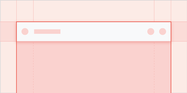
App bar & header
A dedicated space for important app-related functions
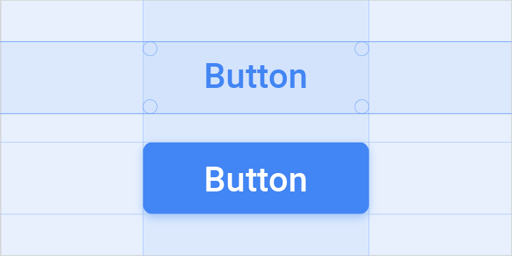
Buttons
Action affordances that communicate their purpose to the user
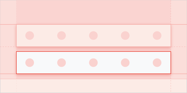
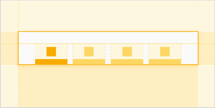
Control bar
An expandable set of controls associated with a particular view
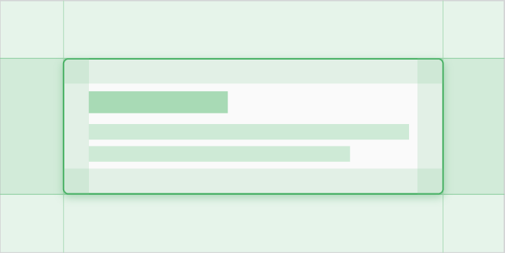
Dialogs
Cards featuring messages to users about timely or urgent information, sometimes with action options for responding

Grids
Scrollable arrays of images representing content items, with brief text beneath each image
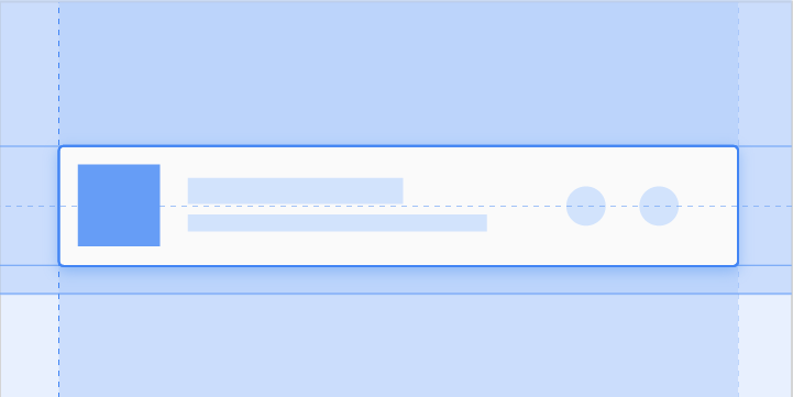
List items
Content displayed as lines of text (with optional small images or icons) in a single, scrollable column
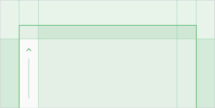
Minimized control bar
A smaller version of the control bar available across multiple views, with minimal controls and metadata
Subheader
A list tile that identifies a section of content in a grid or list view
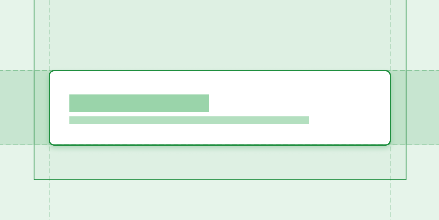
Toasts
Informational messages briefly displayed near the bottom of the screen