
Page Summary
-
Google Workspace add-ons use card stacks to manage the add-on interface, with separate stacks for homepage/non-contextual cards and contextual cards.
-
Navigation between cards is achieved by pushing and popping cards to and from these stacks using the
Navigationclass and its functions likepushCard,popCard, andpopToRoot. -
Contextual cards are triggered by specific user actions and can either replace the current card or display as a peek header, allowing users to choose whether to view them.
-
When returning multiple cards from a trigger function, the host application displays a card with a list of headers, allowing users to select and navigate to the desired card.
-
For optimal user experience, developers should prioritize clear navigation paths and consider using
updateCardfor state changes within a card,pushCardfor displaying further details, and a combination ofpopCardandpushCardfor updating previous and current cards.
Most card-based add-ons use multiple cards that represent different 'pages' of the add-on interface. For an effective user experience, use natural and intuitive navigation between cards in your add-on.
In the original Gmail add-ons, the host application handled transitions between different cards by pushing and popping cards to and from a single card stack, and displayed the top card of the stack.
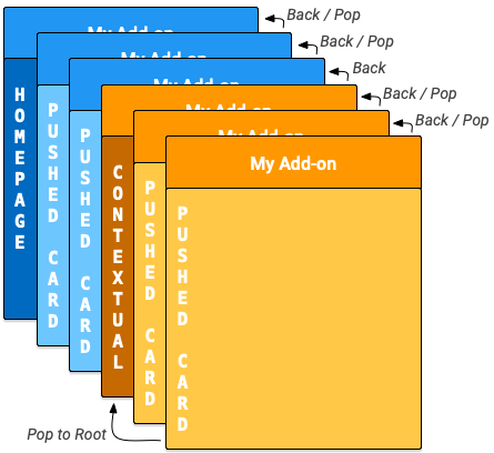
Google Workspace add-ons introduces
homepages and non-contextual cards. To
accommodate contextual and non-contextual cards, Google Workspace add-ons has an
internal card stack for each. When an add-on is opened
in a host, the corresponding homepageTrigger fires to create the first
homepage card on the stack (the dark blue "homepage" card in the following
diagram).
If a homepageTrigger is not defined, a default card is created, displayed,
and pushed onto the non-contextual stack. This first card is a root card.
The add-on can create additional non-contextual cards and push them onto the stack (the blue "pushed cards" in the diagram) as the user navigates through the add-on. The add-on UI displays the top card in the stack, so pushing new cards to the stack changes the display, and popping cards off the stack returns the display to previous cards.
If your add-on has a defined
contextual trigger,
when the user enters that context the trigger fires. The trigger function
builds the contextual card, but the UI display is updated based on the
DisplayStyle of the new
card:
- If the
DisplayStyleisREPLACE(the default), the contextual card (the dark orange "contextual" card in the diagram) replaces the currently displayed card. This effectively starts a new contextual card stack on top of the non-contextual card stack, and this contextual card is the root card of the contextual stack. - If the
DisplayStyleisPEEK, the UI instead creates a peeking header that appears at the bottom of the add-on sidebar, overlaying the current card. The peek header shows the new card's title and provides the user button controls that let them decide whether to view the new card or not. If they click the View button, the card replaces the current card (as described previously withREPLACE).
You can create additional contextual cards and push them onto the stack (the yellow "pushed cards" in the diagram). Updating the card stack changes the add-on UI to display the top card. If the user leaves a context, the contextual cards on the stack are removed and the display updates to the top non-contextual card or homepage.
If the user enters a context that the add-on doesn't define a contextual trigger for, the application doesn't create a new card and the current card remains.
The navigation actions described in the following section only act on cards from
the same context; for example,
popToRoot
from within a contextual card only pops all of the other contextual cards, and
won't affect homepage cards.
In contrast, the button is always available for the user to navigate from your contextual cards to your non-contextual cards.
Navigation methods
Create transitions between cards by adding or removing cards from the card
stacks. The Navigation class
includes functions to push and pop cards from the stacks. To build effective
card navigation, configure your
widgets to use navigation
actions. Push or pop multiple cards
simultaneously, but you can't remove the initial homepage card that is first
pushed onto the stack when the add-on starts.
To navigate to a new card in response to a user interaction with a widget, follow these steps:
- Create an
Actionobject and associate it with a callback function you define. - Call the widget's appropriate widget handler
function to
set the
Actionon that widget. - Implement the callback function that conducts the navigation. This function
is given an action event
object as an
argument and must do the following:
- Create a
Navigationobject to define the card change. A singleNavigationobject can contain multiple navigation steps, which are conducted in the order they are added to the object. - Create an
ActionResponseobject using theActionResponseBuilderclass and theNavigationobject. - Return the built
ActionResponse.
- Create a
When you build navigation controls, use these
Navigation object functions:
| Function | Description |
|---|---|
Navigation.pushCard |
Pushes a card onto the current stack. Build the card before you push it. |
Navigation.popCard |
Removes one card from the top of the stack. Equivalent of clicking the back arrow in the add-on header row. This doesn't remove root cards. |
Navigation.popToRoot |
Removes all cards from the stack except for the root card. Essentially resets that card stack. |
Navigation.popToNamedCard |
Pops cards from the stack until it reaches a card with the given name or the stack's root card. You can assign names to cards using the CardBuilder.setName function. |
Navigation.updateCard |
Does an in-place replacement of the current card, refreshing it's display in the UI. |
Follow navigation best practices
If a user interaction or event should result in re-rendering cards in the same
context, use
Navigation.pushCard,
Navigation.popCard,
and
Navigation.updateCard
methods to replace the existing cards. If a user interaction or event should
result in re-rendering cards in a different context, use
ActionResponseBuilder.setStateChanged
to force re-execution of your add-on in those contexts.
The following are navigation examples:
- If an interaction or event changes the state of the current card (for example,
adding a task to a task list), use
updateCard. - If an interaction or event provides further detail or prompts the user for
further action (for example, clicking an item's title to see more details, or
pressing a button to create a new Calendar event), use
pushCardto show the new page while allowing the user to exit the new page using the back-button. - If an interaction or event updates state in a previous card (for example,
updating an item's title from with the detail view), use something like
popCard,popCard,pushCard, andpopToRootto update previous card and the current card.
Refresh cards
Users can refresh a card by re-running the Apps Script trigger function registered in your manifest. Users trigger this refresh through an add-on menu item:
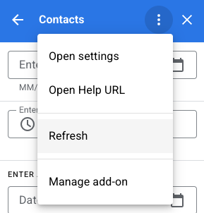
The application automatically adds this action to cards that homepageTrigger
or contextualTrigger trigger functions generate, as specified in your
add-on's manifest file (the 'roots' of the contextual
and non-contextual card stacks).
Return multiple cards

Homepage or contextual trigger functions are used to build and return either a
single Card object or an array of
Card objects that the application
UI displays.
If there is only one card, it is added to the non-contextual or contextual stack as the root card and the host application UI displays it.
If the returned array includes more than one built
Card object, the host application
instead displays a new card, which contains a list of each card's header. When
the user clicks any of those headers, the UI displays the corresponding card.
When the user selects a card from the list, that card is pushed onto the current stack and the host application displays it. The button returns the user to the card header list.
This 'flat' card arrangement works if the add-on doesn't need transitions between cards. However, in most cases, it's better practice to directly define card transitions, and have your homepage and contextual trigger functions return a single card object.
Example
Here is an example that shows how to construct several cards with navigation
buttons that jump between them. These cards can be added to either the
contextual or non-contextual stack by pushing the card returned
by the createNavigationCard function in or outside of a particular context.
/**
 *  Create the top-level card, with buttons leading to each of three
 *  'children' cards, as well as buttons to backtrack and return to the
 *  root card of the stack.
 *  @return {Card}
 */
function createNavigationCard() {
  // Create a button set with actions to navigate to 3 different
  // 'children' cards.
  var buttonSet = CardService.newButtonSet();
  for(var i = 1; i <= 3; i++) {
    buttonSet.addButton(createToCardButton(i));
  }

  // Build the card with all the buttons (two rows)
  var card = CardService.newCardBuilder()
      .setHeader(CardService.newCardHeader().setTitle('Navigation'))
      .addSection(CardService.newCardSection()
          .addWidget(buttonSet)
          .addWidget(buildPreviousAndRootButtonSet()));
  return card.build();
}

/**
 *  Create a button that navigates to the specified child card.
 *  @return {TextButton}
 */
function createToCardButton(id) {
  var action = CardService.newAction()
      .setFunctionName('gotoChildCard')
      .setParameters({'id': id.toString()});
  var button = CardService.newTextButton()
      .setText('Card ' + id)
      .setOnClickAction(action);
  return button;
}

/**
 *  Create a ButtonSet with two buttons: one that backtracks to the
 *  last card and another that returns to the original (root) card.
 *  @return {ButtonSet}
 */
function buildPreviousAndRootButtonSet() {
  var previousButton = CardService.newTextButton()
      .setText('Back')
      .setOnClickAction(CardService.newAction()
          .setFunctionName('gotoPreviousCard'));
  var toRootButton = CardService.newTextButton()
      .setText('To Root')
      .setOnClickAction(CardService.newAction()
          .setFunctionName('gotoRootCard'));

  // Return a new ButtonSet containing these two buttons.
  return CardService.newButtonSet()
      .addButton(previousButton)
      .addButton(toRootButton);
}

/**
 *  Create a child card, with buttons leading to each of the other
 *  child cards, and then navigate to it.
 *  @param {Object} e object containing the ID of the card to build.
 *  @return {ActionResponse}
 */
function gotoChildCard(e) {
  var id = parseInt(e.parameters.id);  // Current card ID
  var id2 = (id==3) ? 1 : id + 1;      // 2nd card ID
  var id3 = (id==1) ? 3 : id - 1;      // 3rd card ID
  var title = 'CARD ' + id;

  // Create buttons that go to the other two child cards.
  var buttonSet = CardService.newButtonSet()
    .addButton(createToCardButton(id2))
    .addButton(createToCardButton(id3));

  // Build the child card.
  var card = CardService.newCardBuilder()
      .setHeader(CardService.newCardHeader().setTitle(title))
      .addSection(CardService.newCardSection()
          .addWidget(buttonSet)
          .addWidget(buildPreviousAndRootButtonSet()))
      .build();

  // Create a Navigation object to push the card onto the stack.
  // Return a built ActionResponse that uses the navigation object.
  var nav = CardService.newNavigation().pushCard(card);
  return CardService.newActionResponseBuilder()
      .setNavigation(nav)
      .build();
}

/**
 *  Pop a card from the stack.
 *  @return {ActionResponse}
 */
function gotoPreviousCard() {
  var nav = CardService.newNavigation().popCard();
  return CardService.newActionResponseBuilder()
      .setNavigation(nav)
      .build();
}

/**
 *  Return to the initial add-on card.
 *  @return {ActionResponse}
 */
function gotoRootCard() {
  var nav = CardService.newNavigation().popToRoot();
  return CardService.newActionResponseBuilder()
      .setNavigation(nav)
      .build();
}