|
|
 View source on GitHub View source on GitHub
|
Introduction
Meridian Scenario Planner is a tool that automates the creation of comprehensive reports that analyze the effectiveness of various marketing channels and their impact on sales or KPIs. The resulting report shows Meridian based marketing analysis and supports interactive budget optimization.
Key Features
- User Friendly: With a trained Meridian model, anyone can generate an analysis report with intuitive configuration and a few clicks.
- Interactive Budget Optimization: Users can adjust budget scenarios based on the real business requirement and visualize results interactively .
- Collaboration: Facilitates collaboration among marketing teams by providing a centralized report.
- Algorithm Transparency:Users have full control from model loading to report generation.
- Scalability:Users can extend this tool and integrate it to their infrastructure, for example, report embedding, cloud resource integration etc.
How To Obtain A Report
This Colab notebook is provided as the starting point for report generation. This Colab assumes that at least one trained model is stored in the Google Drive or Google Cloud Storage that the Colab Notebook has access to. If not, a model can be created from the Meridian Demo Colab.
Dashboard Visualization And Configuration
Marketing analysis results visualizations
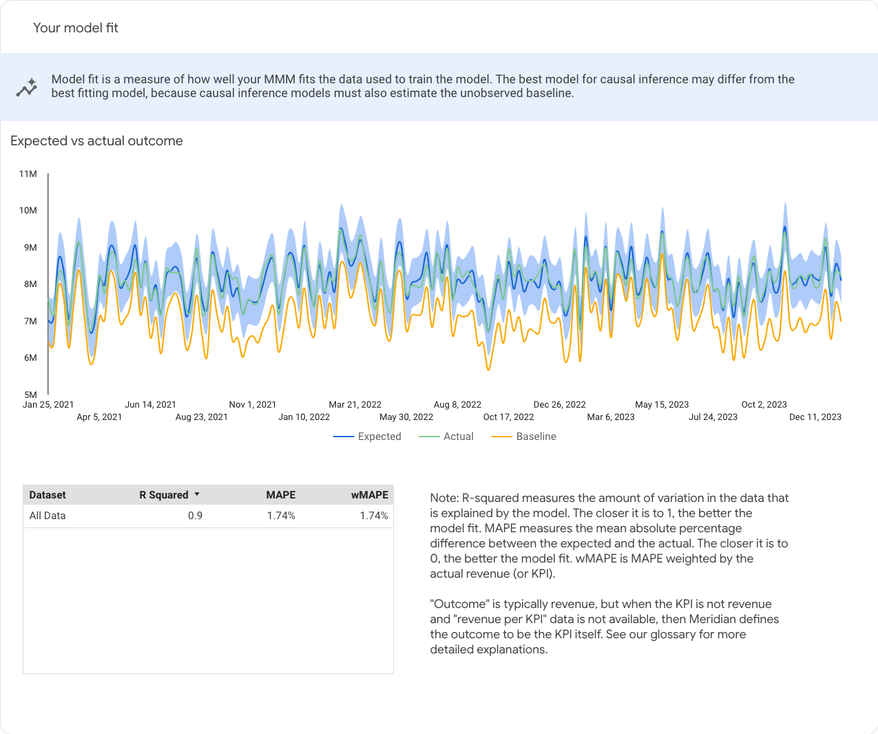
Model fit
The Your model fit section lets you check statistical goodness of fit. These plots facilitate the assessment of the model's performance and are a measure of how well your MMM fits the data used to train the model.
Model fit statistics can also be useful for comparing candidate models. However, keep in mind that goodness-of-fit metrics don't give a complete picture of how good a model is for causal inference. The best model for causal inference may differ from the best-fitting model, because causal inference models must also estimate the unobserved baseline.
Expected vs actual outcome1
The Expected vs actual outcome chart lets you compare the expected, actual, and baseline outcome. Hover over any point in the chart to see a pane that displays the time period for that point, the specific numerical data for expected, actual, and baseline outcome, and the confidence interval.
Model fit metrics
The Model fit metrics table shows the dataset metrics for all of the following types:
- R-squared: Measure the amount of variation in the data that is explained by the model. The closer the value is to 1, the more accurate the model is.
- Mean Absolute Percentage Error (MAPE): Measures the mean absolute percentage difference between the expected and the actual. The closer the value is to 0, the more accurate the model is.
- Weighted Mean Absolute Percentage Error (wMAPE): This measurement is weighted by the actual revenue (or KPI). Weighted is generally preferred over unweighted because it is less influenced by geos and weeks with relatively small revenue (or KPI). For more information, see wMAPE.
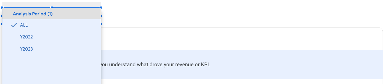
Analysis period selection
For charts in "Channel contribution" and "Return on investment", you can change the analysis period from the drop-down list. The list of time periods is determined by the time breakdown setup in the report generation spec.
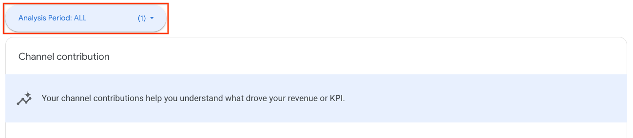
Channel contribution
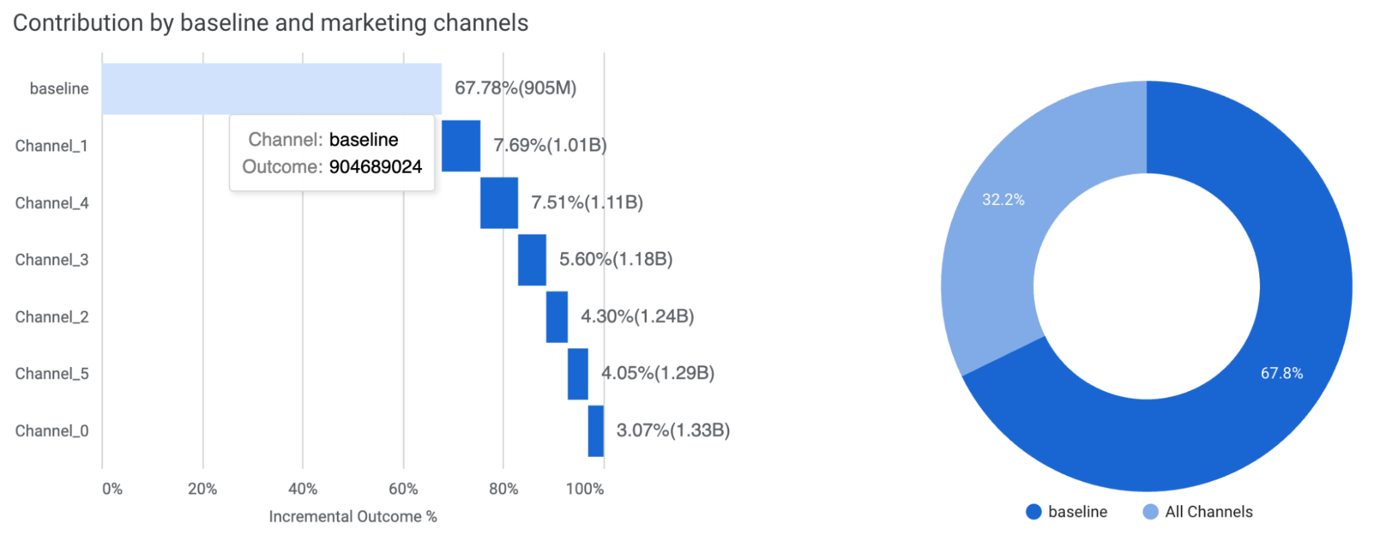
The Channel contribution section provides an analysis of the impact of your media and non-media activities on your revenue or KPI performance. It lets you compare key metrics such as return on investment (ROI), percent of spend, and percent of incremental revenue or KPI across different channels. Additionally, this section lets you break down the contribution by baseline, pricing promotions, and various marketing channels.
- Contribution by baseline, price promotions, and marketing channels: Use
these charts (Figure 12) to understand the overall financial impact of your
combined marketing strategies and tactics versus the baseline.
Baseline is what would have happened, such as for your brand or product line, in the absence of any marketing channel contributions. Any company expects to have sales without marketing. Some brands expect to see more than others due to factors such as previously established brand recognition and seasonal demand patterns.
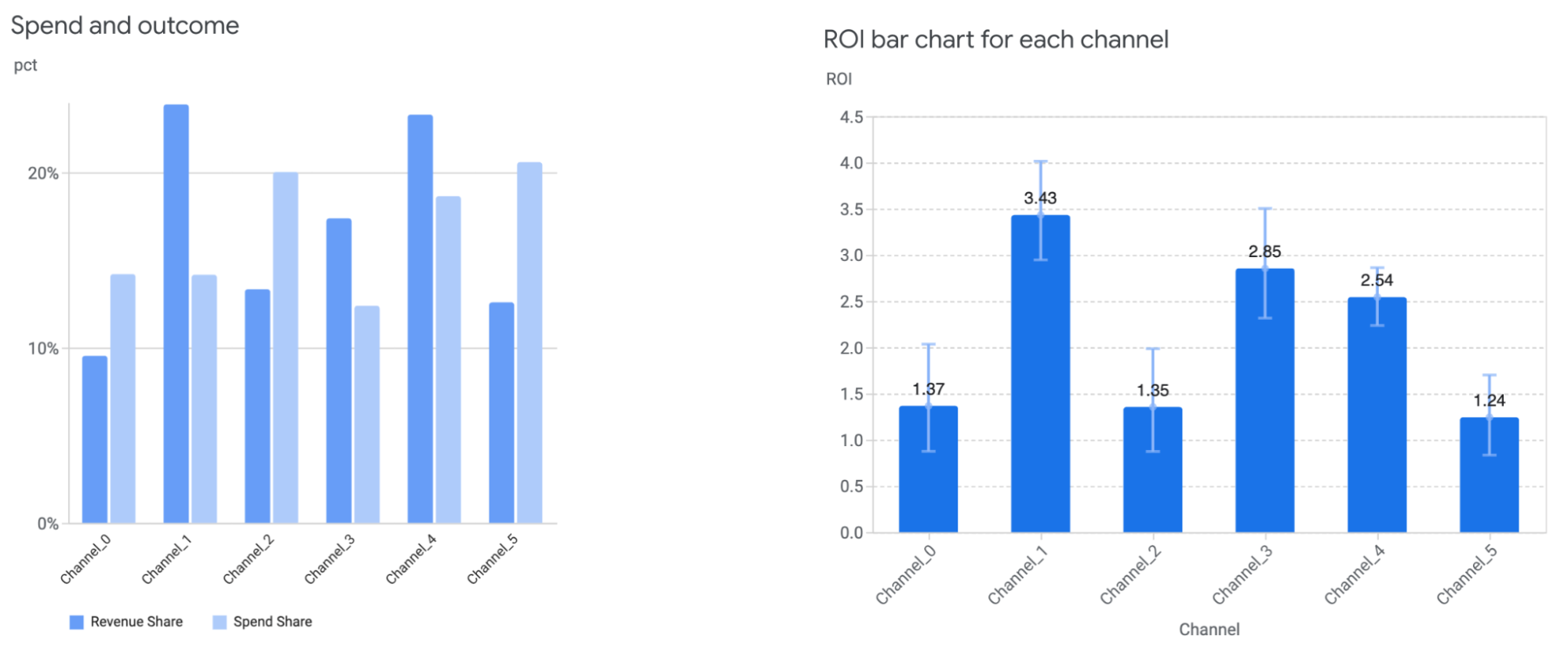
Estimating baseline revenue or KPI helps put media contributions into perspective and drive actionable marketing decisions. For example, you might see that the rise in your overall sales was due to a 12% contribution from TV ads, which can help justify the ad spend and marketing plan. Spend and outcome: Shows each channel's percent of media spend and the percent of contribution to the total incremental revenue or KPI. See Figure 13-left for example. This chart gives a high level overview of relative channel size and performance.
ROI for each channel: Compares the ROI between channels using a bar chart. See Figure 13-right for example.
Return on investment
The return on investment (ROI) charts help you understand how your marketing activities impacted your business objectives. ROI is defined as incremental outcome per dollar spent.
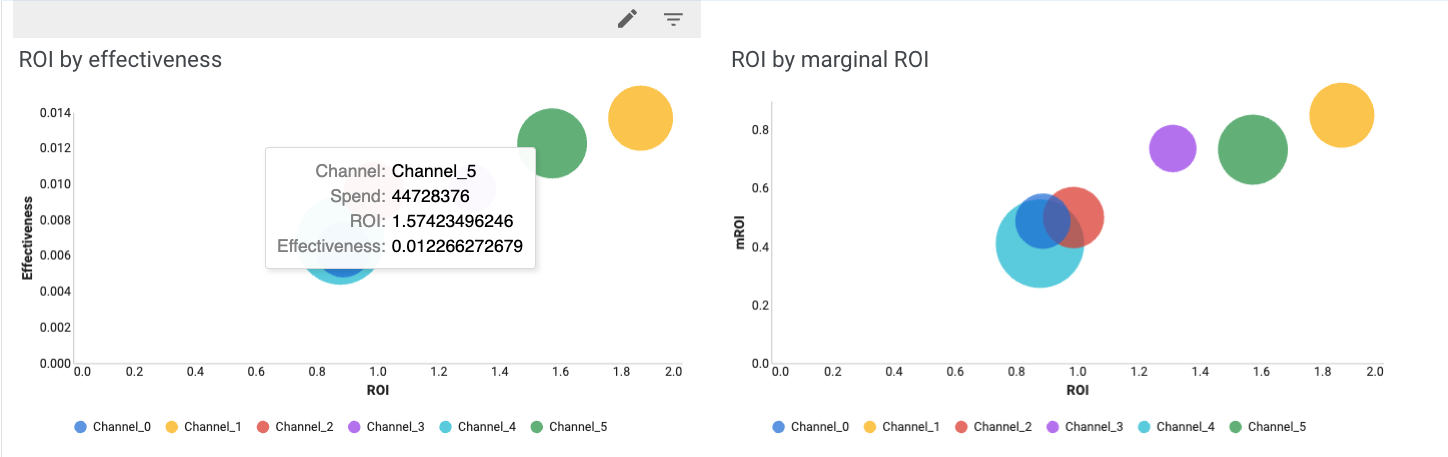
Comparing ROI by effectiveness and marginal ROI across channels provides a deep, holistic view channel performance. Effectiveness is defined as incremental outcome per media unit.
Marginal ROI (mROI) is an indicator of the efficiency of additional spend. For example, channels with high ROI but low mROI are likely in the saturation phase. So any additional investment won't likely bring in the return that the initial investments did. Conversely, channels with high ROI and high mROI perform well and will likely continue to yield high returns with additional spending.
Interactive budget optimization
Optimizations help guide how to allocate the budget for the next period. The key feature in the Meridian Analysis Report is that the budget optimization is interactive, so one can try out fixed and flexible budget planning scenarios and a variety of constraint options.
Set up configurations
| ‼️The budget optimization configuration page takes inputs in steps. To prevent configuration conflicts and unnecessary computations, it is recommended to use the report in Edit mode and pause the report computation before configuring and resume it once finished to trigger the report update. See Pause report updates for more details. |
|---|
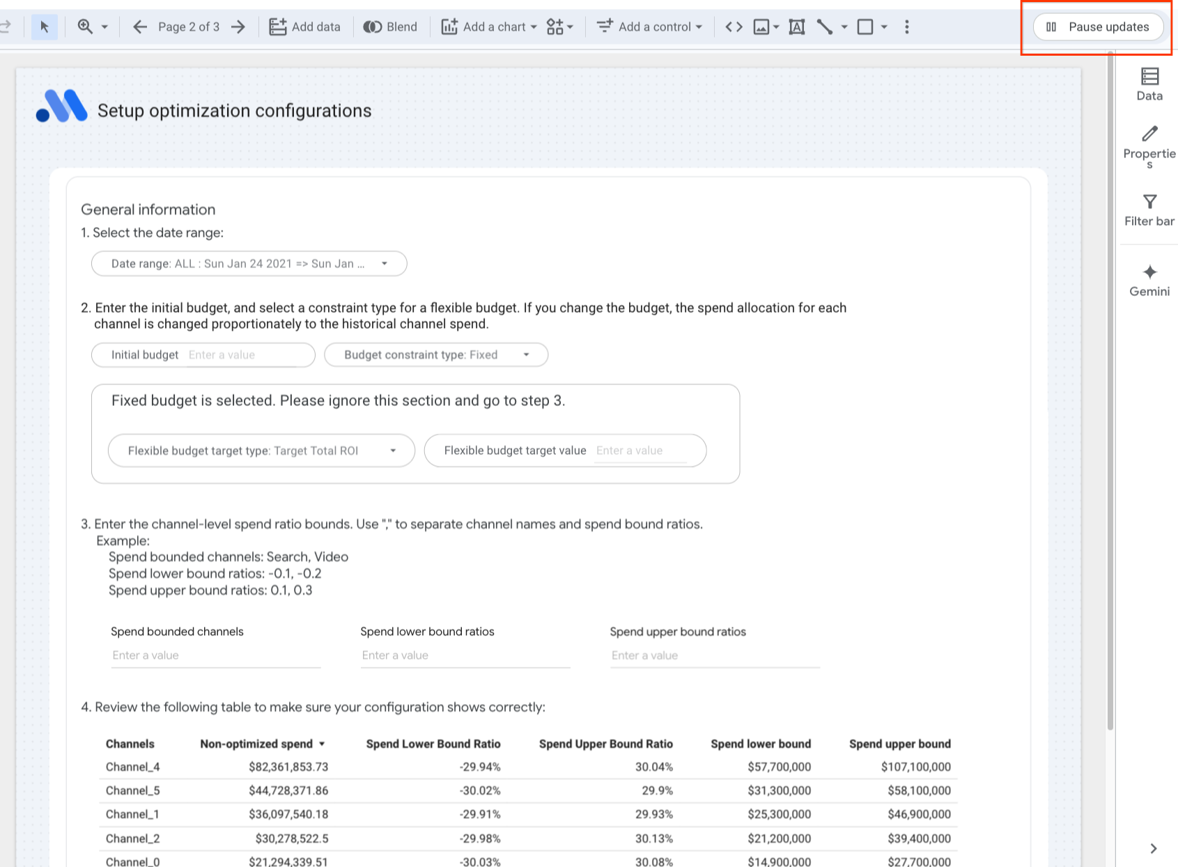
1. Select date range
The available date ranges are determined by the time breakdown configuration in the report generation specifications.
2. Budget constraints
Enter your initial budget or unspecify to use the historical budget in the data, and select one of the following from the Budget constraint type drop-down list:
- Fixed: Finds the optimal allocation across channels for a given budget
to maximize the overall ROI.
Note: For a fixed budget, don't set the parameters for the flexible budget case. Doing so will cause an error. - Flexible: Maximizes your total incremental outcome or determines the
maximum amount you can spend on each channel, depending on which flexible
budget target you set.
- Select the flexible budget target type:
- Target Total ROI: Maximizes your total incremental outcome while maintaining a target minimum overall ROI.
- Target channel mROI: Determines the maximum amount you can spend on each channel, while still achieving a target minimum marginal ROI on each channel.
- Enter the flexible budget target value:
- For target total ROI: Enter the minimum overall target ROI for a flexible budget scenario.
- For target channel marginal ROI: Enter the minimum target channel marginal ROI for a flexible budget scenario.
3. Channel spend constraints
The budget optimization explores the available allocation space and identifies
the optimal channel spend allocation to optimize the KPI/revenue. The
exploration space is determined by min_spend_shift_ratio and
max_spend_shift_ratio.
More specifically, the minimum channel spend in the exploration space is:
min_channel_spend=(1-min_spend_shift_ratio) * historical_channel_spend
The maximum channel spend is:
max_channel_spend=(1+max_spend_shift_ratio) * historical_channel_spend
By default, the entire exploration space is used to find the optimal spend allocation. In Step 3, users can add additional spend constraints at the channel level to meet their requirements.
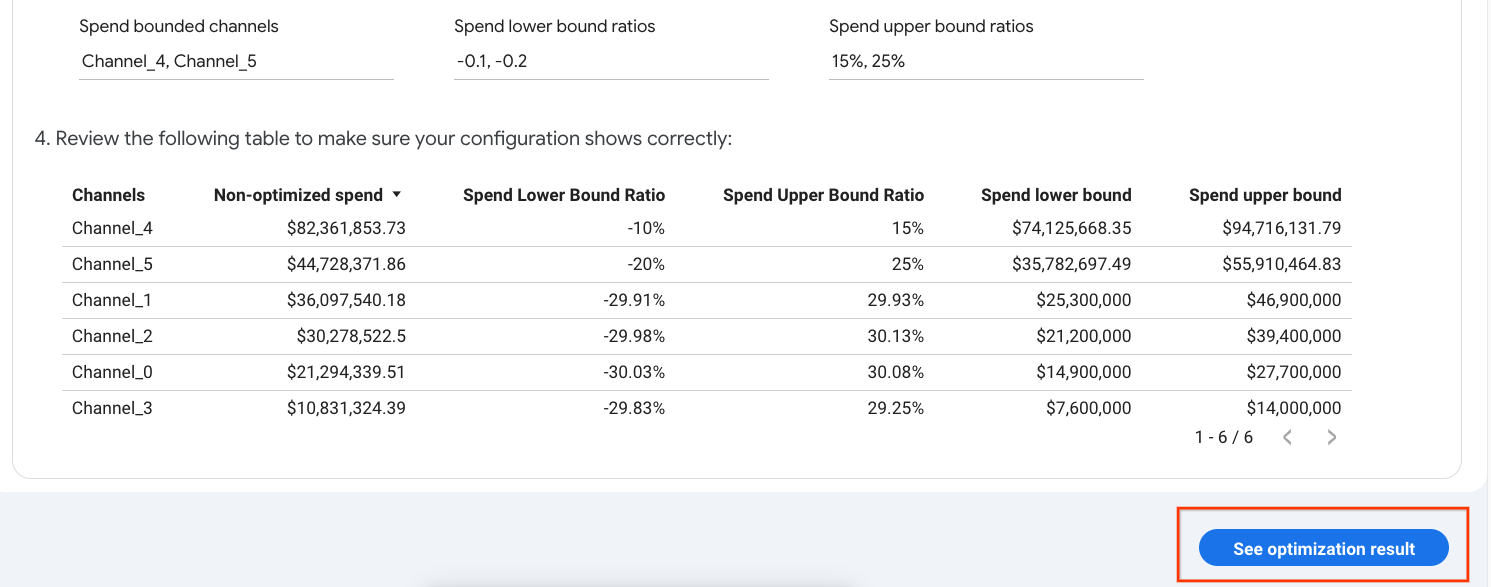
To do so, enter the channel-level spend ratio bounds. Use commas to separate channel names and spend bound ratios. For the ratio values, use either decimals or percentages for each input box. Don't mix the two formats in the same input box.
Example:
Spend bounded channels: Search,Video
Spend lower bound ratios: -0.1, -0.2
Spend upper bound ratios: 15%, 25%
This will set the available spend range of "Search" to between -10% and 15% of its original spend.
Note the following:
- Spend lower bound ratio is a non-positive value. The valid range is
determined by
min_spend_shift_ratioand your initial budget at step 2. A low initial budget will provide less room to adjust your lower bound. - Spend upper bound ratio is a non-negative value. The valid range is
determined by
max_spend_shift_ratioand your initial budget at step 2. A high initial budget will provide less room to adjust your upper bound.
4. Review your configuration in the configuration table.
Review the resulting budget optimization scenario. If everything looks good, use the report in View mode and click the button at the bottom right corner to see the optimization result.
TIP: Before setting channel level spend constraints, check the "Spend Lower Bound Ratio" and "Spend Upper Bound Ratio" columns in the table to get a sense of the valid range.
| ‼️Ensure no system errors are present before navigating to another page. A known issue exists within Looker Studio, where updating charts on the other page when a system error exists may cause those charts to become unresponsive. To prevent this, verify that the review table is visualized correctly before proceeding. If this issue occurs, refresh the report and start again. |
|---|
Interpret the optimization results
In the Meridian Analysis Report, the optimizations are interactive. You can change the options on the Setup page to see your current data modeled through these filters.
Optimization overview
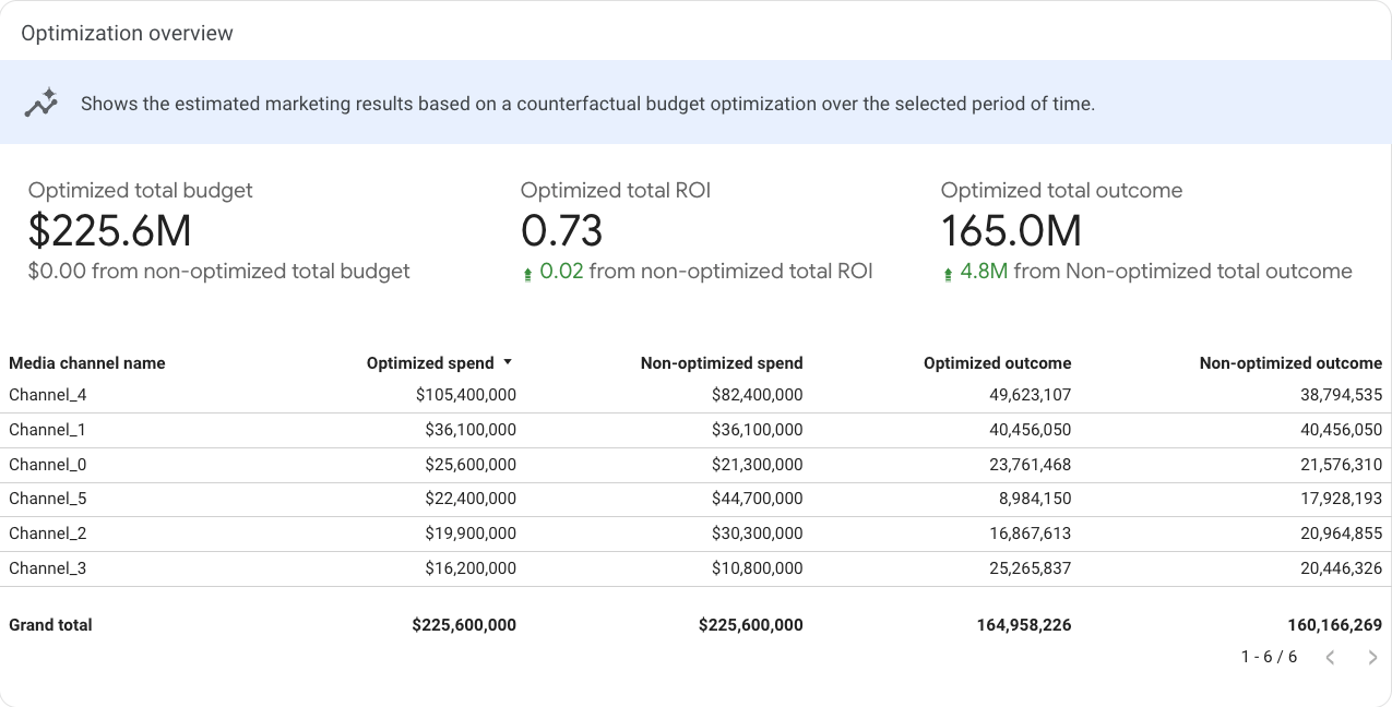
The Optimization overview section is a summary table that shows the optimized total budget, total ROI, and total outcome (KPI/revenue) compared with the non-optimized data for the time period you specified. Additionally, this section shows the optimized and non-optimized spend and outcome at the channel level.
Note that if a target total ROI is set for flexible budget optimization, the optimized total ROI may be lower than the minimum target value if the spend limit is reached.
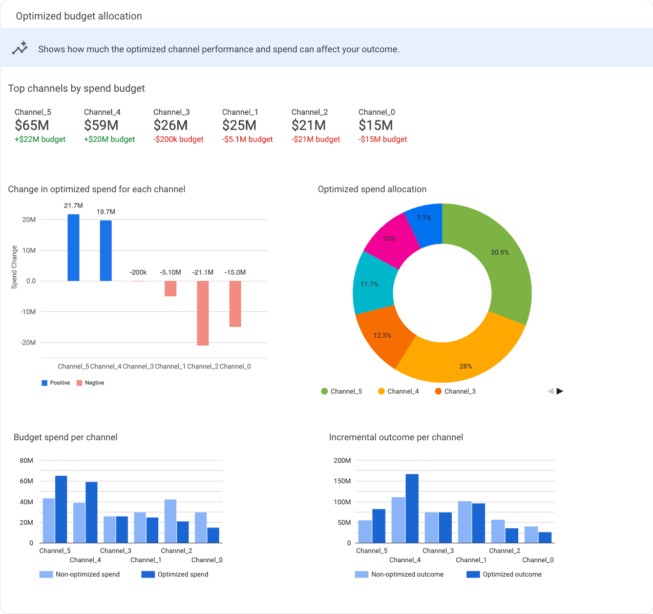
Optimized budget allocation
This section contains a summary table that shows how much the optimized channel performance and spend can affect your revenue/KPI, and several charts that give different views of the changes of optimized spend for each channel.
Change in optimized spend for each channel shows the budget optimization recommended spend change by channel. Change is defined as the difference between optimized and current spend.
Optimized spend allocation shows the percent of spend allocated to each channel.
Budget spend per channel compares the non-optimized and optimized budget spend for each channel.
Incremental outcome per channel compares the amount of non-optimized and optimized incremental outcome for each channel.
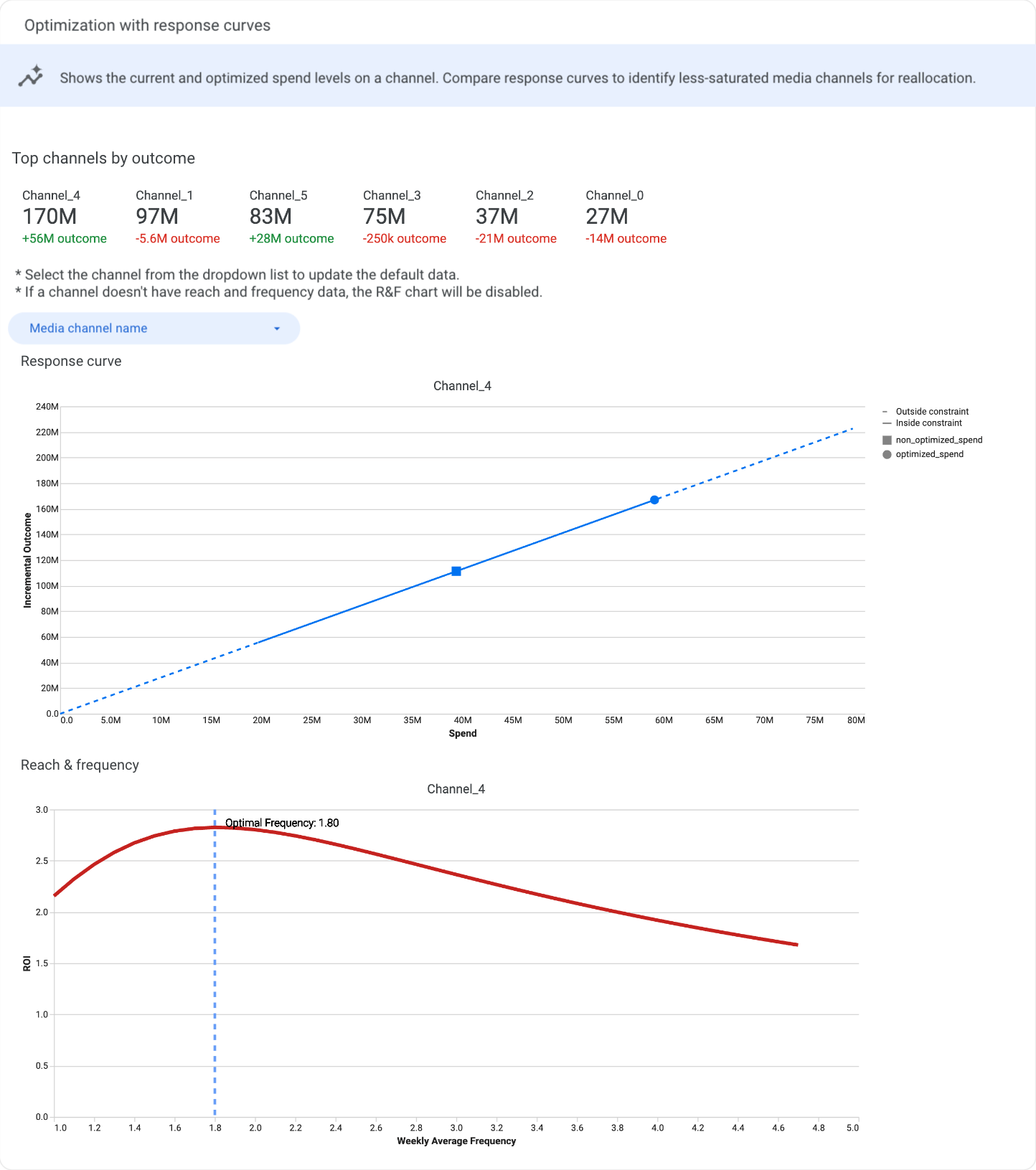
Optimization with response curves
The table shows the top channels by outcome.
The response curves show incremental outcome as a function of spend. The current and optimal spend levels are plotted as points on this curve. Response curves show how the return per monetary unit spent eventually diminishes, which can further guide budget decisions.
In the response curve charts, the solid line represents the spend constraint bounds that you set for the optimization. The dotted line represents spending outside of the constraints.
The plot also indicates two points:
- The circle represents the current spend level
- The square represents the optimized spend level
By default, a Response curve chart and a Reach & frequency chart are displayed, but they are not synchronized.
Select a channel from the Media channel name drop-down list to see the corresponding response curve. If reach and frequency is available for a channel, the R&F chart is automatically updated with the corresponding data. If there is no R&F data for the channel, the R&F chart is disabled.
Data Security
- Sharing the temporary dashboard is better than sharing a persisted dashboard.
- Give the minimum access, prefer viewer access over editor access.
Dashboard Link Types
Looker Studio generates two distinct types of dashboard links:
- Temporary (Creation) Link:
https://lookerstudio.google.com/reporting/create?...Generated from Colab. This is an unsaved instance. - Persisted (Saved) Link:
https://lookerstudio.google.com/c/u/0/reporting/...Created only after the user clicks "Edit and Save" on a temporary dashboard.
Data Access & Credentials
Sharing a Persisted Dashboard: The sharer remains the Owner. Viewers effectively "impersonate" the Owner, viewing data using the Owner's credentials without needing direct access to the underlying data source.
Sharing a Temporary Dashboard: The recipient cannot view the data immediately. They must "Edit and Save" the dashboard first, becoming the new Owner. This forces them to authenticate using their own credentials and data access rights.
Security Recommendation
To maximize data security, share the Temporary Dashboard link. This ensures the recipient must own the report and possess the necessary underlying data access rights, eliminating the risk of unintended data exposure through owner credential impersonation.
Note on Editor Access: Granting "Editor" access on a persisted dashboard is discouraged. An Editor can potentially modify data connections to view unauthorized data with the Owner's credentials. If editing is required, the user should make their own copy of the report.