Tài liệu này trình bày cách tuân theo kiểu Glass và triển khai các phương pháp hay nhất thường gặp về giao diện người dùng có thể tối ưu hoá trải nghiệm của người dùng. Nó bao gồm các phần tử sau trên giao diện người dùng:
Chủ đề
Chủ đề Glass mà bạn nên dùng có những đặc điểm sau:
- Hiển thị các hoạt động ở chế độ toàn màn hình mà không có thanh thao tác.
- Áp dụng nền đen đồng nhất.
- Đặt màu sáng hơn cho hiệu ứng cạnh màu.
- Áp dụng màu văn bản trắng.
Sau đây là các chế độ cài đặt giao diện được đề xuất cho Glass:
 <style name="AppTheme" parent="Theme.AppCompat.NoActionBar">
   <item name="android:windowBackground">@android:color/black</item>
   <item name="android:colorEdgeEffect">@android:color/white</item>
   <item name="android:textColor">@android:color/white</item>
 </style>
Bố cục XML
Sau đây là 2 bố cục thẻ cơ bản mà các mảnh của bạn có thể mở rộng:
Bố cục chính
Bố cục này xác định khoảng đệm và chân trang tiêu chuẩn được đề xuất cho thẻ. Đưa quan điểm của riêng bạn vào
FrameLayout trống.
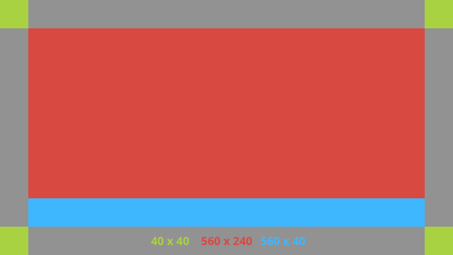
Dưới đây là một ví dụ về bố cục XML:
<?xml version="1.0" encoding="utf-8"?>
<androidx.constraintlayout.widget.ConstraintLayout
    xmlns:android="http://schemas.android.com/apk/res/android"
    xmlns:app="http://schemas.android.com/apk/res-auto"
    android:id="@+id/layout"
    android:layout_width="match_parent"
    android:layout_height="match_parent">

  <FrameLayout
      android:id="@+id/body_layout"
      android:layout_width="0dp"
      android:layout_height="0dp"
      android:layout_margin="@dimen/glass_card_margin"
      app:layout_constraintBottom_toTopOf="@id/footer"
      app:layout_constraintEnd_toEndOf="parent"
      app:layout_constraintStart_toStartOf="parent"
      app:layout_constraintTop_toTopOf="parent">

    <!-- Put your widgets inside this FrameLayout. -->

  </FrameLayout>

  <!-- The footer view will grow to fit as much content as possible while the
         timestamp view keeps its width. If the footer text is too long, it
         will be ellipsized with a 40dp margin between it and the timestamp. -->

  <TextView
      android:id="@+id/footer"
      android:layout_width="0dp"
      android:layout_height="wrap_content"
      android:layout_marginStart="@dimen/glass_card_margin"
      android:layout_marginEnd="@dimen/glass_card_margin"
      android:layout_marginBottom="@dimen/glass_card_margin"
      android:ellipsize="end"
      android:singleLine="true"
      android:textAppearance="?android:attr/textAppearanceSmall"
      app:layout_constraintBottom_toBottomOf="parent"
      app:layout_constraintEnd_toStartOf="@id/timestamp"
      app:layout_constraintStart_toStartOf="parent" />

  <TextView
      android:id="@+id/timestamp"
      android:layout_width="0dp"
      android:layout_height="wrap_content"
      android:layout_marginEnd="@dimen/glass_card_margin"
      android:layout_marginBottom="@dimen/glass_card_margin"
      android:ellipsize="end"
      android:singleLine="true"
      android:textAlignment="viewEnd"
      android:textAppearance="?android:attr/textAppearanceSmall"
      app:layout_constraintBottom_toBottomOf="parent"
      app:layout_constraintEnd_toEndOf="parent" />

</androidx.constraintlayout.widget.ConstraintLayout>
Bố cục cột bên trái
Bố cục này xác định một cột bên trái có chiều rộng bằng 1/3 và một cột bên phải có chiều rộng bằng 2/3 dưới dạng hai lớp
FrameLayout mà bạn có thể đặt các khung hiển thị vào. Tham khảo hình ảnh sau đây để xem ví dụ.
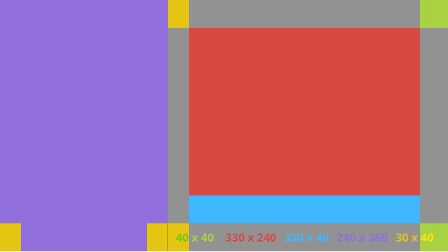
Dưới đây là một ví dụ về bố cục XML:
<?xml version="1.0" encoding="utf-8"?>
<androidx.constraintlayout.widget.ConstraintLayout
    xmlns:android="http://schemas.android.com/apk/res/android"
    xmlns:app="http://schemas.android.com/apk/res-auto"
    android:layout_width="match_parent"
    android:layout_height="match_parent">

  <FrameLayout
      android:id="@+id/left_column"
      android:layout_width="0dp"
      android:layout_height="match_parent"
      android:background="#303030"
      app:layout_constraintBottom_toBottomOf="parent"
      app:layout_constraintStart_toStartOf="parent"
      app:layout_constraintTop_toTopOf="parent"
      app:layout_constraintWidth_percent=".333">

    <!-- Put widgets for the left column inside this FrameLayout. -->

  </FrameLayout>

  <FrameLayout
      android:id="@+id/right_column"
      android:layout_width="0dp"
      android:layout_height="0dp"
      android:layout_marginTop="@dimen/glass_card_two_column_margin"
      android:layout_marginStart="@dimen/glass_card_two_column_margin"
      android:layout_marginBottom="@dimen/glass_card_two_column_margin"
      android:layout_marginEnd="@dimen/glass_card_margin"
      app:layout_constraintBottom_toTopOf="@id/footer"
      app:layout_constraintEnd_toEndOf="parent"
      app:layout_constraintStart_toEndOf="@id/left_column"
      app:layout_constraintTop_toTopOf="parent">

    <!-- Put widgets for the right column inside this FrameLayout. -->

  </FrameLayout>

  <!-- The footer view will grow to fit as much content as possible while the
         timestamp view keeps its width. If the footer text is too long, it
         will be ellipsized with a 40dp margin between it and the timestamp. -->

  <TextView
      android:id="@+id/footer"
      android:layout_width="0dp"
      android:layout_height="wrap_content"
      android:layout_marginStart="@dimen/glass_card_margin"
      android:layout_marginEnd="@dimen/glass_card_margin"
      android:layout_marginBottom="@dimen/glass_card_margin"
      android:ellipsize="end"
      android:singleLine="true"
      android:textAppearance="?android:attr/textAppearanceSmall"
      app:layout_constraintBottom_toBottomOf="parent"
      app:layout_constraintEnd_toStartOf="@id/timestamp"
      app:layout_constraintStart_toEndOf="@id/left_column" />

  <TextView
      android:id="@+id/timestamp"
      android:layout_width="0dp"
      android:layout_height="wrap_content"
      android:layout_marginEnd="@dimen/glass_card_margin"
      android:layout_marginBottom="@dimen/glass_card_margin"
      android:ellipsize="end"
      android:singleLine="true"
      android:textAlignment="viewEnd"
      android:textAppearance="?android:attr/textAppearanceSmall"
      app:layout_constraintBottom_toBottomOf="parent"
      app:layout_constraintEnd_toEndOf="parent" />

</androidx.constraintlayout.widget.ConstraintLayout>
Phương diện chuẩn
Sử dụng các bố cục sau cùng với bố cục trước đó hoặc bố cục của riêng bạn để tạo một tệp tuân thủ kiểu tiêu chuẩn của Glass. Tạo tệp này dưới dạng res/values/dimens.xml trong dự án Android của bạn.
<?xml version="1.0" encoding="utf-8"?>
<resources>

  <!-- The recommended margin for the top, left, and right edges of a card. -->
  <dimen name="glass_card_margin">40dp</dimen>

  <!-- The recommended margin between the bottom of the card and the footer. -->
  <dimen name="glass_card_footer_margin">50dp</dimen>

  <!-- The recommended margin for the left column of the two-column card. -->
  <dimen name="glass_card_two_column_margin">30dp</dimen>

</resources>
Trình đơn
Bạn nên dùng
RecyclerView để tạo trình đơn. Các tệp này phải dựa trên tệp trình đơn Android tiêu chuẩn trong tài nguyên dự án Android Studio. Android cho phép bạn ghi đè quá trình tạo trình đơn tiêu chuẩn và thay thế bằng quá trình triển khai của riêng bạn. Để thực hiện việc này, hãy làm theo các bước sau:
- Tạo bố cục bằng
RecyclerViewvà đặt bố cục đó làm khung hiển thị choActivity. - Đặt
RecyclerViewvà đối tượng chuyển đổi của nó để sử dụng tập hợp các mục trong trình đơn mới tạo. - Ghi đè phương thức
onCreateOptionsMenu.- Tăng kích thước trình đơn và thêm phần tử mới vào tập hợp cho từng mục trong trình đơn.
- Gọi phương thức
notifyDataSetChangedtrên trình chuyển đổi.
Kotlin
    override fun onCreateOptionsMenu(menu: Menu): Boolean {
        val menuResource = intent
            .getIntExtra(EXTRA_MENU_KEY, EXTRA_MENU_ITEM_DEFAULT_VALUE)
        if (menuResource != EXTRA_MENU_ITEM_DEFAULT_VALUE) {
            menuInflater.inflate(menuResource, menu)
            for (i in 0 until menu.size()) {
                val menuItem = menu.getItem(i)
                menuItems.add(
                    GlassMenuItem(
                        menuItem.itemId, menuItem.icon,
                        menuItem.title.toString()
                    )
                )
                adapter.notifyDataSetChanged()
            }
        }
        return super.onCreateOptionsMenu(menu)
    }
Java
    @Override
    public boolean onCreateOptionsMenu(Menu menu) {
      final int menuResource = getIntent()
          .getIntExtra(EXTRA_MENU_KEY, EXTRA_MENU_ITEM_DEFAULT_VALUE);
      if (menuResource != EXTRA_MENU_ITEM_DEFAULT_VALUE) {
        final MenuInflater inflater = getMenuInflater();
        inflater.inflate(menuResource, menu);

        for (int i = 0; i < menu.size(); i++) {
          final MenuItem menuItem = menu.getItem(i);
          menuItems.add(
              new GlassMenuItem(menuItem.getItemId(), menuItem.getIcon(),
                  menuItem.getTitle().toString()));
          adapter.notifyDataSetChanged();
        }
      }
      return super.onCreateOptionsMenu(menu);
    }
- Sử dụng
OnScrollListenercùng vớiLayoutManagervàSnapHelperđể xác định lựa chọn nào đã được chọn. - Theo dõi cử chỉ
TAPđể xử lý sự kiện chọn mục trong trình đơn. - Tạo một
Intentcó thông tin về mục trong trình đơn đã chọn. - Đặt kết quả cho hoạt động này và kết thúc hoạt động.
- Gọi
startActivityForResulttừ mảnh hoặc hoạt động mà bạn muốn có trình đơn. Sử dụng cử chỉTAPcho mục đích này. - Ghi đè
onActivityResulttrong mảnh hoặc hoạt động gọi để xử lý mục trong trình đơn đã chọn.
Nguyên tắc
Sau đây là danh sách các đề xuất về cách thiết lập bố cục trình đơn:
- Kích thước văn bản:
64sp - Màu nền:
#96000000 - Sử dụng biểu tượng Material có kích thước
64dpx64dp - Đặt cờ giao diện
windowIsTranslucentthànhtrue
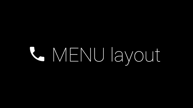
Hình ảnh sau đây là ví dụ về bố cục trình đơn tuỳ chỉnh:
Hãy xem Ứng dụng mẫu Thẻ để biết thông tin chi tiết về cách triển khai.
Trang có thể vuốt
Màn hình và bàn di chuột của Glass phối hợp với nhau để hiển thị các thẻ có thể vuốt một cách thuận tiện. Bạn có thể tạo các trang có thể vuốt trong hoạt động của mình bằng API
ViewPager tiêu chuẩn của Android.
Hãy xem tài liệu đào tạo về Thao tác vuốt màn hình để biết thêm thông tin về cách sử dụng
ViewPager Android để di chuyển qua các thẻ hoặc màn hình.