Z tego dokumentu dowiesz się, jak stosować styl Glass i wdrażać sprawdzone metody dotyczące interfejsu, które mogą zoptymalizować wrażenia użytkowników. Obejmuje te elementy interfejsu:
Motyw
Sugerowany przez nas motyw Glass ma te cechy:
- Wyświetla aktywności na pełnym ekranie bez paska działań.
- Stosuje jednolite czarne tło.
- Ustawia jaśniejszy kolor dla efektu krawędzi.
- Stosuje biały kolor tekstu.
Oto zalecane ustawienia motywu dla Glass:
 <style name="AppTheme" parent="Theme.AppCompat.NoActionBar">
   <item name="android:windowBackground">@android:color/black</item>
   <item name="android:colorEdgeEffect">@android:color/white</item>
   <item name="android:textColor">@android:color/white</item>
 </style>
Układy XML
Fragmenty mogą być rozwijane w 2 podstawowych układach kart:
Układ główny
Ten układ określa sugerowany standardowy odstęp i stopkę karty. Wpisz swoje opinie w pustym polu
FrameLayout.
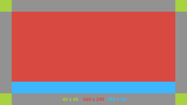
Oto przykładowy układ XML:
<?xml version="1.0" encoding="utf-8"?>
<androidx.constraintlayout.widget.ConstraintLayout
    xmlns:android="http://schemas.android.com/apk/res/android"
    xmlns:app="http://schemas.android.com/apk/res-auto"
    android:id="@+id/layout"
    android:layout_width="match_parent"
    android:layout_height="match_parent">

  <FrameLayout
      android:id="@+id/body_layout"
      android:layout_width="0dp"
      android:layout_height="0dp"
      android:layout_margin="@dimen/glass_card_margin"
      app:layout_constraintBottom_toTopOf="@id/footer"
      app:layout_constraintEnd_toEndOf="parent"
      app:layout_constraintStart_toStartOf="parent"
      app:layout_constraintTop_toTopOf="parent">

    <!-- Put your widgets inside this FrameLayout. -->

  </FrameLayout>

  <!-- The footer view will grow to fit as much content as possible while the
         timestamp view keeps its width. If the footer text is too long, it
         will be ellipsized with a 40dp margin between it and the timestamp. -->

  <TextView
      android:id="@+id/footer"
      android:layout_width="0dp"
      android:layout_height="wrap_content"
      android:layout_marginStart="@dimen/glass_card_margin"
      android:layout_marginEnd="@dimen/glass_card_margin"
      android:layout_marginBottom="@dimen/glass_card_margin"
      android:ellipsize="end"
      android:singleLine="true"
      android:textAppearance="?android:attr/textAppearanceSmall"
      app:layout_constraintBottom_toBottomOf="parent"
      app:layout_constraintEnd_toStartOf="@id/timestamp"
      app:layout_constraintStart_toStartOf="parent" />

  <TextView
      android:id="@+id/timestamp"
      android:layout_width="0dp"
      android:layout_height="wrap_content"
      android:layout_marginEnd="@dimen/glass_card_margin"
      android:layout_marginBottom="@dimen/glass_card_margin"
      android:ellipsize="end"
      android:singleLine="true"
      android:textAlignment="viewEnd"
      android:textAppearance="?android:attr/textAppearanceSmall"
      app:layout_constraintBottom_toBottomOf="parent"
      app:layout_constraintEnd_toEndOf="parent" />

</androidx.constraintlayout.widget.ConstraintLayout>
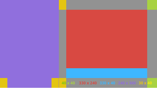
Układ z lewą kolumną
Ten układ definiuje kolumnę po lewej stronie o szerokości 1/3 i kolumnę po prawej stronie o szerokości 2/3 w postaci 2 klas
FrameLayout, w których możesz umieścić widoki. Przyjrzyj się poniższemu obrazowi, aby zobaczyć przykład.
Oto przykładowy układ XML:
<?xml version="1.0" encoding="utf-8"?>
<androidx.constraintlayout.widget.ConstraintLayout
    xmlns:android="http://schemas.android.com/apk/res/android"
    xmlns:app="http://schemas.android.com/apk/res-auto"
    android:layout_width="match_parent"
    android:layout_height="match_parent">

  <FrameLayout
      android:id="@+id/left_column"
      android:layout_width="0dp"
      android:layout_height="match_parent"
      android:background="#303030"
      app:layout_constraintBottom_toBottomOf="parent"
      app:layout_constraintStart_toStartOf="parent"
      app:layout_constraintTop_toTopOf="parent"
      app:layout_constraintWidth_percent=".333">

    <!-- Put widgets for the left column inside this FrameLayout. -->

  </FrameLayout>

  <FrameLayout
      android:id="@+id/right_column"
      android:layout_width="0dp"
      android:layout_height="0dp"
      android:layout_marginTop="@dimen/glass_card_two_column_margin"
      android:layout_marginStart="@dimen/glass_card_two_column_margin"
      android:layout_marginBottom="@dimen/glass_card_two_column_margin"
      android:layout_marginEnd="@dimen/glass_card_margin"
      app:layout_constraintBottom_toTopOf="@id/footer"
      app:layout_constraintEnd_toEndOf="parent"
      app:layout_constraintStart_toEndOf="@id/left_column"
      app:layout_constraintTop_toTopOf="parent">

    <!-- Put widgets for the right column inside this FrameLayout. -->

  </FrameLayout>

  <!-- The footer view will grow to fit as much content as possible while the
         timestamp view keeps its width. If the footer text is too long, it
         will be ellipsized with a 40dp margin between it and the timestamp. -->

  <TextView
      android:id="@+id/footer"
      android:layout_width="0dp"
      android:layout_height="wrap_content"
      android:layout_marginStart="@dimen/glass_card_margin"
      android:layout_marginEnd="@dimen/glass_card_margin"
      android:layout_marginBottom="@dimen/glass_card_margin"
      android:ellipsize="end"
      android:singleLine="true"
      android:textAppearance="?android:attr/textAppearanceSmall"
      app:layout_constraintBottom_toBottomOf="parent"
      app:layout_constraintEnd_toStartOf="@id/timestamp"
      app:layout_constraintStart_toEndOf="@id/left_column" />

  <TextView
      android:id="@+id/timestamp"
      android:layout_width="0dp"
      android:layout_height="wrap_content"
      android:layout_marginEnd="@dimen/glass_card_margin"
      android:layout_marginBottom="@dimen/glass_card_margin"
      android:ellipsize="end"
      android:singleLine="true"
      android:textAlignment="viewEnd"
      android:textAppearance="?android:attr/textAppearanceSmall"
      app:layout_constraintBottom_toBottomOf="parent"
      app:layout_constraintEnd_toEndOf="parent" />

</androidx.constraintlayout.widget.ConstraintLayout>
Standardowe wymiary
Użyj poniższych informacji w połączeniu z poprzednimi układami lub własnymi układami, aby utworzyć plik
zgodny ze standardowym stylem Glass. Utwórz ten plik jako res/values/dimens.xml w projekcie Androida.
<?xml version="1.0" encoding="utf-8"?>
<resources>

  <!-- The recommended margin for the top, left, and right edges of a card. -->
  <dimen name="glass_card_margin">40dp</dimen>

  <!-- The recommended margin between the bottom of the card and the footer. -->
  <dimen name="glass_card_footer_margin">50dp</dimen>

  <!-- The recommended margin for the left column of the two-column card. -->
  <dimen name="glass_card_two_column_margin">30dp</dimen>

</resources>
Menu
Do tworzenia menu zalecamy używanie elementu
RecyclerView. Powinny one być oparte na standardowym pliku menu Androida z zasobów projektu Android Studio. Android umożliwia zastąpienie standardowego menu własną implementacją. W tym celu wykonaj następujące czynności:
- Utwórz układ za pomocą elementu
RecyclerViewi ustaw go jako widok dla elementuActivity. - Ustaw
RecyclerViewi jego adapter, aby używać nowo utworzonej kolekcji elementów menu. - Zastąp metodę
onCreateOptionsMenu.- Rozwiń menu i dodaj nowy element do kolekcji dla każdego elementu menu.
- Wywołaj metodę
notifyDataSetChangedna adapterze.
Kotlin
    override fun onCreateOptionsMenu(menu: Menu): Boolean {
        val menuResource = intent
            .getIntExtra(EXTRA_MENU_KEY, EXTRA_MENU_ITEM_DEFAULT_VALUE)
        if (menuResource != EXTRA_MENU_ITEM_DEFAULT_VALUE) {
            menuInflater.inflate(menuResource, menu)
            for (i in 0 until menu.size()) {
                val menuItem = menu.getItem(i)
                menuItems.add(
                    GlassMenuItem(
                        menuItem.itemId, menuItem.icon,
                        menuItem.title.toString()
                    )
                )
                adapter.notifyDataSetChanged()
            }
        }
        return super.onCreateOptionsMenu(menu)
    }
Java
    @Override
    public boolean onCreateOptionsMenu(Menu menu) {
      final int menuResource = getIntent()
          .getIntExtra(EXTRA_MENU_KEY, EXTRA_MENU_ITEM_DEFAULT_VALUE);
      if (menuResource != EXTRA_MENU_ITEM_DEFAULT_VALUE) {
        final MenuInflater inflater = getMenuInflater();
        inflater.inflate(menuResource, menu);

        for (int i = 0; i < menu.size(); i++) {
          final MenuItem menuItem = menu.getItem(i);
          menuItems.add(
              new GlassMenuItem(menuItem.getItemId(), menuItem.getIcon(),
                  menuItem.getTitle().toString()));
          adapter.notifyDataSetChanged();
        }
      }
      return super.onCreateOptionsMenu(menu);
    }
- Użyj
OnScrollListenerrazem zLayoutManageriSnapHelper, aby określić, która opcja została wybrana. - Nasłuchuj gestu
TAP, aby obsłużyć zdarzenie wyboru elementu menu. - Utwórz
Intentz informacjami o wybranej pozycji menu. - Ustaw wynik tego działania i zakończ je.
- Wywołaj
startActivityForResultz fragmentu lub aktywności, w której chcesz mieć menu. W tym celu użyj gestuTAP. - Zastąp
onActivityResultw fragmencie lub aktywności wywołującej, aby obsłużyć wybraną pozycję menu.
Wytyczne
Oto kilka sugestii dotyczących konfiguracji układu menu:
- Rozmiar tekstu:
64sp - Kolor tła:
#96000000 - Użyj ikon Material Design o rozmiarze
64dpx64dp. - Ustaw flagę motywu
windowIsTranslucentnatrue
Obraz poniżej przedstawia przykład dostosowanego układu menu:
Szczegółowe informacje o wdrażaniu znajdziesz w przykładowej aplikacji do kart.
Strony, które można przesuwać
Wyświetlacz i touchpad Glass współpracują ze sobą, aby wygodnie wyświetlać karty, które można przesuwać. W aktywności możesz tworzyć strony, które można przesuwać, za pomocą standardowego interfejsu Android
ViewPager API.
Więcej informacji o tym, jak używać Androida
ViewPager do przewijania kart lub ekranów, znajdziesz w dokumentacji szkoleniowej dotyczącej przesuwania po ekranie.