Android Automotive OS のカラー戦略の基盤は、「黒から構築する」という考え方です。インターフェースの色を黒をベースにすることで、昼夜のテーマが大きく変わることなく、より一貫したユーザー エクスペリエンスを実現できます。
また、黒色は自動車の内装やダッシュボードに使われることが多く、ハードウェアとの調和が良くなります。
概要(要約)
- カラーはブラックから選択可能で、昼夜を問わずドライブをサポートします
- 背景とアイコンまたはテキストのコントラスト比を 4.5:1 以上に保つ
- 目的を持って、最小限に抑える
- 高度をグレースケールで表示する
- 透明度と不透明度を使用して視覚的なフォーカスをガイド
パレットとグラデーション
Android Automotive OS インターフェースのダークモードは、グレースケール パレットをベースにしています。理想的には、マテリアル デザイン パレットのカラーのダーク バリアントのように、追加の色は濃度を下げる必要があります。
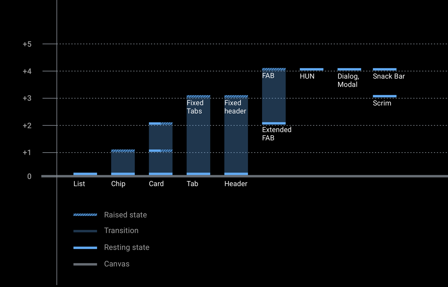
このセクションには、パレットと不透明度に関する情報のほか、各コンポーネントに関連付けられたエレベーションのグレースケール値を提供するグラフが含まれます。

Android Automotive OS のグレースケール パレット
Android Automotive OS のグレースケール パレットは、テキストやアイコンなどの要素に使用され、運転環境に固有の要件に対応するように設計されています。
このパレットは、以下を行うのに十分な多様化する必要があります。
- ダークモード UI のさまざまなユースケースをすべてカバーする
- 色調の違いを通じて階層を定義するのに十分な範囲を提供する
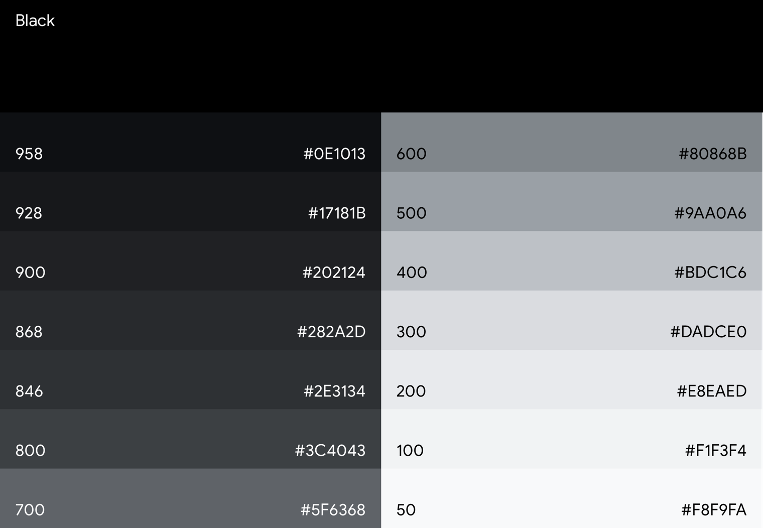
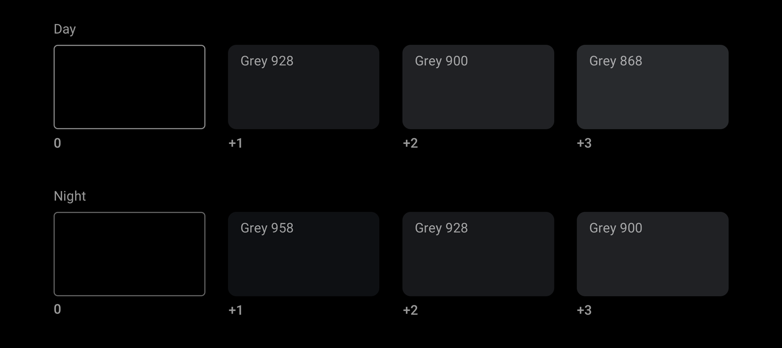
シャドウが認識できない真の黒色の背景でも、色調の違いにより奥行きがあるかのような錯覚を作り出しています。十分な色調の違いを提供するために、Android Automotive OS のグレースケール パレットにはミッドグレーが含まれています。グレー 900 から始まるマテリアル デザインのグレーは、すぐに明るめの色に近づきます。2 ステップ明白な色はグレー 700 になり、自動車のコンテキストには明るすぎます。
アクセント カラー
Android Automotive OS インターフェースの中核となるグレースケール パレットに加えて、フォーカスを描画するなどの目的で他の色を控えめに使用することもできます。
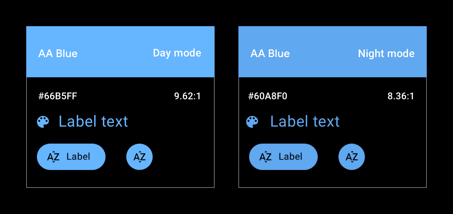
現在、Android Automotive OS には公式のアクセント カラーが 1 つあります。青の色合いは、サポート ライブラリでは「車のアクセント」と呼ばれています。彩度と鮮やかさを高めるために、このブルーは標準の Google ブルーから少しシフトしています。これにより、暗い場所でも色が安定しやすくなります。
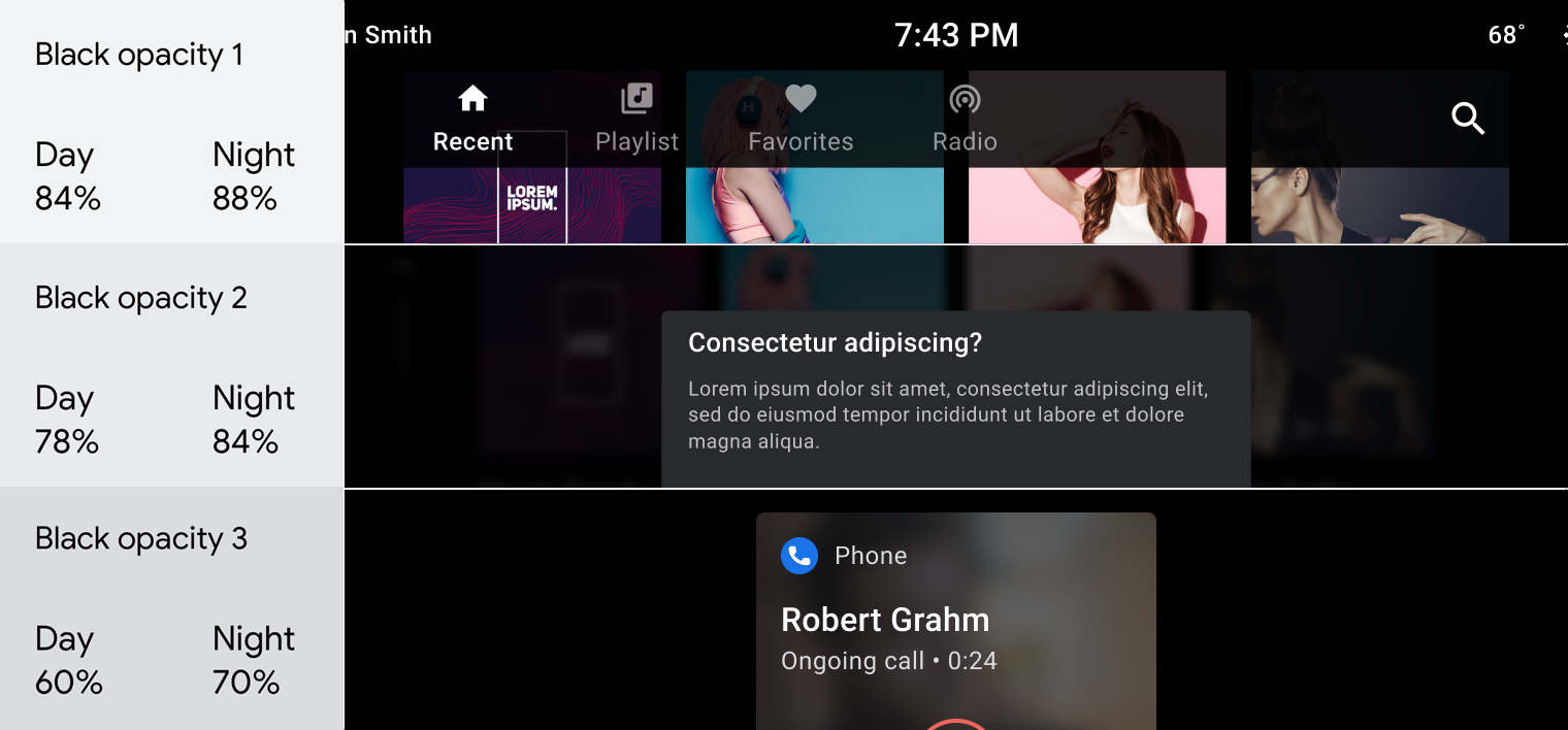
不透明度値のグラフ
透明度によって奥行き感が伝わり、マテリアル デザインの空間モデルが強化されます。透明度を効果的に使用するには、ユースケースに基づいて不透明度の値(濃い色または白色)を選択します。
ダークの不透明度の値
暗い不透明度値の最も一般的なユースケースは、スクリム(オーバーレイ)の作成です。
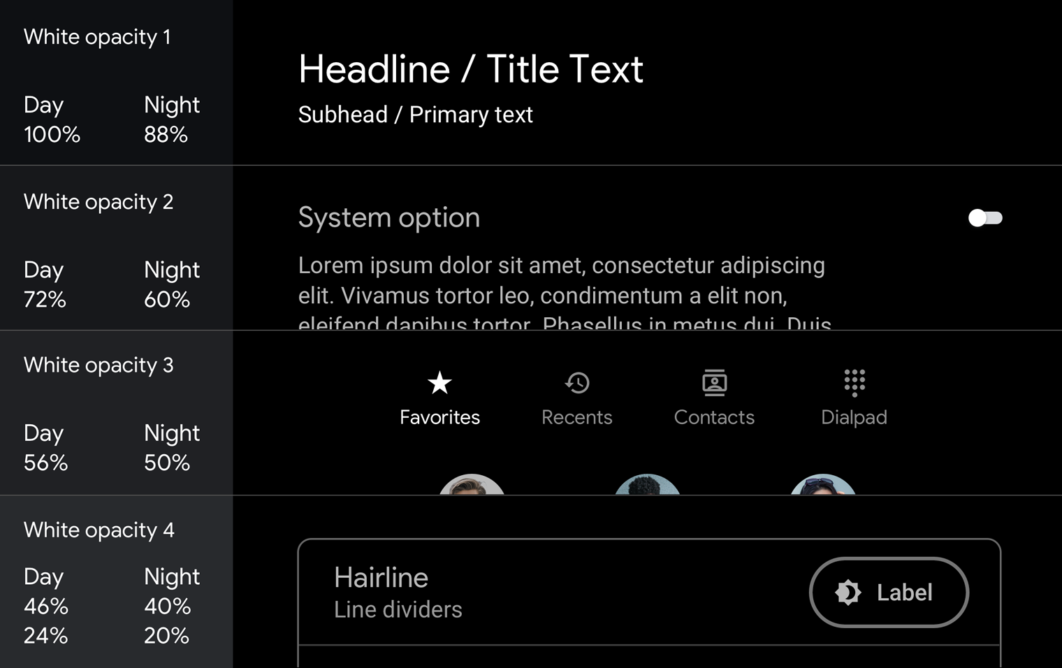
白の不透明度の値
これらの値は主にテキストで使用されます。背景に色を付けると特に効果的です。暗い色の背景に単色グレーを使用すると、画像がぼやけて見えます。
スクリムとテキスト階層で不透明度を使用する方法の例については、ガイダンスと例をご覧ください。
コントラスト
Android Automotive OS の基本的な安全ガイドラインを満たすには、背景とアイコンまたはテキストのコントラスト比を 4.5:1 以上にする必要があります。特定の自動車用 UI 要素にコントラスト比がどのように適用されるかについて詳しくは、コンテンツを読みやすくするをご覧ください。
推奨
禁止事項
ガイダンスと例
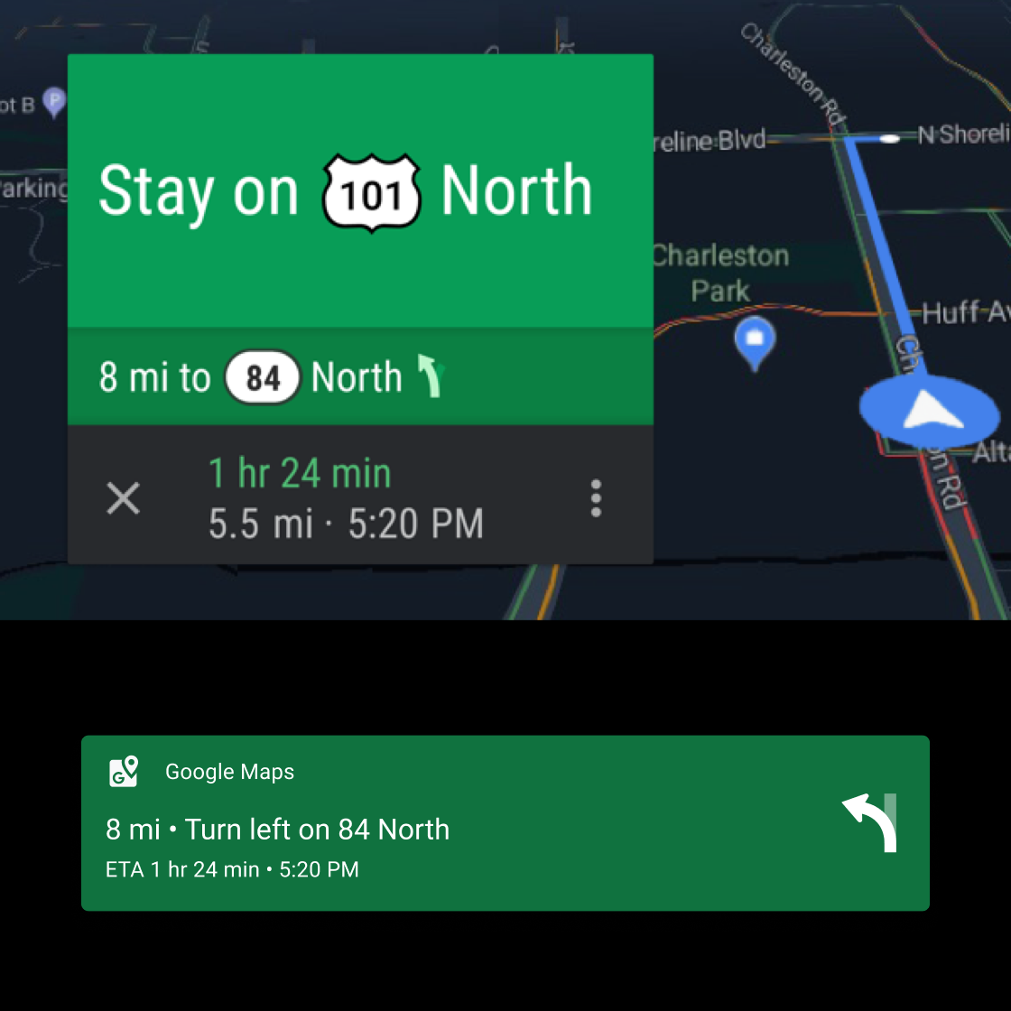
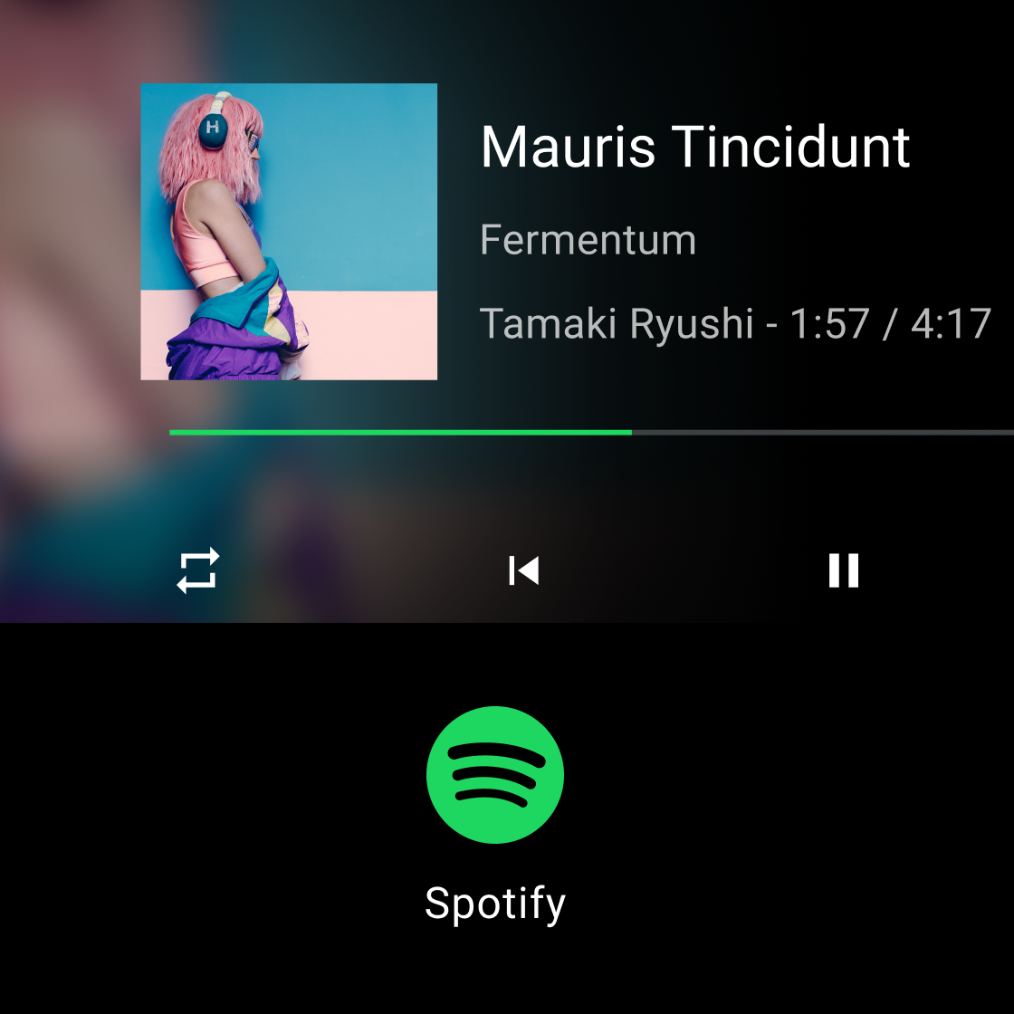
Android Automotive OS のダーク UI は、色の使用を最小限に抑えた、クリーンでシンプルです。UI 要素に適切な色、トーン、不透明度の値を使用する(パレットとグラデーションを参照)だけでなく、色とカラー グラデーションのすべての使用に目的を持たせることが重要です。
このセクションでは、透明度、不透明度、色を適用してさまざまな目標を達成するためのガイダンスと例を示します。これらの目標には次のものがあります。
- 背景の不明瞭化
- 一貫性の維持
- 視覚的な階層を確立して、ユーザーのフォーカスをメインのアクションに引き付ける。
- リスト内のエンティティを区別する
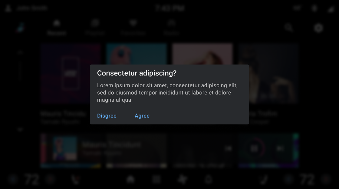
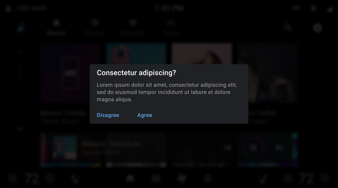
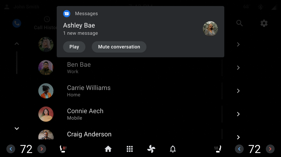
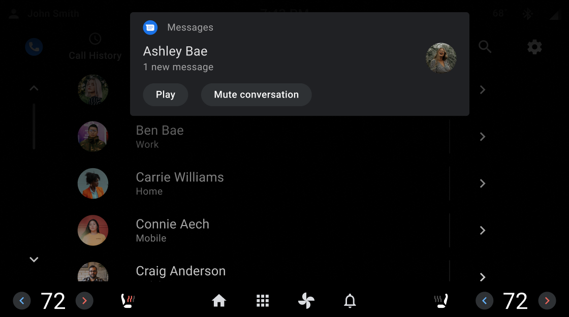
スクリムで背景を隠す
全画面表示のスクリム(オーバーレイ)は、ユーザーに操作を求めるダイアログなど、妨げとなる要素の背後にある背景を覆うために使用されます。部分的なスクリムは、通知などの要素の遷移に注意を引くために使用されます。
色の一貫性を保つ
色は、記憶と認識を増強するための強力な手がかりです。画面間で一貫したエクスペリエンスを生み出すために使用。
推奨

推奨
推奨
禁止事項
視覚的な階層を確立する
白い不透明度の値を使用して、一貫性のある強力な視覚的階層を作成します。88、72、56 の不透明度の値は、暗い背景で快適な読書環境を作り出し、アクセシビリティ要件を満たすのに十分なコントラストを含んでいます。夜間モードの白は不透明度を 96% にします。
推奨
禁止事項