Sử dụng bộ sưu tập để sắp xếp ngăn nắp các trang
Lưu và phân loại nội dung dựa trên lựa chọn ưu tiên của bạn.
Kiểu chữ, hay kiểu văn bản, được dùng để thể hiện hệ phân cấp của văn bản và cách văn bản hoạt động trong giao diện người dùng. Kiểu chữ dùng cho môi trường lái xe phải ưu tiên mức độ dễ đọc.
Thông tin tóm tắt:
Sử dụng thông tin hiển thị, nội dung và văn bản phụ từ thang chữ cái của Android Auto
Kích thước văn bản nội dung tối thiểu là 24 dp – kích thước văn bản phụ dành riêng cho thông tin không quan trọng
Dùng lưới 4 dp để căn chỉnh
Áp dụng các thuộc tính kiểu để tạo hiệu ứng (phân cấp hỗ trợ, tập trung vào sự chú ý)
Sử dụng độ đậm phông chữ trung bình một cách tiết kiệm – và tránh in đậm
Tham chiếu theo tỷ lệ và lưới
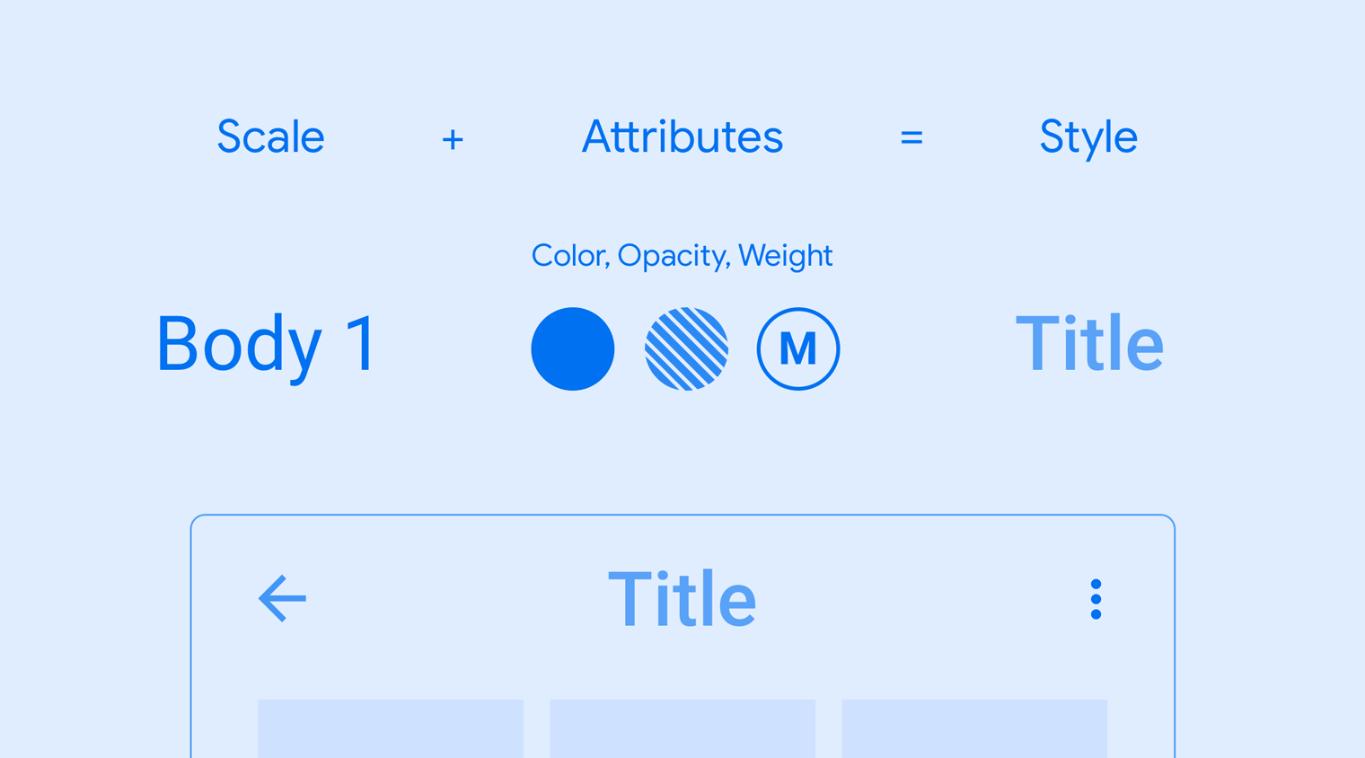
Lưới kiểu chữ và tỷ lệ kiểu chữ của Android Auto cung cấp một nhóm văn bản nhất quán, dễ dàng xem nhanh cho nhiều kích thước văn bản hiển thị, nội dung và văn bản phụ.
Tỷ lệ kiểu chữ trên Android Auto
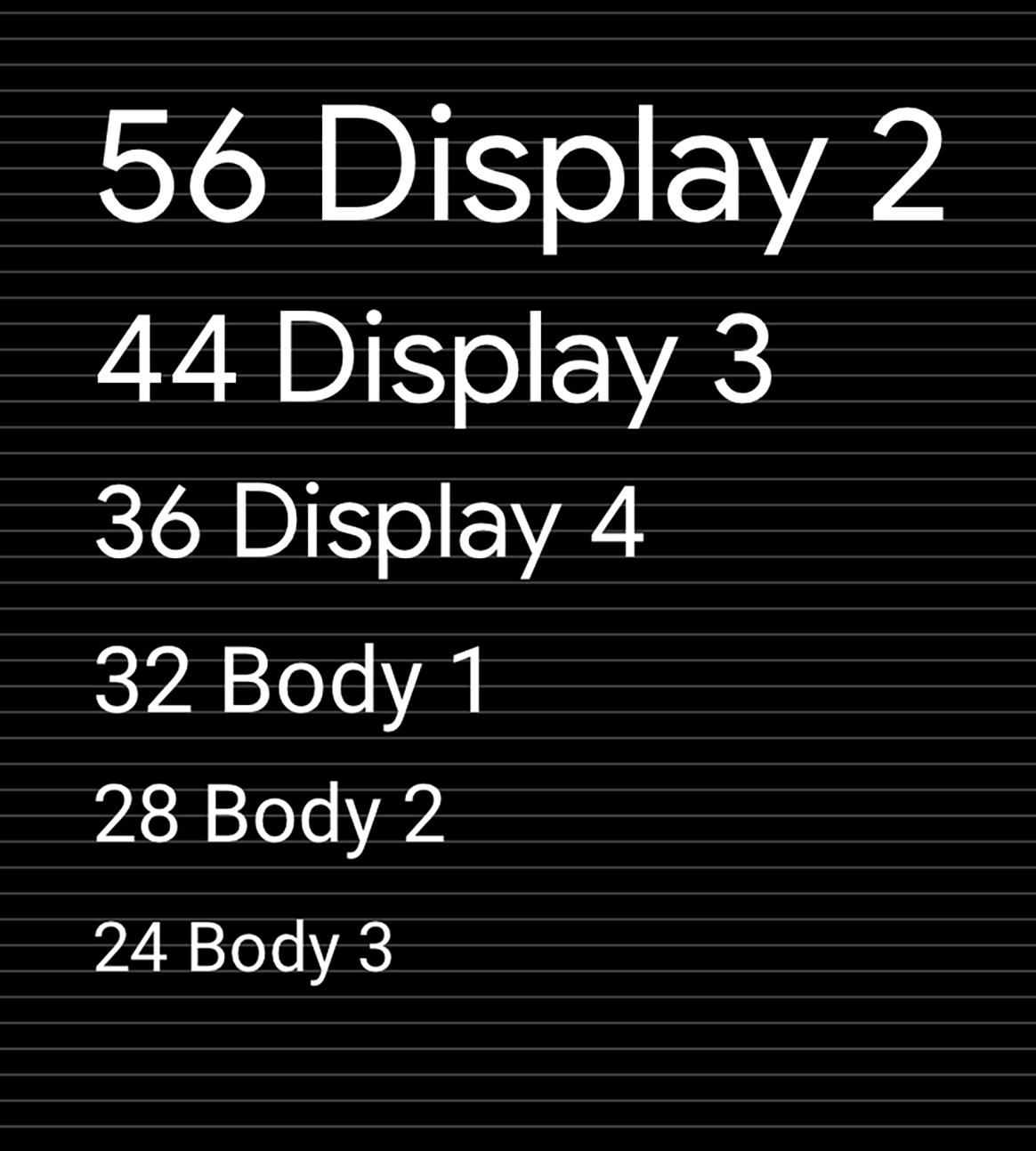
Kiểu chữ cung cấp 9 kiểu cho văn bản hiển thị, văn bản nội dung và văn bản phụ – mỗi kiểu có phông chữ, kích thước phông chữ và chiều cao dòng được chỉ định.
Mặc dù kích thước văn bản nội dung nhỏ nhất cho Android Auto là 24 dp, nhưng kích thước loại văn bản phụ dưới 24 dp có thể được sử dụng một cách thận trọng. Vì không dễ dàng xem nhanh được, kích thước phụ này nên được dành riêng cho thông tin không quan trọng, chẳng hạn như nội dung trên thanh trạng thái.
Thông tin phông chữ trong tỷ lệ này được viết ở định dạng sau: (Tên phông chữ) (Kích thước loại) / (Chiều cao dòng). Giá trị cho kích thước kiểu dữ liệu và chiều cao dòng được tính bằng điểm (pt).
Lưới sắp chữ và tham chiếu cơ sở
Tất cả các kiểu chữ đều hiển thị trên lưới 4 dp. Lưới này đảm bảo văn bản được điều chỉnh tỷ lệ đồng đều và giãn cách theo chiều dọc, tạo ra một hệ phân cấp hình ảnh nhất quán dựa trên số gia 4 dp.
Thang tỷ lệ của Android Auto được thiết kế để phù hợp với mức tăng kích thước phông chữ 4 dp.
Hướng dẫn và ví dụ
Áp dụng tỷ lệ và kiểu nhất quán cho văn bản giao diện người dùng có thể giúp:
Đảm bảo tất cả văn bản đều dễ đọc
Truyền tải hệ phân cấp hình ảnh giữa các thành phần văn bản
Tập trung sự chú ý vào những điểm quan trọng nhất
Hướng dẫn sau đây trình bày cách áp dụng tỷ lệ và kiểu cho Android Auto sao cho phù hợp.
Đang áp dụng tỷ lệ
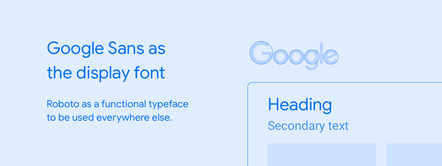
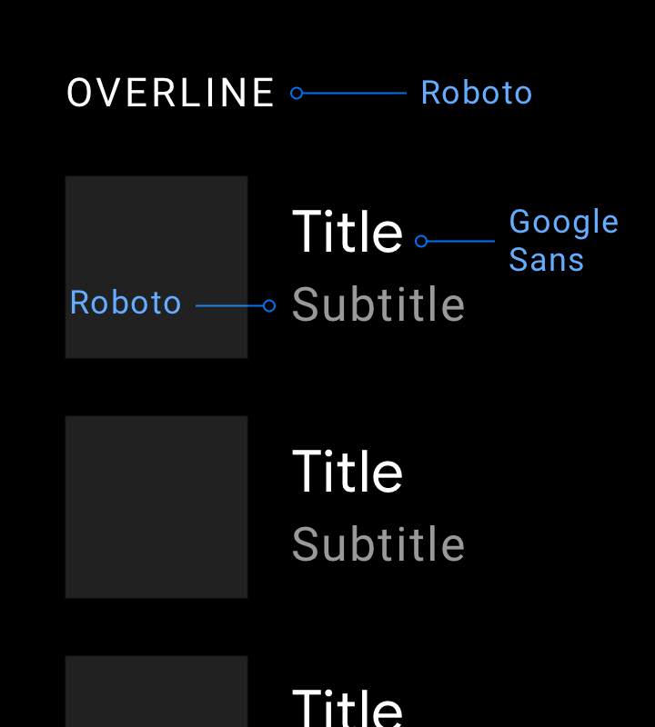
Bạn nên dùng Google Sans cho loại kích thước 32dp trở lên. Phông chữ Roboto được sử dụng ở mọi nơi khác vì nó dễ đọc ở kích thước nhỏ hơn.
Ví dụ này cho thấy cách sử dụng thích hợp Google Sans và Roboto ở nhiều cấp độ cỡ chữ.
Ví dụ
Việc nên làm
Khi sử dụng phông chữ hiển thị phù hợp nhất với văn bản lớn, chẳng hạn như Google Sans, hãy duy trì phông chữ ở kích thước loại là 32dp trở lên. Hãy sử dụng Roboto cho văn bản phụ nhỏ hơn vì văn bản này vẫn dễ đọc ở kích thước dưới 32 dp.
Việc không nên làm
Đừng dùng Google Sans cho văn bản có kích thước nhỏ hơn vì mức độ dễ đọc không tối ưu.
Đang áp dụng kiểu
Mỗi kiểu chữ bao gồm một tập hợp tỷ lệ và thuộc tính như màu sắc, độ mờ và độ đậm phông chữ. Bạn có thể thêm các thuộc tính này vào kiểu bất kỳ để tạo hiệu ứng, cho dù mục đích là tập trung sự chú ý hay giảm bớt điểm nhấn.
Kiểu Tiêu đề trong ví dụ này bao gồm tỷ lệ Body 1 (xác định kích thước phông chữ và chiều cao dòng) được điều chỉnh bằng các thuộc tính bổ sung về màu sắc, độ mờ và độ đậm.
Ví dụ
a. Nội dung 3 b. Nội dung 2 c. Nội dung 1a. Nội dung 2 b. Hiển thị 3 c. Nội dung 2
Việc nên làm
Sử dụng độ đậm phông chữ trung bình một cách tiết kiệm. Lưu lại để dùng khi bạn cần nhấn mạnh văn bản chính hoặc văn bản chủ động, chẳng hạn như thẻ Gần đây trong ví dụ này, hoặc để thiết lập hệ thống phân cấp trực quan.
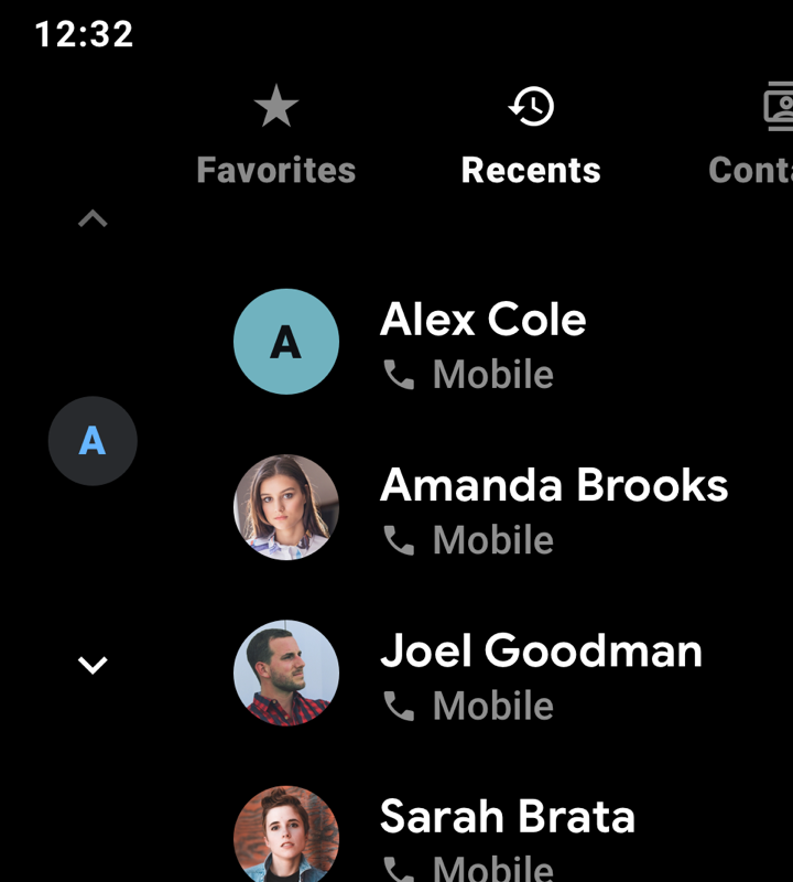
Việc không nên làm
Độ đậm phông chữ đậm (áp dụng cho tất cả văn bản trong ví dụ này) sẽ khó đọc hơn so với độ đậm trung bình và cần được tránh.
[[["Dễ hiểu","easyToUnderstand","thumb-up"],["Giúp tôi giải quyết được vấn đề","solvedMyProblem","thumb-up"],["Khác","otherUp","thumb-up"]],[["Thiếu thông tin tôi cần","missingTheInformationINeed","thumb-down"],["Quá phức tạp/quá nhiều bước","tooComplicatedTooManySteps","thumb-down"],["Đã lỗi thời","outOfDate","thumb-down"],["Vấn đề về bản dịch","translationIssue","thumb-down"],["Vấn đề về mẫu/mã","samplesCodeIssue","thumb-down"],["Khác","otherDown","thumb-down"]],["Cập nhật lần gần đây nhất: 2025-07-28 UTC."],[[["\u003cp\u003eAndroid Auto's typography prioritizes legibility using display, body, and subtext styles with a minimum body text size of 24dp.\u003c/p\u003e\n"],["\u003cp\u003eA 4-dp grid ensures consistent scaling and vertical spacing for all text elements, creating a clear visual hierarchy.\u003c/p\u003e\n"],["\u003cp\u003eGoogle Sans is used for text sizes 32dp and larger, while Roboto is used for smaller sizes due to its legibility.\u003c/p\u003e\n"],["\u003cp\u003eStyle attributes like color, opacity, and font weight are used to create effects and emphasize important information, however, bold font weights should be avoided due to reduced legibility.\u003c/p\u003e\n"],["\u003cp\u003eSubtext sizes below 24dp should be used sparingly and reserved for non-crucial information to maintain glanceability.\u003c/p\u003e\n"]]],[],null,["# Typography\n\n\u003cbr /\u003e\n\nTypography, or the styling of text, is used to express text's hierarchy and how it functions in a UI. Typography used for the driving environment should prioritize legibility.\n\n**At a glance:** \n- Use display, body, and subtext from the Android Auto typographic scale\n- Minimum body text size is 24dp -- reserve subtext sizes for non-crucial information\n- Use a 4-dp grid for alignment \n- Apply style attributes to create effects (support hierarchy, focus attention)\n- Use medium font weights sparingly -- and avoid bold\n\n*** ** * ** ***\n\nScale and grid references\n-------------------------\n\nThe Android Auto typographic scale and typesetting grid provide a consistent, easily glanceable set of text styles for a range of display text, body text, and subtext sizes.\n\n### Android Auto typographic scale\n\nThe type scale provides nine styles for display text, body text, and subtext -- each with a specified font, font size, and line height.\n\nWhile the smallest body text size for Android Auto is 24dp, subtext type sizes below 24dp can be used sparingly. Because this subtext size is not easily glanceable, it should be reserved for non-crucial information, such as status bar content.\nThe font information in this scale is written in the following format: (Font name) (Type size) / (Line height). The values for type size and line height are shown in points (pt).\n\n### Typesetting grid and baseline reference\n\nAll type styles are displayed on the 4dp grid. This grid ensures even that text is evenly scaled and vertically spaced, creating a consistent visual hierarchy based on 4dp increments.\nThe Android Auto scale is designed to accommodate 4dp font-sizing increments.\n\n*** ** * ** ***\n\nGuidance and examples\n---------------------\n\nApplying a consistent scale and style to your UI text can help:\n\n- Keep all text legible\n- Convey a visual hierarchy across text elements\n- Focus attention in the most important spots\n\nThe following guidance demonstrates how to apply the Android Auto scale and styles appropriately.\n\n### Applying scale\n\nGoogle Sans should be used for type sizes 32dp and larger. Roboto is used everywhere else because it is legible in smaller sizes.\n| **Note:** For languages not covered by Google Sans and Roboto, [Noto Sans](https://fonts.google.com/specimen/Noto+Sans#standard-styles) is the recommended typeface. Noto Sans is derived from metrics similar to Roboto and is designed for internationalization.\nThis example shows appropriate uses of Google Sans and Roboto at various levels of the typgraphic scale.\n\n#### Examples\n\n\n**Do**\nWhen using a display font best suited to large text, such as Google Sans, keep it at type sizes of 32dp or larger. Use Roboto for smaller, secondary text because it maintains good legibility at sizes below 32dp.\n**Don't**\nDon't use Google Sans for smaller text sizes at which its legibility is not optimal.\n\n*** ** * ** ***\n\n### Applying style\n\nEach typographic style consists of a set of scales and attributes such as color, opacity, and font weight. These attributes can be added to any type style to create an effect, whether the intention is to focus attention or reduce emphasis.\nThe Title style in this example consists of the Body 1 scale (which defines the font size and line height) modified by additional attributes of color, opacity, and weight.\n\n#### Examples\n\na. Body 3 \nb. Body 2 \nc. Body 1 a. Body 2 \nb. Display 3 \nc. Body 2 \n\n**Do**\nUse the medium font weight sparingly. Save it for when you need to emphasize the primary or active text, such as the Recents tab in this example, or to establish visual hierarchy.\n**Don't**\nBold font weights (applied to all text in this example) are less legible than medium weights and should be avoided."]]