Adaptive banners are the next generation of responsive ads, maximizing performance by optimizing ad size for each device. Improving on smart banners, which supported only fixed heights, adaptive banners let you specify the ad width and use this to determine the optimal ad size.
To choose the best ad size, adaptive banners use fixed aspect ratios instead of fixed heights. This results in banner ads that occupy a more consistent portion of the screen across devices and provides opportunities for improved performance.
When working with adaptive banners, note that they will always return a constant size for a given device and width. Once you've tested your layout on a given device, you can be sure that the ad size will not change. However, the size of the banner creative may change across different devices. Consequently, we recommend that your layout accommodate variances in ad height. In rare cases, the full adaptive size may not be filled and a standard size creative will be centered in this slot instead.
Prerequisites
- Follow the instructions from the Get Started guide on how to Import the Mobile Ads Flutter plugin.
When to use adaptive banners
Adaptive banners are designed to be a drop-in replacement for both the industry standard 320x50 banner size and the smart banner format which they supersede.
These banner sizes are commonly used as anchored banners, which are usually locked to the top or bottom of the screen.
For such anchored banners, the aspect ratio when using adaptive banners will be similar to that of a standard 320x50 ad, as can be seen in the three examples below:
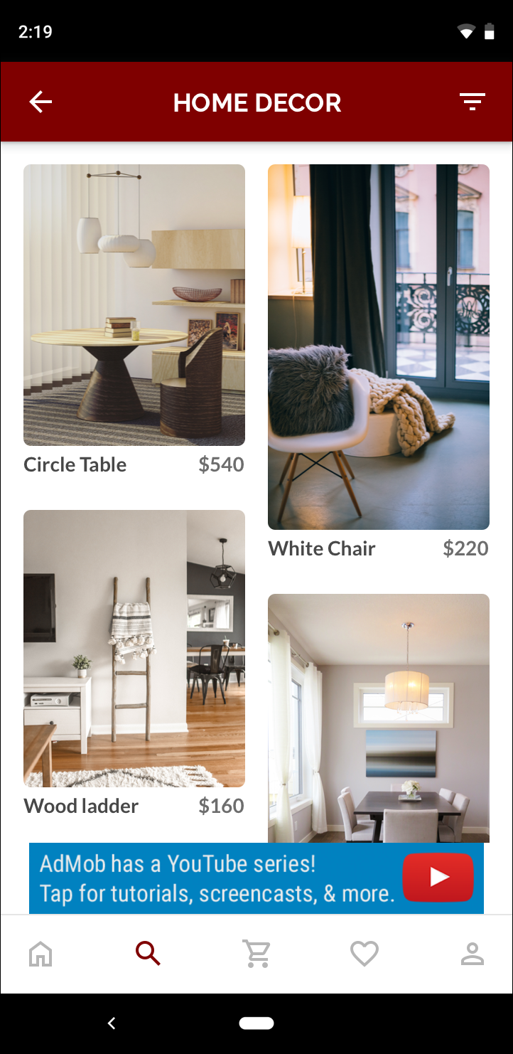 320x50 banner |
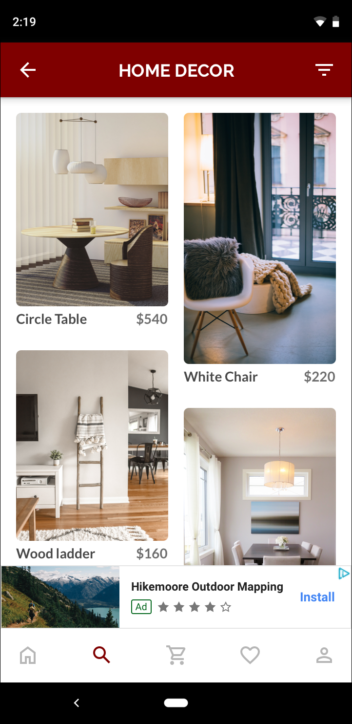 Adaptive banner |
 Smart banner |
The adaptive banner makes better use of the available screen size. Additionally, compared to a smart banner, an adaptive banner is a better choice because:
It uses any width you provide, rather than forcing the width to be full screen, enabling you to account for the safe area on iOS, and display cutouts on Android.
It selects an optimal height for the specific device, rather than having a constant height across different size devices, mitigating the effects of device fragmentation.
Implementation notes
When implementing adaptive banners in your app, keep the following points in mind:
- You must know the width of the view that the ad will be placed in, and this should take into account the device width and any safe areas or cutouts that are applicable.
- You may need to update or create new line items to work with adaptive sizes. Learn more.
- Ensure that your ad view background is opaque to be compliant with AdMob policies when smaller ad sizes serve that do not fill the ad slot.
- Ensure you are using the latest version of the Google Mobile Ads Flutter plugin.
- The adaptive banner sizes are designed to work best when using the full available width. In most cases, this will be the full width of the screen of the device in use. Be sure to take into account applicable safe areas.
- The Google Mobile Ads SDK will size the banner with an optimized ad height for the given width when using the adaptive AdSize APIs.
- There are two methods to get an ad size for adaptive:
AdSize.getAnchoredAdaptiveBannerAdSize(Orientation orientation, int width)to request for a specific orientation, andAdSize.getCurrentOrientationAnchoredAdaptiveBannerAdSize(int width)for the current orientation at the time of execution. - The size returned for a given width on a given device will always be the same, hence once you've tested your layout on a given device, you can be sure that the ad size will not change.
- Anchored banner height is never larger than the lesser of 15% of the device's height or 90 density independent pixels and never smaller than 50 density independent pixels.
Quickstart
Follow the steps below to implement a simple anchored adaptive banner.
- Get an adaptive banner ad size. The size you get will be used to request
your adaptive banner. To get the adaptive ad size, make sure that you:
- Get the width of the device in use in density independent pixels, or set
your own width if you don't want to use the full width of the screen.
You can use
MediaQuery.of(context)to get the screen width. - Use the appropriate static methods on the ad size class, such as
AdSize.getCurrentOrientationAnchoredAdaptiveBannerAdSize(int width)to get an adaptiveAdSizeobject for the current orientation.
- Get the width of the device in use in density independent pixels, or set
your own width if you don't want to use the full width of the screen.
You can use
- Create an
AdManagerBannerAdobject with your ad unit ID, the adaptive ad size, and an ad request object. - Load the ad like you would a normal banner ad, and display it from an
AdWidgetjust like you would a normal ad view.
Code example
Here's an example widget that loads an anchored adaptive banner to fit the width of the screen:
import 'dart:io';

import 'package:flutter/material.dart';
import 'package:google_mobile_ads/google_mobile_ads.dart';

/// This example demonstrates anchored adaptive banner ads.
class AnchoredAdaptiveExample extends StatefulWidget {
  @override
  _AnchoredAdaptiveExampleState createState() =>
      _AnchoredAdaptiveExampleState();
}

class _AnchoredAdaptiveExampleState extends State<AnchoredAdaptiveExample> {
  AdManagerBannerAd? _anchoredAdaptiveAd;
  bool _isLoaded = false;

  @override
  void didChangeDependencies() {
    super.didChangeDependencies();
    _loadAd();
  }

  Future<void> _loadAd() async {
    // Get an AnchoredAdaptiveBannerAdSize before loading the ad.
    final AnchoredAdaptiveBannerAdSize? size =
        await AdSize.getCurrentOrientationAnchoredAdaptiveBannerAdSize(
            MediaQuery.of(context).size.width.truncate());

    if (size == null) {
      print('Unable to get height of anchored banner.');
      return;
    }

    _anchoredAdaptiveAd = AdManagerBannerAd(
      // TODO: replace with your own ad unit.
      adUnitId: '<your-ad-unit>',
      sizes: [size],
      request: AdManagerAdRequest(),
      listener: AdManagerBannerAdListener(
        onAdLoaded: (Ad ad) {
          print('$ad loaded: ${ad.responseInfo}');
          setState(() {
            // When the ad is loaded, get the ad size and use it to set
            // the height of the ad container.
            _anchoredAdaptiveAd = ad as AdManagerBannerAd;
            _isLoaded = true;
          });
        },
        onAdFailedToLoad: (Ad ad, LoadAdError error) {
          print('Anchored adaptive banner failedToLoad: $error');
          ad.dispose();
        },
      ),
    );
    return _anchoredAdaptiveAd!.load();
  }

  @override
  Widget build(BuildContext context) => Scaffold(
        appBar: AppBar(
          title: Text('Anchored adaptive banner example'),
        ),
        body: Center(
          child: Stack(
            alignment: AlignmentDirectional.bottomCenter,
            children: <Widget>[
              ListView.separated(
                  padding: const EdgeInsets.symmetric(horizontal: 16.0),
                  itemBuilder: (context, index) {
                    return Text(
                      'Placeholder text',
                      style: TextStyle(fontSize: 24),
                    );
                  },
                  separatorBuilder: (context, index) {
                    return Container(height: 40);
                  },
                  itemCount: 20),
              if (_anchoredAdaptiveAd != null && _isLoaded)
                Container(
                  color: Colors.green,
                  width: _anchoredAdaptiveAd!.size.width.toDouble(),
                  height: _anchoredAdaptiveAd!.size.height.toDouble(),
                  child: AdWidget(ad: _anchoredAdaptiveAd!),
                )
            ],
          ),
        ),
      );

  @override
  void dispose() {
    super.dispose();
    _anchoredAdaptiveAd?.dispose();
  }
}
Here the function
AdSize.getCurrentOrientationAnchoredAdaptiveBannerAdSize is used
to get the size for a banner in an anchored position for the current interface
orientation. For pre-loading an anchored banner in a given orientation, use
AdSize.getAnchoredAdaptiveBannerAdSize(Orientation orientation, int width)
and pass the desired orientation.