
Page Summary
-
Higher contrast improves readability for all users, including those with color blindness or low vision.
-
WCAG recommends a minimum contrast ratio of 4.5:1 for small text and 3:1 for large text to ensure accessibility.
-
Using a contrast checker tool is crucial for accurately measuring and achieving sufficient color contrast, as visual judgment can be unreliable.
-
Color blindness affects a significant portion of the population, emphasizing the importance of accessible design.
-
Implementing higher contrast in design benefits everyone and aligns with web accessibility standards for inclusive content.
Higher contrast makes it easier for everyone to read text and images. When there is low contrast, everyone has difficulty viewing content.
Color blindness affects over 300 million people worldwide: 1 in 12 men and 1 in 200 women.
Higher contrast helps people with color blindness and low vision, or anyone that views a screen in bright sunlight.
Visit Colour Blind Awareness to learn more about the effects of color blindness.
WCAG suggests these minimum contrast ratios:
- 4.5:1 for small text
- 3:1 for large text (at least 14 pt bold/18 pt regular)
Consider the following contrast examples:
-
Poor contrast
-
Better contrast
-
Best contrast
Exercise: Choose colors with sufficient contrast
Complete the following exercise to practice measuring sufficient color contrast:
- In a separate browser window, open the Contrast Checker by Web Accessibility In Mind (WebAIM).
- In the contrast checker, enter the following Hex colors to find out which foreground-background ratios meet contrast requirements. Record the contrast ratios on a notepad or separate document to compare your answers with the possible answers.
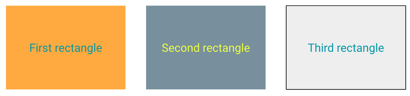
- First rectangle:
- Foreground: #148695
- Background: #FD9C32
- Second rectangle:
- Foreground: #EBFF33
- Background: #667E8B
- Third rectangle:
- Foreground: #128697
- Background: #EAEAEA
Even though some of the pairs may look higher contrast, none of them actually meets WCAG standards.
Unfortunately, "eyeballing it isn't enough"—it's best to use a contrast checker.
Click the icon to see the expected answers.
Use minimum contrast guidelines to ensure that everyone can see your content.
Next unit: Choose inclusive language