Page Summary
-
Material design system icons are simple, modern, friendly, and sometimes quirky icons optimized for display on all common platforms and display resolutions.
-
The icons are available for free under the Apache License Version 2.0 and can be used in various project types.
-
You can browse and download individual icons in SVG or PNG format from the Material Icons Library or download the entire set from a zip archive or the Git repository.
-
For web projects, the icon font is the easiest and most efficient method to incorporate icons, serving over 900 icons from a single small file and styled entirely with CSS.
-
The icons can be used in HTML with ligatures for modern browsers or numeric character references for older browsers and can be easily styled for size and color according to material design guidelines.
An overview of material icons—where to get them and how to integrate them with your projects.
What are material icons?
Material design system icons are simple, modern, friendly, and sometimes quirky. Each icon is created using our design guidelines to depict in simple and minimal forms the universal concepts used commonly throughout a UI. Ensuring readability and clarity at both large and small sizes, these icons have been optimized for beautiful display on all common platforms and display resolutions.
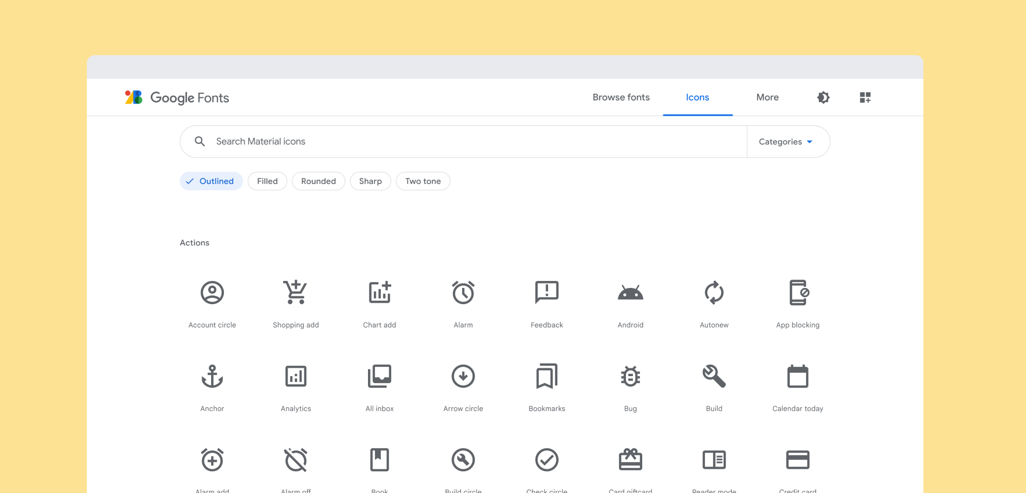
See the full set of material design icons in the Material Icons Library.
Getting icons
The icons are available in several formats and are suitable for different types of projects and platforms, for developers in their apps, and for designers in their mockups or prototypes.
Licensing
We have made these icons available for you to incorporate them into your products under the Apache License Version 2.0. Feel free to remix and re-share these icons and documentation in your products. We'd love attribution in your app's about screen, but it's not required.
Browsing and downloading individual icons
The complete set of material icons are available on the material icon library. The icons are available for download in SVG or PNGs, formats that are suitable for web, Android, and iOS projects or for inclusion in any designer tools.
Downloading everything
Grab the latest stable zip archive (~310MB) of all icons or the bleeding-edge version from master.
Git Repository
The material icons are available from the git repository which contains the complete set of icons including all the various formats we are making available.
$ git clone https://github.com/google/material-design-icons/
Icon font for the web
The material icon font is the easiest way to incorporate material icons with web projects. We have packaged all the material icons into a single font that takes advantage of the typographic rendering capabilities of modern browsers so that web developers can easily incorporate these icons with only a few lines of code.
Using the font is not only the most convenient method, but it is efficient and looks great:
- 900+ icons all from a single, small file.
- Served from Google Web Font servers or can be self hosted.
- Supported by all modern web browsers.
- Colored, sized and positioned entirely with CSS.
- Vector-based: Looks great at any scale, retina displays, low-dpi display screens.
The icon font weighs in at only 42KB in its smallest woff2 format and 56KB in standard woff format. By comparison, the SVG files compressed with gzip will generally be around 62KB in size, but this can be reduced considerably by compiling only the icons you need into a single SVG file with symbol sprites.
Setup Method 1. Using via Google Fonts
The easiest way to set up icon fonts for use in any web page is through Google Fonts. All you need to do is include a single line of HTML:
<link href="https://fonts.googleapis.com/icon?family=Material+Icons"
      rel="stylesheet">
Similar to other Google Web Fonts, the correct CSS will be served to activate the
'Material Icons' font specific to the browser.
An additional CSS class will be declared called .material-icons.
Any element that uses this class will have the correct CSS to render these icons from the web font.
Setup Method 2. Self hosting
For those looking to self host the web font, some additional setup is necessary.
Host the icon font in a location, for example https://example.com/material-icons.woff, and add the following CSS rule:
@font-face {
  font-family: 'Material Icons';
  font-style: normal;
  font-weight: 400;
  src: url(https://example.com/MaterialIcons-Regular.eot); /* For IE6-8 */
  src: local('Material Icons'),
    local('MaterialIcons-Regular'),
    url(https://example.com/MaterialIcons-Regular.woff2) format('woff2'),
    url(https://example.com/MaterialIcons-Regular.woff) format('woff'),
    url(https://example.com/MaterialIcons-Regular.ttf) format('truetype');
}
In addition, the CSS rules for rendering the icon will need to be declared to render the font properly. These rules are normally served as part of the Google Web Font stylesheet, but will need to be included manually in your projects when self-hosting the font:
.material-icons {
  font-family: 'Material Icons';
  font-weight: normal;
  font-style: normal;
  font-size: 24px;  /* Preferred icon size */
  display: inline-block;
  line-height: 1;
  text-transform: none;
  letter-spacing: normal;
  word-wrap: normal;
  white-space: nowrap;
  direction: ltr;

  /* Support for all WebKit browsers. */
  -webkit-font-smoothing: antialiased;
  /* Support for Safari and Chrome. */
  text-rendering: optimizeLegibility;

  /* Support for Firefox. */
  -moz-osx-font-smoothing: grayscale;

  /* Support for IE. */
  font-feature-settings: 'liga';
}
Using the icons in HTML
It’s easy to incorporate icons into your web page. Here’s a small example:
face
<span class="material-icons">face</span>
This example uses a typographic feature called ligatures, which allows rendering of an icon glyph simply by using its textual name. The replacement is done automatically by the web browser and provides more readable code than the equivalent numeric character reference.
This feature is supported in most modern browsers on both desktop and mobile devices.
| Browser | Version supporting ligatures |
|---|---|
| Google Chrome | 11 |
| Mozilla Firefox | 3.5 |
| Apple Safari | 5 |
| Microsoft IE | 10 |
| Microsoft Edge | 18 |
| Opera | 15 |
| Apple MobileSafari | iOS 4.2 |
| Android Browser | 3.0 |
For browsers that do not support ligatures, fall back to specifying the icons using numeric character references like the example below:
<span class="material-icons"></span>Find both the icon names and codepoints on the material icons library by selecting any icon and opening the icon font panel. Each icon font has a codepoints index in our git repository showing the complete set of names and character codes (here).
Styling icons in material design
These icons were designed to follow the material design guidelines and they look best when using the recommended icon sizes and colors. The styles below make it easy to apply our recommended sizes, colors, and activity states.
/* Rules for sizing the icon. */
.material-icons.md-18 { font-size: 18px; }
.material-icons.md-24 { font-size: 24px; }
.material-icons.md-36 { font-size: 36px; }
.material-icons.md-48 { font-size: 48px; }

/* Rules for using icons as black on a light background. */
.material-icons.md-dark { color: rgba(0, 0, 0, 0.54); }
.material-icons.md-dark.md-inactive { color: rgba(0, 0, 0, 0.26); }

/* Rules for using icons as white on a dark background. */
.material-icons.md-light { color: rgba(255, 255, 255, 1); }
.material-icons.md-light.md-inactive { color: rgba(255, 255, 255, 0.3); }
Sizing
Although the icons in the font can be scaled to any size, in accordance with material design icons guidelines, we recommend them to be shown in either 18, 24, 36 or 48px. The default being 24px.
CSS rules for the standard material design sizing guidelines:
.material-icons.md-18 { font-size: 18px; }
.material-icons.md-24 { font-size: 24px; }
.material-icons.md-36 { font-size: 36px; }
.material-icons.md-48 { font-size: 48px; }
Material icons look best at 24px, but if an icon needs to be displayed in an alternative size, using the above CSS rules can help:
<span class="material-icons md-18">face</span><span class="material-icons md-24">face</span><span class="material-icons md-36">face</span><span class="material-icons md-48">face</span>Coloring
Using the icon font allows for easy styling of an icon in any color. In accordance with material design icon guidelines, for active icons we recommend using either black at 54% opacity or white at 100% opacity when displaying these on light or dark backgrounds, respectively. If an icon is disabled or inactive, using black at 26% or white at 30% for light and dark backgrounds, respectively.
Here are some examples, using the material CSS styles described above:
.material-icons.md-dark { color: rgba(0, 0, 0, 0.54); }
.material-icons.md-dark.md-inactive { color: rgba(0, 0, 0, 0.26); }

.material-icons.md-light { color: rgba(255, 255, 255, 1); }
.material-icons.md-light.md-inactive { color: rgba(255, 255, 255, 0.3); }
Example for drawing an icon on a light background with a dark foreground color:
<span class="material-icons md-dark">face</span><span class="material-icons md-dark md-inactive">face</span>Example for drawing an icon on a dark background with a light foreground color:
<span class="material-icons md-light">face</span><span class="material-icons md-light md-inactive">face</span>To set a custom icon color, define a CSS rule specifying the desired color for the font:
.material-icons.orange600 { color: #FB8C00; }
and then use the class when referring to the icon:
<span class="material-icons orange600">face</span>Icon images for the web
Material icons are also available as regular images, both in PNG and SVG formats.
SVG
The material icons are provided as SVGs that are suitable for web projects. Individual icons are downloadable from the material icons library. The SVGs are also available from the material design icons git repository under the path:
material-design-icons/src/
For example, icons for maps are in src/maps:
material-design-icons/src/maps/
If multiple icons are in use on a web site, creating spritesheets out of the images is recommended. For more information, refer to the documentation in the sprites directory of the git repository.
PNG
PNG is the most traditional way to display icons on the web. Our downloads from the material icons library provide both single and double densities for each icon. They are referred to as 1x and 2x respectively in the download. Icons are also available in the git repository under:
material-design-icons/png/
If multiple icons are in use on a web site, creating spritesheets out of the images is recommended. For more information, refer to recommendations in the sprites directory in the git repository.
Icons for Android
PNGs suitable for Android are available from the material icons library. These come in all the supported screen densities so they should look good on any device.
The icons are also available in the material design icons git repository in the same combination of colors and sizes named as follows:
The Vector Drawable is currently only available as a black 24dp icon. This is for compatibility with our most standard icon size. To render the icon in a different color, use drawable tinting available on Android Lollipop.
When using the Vector Drawable, it may not be necessary to include the xxxhdpi density PNG since it is unlikely a device supporting that screen density does not support Vector Drawables.
Icons for iOS
Material icons also work well within iOS apps. In both the material icons library and git repository, these icons are packaged up in Xcode imagesets which will work easily with Xcode Asset Catalogs (xcassets). These imagesets can be added to any Xcode Asset Catalogs by dragging them into Xcode on to the asset catalog or by copying the folder into the xcasset folder.
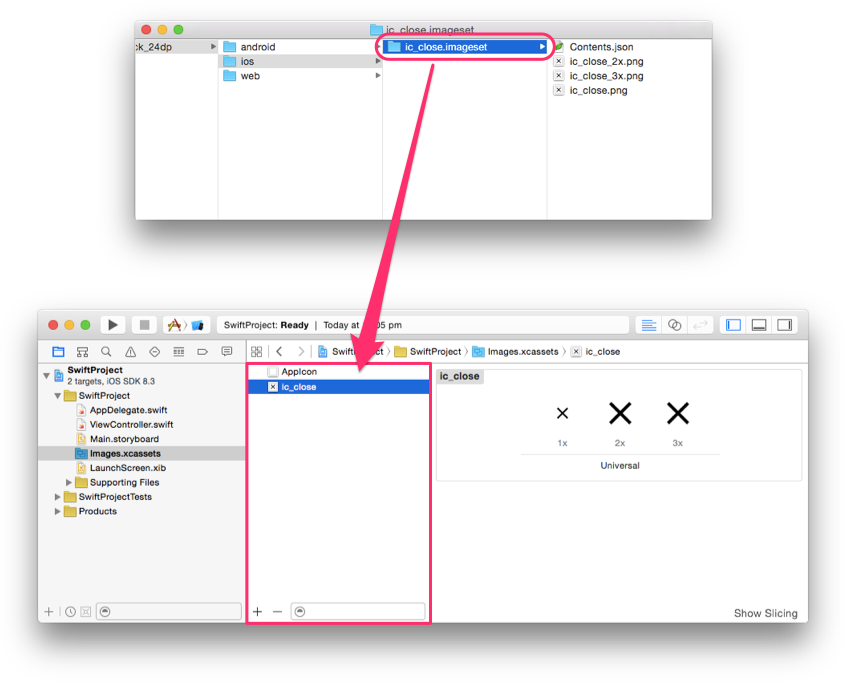
The imageset contains the single, double and triple density images (1x, 2x, 3x) so they work on all known iOS screen densities. Both black and white icons are provided, but we recommend using UIImage's imageWithRenderingMode with UIImageRenderingModeAlwaysTemplate which will allow the image to be used as an alpha mask that can be tinted to any possible color.
Objective-C example:
UIButton *button = [[UIButton alloc] init];
UIImage *closeImage =
    [[UIImage imageNamed:@"ic_close"]
       imageWithRenderingMode:UIImageRenderingModeAlwaysTemplate];
button.tintColor = [UIColor colorWithWhite:0 alpha:0.54f];
[button setImage:closeImage forState:UIControlStateNormal];
Swift Example:
let button = UIButton()
let closeImage = UIImage(named:"ic_close")?.imageWithRenderingMode(
    UIImageRenderingMode.AlwaysTemplate)
button.tintColor = UIColor(white:0, alpha:0.54)
button.setImage(closeImage, forState:UIControlState.Normal)
Icons in RTL
Languages such as Arabic and Hebrew are read from right-to-left (RTL). For RTL languages, UIs should be mirrored to display most elements in RTL. When a user interface is mirrored for RTL, some of the icons should also be mirrored. When text, layout, and iconography are mirrored to support right-to-left UIs, anything that relates to time should be depicted as moving from right to left. For example, forward points to the left, and backwards points to the right. However, be mindful that the context in which the icon is placed also influences whether an icon should be mirrored or not.
Icons should only be mirrored if their direction matches other UI elements in RTL mode. When an icon represents visual features of your website that are different in RTL, then the icon should also be mirrored in RTL. For example, if the numbers in a numbered list are on the right side in the RTL language, then the numbers should be on the right side of the mirrored icon.
RTL icons on Android
This Android developer article describes in-depth how to implement RTL user interfaces. By default on Android, icons are not mirrored when the layout direction is mirrored. You need to specifically mirror the appropriate icons when needed, either by providing specialized assets for RTL languages, or using framework functionality to mirror the assets.
To provide specialized assets for RTL languages, you can use the ldrtl qualifier on resource directories, such as res/drawable-ldrtl/. Resources inside such directories will only be used for RTL languages. For devices running Android API 19 or newer, the framework also provides the autoMirrored attribute for Drawables. When this attribute is set to true, the drawable will be automatically mirrored on RTL languages.
Using autoMirrored:
<vector xmlns:android="http://schemas.android.com/apk/res/android"
        android:width="24dp"
        android:height="24dp"
        android:viewportWidth="24.0"
        android:viewportHeight="24.0"
        android:tint="?attr/colorControlNormal"
        android:autoMirrored="true">
  <path
        android:fillColor="@android:color/white"
        android:pathData="M20,11H7.83l5.59,-5.59L12,4l-8,8 8,
                          8 1.41,-1.41L7.83,13H20v-2z"/>
</vector>
If using autoMirrored or providing alternate Drawable resources isn’t an option, the ImageView scaleX attribute can also be used to mirror drawables (for instance, by providing a RTL-specific layout in a res/layout-ldrtl directory).
Mirroring within the layout file:
<ImageView
    android:id="@+id/my_icon"
    android:layout_width="60dp"
    android:layout_height="60dp"
    android:scaleX="-1" />
Lastly, drawables can be mirrored programmatically.
Manually check for layout direction using getLayoutDirection:
if (ViewCompat.getLayoutDirection(view) == ViewCompat.LAYOUT_DIRECTION_RTL) {
  // custom code
}
Mirroring ImageView contents programmatically:
imageView.setScaleX(-1);
RTL icons on iOS
iOS has the concept of a UISemanticContentAttribute that is attached to each view. This can be unspecified, forceLeftToRight, forceRightToLeft, playback or spatial. iOS uses this value and the (left-to-right (LTR)/RTL setting of the device presenting the interface to determine the effectiveLayoutDirection of the view. This effectiveLayoutDirection determines whether or not to mirror an image when it is displayed.
By default, images' semantic content is set to unspecified. This causes them to be mirrored in RTL mode. If you do not want an icon to ever be mirrored, you need to explicitly set it to be forceLeftToRight. Apple calls out some exceptions that should not be mirrored, such as media playback (Fast Forward, rewind, etc.), musical notes, images indicating the passage of time, etc.
Objective-C example:
// Prevent an icon from being mirrored in RTL mode
UIImage *icon = [UIImage imageNamed:@"my_icon.png"];
UIImageView *iconView = [[UIImageView alloc] initWithImage:icon];
iconView.semanticContentAttribute =
  UISemanticContentAttributeForceLeftToRight;
Swift example:
// Prevent an icon from being mirrored in RTL mode
let iconImage = UIImage.init(named: "my_icon.png")
let iconView = UIImageView.init(image: iconImage)
iconView.semanticContentAttribute = .forceLeftToRight;
For more in-depth documentation on how to implement RTL on iOS and macOS, please review Apple's RTL documentation.
Semantic content was added in iOS 9. If you are supporting earlier versions of iOS, the material internationalization framework backports some of the functionality to iOS 8.
RTL icons on the web
We recommend the following article as a primer to RTL on the web: https://hacks.mozilla.org/2015/09/building-rtl-aware-web-apps-and-websites-part-1 https://hacks.mozilla.org/2015/10/building-rtl-aware-web-apps-websites-part-2
By default on the web, icons are not mirrored when the layout direction is mirrored. You need to specifically mirror the appropriate icons when needed.
The example below shows how to implement a simple RTL CSS rule. You can also view it on codepen.
page.html
<html dir="rtl">
  <img class="material-icons" src="my_icon.png" alt="my icon"/>
</html>
page.css
html[dir="rtl"] .icon {
  -moz-transform: scaleX(-1);
  -o-transform: scaleX(-1);
  -webkit-transform: scaleX(-1);
  transform: scaleX(-1);
  filter: FlipH;
  -ms-filter: "FlipH";
}
Generate your own RTL icons using ImageMagick
If mirroring the icons in code is not an option you can use ImageMagick to horizontally mirror the image.
convert -flop my_icon.png my_icon_rtl.png
Which icons should be mirrored for RTL?
Here is a list of icons that can be programmatically mirrored to RTL:
| arrow back | arrow back ios | arrow forward |
| arrow forward ios | arrow left | arrow right |
| assignment | assignment return | backspace |
| battery unknown | call made | call merge |
| call missed | call missed outgoing | call received |
| call split | chevron left | chevron right |
| chrome reader mode | device unknown | dvr |
| event note | featured play list | featured video |
| first page | flight land | flight takeoff |
| format indent decrease | format indent increase | format list bulleted |
| forward | functions | input |
| keyboard tab | label | label important |
| label outline | last page | launch |
| list | live help | mobile screen share |
| multiline chart | navigate before | navigate next |
| next week | note | open in new |
| playlist add | queue music | redo |
| reply | reply all | screen share |
| send | short text | show chart |
| sort | star half | subject |
| trending flat | toc | trending down |
| trending up | undo | view list |
| view quilt | wrap text |