Page Summary
-
Users can control media playback from either the full-screen Playback view or the minimized control bar.
-
The Playback view displays metadata, playback controls, and can be controlled with gestures.
-
The minimized control bar appears when leaving the Playback view and provides basic playback controls while allowing browsing.
-
Media apps can implement a queue, accessible from the Playback view, showing current and upcoming content.
This section describes how playback works for media apps.
Users can control media playback from either of the following:
- Playback view (full screen, full set of controls)
- Minimized control bar (minimal controls, available across views)
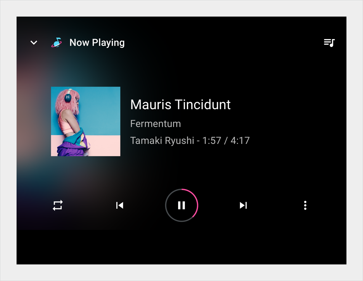
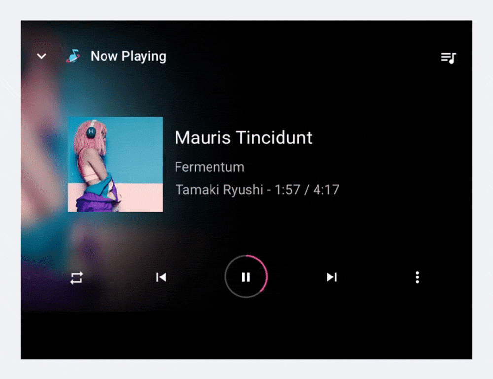
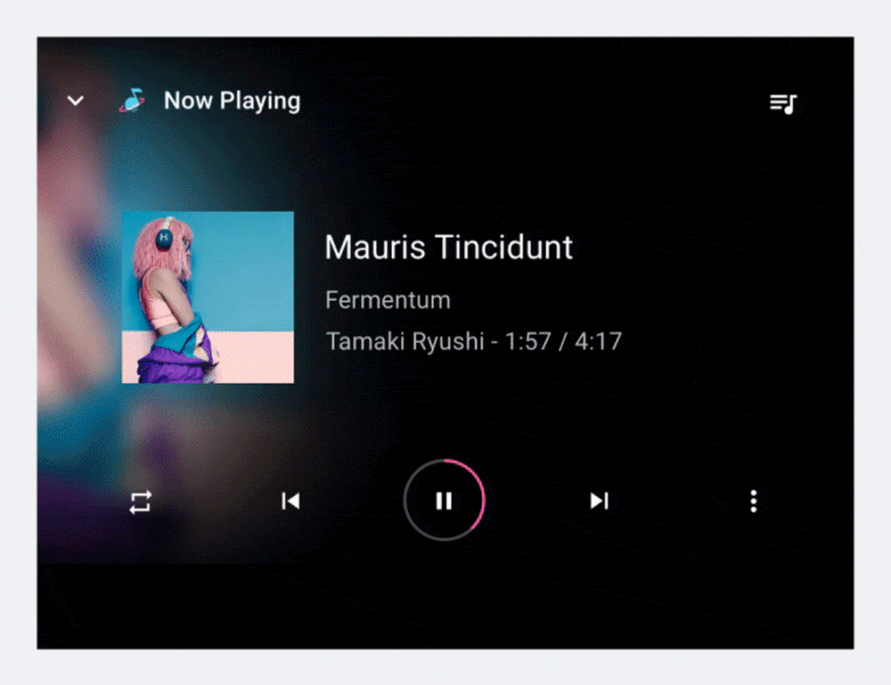
Playback view
To begin playback, a user selects a playable item in the content space, such as an album or song, and the playback view takes over the entire content space. The playback view displays metadata and playback controls for the selected content. Users can control playback using these controls and also with gestures.
Playback controls
Playback controls are displayed in the control bar, which can be expanded if there are more than 5 controls (see “Playback control locations,” below). If the app implements a queue, the app header includes an affordance to access the queue.
Playback control locations
To ensure consistent usage across media services, the bottom row of controls (or the only row, if the control bar is unexpanded) should present the controls in the order shown below. The top row, which appears only when the control bar is expanded, is reserved for up to 5 custom actions.
If an app doesn’t use Previous or Next buttons, these buttons may also be replaced with custom actions.
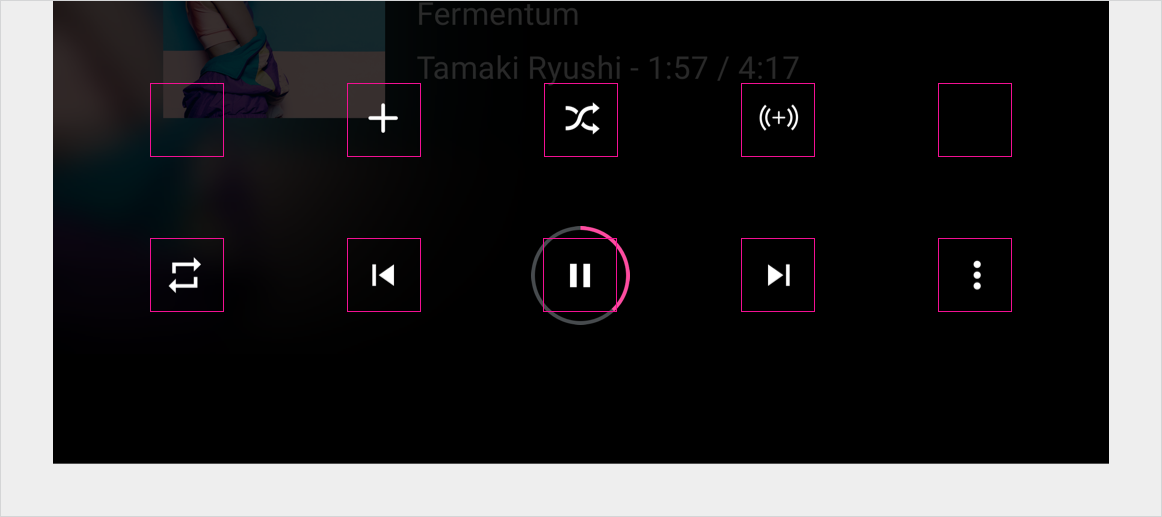
| Position | Button |
|---|---|
| Far left | Custom action |
| Left of center | Previous or custom action |
| Center | Play / Pause |
| Right of center | Next or custom action |
| Far right | Overflow affordance (if there are more than 5 controls) or custom action |
Gestures
In addition to using the controls in Playback view, users can use a gesture to minimize the view.

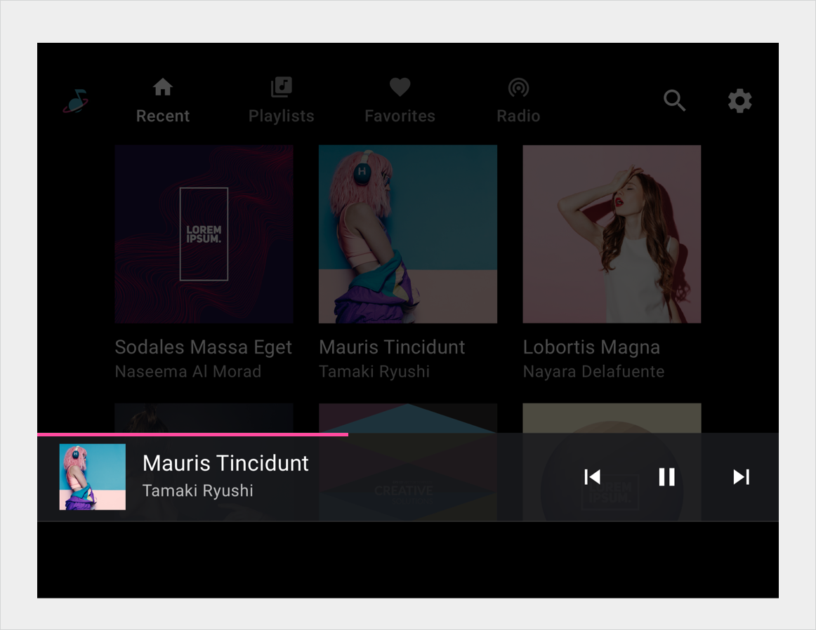
Minimized control bar
If the user leaves the playback view while content is still playing, the control bar available in the playback view collapses into the minimized control bar, which provides information about the currently playing content, plus basic controls such as Play and Pause. The minimized control bar allows the user to browse available media while the current song or other content continues playing.
Queue
If a media app implements a queue, the playback view’s app header includes a queue affordance. Selecting the affordance displays a scrollable, chronologically ordered list of currently playing and upcoming content. Some media apps may also display previously played content in the queue.
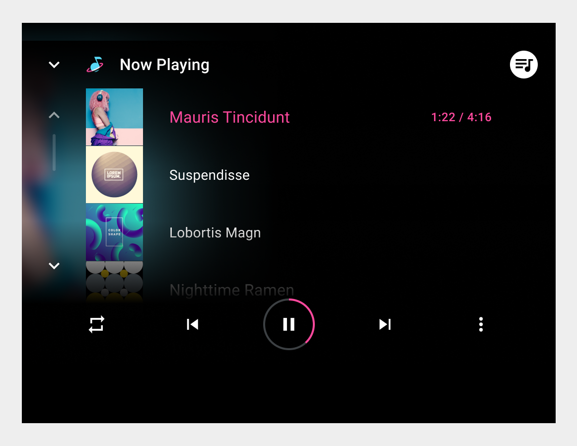
At a minimum, the queue displays a title for each queued item. App developers can also provide a thumbnail for each. In addition, they can provide an icon to indicate the currently playing item, which can also be indicated by showing the elapsed time for that item. However, car makers can choose whether to show or hide any of these items: the thumbnail, the icon, or the elapsed time.
Users can scroll the list and select any item in the queue to play it immediately in the playback view. To return to the playback view without selecting an item to play, users can select either the queue or back affordance.