Page Summary
-
Apps requiring sign-in should provide a sign-in flow using suggested methods, adaptable from provided sample code.
-
The process involves choosing sign-in methods (Google, Phone, Standard), adjusting screen content, and customizing visual styling.
-
Google sign-in is strongly recommended as the primary method, with Phone or Standard sign-in as backups or primary options if Google sign-in is not supported.
-
Customization includes replacing the sample app logo, modifying text, adjusting PIN logic, and styling elements like input fields, buttons, colors, and typography.
-
Sign-in flows should adhere to guidelines for usability, consistency, and visual design in Android Automotive OS, including keeping PINs 8 digits or fewer and separating username/password entry for standard sign-in.
If sign-in is required for your app, you need to supply a sign-in flow featuring one or more of the suggested sign-in methods.
You can create this flow by adapting the provided sample code. The process involves these steps:
- Choosing a primary sign-in method (and any backup methods)
- Adjusting the content of the sign-in screens
- Customizing the visual styling
The sample code is provided in the Universal Android Music Player (UAMP) Automotive app. This code is designed to adapt to a variety of screen sizes, so you don’t need to deal with questions of portrait vs. landscape mode.
As you adapt the sample code for your app, the guidelines provided here will help you make sure your sign-in experience remains vehicle-optimized. To find out how users will access your sign-in experience, visit Sign-in, settings & search.
Choose sign-in methods
Your first step in adapting the sample code is to decide which of the 3 available sign-in methods you want to offer.
| Sign-in method | How it works |
|---|---|
|
A) Google sign-in
(strongly recommended) |
Enter Google account and password |
|
B) Phone sign-in
(recommended as a backup option – or primary option, if your app doesn’t support Google sign-in) |
Enter PIN code from car screen on phone, or vice versa |
|
C) Standard sign-in
(best as a back-up option) |
Enter username (or email) and password for the app |
Google sign-in should be presented as the primary option if your app supports it, because it is easiest for users. If your app doesn’t support Google sign-in, phone sign-in is the next best choice as primary option.
The sign-in flow in the sample code includes screens for all three methods. Once you’ve decided which options you’re supporting (both the primary option and any backup options you may want to support), you can disable any remaining options in the sample code and focus on customizing the remaining screens.
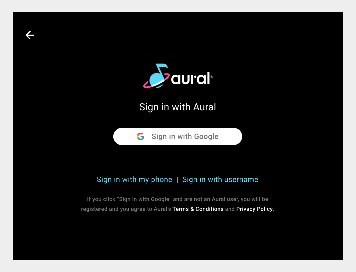
A) Google sign-in
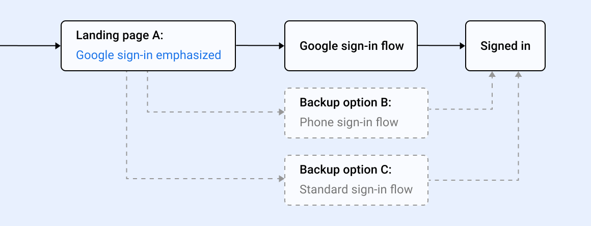
If your app supports Google sign-in and Google sign-in is available in the system, it’s best to make this method the primary option in your sign-in flow. It’s easy for users because they simply need to confirm their existing Google account.
If you offer phone sign-in or standard sign-in, those should be presented as backup options available from text links at the bottom of the landing screen.

Google sign-in flow
With Google sign-in, the landing page is the only screen you need to design, unless you are also offering backup options. Phone sign-in and Standard sign-in summarize screens and flows for those options.
B) Phone sign-in
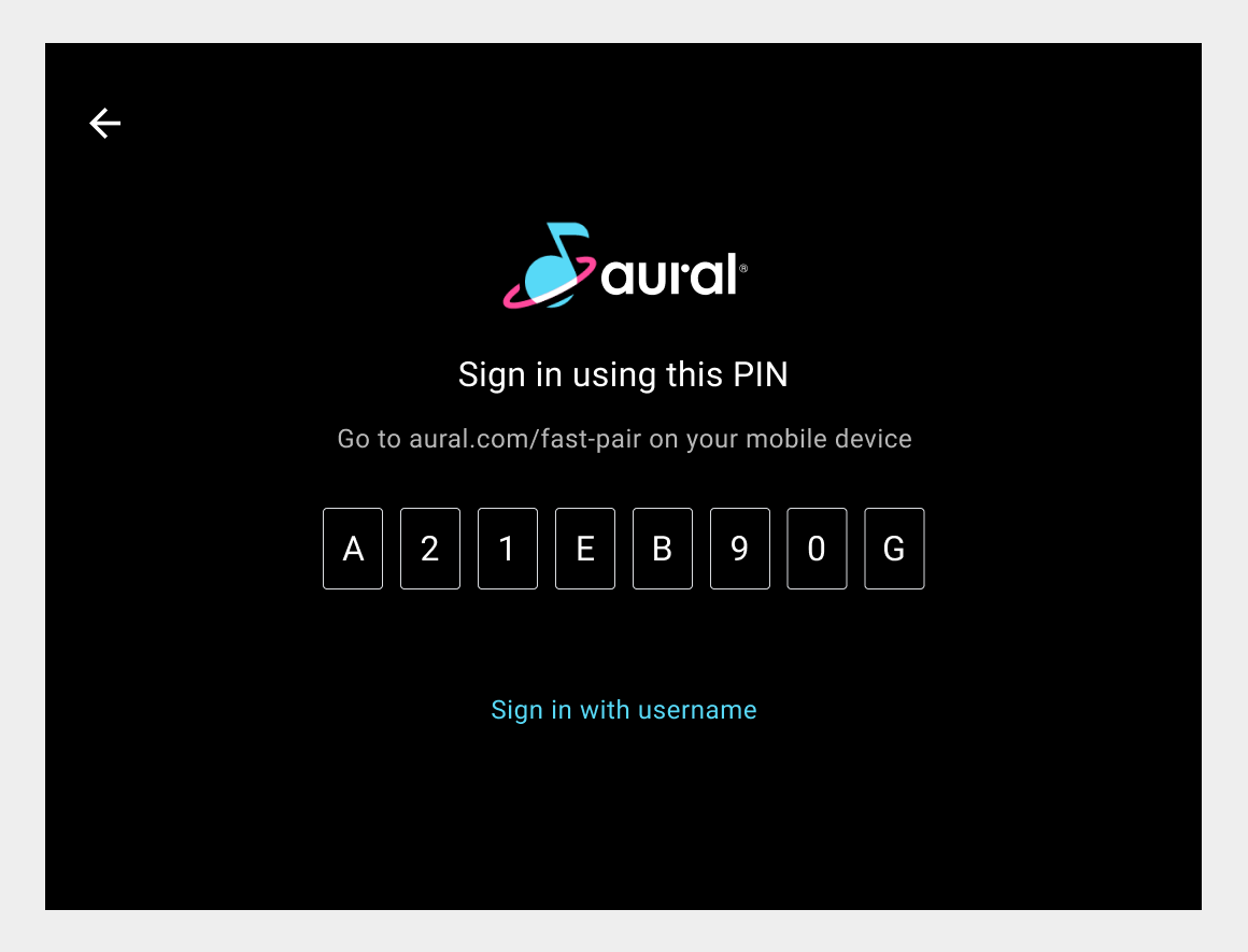
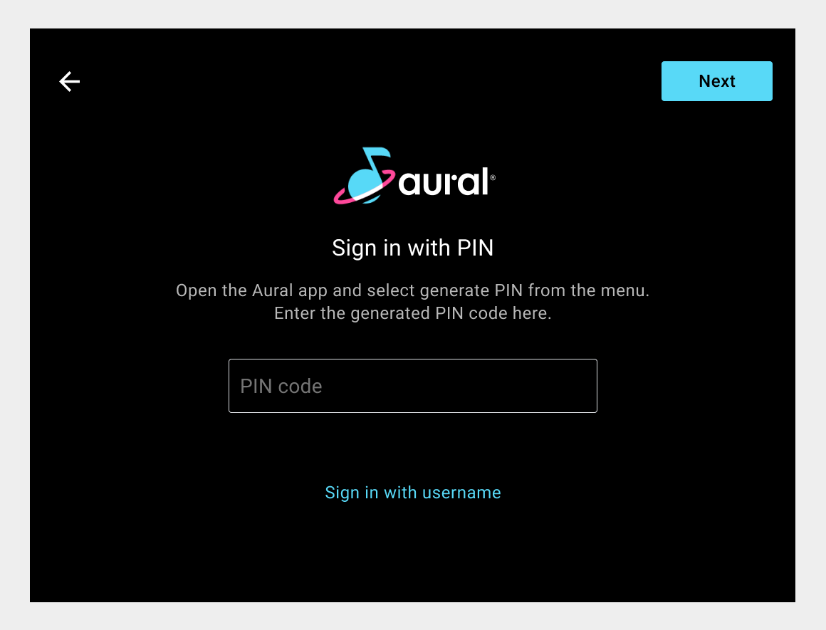
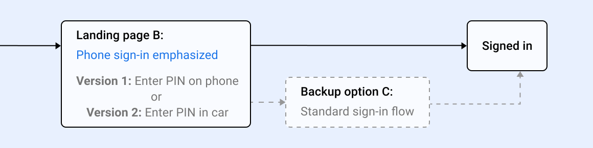
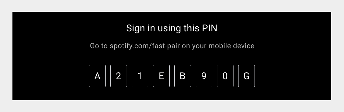
If your app doesn’t support Google sign-in, it’s best to offer phone sign-in as the primary option in your sign-in flow. (Phone sign-in can also be offered as a backup option for Google sign-in.) With phone sign-in, users don’t need to remember a username or password. Instead, they enter a PIN that is supplied to them.
Phone sign-in can be done either of 2 ways:
- Users see a PIN on the car screen and enter it on their phones
- Users look up a PIN on their phones and enter it on the car screen
If the standard username-and-password method is also offered, it should be presented as a backup option available from a text link at the bottom of the landing screen.
Phone sign-in flow
With Phone sign-in, you can choose from two versions of the landing page: one that displays a PIN for entry on the phone, and one that lets users enter a PIN supplied on the phone.
The screen for the landing page is the only one you need to design, unless you are also offering Standard sign-in as a backup option.
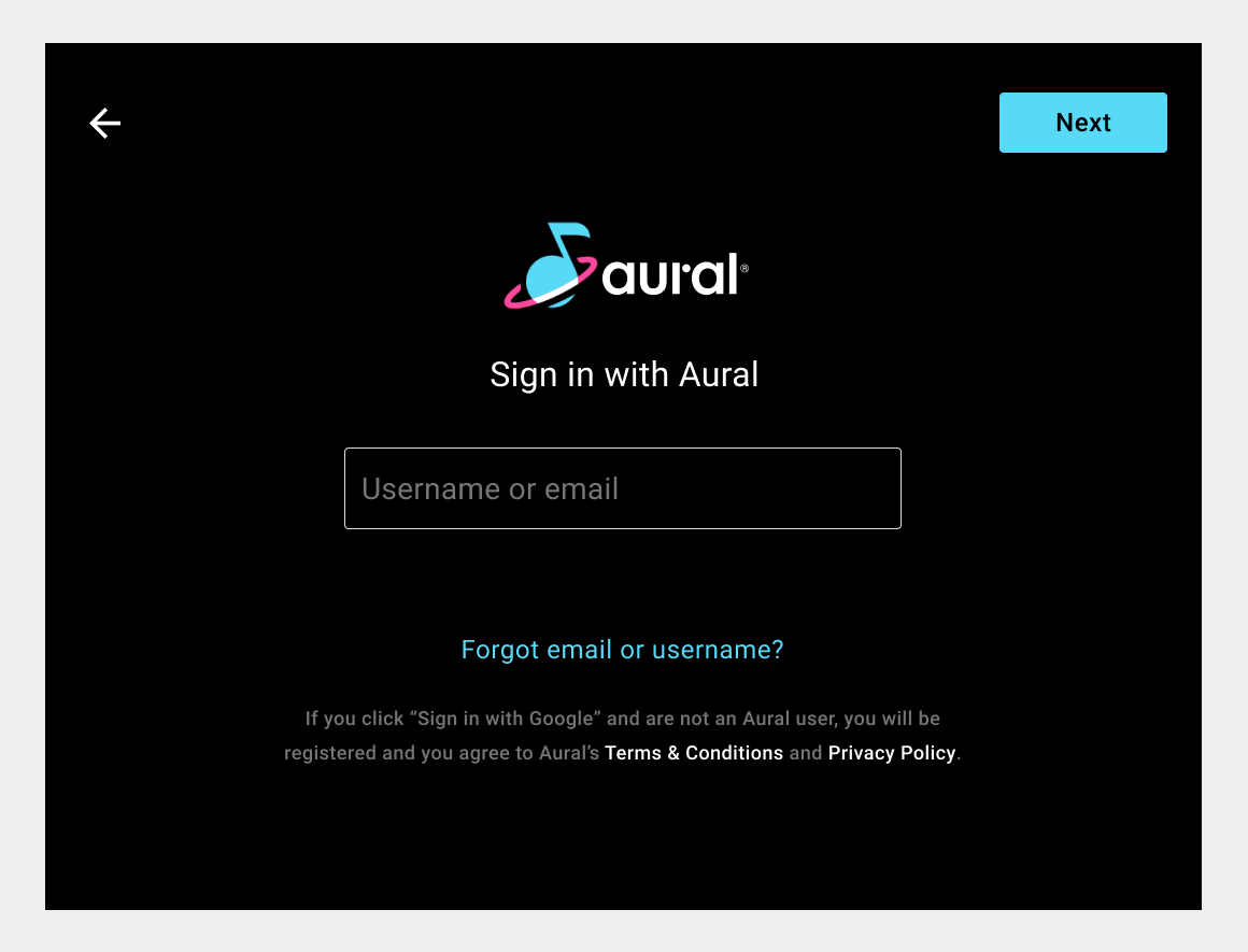
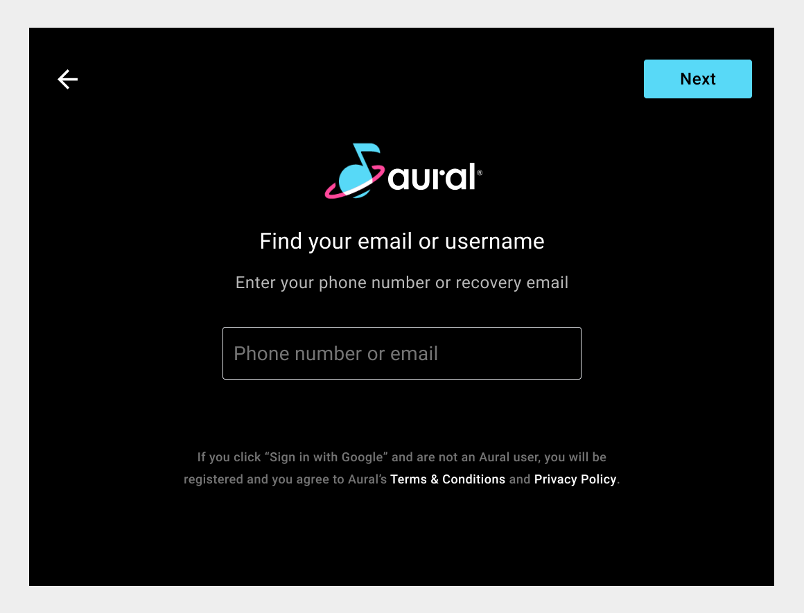
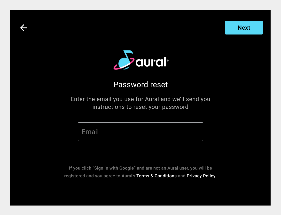
C) Standard sign-in
Standard sign-in for an app requires a user to enter a username (or email) on the landing page, then enter a password on the next page.
Standard sign-in can be offered as a backup option to Google sign-in or phone sign-in. Or, if neither of the other two options are supported, it can be the primary sign-in option. Standard sign-in is not recommended as a primary option, however, because it involves multiple steps and remembering usernames and passwords.
Because users may not always remember usernames and passwords, it’s important to offer options for retrieving or resetting them. These options should be offered via text links at the bottom of the entry screens, so they don’t compete for attention with the primary actions of username and password entry.

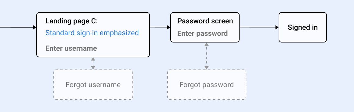
Standard sign-in flow
The flow for standard sign-in is a sequence of 2 screens (username entry and password entry), with optional side trips to 2 other screens. You will need versions of all 4 screens.
Adjust content of screens
Once you have determined which sign-in methods your app will support, you will know which screens will be in your sign-in flow. Depending on what you choose to support, you may have anywhere from 1 to 6 screens for which you need to determine the content (and styling, as discussed in Customize styling).
If you choose Google sign-in or phone sign-in with no backup options, you’ll have 1 sign-in screen to create. On the other hand, if you choose Google sign-in with both other options as backups, you’ll have 6 screens (1 for Google sign-in, 1 for Phone sign-in, and 4 for Standard sign-in).
Examples of these screens are shown in the Google sign-in, phone sign-in, and standard sign-in sections. If you are working from the sample code, you can modify the versions of these screens created in the code. If you are not using the sample code, you should still use these examples as a model.
You’ll need to make some adjustments to the content of these screens, including the following:
- Replace the logo for the fictional Aural app with your app logo
- Modify text and links to reference your app and your related content
- Adjust the PIN-display logic
Logo replacement and PIN-display logic are discussed in more detail below.
Replace app logo
After removing screens you don’t need from the sample code, you’ll want to make sure the remaining screens display your app logo instead of the logo for the fictional Aural app. This replacement may affect other aspects of page design, as discussed below.
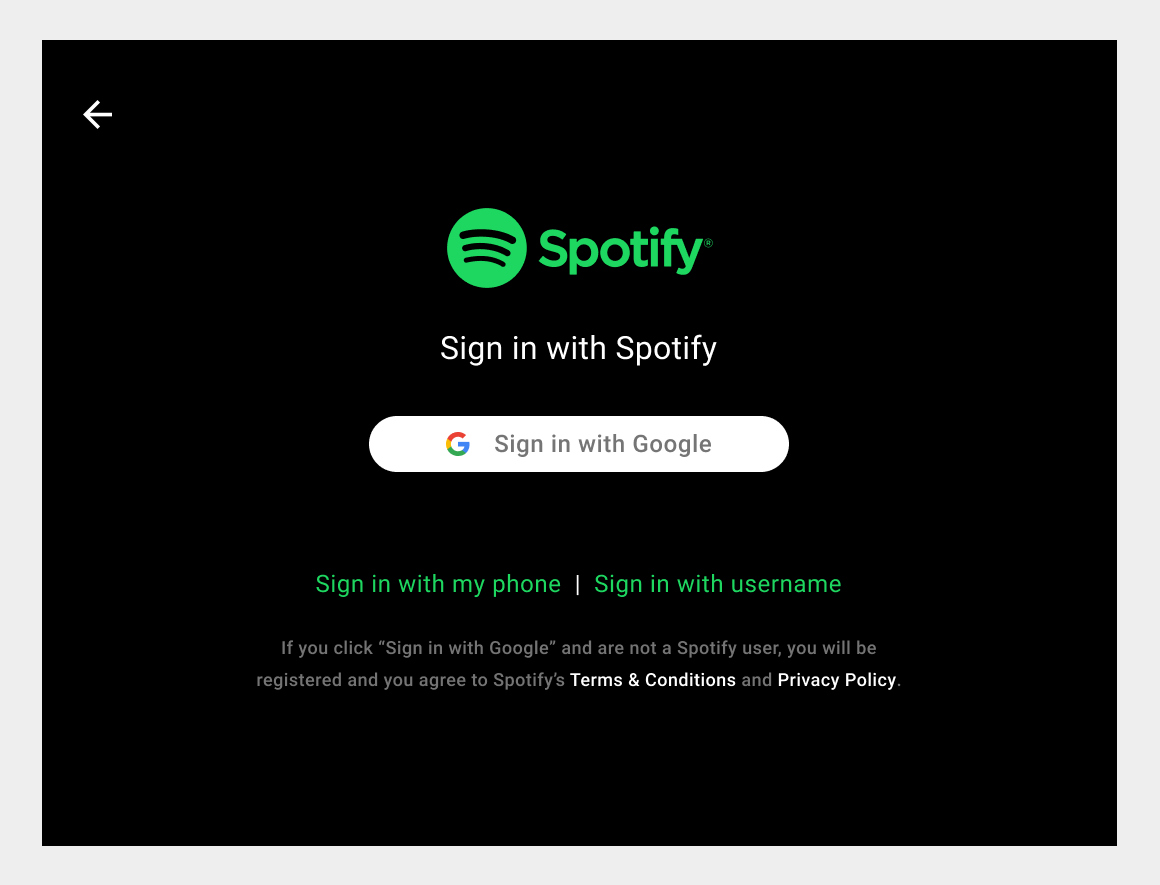
Replacing the logo may lead you to other fine-tuning, such as customizing the colors of other page elements or adjusting the clearance around the logo.
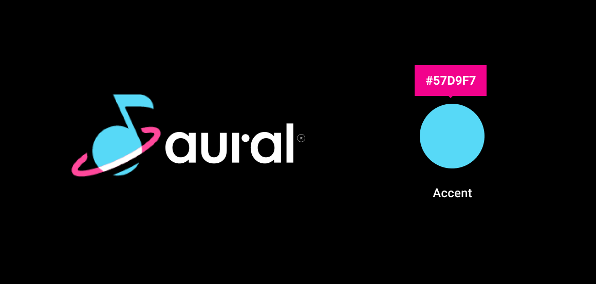
Customizing colors to go with the logo
To ensure that your app logo blends in well with surrounding page elements, you can customize the sign-in code to use your app’s accent color. Styling customization is discussed in the next step, Customize styling.
Adjusting the logo clearance
After replacing the Aural logo with your app’s logo, which will be scaled to the same size as the Aural logo, check the spacing around the logo. If the amount of clear space doesn’t meet your brand guidelines, you can add space around the edges of the logo in the logo file.
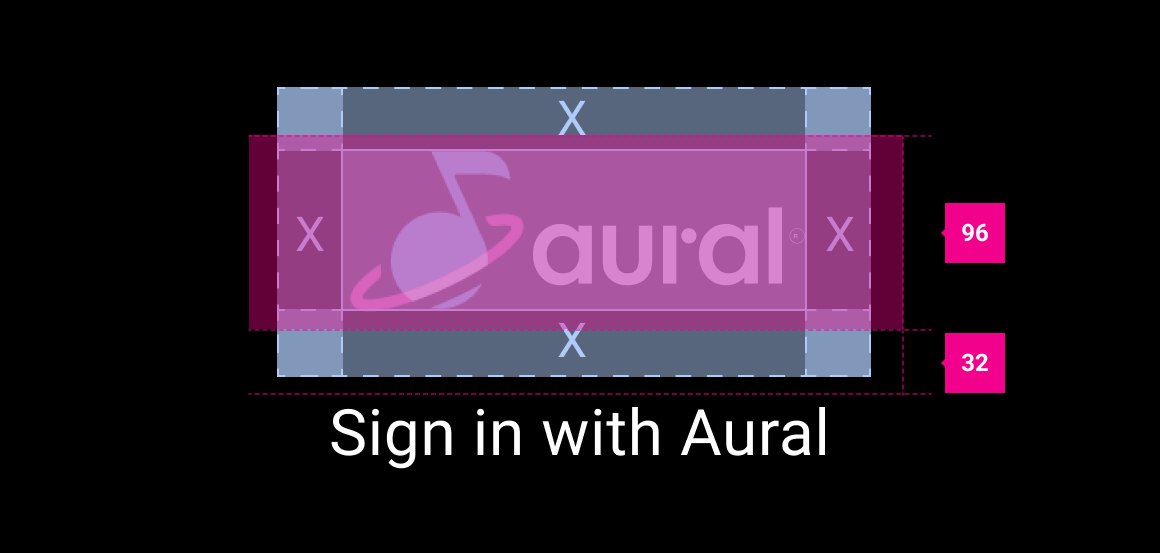
Another approach would be to adjust the spacing on the screen. However, with this approach,you would need to adjust the spacing around the logo individually for each layout. For this reason, adding space within the logo file is the easiest way to increase the clear space around the logo.
Adjust PIN-display logic
The sample sign-in flow generates PIN codes randomly using a simple RAND function. To implement a PIN-generation method based on more robust business logic, you need to modify the relevant code in PinCodeSignInFragment.kt, which is part of the Universal Android Music Player (UAMP) Automotive app.
Customize styling
After adjusting the content of your sign-in screens, you can apply global, brand-appropriate styling to aspects of the UI that affect multiple screens.
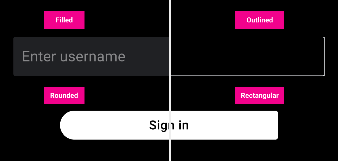
You may want to customize any or all of the following to reflect your brand styling:
- Input field style: filled, outlined, or underlined
- Button style: rounded or rectangular
- Colors: accent, button fill and text, form fill and stroke, form error
- Typography: font, text size
Examples of some of these customization options are below. Keep in mind that customized styling must maintain contrast, minimum sizes for text and touch targets, and other requirements described in Guidelines for custom screens.

Input fields and buttons
The sample sign-in flow uses outlined input fields and rounded buttons as its default styles. Go ahead and change these default styles if different ones – for example, rectangular buttons instead of rounded ones – would better express your brand.
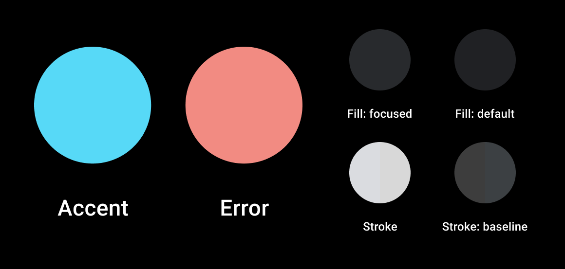
Colors
Customizing the accent and error-state colors used in forms and buttons is a helpful way to express your brand throughout the sign-in flow. Customizing these colors is also important for making sure that input fields, buttons, and links look good on the same page with your app logo, rather than clashing with it.
Make sure that any colors you specify maintain a contrast ratio of at least 4.5:1 between adjacent page elements. For additional guidance about color, as well as details about the color palette used in Android Automotive OS, consult Visual foundations: Color.
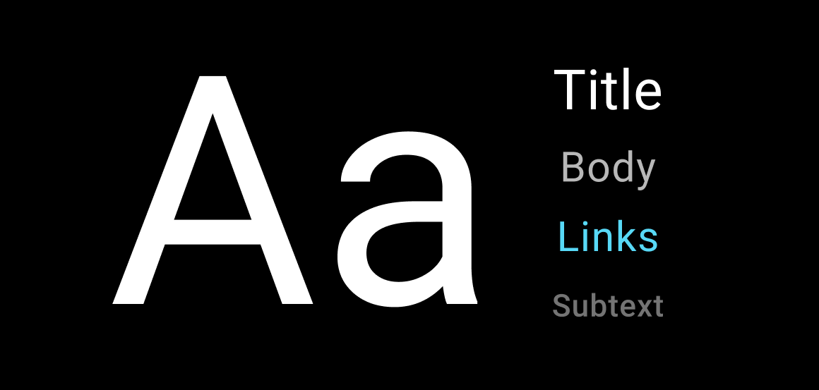
Typography
While typography in the sample sign-in flow can be customized, be cautious about making any changes that could affect legibility. Consult Visual foundations: Typography for information about fonts, minimum type sizes, and other considerations with respect to readability of text on car screens.
Sign-in guidelines
The guidelines in this section relate to how sign-in should work, for optimal usability, in Android Automotive OS. The sample sign-in flow provided in the Universal Android Music Player (UAMP) app meets these guidelines, for the most part. It does not provide a way to create an account, because that would require app-specific logic.
If you have followed the customization process described in this section and have not otherwise changed how the code works, your sign-in flow should be in good shape with respect to the guidelines below. However, be sure to check that your customized styling meets the general requirements specified in Guidelines for custom screens.
If you have made more substantial modifications to the sign-in screens or code, beyond what is described in this section, check your sign-in flow with respect to the general Guidelines for custom screens and also the specific sign-in guidelines below.
| Requirement level | Guidelines |
|---|---|
| SHOULD |
App developers should:
|
| MAY |
App developers may:
|
Rationale:
Consistent media experience. Sign-in screens designed for one media app should provide an experience that is broadly consistent with sign-in screens for other media apps.
Consistent look and feel. Sign-in screens should support the basic design principles and visual foundations for Android Automotive OS.