Page Summary
-
Android Auto's adaptive-responsive framework adapts app layouts to any car screen size using adaptive and responsive design principles.
-
Breakpoints, which are strategically defined screen height and width measurements, determine when to show a specific layout based on ranges of screen height and width.
-
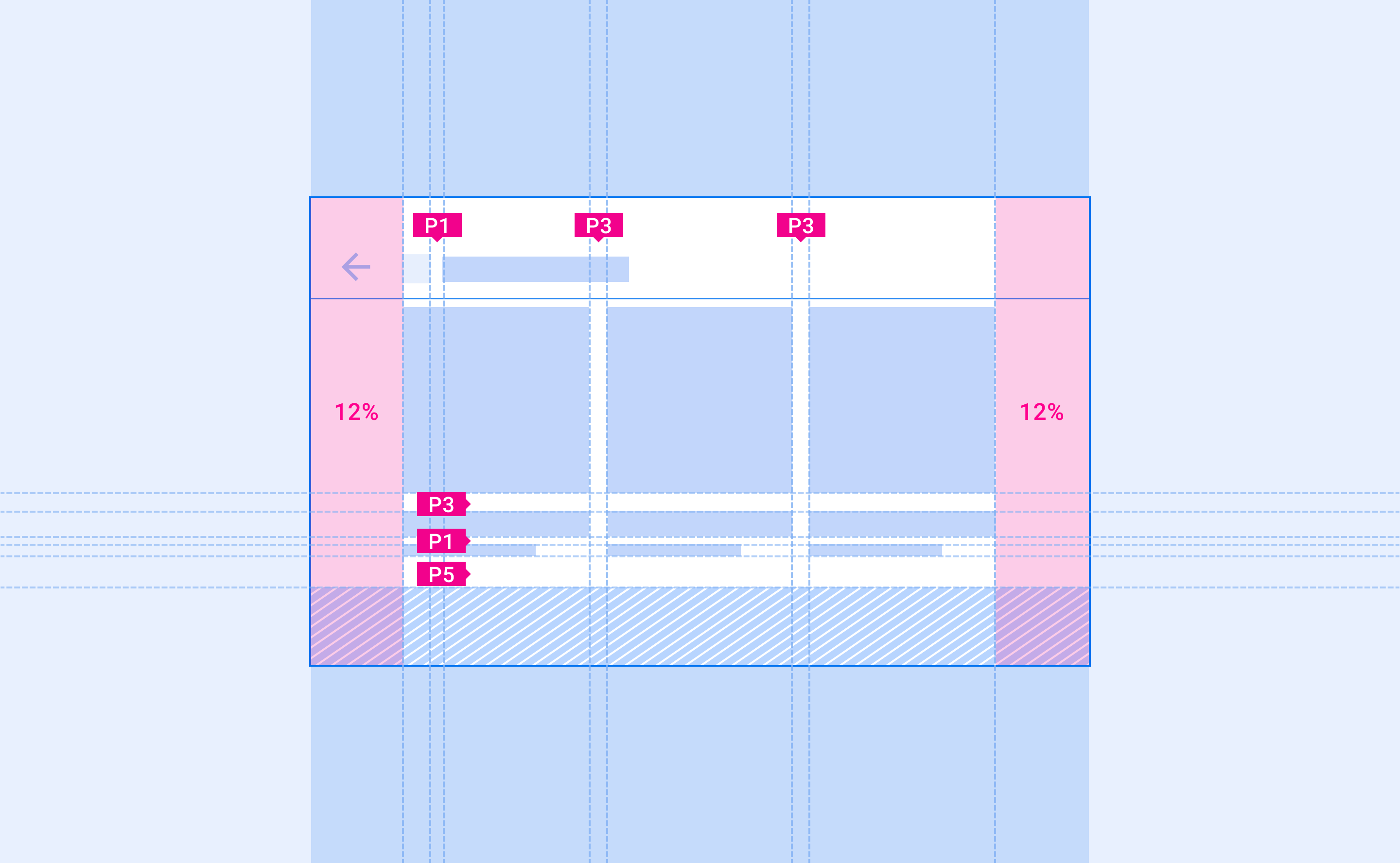
Responsive design, used for left and right margins, adapts layouts proportionally to the exact screen size, with margins adjusting to 12% of the screen width.
-
Android Auto layouts align UI elements along an 8dp grid, with padding applied in multiples of 8dp and smaller components sometimes using 12dp padding.
-
Keylines are measurements that organize a UI by showing where elements and components should be placed horizontally in a layout, changing based on screen width to consistently scale placement across different screen sizes.
Android Auto's adaptive-responsive (AR) framework adapts app layouts to any car screen size.
App UI and features, such as media browsing and playback actions, are also automatically adapted in Android Auto—compatible cars for apps projected from a user's phone.
At a glance
- Layouts adjust to the screen size at specific breakpoints
- Apply padding in 8dp increments
- Place 12dp padding between smaller components sparingly
How layout is determined
Android Auto's AR framework uses both adaptive design and responsive design:
- Responsive design (exact screen size determines layout) is used for the left and right margins
- Adaptive design (ranges of screen height and width determine layout) is used for layout
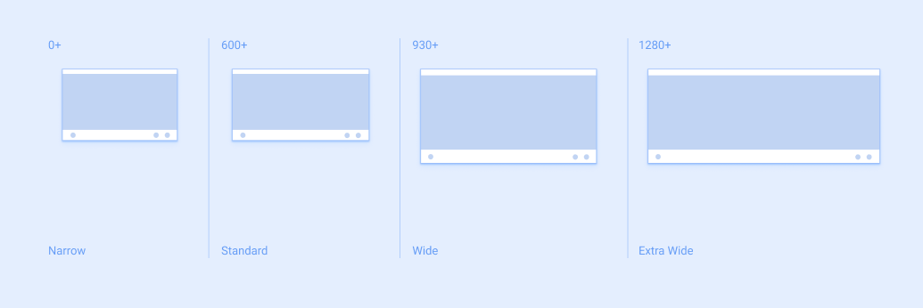
Layout is determined using measurements called breakpoints. Breakpoints are strategically defined screen height and width measurements that determine when to show a specific layout. For each breakpoint range, the layout adjusts to suit the screen size and orientation.
Adaptive
Adaptive design uses breakpoints to determine a screen’s layout. For a defined range of screen sizes (such as those less than 1280dp wide) a specific layout is displayed.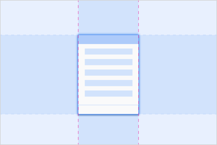
Responsive
Responsive design adapts a layout in a way that’s proportional to the exact screen size. Components have flex areas that can be expanded or shrunk to an appropriate size for each car’s screen.Adaptive breakpoints
Android Auto relies on adaptive breakpoints to determine screen layout, which are calculated from the size of the app window, rather than the entire screen.
Responsive margins
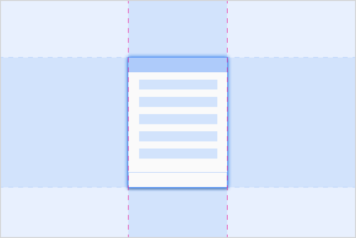
Android Auto uses responsive margins based on the size of the entire car screen. The left and right margins adjust to 12% of the screen width, and they typically contain scroll bars and navigation controls. The remaining screen space, called the app canvas, contains app content.
To provide more space, the right-side margin can be removed on smaller screen sizes. This space can be used by the app as a secondary area to show additional information.
The layout grid
Android Auto layouts align UI elements along an 8dp grid, with some smaller components aligning to a 4dp grid.
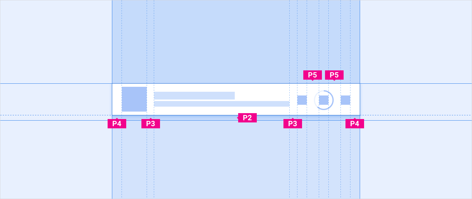
Padding
Padding refers to the space between UI elements. The Android Auto padding scale is applied in multiples of 8dp, up to padding sizes of 96dp. Any larger amounts of padding should also be added in multiples of 8dp.
This table lists typical padding values seen in the Auto UI. Size increments are listed in increasing order, marked by labels that start with the letter “P”:
| P0 | P1 | P2 | P3 | P4 | P5 | P6 | P7 | P8 |
|---|---|---|---|---|---|---|---|---|
| 4dp | 8dp | 12dp | 16dp | 24dp | 32dp | 48dp | 64dp | 96dp |
Padding for smaller components
To create better alignment, and allow sufficient spacing, smaller components may use 12dp of padding sparingly.
Keylines
Keylines are measurements that organize a UI by showing where elements, and components, should be placed horizontally in a layout (along the x-axis). They are marked by labels that start with the letter “KL."
Keylines can be placed anywhere in a layout. They can be used to indicate the distance between any two vertical edges (of elements, components, or the screen itself). Components and elements align their left or right edge to the closest keyline.
Measuring with keylines
Keylines change based on screen width, allowing UI elements to consistently scale their placement across different screen sizes.
The following keylines are recommended for a range of screen sizes, represented by labels marked with “KL(n)". They are shown in order of increasing keyline size:
| KL(n) | Narrow screens (0-600dp) |
Standard screens (600-930dp) |
Wide screens (930-1280dp) |
Extra wide screens (1280dp+) |
|---|---|---|---|---|
| KL0 | 16dp | 24dp | 24dp | 32dp |
| KL1 | 24dp | 32dp | 32dp | 48dp |
| KL2 | 96dp | 112dp | 112dp | N/A |
| KL3 | 112dp | 128dp | 128dp | 152dp |
| KL4 | 148dp | 168dp | 168dp | N/A |