Page Summary
-
A properly formatted and cropped logo increases credibility and user engagement, while a badly displayed logo lowers trust.
-
Agent logos are cropped to display as circles, so ensure your logo crops well within a circular shape.
-
Leave sufficient space around your logo and space it equidistant from all sides of the image to prevent parts from being cropped out.
A properly formatted and cropped logo establishes your agents’s credibility, which can increase user engagement. A badly displayed logo lowers trust in an agent more than no branding at all. Because of how strongly a logo can affect users' perceptions and willingness to use an agent, it's important that your logo displays well.
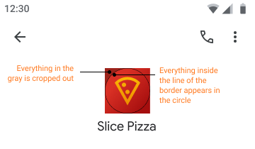
Logos crop to display as circles. Because images are defined as rectangles, you need to check that your logo crops to a circle well. You don't need to account for the thickness of the border that displays around logos. The border doesn't overlap the logo image.

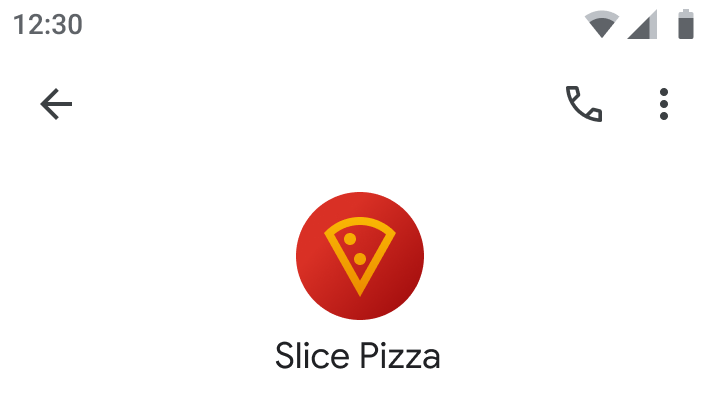
Do
Leave sufficient space in your image to account for cropping.


Space your logo equidistant from all sides of the image to make sure it displays properly and fully.


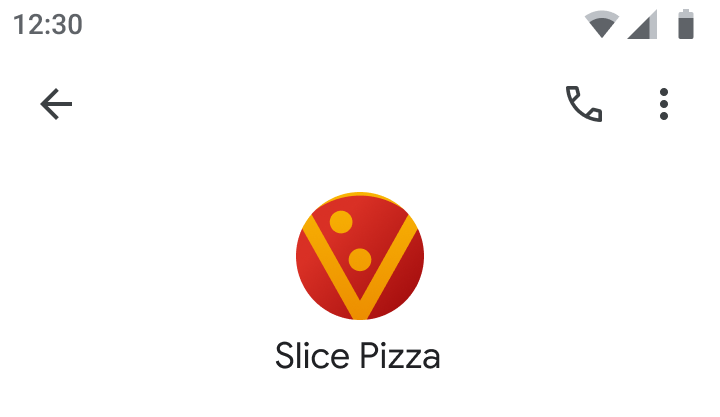
Don't
When a logo takes up the entire height and width of the image, parts of the logo often get cropped out. The result is an unbalanced, badly cropped icon prone to credibility issues.


Resources
Use the following resources to help you design your logo or troubleshoot issues.
Templates
Use the circle logo template as a base for agent logos you create.

Logo preview tool
Enter a URL for your logo to see how it would look to users.