[Editor add-ons](https://developers.google.com/workspace/add-ons/concepts/types#editor_add-ons)
build user interfaces (menus, sidebars, and dialogs) using Apps Script's
[HTML service](https://developers.google.com/apps-script/reference/html/html-service). Because the interfaces
are developed in HTML and CSS, they are highly customizable. However, when
building your add-on interface you should design it to provide a great user
experience.
The best add-ons extend each editor naturally by using familiar controls and
behaviors. When building a new add-on:
- Use the [add-ons CSS package](https://developers.google.com/workspace/add-ons/guides/css) in your [HTML service](https://developers.google.com/apps-script/reference/html/html-service) pages.
- When in doubt about design, find a similar dialog or sidebar in the editor and match it, or refer to an [add-on quickstart](https://developers.google.com/workspace/add-ons/translate-addon-sample).
- Follow this style guide to create a seamless experience.
## Text
This section provides suggestions for writing UI text that is clear and helps
users understand how to use your add-on.
### Add-on name
You must set your add-on's name when you [publish](https://developers.google.com/workspace/add-ons/how-tos/publish-add-on-overview)
it. The name appears in many places, such as the add-on store and within menus.
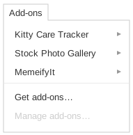
- Use title case.
- Avoid punctuation, especially parentheses, unless part of your brand.
- Keep it short---30 or fewer characters is best. Long names may be automatically truncated.
- Don't include the name of the Google product the add-on is for (or use the word Google).
- Leave out version information.
- Make sure the add-on's published name is the same as the filename of the script project. The project name appears in the authorization dialog.
| No | Yes |
|---|---|
|  |  |
### Writing style
You shouldn't need to write much. Most actions should be made clear through
iconography, layout, and short labels. If you find a portion of your
add-on needs more extensive explanation than short
labels can provide, it's a best practice to create a separate web page
describing your add-on and link to it.
When writing UI text:
- Use sentence case (especially for buttons, labels, and menu items).
- Prefer short, clear text without jargon or acronyms.
| No | Yes |
|---|---|
| | |
### Post-install tip
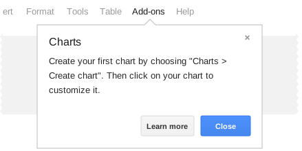
Your post-install tip pops up right after someone installs your add-on, and also
shows up in Help. You have a couple sentences to help users get started quickly.
- Start with an action word.
- Describe the first step for using your add-on.
- If you have a main UI, such as a sidebar, explain how to open it.
- Don't promote your add-on here---it's already installed.
| No | Yes |
|---|---|
|  |  |
### Menu items
Unlike regular Apps Script projects, add-ons don't appear in the script editor
or script manager; users cannot run add-on scripts directly. Instead, every
add-on gets a spot in the [add-ons menu](https://developers.google.com/workspace/add-ons/concepts/menus).
The menu (and possibly a [dialog or sidebar](https://developers.google.com/workspace/add-ons/guides/editor-style#custom_user_interfaces)) let
users interact with the add-on.
- The menu is a key part of how users control your add-on, so design its structure and wording carefully.
- Avoid menu items that repeat your add-on's name. Instead, start with an action word.
- If your main menu item begins a workflow and there's no single verb that describes what it does, call it "Start". This pattern is used in the [Docs add-on quickstart](https://developers.google.com/workspace/add-ons/editors/docs/quickstart/translate).
- Unless your menu has more than six items, try not to use sub-menus. They can be finicky and hard to select.
- Describe the task, not the UI component that the menu item displays.
| No | Yes |
|---|---|
|  |  |
### Error messages
When something goes wrong, it's important to use plain language. Explain the
problem from the user's standpoint, and suggest how to fix it.
- Don't allow the user to see any exceptions your code throws. Instead, use [`try...catch`](https://developer.mozilla.org/en-US/docs/Web/JavaScript/Reference/Statements/try...catch) statements to intercept exceptions, then display a user-friendly error message with inline text styled in the [`error`](https://developers.google.com/workspace/add-ons/guides/css#typography) class from the add-ons CSS package or an [alert](https://developers.google.com/apps-script/guides/dialogs#alert_dialogs) dialog.
- Before you publish, check that your add-on doesn't log debug information to the JavaScript console; use [Cloud Logging](https://developers.google.com/apps-script/guides/logging#stackdriver_logging) instead.
| No | Yes |
|---|---|
|  |  |
### Help content
Every add-on's menu includes an automatic Help dialog. If you provide a help URL
when you publish, the "Learn more" button links to that page. Unless your
add-on is self-explanatory, please provide a page that explains how to use it.
- When possible, show instructions in a bulleted or numbered list. Walk users through to the end result, with clear references to named UI elements.
- Make sure your instructions clearly explain any requirements, like setting up a spreadsheet in a certain way.
- Feel free to link to your help content from your main user interface as well. If your add-on creates a fresh document, you can also display instructions in the body of the document.
## Custom user interfaces
Some Editor add-ons can be controlled entirely by their menu,
but most display a [sidebar or dialog](https://developers.google.com/workspace/add-ons/concepts/dialogs) with
custom content.
- Sidebars are best for persistent tools that people are likely to use repeatedly while referring to the content of their document or spreadsheet.
- Dialogs are best for single-use tools, settings pages, and important messages.
### UI text
In any dialog or sidebar, assume people only read the title and button labels.
Can they still figure out what your interface does and make a good choice?
- Use a title and button labels that stand on their own.
- Avoid long blocks of descriptive text.
### Dialogs
Dialogs are great for tools people use once, then move on. For example, if your
add-on lets people insert a graphic, you might display a dialog with choices of
what to insert¸ then close the dialog when the graphic is inserted. Dialogs are
also helpful for displaying your add-on's settings,
or for communicating an important message.
- Don't open a dialog (including an [alert or prompt](https://developers.google.com/apps-script/guides/dialogs)) from another dialog---only display one at a time.
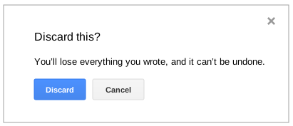
- For the dialog title, use a word or short phrase, leading with the most important word.
- Button labels should relate to the dialog title.
- Prefer two buttons, usually a primary action and "Cancel". For special cases that require a third button, consider the bottom-right corner.
- Put buttons in the bottom-left corner of the dialog. The blue primary button should be on the left, with any gray secondary buttons to the right.
| No | Yes |
|---|---|
|  |  |
### Sidebars
Sidebars let people refer back to their document, spreadsheet, presentation, or
form while making choices. They also let people use your
add-on repeatedly. Whenever a new sidebar is opened,
any previous sidebar closes automatically. They're best for temporary modes that
the user exits when done.
- Users might have other add-ons with their own sidebars. If two add-ons try to open sidebars simultaneously, only one is shown.
- Don't display a sidebar or dialog when a document first opens.
- Only add-ons operating in [`AuthMode.FULL`](https://developers.google.com/workspace/add-ons/concepts/editor-auth-lifecycle#authorization_modes) can open sidebars or dialogs. You can use a [menu item](https://developers.google.com/workspace/add-ons/guides/editor-style#menu_items) to open a sidebar since this prompts the user to provide full authorization.
## Controls
Great add-on UIs leave their controls some breathing
room. Adequate margins and padding go a long way, whereas dense controls can
seem overwhelming. When in doubt, borrow a layout from the editor itself. For
example, review existing dialogs in Google Docs, such as **File \> Page
setup**, when creating your own.
The documentation for the [add-ons CSS package](https://developers.google.com/workspace/add-ons/guides/css)
provides sample markup for each of the types of controls described in the
following sections.
### Buttons
Use buttons to control your user interface's main actions rather than plain
links or other elements.
- Avoid displaying more than one blue, red, or green button at a time. Gray buttons may appear repeatedly.
- Most button labels should be in sentence case and start with a verb. Red buttons, usually for create actions, should use all caps.
| No | Yes |
|---|---|
| | |
### Checkboxes and radio buttons
Use checkboxes when people can select multiple options, or no option at all. Use
radio buttons (or a select menu) when exactly one option must be selected.
- Don't change checkboxes' behavior to mimic radio buttons.
- Don't do anything immediately when they're checked. People make mistakes. Wait until your users click a button to confirm their choices.
### Select menus
Selects are a great way to offer a short list of alternatives.
- Sort the options alphabetically or by a logical scheme that all users can understand (like days of the week, starting from Sunday).
- If the list grows too long, consider using a different control. For example, you might display a scrollable list to give the menu more space and make it easier to navigate.
### Text areas
If people need to type more than a few words, use a text area.
- Make text areas at least two lines tall so they're easier to use and don't look like text fields.
- Place labels on top.
### Text fields
Use text fields if people only need to type a word or two.
- A text field's width should suggest what you expect people to type in it.
- Avoid using placeholder text as a label, because it disappears on focus. Placeholder text is useful for giving examples or extra detail.
- Place labels on top, but feel free to lay out short text fields side-by-side.
## Branding
This section describes how to add branding to your add-on.
### In your add-on
If you'd like to include branding, keep it brief and light. This helps
people focus on your UI, and makes your add-on feel like part of the editor.
- All aspects of your add-on must follow the [branding guidelines](https://developers.google.com/chrome/web-store/branding).
- Don't include the word "Google" or use Google product icons.
- Text should be no more than a few words and styled in the [`gray`](https://developers.google.com/workspace/add-ons/guides/css#typography) class from the add-ons CSS package.
- Graphics should be on a white background and no more than 200px × 60px.
- For dialogs, branding should be in the bottom-right corner.
- For sidebars, branding can be at the top or bottom.
### In the store
In order to publish an Editor add-on, you need a
[number of image assets](https://developers.google.com/workspace/add-ons/how-tos/publish-add-on-overview#required_assets).
These assets are used to construct the add-on store listing.
- All aspects of your store listing must follow the [branding guidelines](https://developers.google.com/chrome/web-store/branding).
- For more details on the images you need to provide, see the [image guidelines](https://developers.google.com/chrome/web-store/docs/images).
## Accessibility
Everyone should be able to enjoy your add-on, whether they see colors
differently, use a screen reader, or have other needs. Accessibility is a broad
topic that can't be fully covered in this style guide. One helpful resource is
the [Google Accessibility](http://www.google.com/accessibility/) site. But here
are a few tips to get started:
- Make sure you can navigate to all UI controls with the keyboard. Add `tabindex=0` to custom controls (like those made with ``) so people can tab to them. Consider if other keys should be supported too, such as arrows for a list.
- Some people may use a screen reader with your add-on. Thus, images should have an [`alt` attribute](http://diveintoaccessibility.info/day_23_providing_text_equivalents_for_images.html), and custom controls should have [ARIA attributes](http://www.w3.org/TR/wai-aria/) to describe their use.
- Don't rely solely on color to communicate state. Use icons and text too.
If you use standard web controls, like those described earlier in this guide,
making your add-on accessible is easier.