Give users fast, secure access to everyday essentials
With Google Wallet, your customers can tap to pay everywhere Google Pay is accepted, shop with loyalty cards, board a flight, and more, all with just their Android phone.
Introducing Google Wallet and developer API features
Google is building a secure, private digital wallet for Android and Chrome users. Learn more about what's changing.
Digitize any wallet object with the Google Wallet API
Follow a step-by-step workshop on how to digitize any wallet object using the Google Wallet API.
Use cases
We've customized our developer guides to fit your specific needs. Choose your use case to get started.
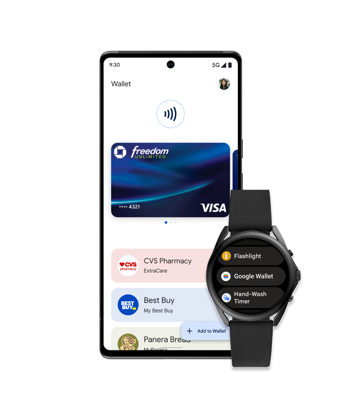
Retail
Make it easy for your customers to add loyalty cards, offers, gift cards, or make in-store payments using their mobile device. Integrate with Google Wallet and engage with users through location-based notifications, real-time updates, and more.
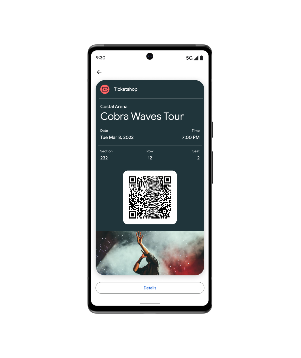
Tickets
Your users can add tickets and passes for movies, flights, and more, right in Google Wallet.
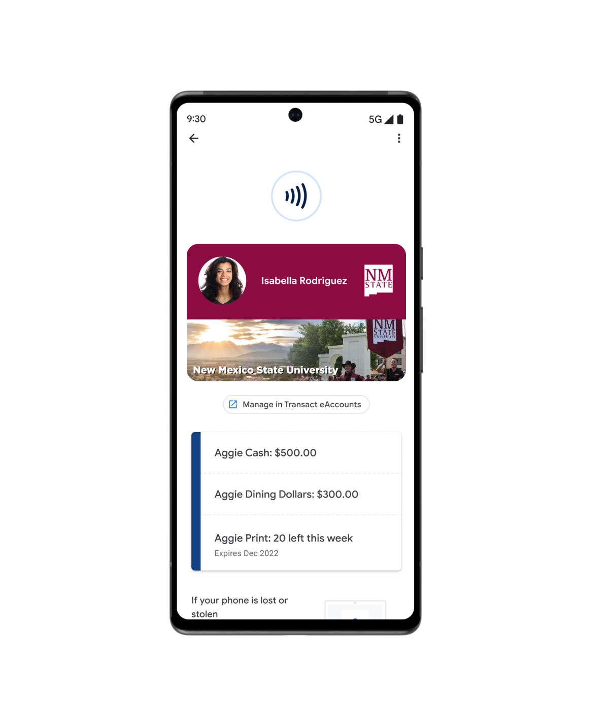
Access
Google Wallet is simple, secure, and convenient. From digital car keys to campus ID cards, your users can add them all in their Google Wallet.
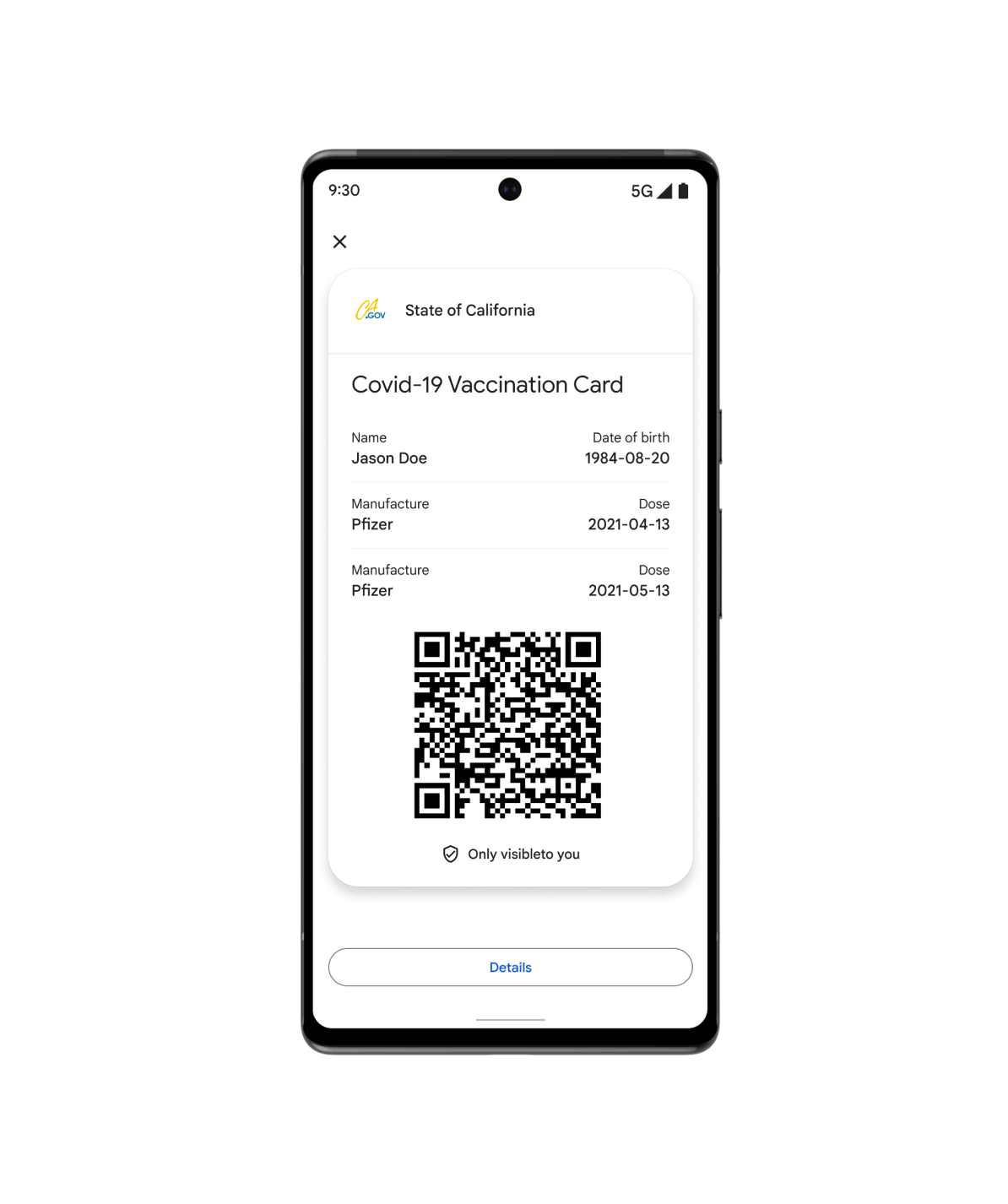
Health
Offer your patients fast and secure access to their protected health with Google Wallet. From vaccine cards to test records, users can add everything to their device and add them to their Android Home screen.
And more…
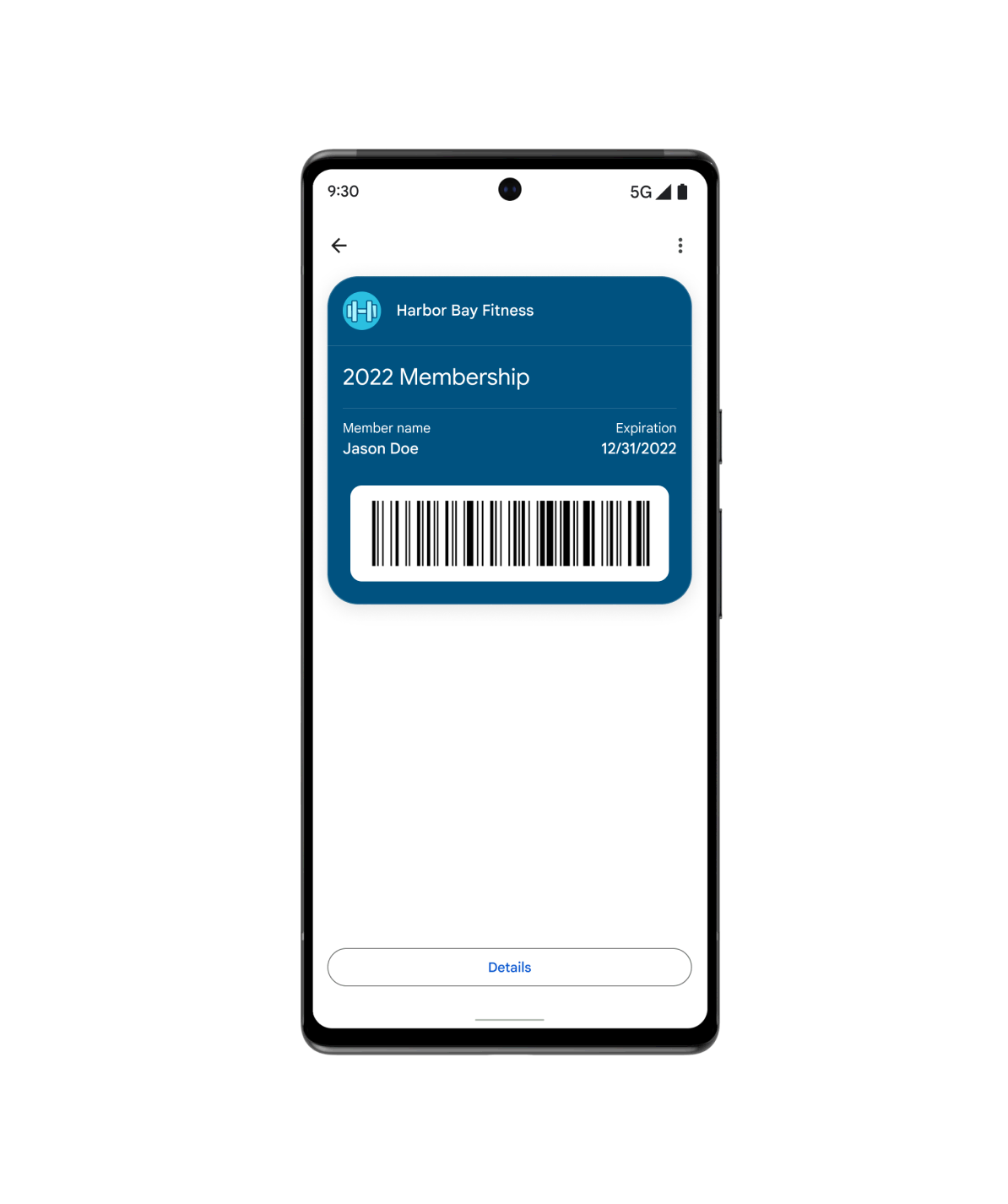
Use the Generic pass when your use case does not fit into any of our other pre-defined types. From gym memberships to library cards, insurance cards to parking passes, you can customize generic passes to meet your customers' needs.
Featured resources
Find the latest developer tools and samples to help you build wallet objects.

Passes visual demo
Make quick adjustments to the design of your loyalty card in Google Wallet, and get the code snippet in your preferred language.

Code samples
Browse and clone sample integrations for each vertical and programming language (Java, C#, Python, PHP, JavaScript)

Codelabs
Explore self-guided codelabs and gain firsthand experience with Google Wallet APIs.
Product news
Stay in the know with news from Google Wallet developers.
Increase cross-platform adoption with the Pass Converter
The Pass Converter lets you take existing passes for one wallet application, convert them, and make them available in your mobile or web application for another wallet platform.
Try the new Google Wallet API code samples
The Google Wallet API code samples repository shows how to create classes, objects, Add to Google Wallet links, and manage issuer accounts. Each supported language includes detailed documentation comments compatible with most popular IDEs.
Simpler Google Wallet integration for Android developers
Learn about the benefits of using the new Google Wallet Android SDK to digitize wallet objects on Android, and explore developer resources to help you integrate.
Google Pay and Wallet Console
Enable fast, simple checkout, passes, and more within your Android app or website.