Introducing Feature Crosses
Can a feature cross truly enable a model to fit nonlinear data? To find out, try this exercise.
Task: Try to create a model that separates the blue dots from the orange dots by manually changing the weights of the following three input features:
- x1
- x2
- x1 x2 (a feature cross)
To manually change a weight:
- Click on a line that connects FEATURES to OUTPUT. An input form will appear.
- Type a floating-point value into that input form.
- Press Enter.
Note that the interface for this exercise does not contain a Step button. That's because this exercise does not iteratively train a model. Rather, you will manually enter the "final" weights for the model.
(Answers appear just below the exercise.)
More Complex Feature Crosses
Now let's play with some advanced feature cross combinations. The data set in this Playground exercise looks a bit like a noisy bullseye from a game of darts, with the blue dots in the middle and the orange dots in an outer ring.
Click the plus icon for an explanation of model visualization.
Each Playground exercise displays a visualization of the current state of the model. For example, here's a visualization:
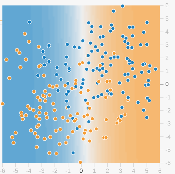
Note the following about the model visualization:
- Each axis represents a specific feature. In the case of spam vs. not spam, the features could be the word count and the number of recipients of the email.
- Each dot plots the feature values for one example of the data, such as an email.
- The color of the dot represents the class that the example belongs to. For example, the blue dots can represent non-spam emails while the orange dots can represent spam emails.
- The background color represents the model's prediction of where examples of that color should be found. A blue background around a blue dot means that the model is correctly predicting that example. Conversely, an orange background around a blue dot means that the model is incorrectly predicting that example.
- The background blues and oranges are scaled. For example, the left side of the visualization is solid blue but gradually fades to white in the center of the visualization. You can think of the color strength as suggesting the model's confidence in its guess. So solid blue means that the model is very confident about its guess and light blue means that the model is less confident. (The model visualization shown in the figure is doing a poor job of prediction.)
Use the visualization to judge your model's progress. ("Excellent—most of the blue dots have a blue background" or "Oh no! The blue dots have an orange background.") Beyond the colors, Playground also displays the model's current loss numerically. ("Oh no! Loss is going up instead of down.")
Task 1: Run this linear model as given. Spend a minute or two (but no longer) trying different learning rate settings to see if you can find any improvements. Can a linear model produce effective results for this data set?
Task 2: Now try adding in cross-product features, such as x1x2, trying to optimize performance.
- Which features help most?
- What is the best performance that you can get?
Task 3: When you have a good model, examine the model output surface (shown by the background color).
- Does it look like a linear model?
- How would you describe the model?
(Answers appear just below the exercise.)