While the Data Preparation and Feature Engineering for Machine Learning course covers general data preparation, this course looks at preparation specific to clustering.
In clustering, you calculate the similarity between two examples by combining all the feature data for those examples into a numeric value. Combining feature data requires that the data have the same scale. This section looks at normalizing, transforming, and creating quantiles, and discusses why quantiles are the best default choice for transforming any data distribution. Having a default choice lets you transform your data without inspecting the data's distribution.
Normalizing Data
You can transform data for multiple features to the same scale by normalizing the data. In particular, normalization is well-suited to processing the most common data distribution, the Gaussian distribution. Compared to quantiles, normalization requires significantly less data to calculate. Normalize data by calculating its z-score as follows:
\[x'=(x-\mu)/\sigma\\ \begin{align*} \text{where:}\quad \mu &= \text{mean}\\ \sigma &= \text{standard deviation}\\ \end{align*} \]
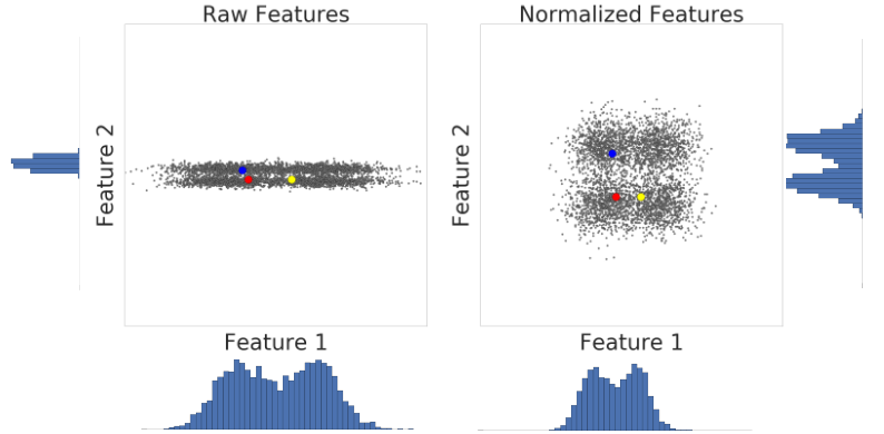
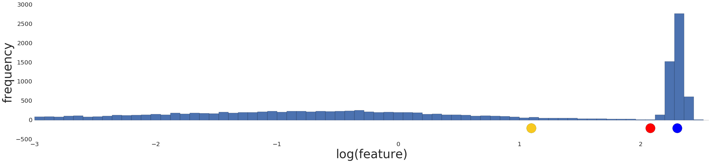
Let’s look at similarity between examples with and without normalization. In Figure 1, you find that red appears to be more similar to blue than yellow. However, the features on the x- and y-axes do not have the same scale. Therefore, the observed similarity might be an artifact of unscaled data. After normalization using z-score, all the features have the same scale. Now, you find that red is actually more similar to yellow. Thus, after normalizing data, you can calculate similarity more accurately.
In summary, apply normalization when either of the following are true:
- Your data has a Gaussian distribution.
- Your data set lacks enough data to create quantiles.
Using the Log Transform
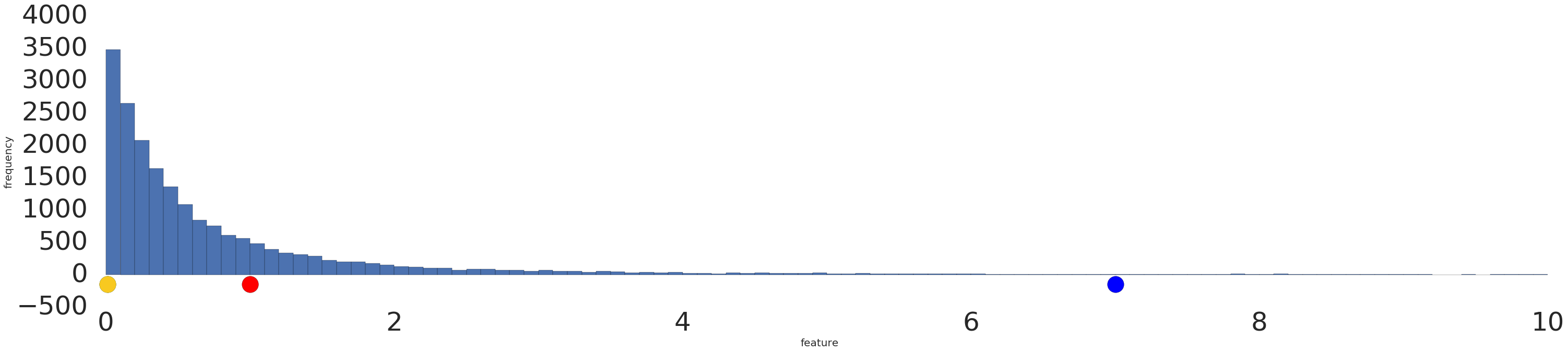
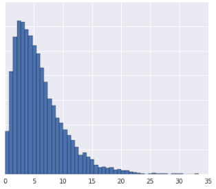
Sometimes, a data set conforms to a power law distribution that clumps data at the low end. In Figure 2, red is closer to yellow than blue.
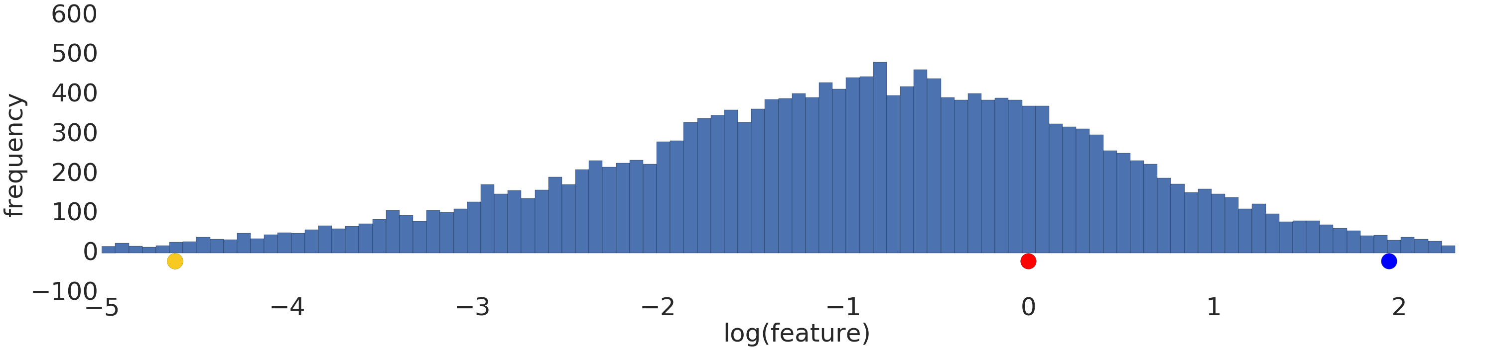
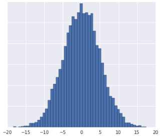
Process a power-law distribution by using a log transform. In Figure 3, the log transform creates a smoother distribution, and red is closer to blue than yellow.
Using Quantiles
Normalization and log transforms address specific data distributions. What if data doesn’t conform to a Gaussian or power-law distribution? Is there a general approach that applies to any data distribution?
Let’s try to preprocess this distribution.
Intuitively, if the two examples have only a few examples between them, then these two examples are similar irrespective of their values. Conversely, if the two examples have many examples between them, then the two examples are less similar. Thus, the similarity between two examples decreases as the number of examples between them increases.
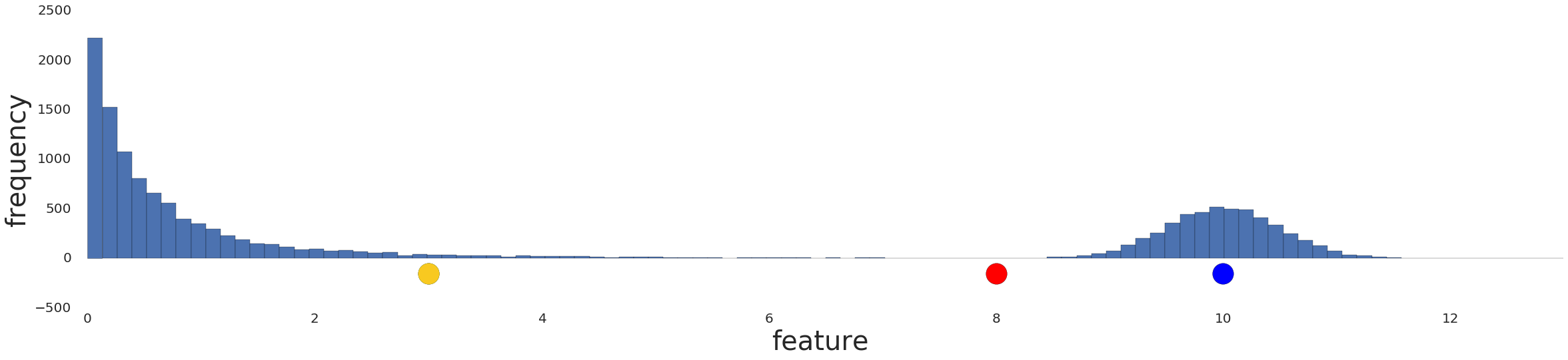
Normalizing the data simply reproduces the data distribution because normalization is a linear transform. Applying a log transform doesn't reflect your intuition on how similarity works either, as shown in Figure 5 below.
Instead, divide the data into intervals where each interval contains an equal number of examples. These interval boundaries are called quantiles.
Convert your data into quantiles by performing the following steps:
- Decide the number of intervals.
- Define intervals such that each interval has an equal number of examples.
- Replace each example by the index of the interval it falls in.
- Bring the indexes to same range as other feature data by scaling the index values to [0,1].
![A graph showing the data after conversion
into quantiles. The line represent 20 intervals.]](/static/machine-learning/clustering/images/Quantize.png)
After converting data to quantiles, the similarity between two examples is inversely proportional to the number of examples between those two examples. Or, mathematically, where “x” is any example in the dataset:
- \(sim(A,B) \approx 1 − | \text{prob}[x > A] − \text{prob}[x > B] |\)
- \(sim(A,B) \approx 1 − | \text{quantile}(A) − \text{quantile}(B) |\)
Quantiles are your best default choice to transform data. However, to create quantiles that are reliable indicators of the underlying data distribution, you need a lot of data. As a rule of thumb, to create \(n\) quantiles, you should have at least \(10n\) examples. If you don't have enough data, stick to normalization.
Check Your Understanding
For the following questions, assume you have enough data to create quantiles.
Question One
- The data distribution is Gaussian.
- You have insight into what the data represents, which tells you that the data should not be transformed nonlinearly. As a result, you avoid quantiles and choose normalization instead.
Question Two
Missing Data
If your dataset has examples with missing values for a certain feature but such examples occur rarely, then you can remove these examples. If such examples occur frequently, we have the option to either remove this feature altogether, or to predict the missing values from other examples by using a machine learning model. For example, you can infer missing numerical data by using a regression model trained on existing feature data.