This document goes over how to follow Glass style and implement common UI best practices when using the GDK.
Glass theme
Glass applies a standard theme to your Glassware, so it stays consistent with the rest of the user interface. The theme has the following characteristics:
- Uses Roboto typeface
- Displays activities full-screen with no status bar or action bar
- Applies solid, black background
To apply the Glass theme, don't declare a theme in your Android Manifest.
If you have a custom style for parts of your Glassware
and want the default Glass theme for everything else,
inherit from Theme.DeviceDefault with the parent attribute:
<resources>
    <style name="CustomTheme" parent="@android:style/Theme.DeviceDefault">
        <!-- Theme customization goes here. -->
    </style>
</resources>
See the Android developer guide on Styles and Themes for more information about creating themes.
Glass-styled cards
The CardBuilder
class creates well-formed cards given a set of properties. Use the layouts
provided by CardBuilder.Layout
whenever possible so that your content looks and feels like other content on
Glass.
To use CardBuilder:
- Create an instance of
CardBuilder, giving it your desired layout fromCardBuilder.Layout. - Set properties of the card, such as the text, footnote, and timestamp.
- Call
CardBuilder.getView()to convert the card to an AndroidView, orCardBuilder.getRemoteViews()to convert it to aRemoteViewsobject. - Use the
Viewin your activities, layouts, or in aCardScrollView, or use theRemoteViewsin aLiveCard.
Common UI features
Many of the layouts provided by CardBuilder support the common user interface
features described below. See the documentation of the individual layouts in
CardBuilder.Layout
for a list of the features supported by each type of card.
Attribution icon
The attribution icon is an optional 36 × 36 pixel icon that appears on
the bottom-right corner of a card and to the right of the timestamp. Set this
icon by calling
CardBuilder.setAttributionIcon()
to identify your application, especially on live cards so a user can quickly
glance and see the source of the information on that card.
Stack indicator
The stack indicator, controlled by
CardBuilder.showStackIndicator(),
is a corner fold that appears on the top-right corner of a card. Use this as
a visual indicator that your card represents a bundle of other cards that the
user can tap directly into.

View view = new CardBuilder(context, CardBuilder.Layout.TEXT)
    .setText("A stack indicator can be added to the corner of a card...")
    .setAttributionIcon(R.drawable.ic_smile)
    .showStackIndicator(true)
    .getView();
Layouts
The following examples show the layouts that are available using the
CardBuilder.
TEXT and TEXT_FIXED
The CardBuilder.Layout.TEXT
layout shows full-bleed text with an optional
image mosaic in the background. The text dynamically resizes to best fit the
available space.
CardBuilder.Layout.TEXT_FIXED
is similar but fixes its text to a smaller size.
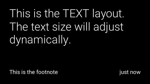


View view1 = new CardBuilder(context, CardBuilder.Layout.TEXT)
    .setText("This is the TEXT layout. The text size will adjust dynamically.")
    .setFootnote("This is the footnote")
    .setTimestamp("just now")
    .getView();
View view2 = new CardBuilder(context, CardBuilder.Layout.TEXT)
    .setText("You can also add images to the background of a TEXT card.")
    .setFootnote("This is the footnote")
    .setTimestamp("just now")
    .addImage(R.drawable.image1)
    .addImage(R.drawable.image2)
    .addImage(R.drawable.image3)
    .addImage(R.drawable.image4)
    .addImage(R.drawable.image5)
    .getView();
View view3 = new CardBuilder(context, CardBuilder.Layout.TEXT_FIXED)
    .setText("This is the TEXT_FIXED layout. The text size is always the same.")
    .setFootnote("This is the footnote")
    .setTimestamp("just now")
    .getView();
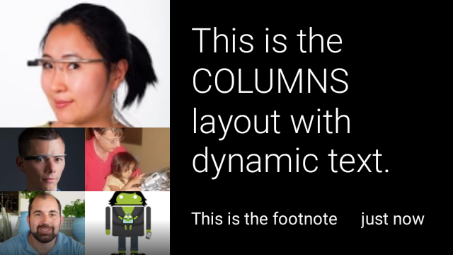
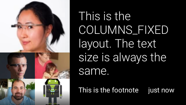
COLUMNS and COLUMNS_FIXED
The
CardBuilder.Layout.COLUMNS
layout shows an image mosaic or icon on the
left side of the card and text on the right side. The text is dynamically sized
to best fit the available space. To keep the text size fixed, use
CardBuilder.Layout.COLUMNS_FIXED.
View view1 = new CardBuilder(context, CardBuilder.Layout.COLUMNS)
    .setText("This is the COLUMNS layout with dynamic text.")
    .setFootnote("This is the footnote")
    .setTimestamp("just now")
    .addImage(R.drawable.image1)
    .addImage(R.drawable.image2)
    .addImage(R.drawable.image3)
    .addImage(R.drawable.image4)
    .addImage(R.drawable.image5)
    .getView();
View view2 = new CardBuilder(context, CardBuilder.Layout.COLUMNS)
    .setText("You can even put a centered icon on a COLUMNS card instead of a mosaic.")
    .setFootnote("This is the footnote")
    .setTimestamp("just now")
    .setIcon(R.drawable.ic_wifi)
    .getView();
View view3 = new CardBuilder(context, CardBuilder.Layout.COLUMNS_FIXED)
    .setText("This is the COLUMNS_FIXED layout. The text size is always the same.")
    .setFootnote("This is the footnote")
    .setTimestamp("just now")
    .addImage(R.drawable.image1)
    .addImage(R.drawable.image2)
    .addImage(R.drawable.image3)
    .addImage(R.drawable.image4)
    .addImage(R.drawable.image5)
    .getView();
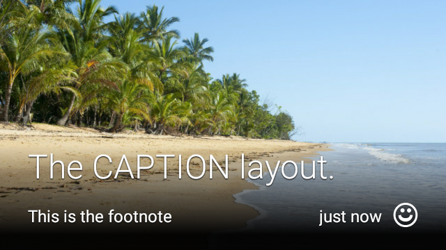
CAPTION
The
CardBuilder.Layout.CAPTION
layout has an image mosaic in the background
and brief caption text aligned at the bottom of the card. An icon can also be
placed next to the caption to represent, for example, the identity of a person
associated with the card's content.
View view1 = new CardBuilder(context, CardBuilder.Layout.CAPTION)
    .setText("The caption layout.")
    .setFootnote("This is the footnote")
    .setTimestamp("just now")
    .addImage(R.drawable.beach)
    .setAttributionIcon(R.drawable.ic_smile)
    .getView();

View view2 = new CardBuilder(context, CardBuilder.Layout.CAPTION)
    .setText("The caption layout with an icon.")
    .setFootnote("This is the footnote")
    .setTimestamp("just now")
    .addImage(R.drawable.beach)
    .setIcon(R.drawable.ic_avatar)
    .setAttributionIcon(R.drawable.ic_smile)
    .getView();
TITLE
The
CardBuilder.Layout.TITLE
layout has an image mosaic in the background
with a centered title and optional icon on the bottom of the card. This layout
is often used to represent contacts or share targets. Footnote and timestamp are
not supported on this layout.

View view = new CardBuilder(context, CardBuilder.Layout.TITLE)
    .setText("TITLE Card")
    .setIcon(R.drawable.ic_phone)
    .addImage(R.drawable.beach)
    .getView();
AUTHOR
Use the
CardBuilder.Layout.AUTHOR
layout to display a message or conversation
where the focus is on the author. It supports an image mosaic in the background,
an icon used as the author's avatar, and a heading and subheading where you can
list identifying information.
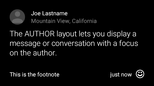
View view = new CardBuilder(context, CardBuilder.Layout.AUTHOR)
    .setText("The AUTHOR layout lets you display a message or conversation "
            + " with a focus on the author.")
    .setIcon(R.drawable.ic_avatar)
    .setHeading("Joe Lastname")
    .setSubheading("Mountain View, California")
    .setFootnote("This is the footnote")
    .setTimestamp("just now")
    .getView();
MENU
The
CardBuilder.Layout.MENU
layout looks like a standard Glass menu. It has a
centered icon and title and an optional footnote. Use this layout for
confirmation screens (transitioning from "Deleting" to "Deleted" after the user
selects a menu item, for example). If you need a real menu, you should use a
standard options menu instead.
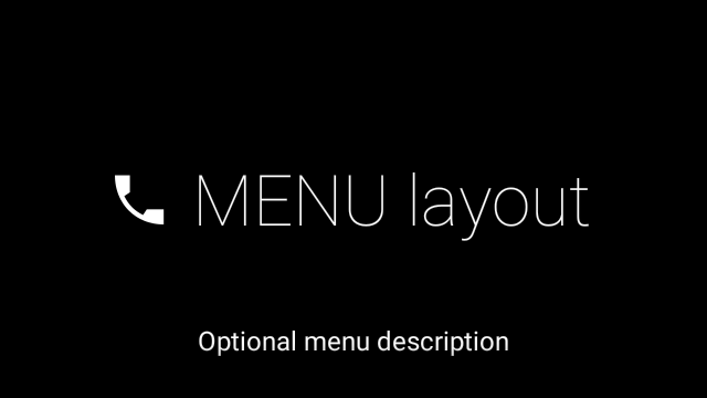
View view = new CardBuilder(context, CardBuilder.Layout.MENU)
    .setText("MENU layout")
    .setIcon(R.drawable.ic_phone)
    .setFootnote("Optional menu description")
    .getView();
EMBED_INSIDE
The
CardBuilder.Layout.EMBED_INSIDE
layout embeds a custom layout XML of your own design into the standard Glass
card template. This lets you design a custom UI for your application but still
have correct placement of a card's footnote, timestamp, attribution icon, and
stack indicator if they are needed.
After calling
CardBuilder.getView(),
use
findViewById()
on the result to access the views inside your embedded layout. Likewise, if you
call
CardBuilder.getRemoteViews(),
you can manipulate your embedded layout's views by passing their IDs directly
into the
RemoteViews
setter methods.
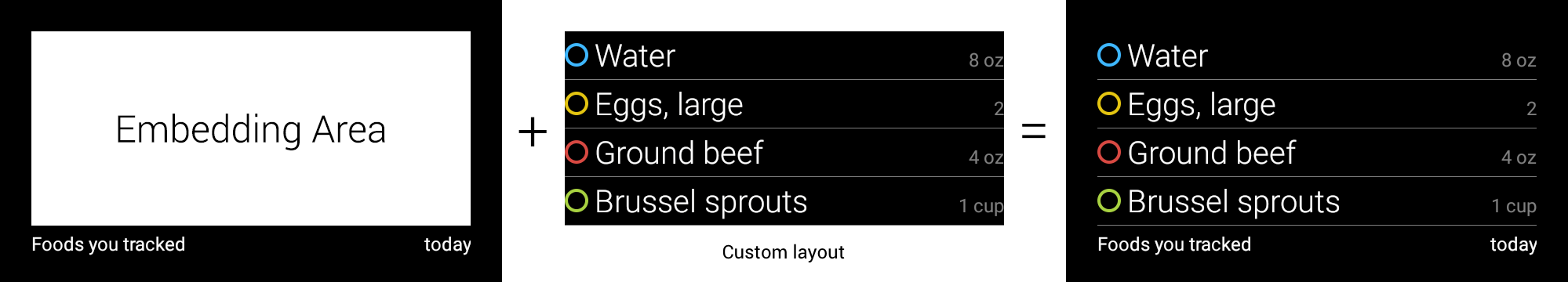
View view = new CardBuilder(context, CardBuilder.Layout.EMBED_INSIDE)
    .setEmbeddedLayout(R.layout.food_table)
    .setFootnote("Foods you tracked")
    .setTimestamp("today")
    .getView();
TextView textView1 = (TextView) view.findViewById(R.id.text_view_1);
textView1.setText("Water");
// ...and so on
For a more detailed example, see the GitHub ApiDemo project.
ALERT
The
CardBuilder.Layout.ALERT
layout contains a large centered icon with a
primary message and footnote. Use this layout in a
Dialog to
show an important informational message, warning, or error in your Glassware.


The following example shows an implementation of AlertDialog and dismisses the
card and opens the WiFi settings when the user taps on the card:
- Create a class that extends
Dialog. - Create the card using
CardBuilderwith theCardBuilder.Layout.ALERTlayout and then set the content view with this card. (Optional) Create a
GestureDetectorto handle user gestures on this card.public class AlertDialog extends Dialog { private final DialogInterface.OnClickListener mOnClickListener; private final AudioManager mAudioManager; private final GestureDetector mGestureDetector; /** * Handles the tap gesture to call the dialog's * onClickListener if one is provided. */ private final GestureDetector.BaseListener mBaseListener = new GestureDetector.BaseListener() { @Override public boolean onGesture(Gesture gesture) { if (gesture == Gesture.TAP) { mAudioManager.playSoundEffect(Sounds.TAP); if (mOnClickListener != null) { // Since Glass dialogs do not have buttons, // the index passed to onClick is always 0. mOnClickListener.onClick(AlertDialog.this, 0); } return true; } return false; } }; public AlertDialog(Context context, int iconResId, int textResId, int footnoteResId, DialogInterface.OnClickListener onClickListener) { super(context); mOnClickListener = onClickListener; mAudioManager = (AudioManager) context.getSystemService(Context.AUDIO_SERVICE); mGestureDetector = new GestureDetector(context).setBaseListener(mBaseListener); setContentView(new CardBuilder(context, CardBuilder.Layout.ALERT) .setIcon(iconResId) .setText(textResId) .setFootnote(footnoteResId) .getView()); } /** Overridden to let the gesture detector handle a possible tap event. */ @Override public boolean onGenericMotionEvent(MotionEvent event) { return mGestureDetector.onMotionEvent(event) || super.onGenericMotionEvent(event); } }(Optional) In your activity, implement an
OnClickListenerto handle any additional flows when the user taps. For more information on starting settings activities like WiFi, see Starting settings.Call the
AlertDialogconstructor to display the alert card.public class MyActivity extends Activity { ... private final DialogInterface.OnClickListener mOnClickListener = new DialogInterface.OnClickListener() { @Override public void onClick(DialogInterface dialog, int button) { // Open WiFi Settings startActivity(new Intent(Settings.ACTION_WIFI_SETTINGS)); } }; @Override protected void onCreate(Bundle bundle) { ... new AlertDialog(context, R.drawable.ic_cloud_sad_150, R.string.alert_text, R.string.alert_footnote_text, mOnClickListener).show(); ... } }
XML layouts
Here are two basic card layouts that you can use if the CardBuilder class does not meet your needs.
Main layout
This layout defines the standard padding and footer for a card. Put your own
views in the empty RelativeLayout.
<?xml version="1.0" encoding="utf-8"?>
<FrameLayout xmlns:android="http://schemas.android.com/apk/res/android"
    xmlns:tools="http://schemas.android.com/tools"
    android:id="@+id/layout"
    android:layout_width="match_parent"
    android:layout_height="match_parent"
    >

    <RelativeLayout
        android:id="@+id/body_layout"
        android:layout_width="match_parent"
        android:layout_height="@dimen/glass_card_body_height"
        android:layout_marginLeft="@dimen/glass_card_margin"
        android:layout_marginTop="@dimen/glass_card_margin"
        android:layout_marginRight="@dimen/glass_card_margin"
        tools:ignore="UselessLeaf"
        >

        <!-- Put your widgets inside this RelativeLayout. -->

    </RelativeLayout>

    <LinearLayout
        android:id="@+id/footer_container"
        android:layout_width="match_parent"
        android:layout_height="wrap_content"
        android:layout_gravity="bottom|left"
        android:layout_marginLeft="@dimen/glass_card_margin"
        android:layout_marginBottom="@dimen/glass_card_footer_margin"
        android:layout_marginRight="@dimen/glass_card_margin"
        android:orientation="horizontal"
        >

        <!-- The footer view will grow to fit as much content as possible while the
             timestamp view keeps a fixed width. If the footer text is too long, it
             will be ellipsized with a 40px margin between it and the timestamp. -->

        <TextView
            android:id="@+id/footer"
            android:layout_width="0dip"
            android:layout_height="wrap_content"
            android:layout_weight="1"
            android:ellipsize="end"
            android:singleLine="true"
            android:textAppearance="?android:attr/textAppearanceSmall"
            />

        <TextView
            android:id="@+id/timestamp"
            android:layout_width="wrap_content"
            android:layout_height="wrap_content"
            android:layout_marginLeft="@dimen/glass_card_margin"
            android:ellipsize="end"
            android:singleLine="true"
            android:textAppearance="?android:attr/textAppearanceSmall"
            />

    </LinearLayout>

</FrameLayout>
Left column layout
This defines a 240px left column and 400px right column in the form of two RelativeLayouts
that you can put your views into.
<?xml version="1.0" encoding="utf-8"?>
<RelativeLayout xmlns:android="http://schemas.android.com/apk/res/android"
    xmlns:tools="http://schemas.android.com/tools"
    android:layout_width="match_parent"
    android:layout_height="match_parent"
    >

    <RelativeLayout
        android:id="@+id/left_column"
        android:layout_width="@dimen/glass_card_left_column_width"
        android:layout_height="match_parent"
        >

        <!-- Put widgets for the left column inside this RelativeLayout. -->

    </RelativeLayout>

    <RelativeLayout
        android:layout_width="wrap_content"
        android:layout_height="@dimen/glass_card_body_height"
        android:layout_alignParentRight="true"
        android:layout_alignParentTop="true"
        android:layout_marginLeft="@dimen/glass_card_two_column_margin"
        android:layout_marginRight="@dimen/glass_card_margin"
        android:layout_marginTop="@dimen/glass_card_margin"
        android:layout_toRightOf="@+id/left_column"
        tools:ignore="UselessLeaf"
        >

        <!-- Put widgets for the right column inside this RelativeLayout. -->

    </RelativeLayout>

    <LinearLayout
        android:id="@+id/footer_container"
        android:layout_width="wrap_content"
        android:layout_height="wrap_content"
        android:layout_alignParentBottom="true"
        android:layout_alignParentRight="true"
        android:layout_gravity="bottom|left"
        android:layout_marginBottom="@dimen/glass_card_footer_margin"
        android:layout_marginLeft="@dimen/glass_card_two_column_margin"
        android:layout_marginRight="@dimen/glass_card_margin"
        android:layout_toRightOf="@+id/left_column"
        android:orientation="horizontal"
        >

        <!--
             The footer view will grow to fit as much content as possible while the
             timestamp view keeps a fixed width. If the footer text is too long, it
             will be ellipsized with a 40px margin between it and the timestamp.
        -->

        <TextView
            android:id="@+id/footer"
            android:layout_width="0dip"
            android:layout_height="wrap_content"
            android:layout_weight="1"
            android:ellipsize="end"
            android:singleLine="true"
            android:textAppearance="?android:attr/textAppearanceSmall"
            />

        <TextView
            android:id="@+id/timestamp"
            android:layout_width="wrap_content"
            android:layout_height="wrap_content"
            android:layout_marginLeft="@dimen/glass_card_margin"
            android:ellipsize="end"
            android:singleLine="true"
            android:textAppearance="?android:attr/textAppearanceSmall"
            />

    </LinearLayout>

</RelativeLayout>
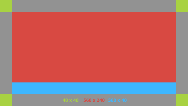
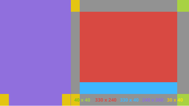
Standard dimensions
Use this file in conjunction with the previous layouts or your own layouts to
to adhere to standard Glass style. Create this file as
res/values/dimens.xml in your Android project.
<?xml version="1.0" encoding="utf-8"?>

<resources>

    <!-- The recommended margin for the top, left, and right edges of a card. -->
    <dimen name="glass_card_margin">40px</dimen>

    <!-- The recommended margin between the bottom of the card and the footer. This is
         an adjusted value so that the baseline of the text in the footer sits 40px
         from the bottom of the card, matching the other margins. -->
    <dimen name="glass_card_footer_margin">33px</dimen>

    <!-- The recommended margin for the left column of the two-column card. -->
    <dimen name="glass_card_two_column_margin">30px</dimen>

    <!-- The maximum height of the body content inside a card. -->
    <dimen name="glass_card_body_height">240px</dimen>

    <!-- The width of the left column in the two-column layout. -->
    <dimen name="glass_card_left_column_width">240px</dimen>

</resources>