There are a variety of widgets you can use to build your UIs. These widgets include
buttons, checkboxes, sliders, textboxes and selection menus. Widgets can only be
printed or added to a panel once. The following sections illustrate the basic
functionality, look, and feel of the widgets. See the
Style section for more information on styling
your widgets. The following examples simply print() the widgets to the
console. For details on adding widgets to panels, see the Panels
and Layouts page.
ui.Label
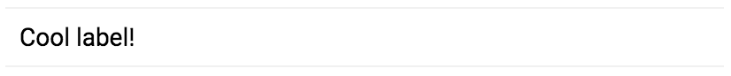
Labels are simply areas in which text is displayed. For example, the following code prints a label:
Code Editor (JavaScript)
var label = ui.Label('Cool label!');
print(label);
Which looks something like:
Break up long labels by inserting a new line character (\n)
and setting the whiteSpace style property argument to
'pre':
print(ui.Label('Here is a:\nnew line', {whiteSpace: 'pre'}));
ui.Button
A button is an interactive UI widget that can be clicked. You can specify a function to be called (the "callback" function) when a user clicks the button. (For more information on event handling with callback functions, see the Events page). The following example prints the map's current center when the button is clicked:
Code Editor (JavaScript)
var button = ui.Button({
  label: 'Get Map Center',
  onClick: function() {
    print(Map.getCenter());
  }
});
print(button);
Which looks something like:

ui.Checkbox
A checkbox is a widget that lets a user check (or uncheck) a box. When the checkbox's state changes, callbacks registered to the widget are passed a boolean value indicating whether the checkbox is now checked. For example:
Code Editor (JavaScript)
var checkbox = ui.Checkbox('Show SRTM layer', true);

checkbox.onChange(function(checked) {
  // Shows or hides the first map layer based on the checkbox's value.
  Map.layers().get(0).setShown(checked);
});

Map.addLayer(ee.Image('CGIAR/SRTM90_V4'));
print(checkbox);
The printed checkbox should look something like:

Note that checking the box turns on a layer displayed on the map. As with other UI components, the Map of the Code Editor can be manipulated programmatically. Learn more about the Map object on the Panels and Layouts page.
ui.Slider
A slider is a widget that lets a user adjust a slider to get a number within the slider range. Configure the range using either the constructor or by setting properties of the slider. The following example uses the slider to set the opacity of the first layer on the Map:
Code Editor (JavaScript)
var slider = ui.Slider();

slider.setValue(0.9);  // Set a default value.
slider.onChange(function(value) {
  Map.layers().get(0).setOpacity(value);
});

Map.addLayer(ee.Image(255), {palette: 'blue'});
print(slider);
The slider should look something like:

Note that the slider value is shown to the right of the slider.
ui.DateSlider
The DateSlider widget is like the Slider widget, but handles
dates explicitly. A DateSlider configured to select a day from June
2018 looks like:
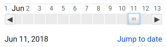
The DateSlider is useful for filtering collections, as shown in the
following example, which builds an annual composite based on the DateRange
set in the DateSlider:
Code Editor (JavaScript)
// Use a DateSlider to create annual composites of this collection.
var collection = ee.ImageCollection('LANDSAT/LC08/C02/T1');
// Use the start of the collection and now to bound the slider.
var start = ee.Image(collection.first()).date().get('year').format();
var now = Date.now();
var end = ee.Date(now).format();

// Run this function on a change of the dateSlider.
var showMosaic = function(range) {
  var mosaic = ee.Algorithms.Landsat.simpleComposite({
    collection: collection.filterDate(range.start(), range.end())
  });
  // Asynchronously compute the name of the composite.  Display it.
  range.start().get('year').evaluate(function(name) {
    var visParams = {bands: ['B4', 'B3', 'B2'], max: 100};
    var layer = ui.Map.Layer(mosaic, visParams, name + ' composite');
    Map.layers().set(0, layer);
  });
};

// Asynchronously compute the date range and show the slider.
var dateRange = ee.DateRange(start, end).evaluate(function(range) {
  var dateSlider = ui.DateSlider({
    start: range['dates'][0],
    end: range['dates'][1],
    value: null,
    period: 365,
    onChange: showMosaic,
    style: {width: '180px'}
  });
  Map.add(dateSlider.setValue(now));
});

// Initialize the map location at southern Africa.
Map.setCenter(23.861, -27.144, 6);
ui.Textbox
A textbox is a place to collect user-entered text. For example:
Code Editor (JavaScript)
var textbox = ui.Textbox({
  placeholder: 'Enter text here...',
  onChange: function(text) {
    print('So what you are saying is ' + text + '?');
  }
});
print(textbox);
The textbox should look something like:

Note that the callback only gets fired when the user has finished entering text (and pressed return), or the user clicks away from the textbox.
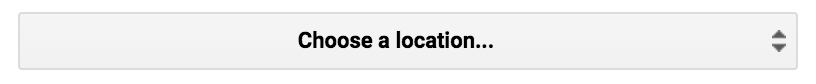
ui.Select
The select widget represents a drop-down menu of choices from which the user can choose one. The following example illustrates a drop-down menu to allow a user to select a location:
Code Editor (JavaScript)
var places = {
  MTV: [-122.0849, 37.3887],
  PEK: [116.4056, 39.9097],
  ZRH: [8.536, 47.376]
};

var select = ui.Select({
  items: Object.keys(places),
  onChange: function(key) {
    Map.setCenter(places[key][0], places[key][1]);
  }
});

// Set a place holder.
select.setPlaceholder('Choose a location...');

print(select);
The select widget should look something like:
ui.Chart
The charts in the ui.Chart package behave similarly to charts in the
Chart package. Specifically, a ui.Chart is a thin shell
around an instance of the Google Visualization API's ChartWrapper.
For more information on manipulating ChartWrapper objects, see
this
reference. For more information on the chart helper functions in Earth Engine, see
the Charts docs.
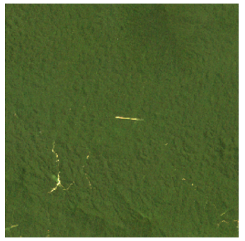
ui.Thumbnail
The thumbnail widget can be used to preview ee.Image and
ee.ImageCollection objects. When given an ee.Image, the widget will
display a static image; when provided an ee.ImageCollection, it will display an
animation with one frame per image in the input. As with ee.Image.getThumbURL() and
ee.ImageCollection.getVideoThumbURL(), you can specify parameters to control the
format and dimensions of the resulting thumbnail:
Code Editor (JavaScript)
// Create a box around an area in the Brazilian Amazon.
var box = ee.Geometry.Polygon([[
  [-62.9564, 2.5596], [-62.9550, 2.4313], [-62.8294, 2.4327], [-62.8294, 2.5596]
]]);

// Visualize the image in RGB.
var image = ee.Image('LANDSAT/LE07/C02/T1_L2/LE07_233058_20011113')
                .select(['SR_B[1-3]'])  // blue, green, red reflectance
                .multiply(0.0000275).add(-0.2)  // apply scaling factors
                .visualize({
                  bands: ['SR_B3', 'SR_B2', 'SR_B1'],
                  min: 0,
                  max: 0.12,
                  gamma: 1.3
                });

// Print a thumbnail to the console.
print(ui.Thumbnail({
  image: image,
  params: {dimensions: '256x256', region: box, format: 'png'},
  style: {height: '300px', width: '300px'}
}));
The thumbnail should look something like:
ui.Map
A ui.Map is a map widget. (In fact, the default Code Editor
Map is an instance of this class). Like other widgets, you can print
a map to the console. Manipulate the content of the map by clearing, getting or setting
individual layers. The following example prints a map to the console that shows the bounds
of the Code Editor Map:
Code Editor (JavaScript)
// Make a little map.
var map = ui.Map();

// Make the little map display an inset of the big map.
var createInset = function() {
  var bounds = ee.Geometry.Rectangle(Map.getBounds());
  map.centerObject(bounds);
  map.clear();
  map.addLayer(bounds);
};

// Run it once to initialize.
createInset();

// Get a new inset map whenever you click on the big map.
Map.onClick(createInset);

// Display the inset map in the console.
print(map);
The inset map should look something like:
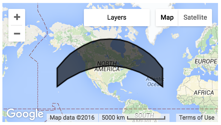
In this example, the user needs to click the big map to get the inset to draw in the little map.
You can also manipulate layers on the map by calling layers() on the map
instance. The layers() returns a ui.data.ActiveList, an
array-like object. When it is changed, the layers on the map change, too. Learn more
in the ui.Map.Layer section.
ui.Map.Layer
A layer is not a styleable widget like a ui.Button. It is just a data
representation of the layer on the map. The following example demonstrates updating a
map by creating a layer and updating the layer's properties based on user input:
Code Editor (JavaScript)
var consoleMap = ui.Map({
  lon: -2.0174,
  lat: 48.6474,
  zoom: 13
});

// Create a Layer from this Sentinel-2 image
var image = ee.Image('COPERNICUS/S2/20150821T111616_20160314T094808_T30UWU');
var visParams = {bands: ['B4', 'B3', 'B2'], max: 2048, gamma: 1};
var layer = ui.Map.Layer(image, visParams);

// Update the map by updating the layers list.
var layers = consoleMap.layers();
layers.add(layer);

// Make a textbox to accept a gamma value.
// Update the layer when the gamma value is entered.
var gammaBox = ui.Textbox({
  value: 1,
  onChange: function(value) {
    // visParams is NOT an ActiveDictionary, so set it again.
    visParams.gamma = value;
    layer.setVisParams(visParams);
  }
});

print(ui.Label('Enter a gamma value:'));
print(gammaBox);
print(consoleMap);
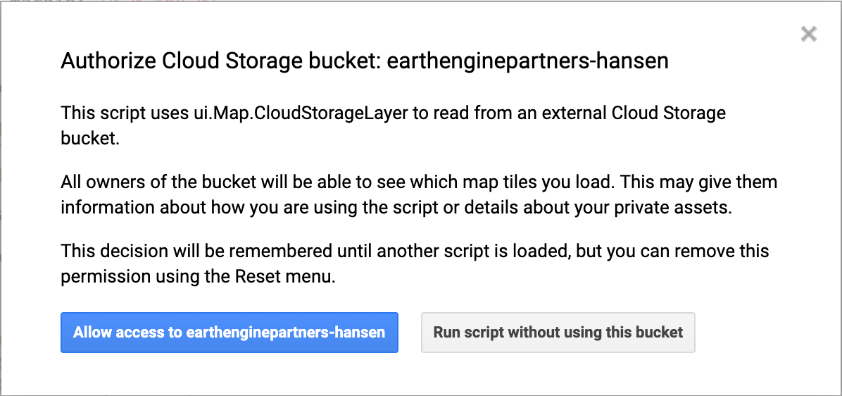
ui.Map.CloudStorageLayer
If you want to display (e.g. in an app) a relatively expensive-to-compute layer,
it may behoove you to export your data to a Cloud Storage bucket
for performance reasons. These static, visualization-only layers can make your apps
and scripts more responsive. You can create a static display layer for this purpose using
Export.map.toCloudStorage().
To use a tile set previously exported by
Export.map.toCloudStorage(),
construct a new ui.Map.Layer from a specified Cloud Storage bucket and
path:
Map.add(ui.Map.CloudStorageLayer({
  bucket: 'earthenginepartners-hansen',
  path: 'tiles/gfc_v1.4/loss_year',
  maxZoom: 12,
  suffix: '.png'
}));
When running a script that loads a Cloud Storage layer, you may see the warning message:
ui.Map.DrawingTools
There is a set of geometry drawing tools that is added by default to the Map
in the Code Editor. You can change the behavior of these tools in the default
Map by calling Map.drawingTools(). For example to hide the
drawing tools:
Code Editor (JavaScript)
Map.drawingTools().setShown(false);
Newly created maps do not get drawing tools by default, but can be enabled by calling the
drawingTools() method on the map:
Code Editor (JavaScript)
var map = ui.Map();
// Prints true since drawingTools() adds drawing tools to the map.
print(map.drawingTools().getShown());
// Replace the default Map with the newly created map.
ui.root.widgets().reset([map]);
The geometry layers drawn by the drawing tools are put into an
ui.data.ActiveList which you can access by calling
Map.drawingTools().layers(). The geometry layers list responds to events
like other active lists, for example the list of layers on the Map returned by
Map.layers(). The following example shows how you can set the visibility of
the geometry layers drawn by the tools (which are shown by default):
Code Editor (JavaScript)
Map.drawingTools().layers().forEach(function(layer) {
  layer.setShown(false);
});
To add a layer programmatically to the drawing tools, you can either call the
addLayer method on the drawing tools or add a layer directly to the layer list:
Code Editor (JavaScript)
var geometries = [ee.Geometry.Point([0,0]), ee.Geometry.Rectangle([[0,0], [1,1]])];
Map.drawingTools().addLayer(geometries, 'my_geometry1', 'red');

var layer = ui.Map.GeometryLayer(geometries, 'my_geometry2', 'blue');
Map.drawingTools().layers().add(layer);
The state of the drawing tools is also carried over when you publish an App. If you have the drawing tools shown or hidden, they will also be shown or hidden in your App. The geometries in your imports will also be carried over in your App.
ui.Map.GeometryLayer
A GeometryLayer is a collection of geometries that acts as a single
Geometry, GeometryCollection, or FeatureCollection
that is added to the imports section at the top of your script and can be referenced in
code.
GeometryLayers drawn by the drawing tools have a default behavior that you
can override by providing new callback functions. For example, suppose you want
interactive changes to the geometries to trigger an event. To implement a particular
behavior, you can set the onEdit(), onErase(), or
onDraw() method(s) on the tools in order to respond to user actions.
The following example shows how to trigger a computation and update a label with the
computation result when the user adds/edits/erases a geometry:
Code Editor (JavaScript)
// Load elevation data.
var srtm = ee.Image('USGS/SRTMGL1_003');
Map.addLayer(srtm, {min: 0, max: 5000}, 'SRTM');

// Make a label to display mean elevation at drawn points.
var label = new ui.Label('Draw points to calculate mean elevation');
var inspector = new ui.Panel([label]);
Map.add(inspector);
// Don't make imports that correspond to the drawn points.
Map.drawingTools().setLinked(false);
// Limit the draw modes to points.
Map.drawingTools().setDrawModes(['point']);
// Add an empty layer to hold the drawn points.
Map.drawingTools().addLayer([]);
// Set the geometry type to be point.
Map.drawingTools().setShape('point');
// Enter drawing mode.
Map.drawingTools().draw();

// This function gets called when the geometry layer changes.
// Use debounce to call the function at most every 100 milliseconds.
var getAverageElevation = ui.util.debounce(function() {
  var points = Map.drawingTools().layers().get(0).toGeometry();
  var elevation = srtm.reduceRegion({
    reducer: ee.Reducer.mean(),
    geometry: points,
    scale: 30
  }).get('elevation');
  // Asynchronously evaluate the mean elevation.
  elevation.evaluate(showElevation);
}, 100);

// Set the callback function on changes of the geometry layer.
Map.drawingTools().onEdit(getAverageElevation);
Map.drawingTools().onDraw(getAverageElevation);
Map.drawingTools().onErase(getAverageElevation);

// Set the label to the result of the mean reduction.
function showElevation(elevation) {
  inspector.clear();
  var elevationLabel = ui.Label('Mean elevation: ' + elevation);
  inspector.add(elevationLabel);
}
Note that setLinked() is used to toggle the connection between the
geometry drawing tools and the Imports
section of the Code Editor. In this example, the geometry tools are unlinked to
prevent imports from being created. toGeometry is used to convert the
layer to an ee.Geometry. If the imported layer represents a Feature
or FeatureCollection, you can retrieve the underlying EE object using
getEeObject(). Also note the use of ui.util.debounce
to prevent each movement of a geometry from triggering the callback function. Specifically,
the function will not fire until 100 milliseconds have elapsed since the last event. This
helps ensure that the function only runs when the user has completed the edit action.
A geometry layer in the imports is associated with a Geometry or
GeometryCollection, so it can only contain geometries with the same geodesic
state because the GeoJSON format only allows a single geodesic state for the collection
of geometries (see Geodesic vs. Planar Geometries
page for more info). Converting the geometry layer to a
FeatureCollection by pressing the gear icon next to the layer name will
allow you to add geodesic and planar geometries to the same layer. However, converting
it back to a Geometry will produce an error. To avoid that, either convert
to a FeatureCollection or delete geometries until there is only one geodesic
state in the layer.
ui.Map.Linker
Like a layer, a linker is not a styleable widget. It is a behind-the-scenes utility that
can be used to synchronize the movement of multiple ui.Map instances:
Code Editor (JavaScript)
// Add two maps to the screen.
var left = ui.Map();
var right = ui.Map();
ui.root.clear();
ui.root.add(left);
ui.root.add(right);

// Link the "change-bounds" event for the maps.
// When the user drags one map, the other will be moved in sync.
ui.Map.Linker([left, right], 'change-bounds');
ui.SplitPanel
A ui.SplitPanel is useful for comparing things side-by-side. The advantage
of a ui.SplitPanel over two ordinary panels is that a handle can be used to
achieve a wipe transition between the panels in a ui.SplitPanel. The
following example uses a ui.SplitPanel to display the spectral differences
of burn scars:
Code Editor (JavaScript)
// Load an image of the Santa Rosa, California 2017 fires.
var image = ee.Image('LANDSAT/LC08/C02/T1_TOA/LC08_045033_20171011');

// Add a color-SWIR composite to the default Map.
Map.setCenter(-122.6624, 38.5011, 12);
Map.addLayer(image, {bands: ['B7', 'B5', 'B3'], max: 0.3}, 'color-SWIR');

// Make another map and add a color-NIR composite to it.
var linkedMap = ui.Map();
linkedMap.addLayer(image, {bands: ['B5', 'B4', 'B3'], max: 0.3}, 'color-NIR');
// Add a thermal image to the map.
linkedMap.addLayer(image, {
  bands: ['B11'],
  min: 290,
  max: 305,
  palette: ['gray', 'white', 'yellow', 'red']
}, 'Thermal');

// Link the default Map to the other map.
var linker = ui.Map.Linker([ui.root.widgets().get(0), linkedMap]);

// Make an inset map and add it to the linked map.
var inset = ui.Map();
inset.style().set({position: 'bottom-right', width: '300px', height: '250px'});
inset.setControlVisibility({all: false, mapTypeControl: true});
linkedMap.add(inset);

// Register a function to the linked map to update the inset map.
linkedMap.onChangeBounds(function() {
  var bounds = ee.Geometry.Rectangle(Map.getBounds());
  inset.centerObject(bounds);
  inset.layers().set(0, bounds);
});

// Create a SplitPanel which holds the linked maps side-by-side.
var splitPanel = ui.SplitPanel({
  firstPanel: linker.get(0),
  secondPanel: linker.get(1),
  orientation: 'horizontal',
  wipe: true,
  style: {stretch: 'both'}
});

// Set the SplitPanel as the only thing in root.
ui.root.widgets().reset([splitPanel]);
Note that the wipe parameter is set to true,
in the ui.SplitPanel constructor in order to let the user swipe the handle
back and forth between the two visualizations.
Styling Widgets
The style of a widget is controlled by the widget's dictionary of style properties. You
can get access to the dictionary by calling style() on the widget. The
object returned by style() is an instance of
ui.data.ActiveDictionary. That means that setting properties of the style
dictionary automatically updates the way the widget is displayed. The allowable keys
for each widget's style dictionary are detailed in the widget's reference docs for the
style() call.
The styles of the widget can be set with the constructor, by calling
style().set() or by calling style() with a dictionary
argument. For example:
Code Editor (JavaScript)
var redLabel = ui.Label('Big, Red Label');

redLabel.style().set('color', 'red');
redLabel.style().set('fontWeight', 'bold');
redLabel.style().set({
  fontSize: '32px',
  padding: '10px'
});

print(redLabel);
Note that in this example, the label is styled first by calling
style().set() with key and value arguments, then by calling
style().set() with a dictionary argument. The second call does not
override the first; it adds and replaces individual style properties rather than
replacing the entire style dictionary.
For more information on the styling options for widgets, see this
Cascading Style Sheet
(CSS) reference for the styles listed in the style() docs for each
widget. Note that the styles allowable for Earth Engine widgets differ from CSS styles
in several places, notably fontSize and fontWeight for
font-style and font-weight, respectively.
The styles dictionary also contains keys that control the position of the widget. See the Panels and Layouts page for more information on how to use positional properties.