Important: While the dynamic and interactive Google Charts are actively maintained, we officially deprecated the static Google Image Charts way back in 2012. It was turned off on March 18, 2019.
This page describes how to create a variety of callouts, bubbles, pins, and other graphics that can be created using a URL.

https://chart.googleapis.com/chart?chst=d_bubble_icon_text_small&chld=ski|bb|Wheeee!|FFFFFF|000000
- Introduction
- Syntax
- Icon Types
- Bubbles
- Pins
- Fun Style Notes
- Weather Forecast Notes
- Outlined Font Text Blocks (Text only)
- Outlined Font Text Blocks (Text + Icon)
- List of Available Flags and Icons
- Text Strings
- Shadows
Introduction
You can create a variety of interesting callouts, pins, or bubbles that mix text and images. These items are called dynamic icons.


Syntax
Root URL: https://chart.googleapis.com/chart?
Dynamic icons support th following parameters after the ? in the root URL:
| Parameter | Required or Optional | Description |
|---|---|---|
chst=<icon_string_constant> |
Required | Describes which kind of icon to create.
|
chld=<icon_data> |
Required | The specific data used to describe the icon's size, rotation, text, and other required data.
|
Icon Types
| Type | Examples |
|---|---|
| Bubbles - Choose small or large text bubbles, with or without icons. |    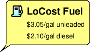 |
| Pins - Pin types can be plain, starred, or slanted, and can have an icon, a single letter, or longer text strings. |       |
| Fun style notes with text and optional title |  |
| Weather forecast notes with title, text, and weather icon |  |
| Multiline outlined text block, no icon |  |
| Single line outlined textblock with icon |   |
Bubbles
Bubbles come in various combinations of features: large or small size, with or without icon, single line or multi-line text. The following table describes the types of bubbles, and the syntax for each. The description of each parameter value is described below the table.
A few additional notes:
- All bubbles resize to fit the width and height of the text that you enter.
- The bubble constant supports a variation ending
in
_withshadow. If you use the_withshadowvariation, it adds a shadow below your bubble.
| Text | Icon | Syntax | Shadow Only | Example |
|---|---|---|---|---|
| Single line | No | chst= |
chst= |
 chst=d_bubble_text_small |
| Single line | Yes | chst= |
chst= |
 chst=d_bubble_icon_text_small |
| Single line | Yes |
chst= |
chst= |
 chst=d_bubble_icon_text_big |
| Multi-line | No | chst= |
chst= |
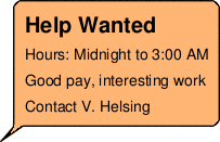 chst=d_bubble_texts_big |
| Multi-line | Yes |
|
chst= |
 chst=d_bubble_icon_texts_big |
Syntax
- <icon_string>
- A string specifying one of the icons described at the end of this document.
- <frame_style>
- The tail direction. Choose of the following tail direction constants:
bb- Balloon frame, tail at bottom left
bbtl- Balloon frame, tail at top left
bbtr- Balloon frame, tail at top right
bbbr- Balloon frame, tail at bottom right
bbT- Balloon frame, no tail
edge_bl- Edge frame, tail at bottom edge, left end
edge_bc- Edge frame, tail at bottom edge, centered
edge_br- Edge frame, tail at bottom edge, right end
edge_tl- Edge frame, tail at top edge, left end
edge_tc- Edge frame, tail at top edge, centered
edge_tr- Edge frame, tail at top edge, right end
edge_lt- Edge frame, tail at left edge, top end
edge_lc- Edge frame, tail at left edge, centered
edge_lb- Edge frame, tail at left edge, bottom end
edge_rt- Edge frame, tail at right edge, top end
edge_rc- Edge frame, tail at right edge, centered
edge_rb- Edge frame, tail at right edge, bottom end
- <fill_color>
- The bubble fill color, as a six-digit HTML hexadecimal color.
- <text_color>
- The text color, as a six-digit HTML hexadecimal color.
- <text>
- A single line of bubble text for one-line bubbles. Spaces must be + marks.
- <text_line_1>|...|<text_line_n>
- One or more lines of text, for multi-line text bubbles. Each line is separated by a | mark. The first line will be shown larger and boldface. Spaces must be replaced by +.
Shadow Only
For bubbles, you can also draw the freestanding shadow using the syntax shown in the table above. Examples:
 chst= |
 chst= |
 chst= |
 chst= |
 chst= |
Pins
You can make a variety of pins with icons and/or short text strings. Here are the available pin types.
| Pin Type | Bubble Constant | Examples |
|---|---|---|
| Plain pin with single letter or icon |
|
  |
| Slanted/starred pin with single letter or icon |
|
    |
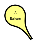
| Scalable, rotatable, multi-line pin | chst=d_map_spin |
 |
Plain Pin
with Single Letter or Icon 

This is a small, upright pin that can hold either a small icon or a single letter.
Letter Syntax
chst=d_map_pin_letter[_withshadow]
chld=<character>|<fill_color>|<text_color>
Icon Syntax
chst=d_map_pin_icon[_withshadow]
chld=<icon_string>|<fill_color>
- <character>
- [Text pins only] A single text character.
- <icon_string>
- [Icon pins only] A string specifying one of the icons described at the end of this document.
- <fill_color>
- The bubble fill color, as a six-digit HTML hexadecimal color.
- <text_color>
- [Text pins only] The text color, as a six-digit HTML hexadecimal color.
Shadow Only
To draw the shadow only for this pin type, use this syntax:
chst=d_map_pin_shadow
The chld parameter is not required for a shadow only.
Examples
 chst=d_map_pin_letter_withshadow |
 chst=d_map_pin_letter |
 chst=d_map_pin_icon |
 chst=d_map_pin_shadow |
Slanted/Starred Pin with Single
Letter or Icon 


This is a small, pin that can either be tilted left or right, or have a star overlap. The contents of the pin can be either a single character or a small icon.
Letter Syntax
chst=d_map_xpin_letter[_withshadow]
chld=<pin_style>|<character>|<fill_color>|<text_color>|<star_fill_color>
Icon Syntax
chst=d_map_xpin_icon[_withshadow]
chld=<pin_style>|<icon_string>|<fill_color>|<star_fill_color>
- <pin_style>
- The pin style. Choose one of the following constants:
pin
pin_star
pin_sleft
pin_sright
- <icon_string>
- [Icon pins] A string specifying one of the icons described at the end of this document.
- <character>
- [Text pins] A single text character.
- <fill_color>
- The bubble fill color, as a six-digit HTML hexadecimal color.
- <text_color>
- [Text pins] The text color, as a six-digit HTML hexadecimal color.
- <star_fill_color>
- [Star pins] The fill color of the star, as a six-digit HTML hexadecimal color.
Shadow Only
To draw the shadow only for this pin type, use this syntax:
chst=d_map_xpin_shadow

chld=<pin_style>
Examples
 chst=d_map_xpin_letter |
 chst=d_map_xpin_letter |
 chst=d_map_xpin_icon |
 chst=d_map_xpin_shadow |
Text Pin with Scaling and Rotation 
This is a pin that can you can manually scale to include longer text strings. You can also rotate the pin a custom amount, and control font size and color.
Syntax
chst=d_map_spin
chld=<scale_factor>|<rotation_deg>|<fill_color>|<font_size>|<font_style>|<text_line_1>|...|<text_line_n>
- <scale_factor>
- A scaling factor to specify the pin size. This is a positive floating point number where 0.5 is the size of unscaled pins. 0.25 would be half that size, 1 would be twice that size, and so on.
- <rotation_deg>
- The rotation of the pin, in degrees. Positive and negative values are allowed. Specify 0 for a vertical pin.
- <fill_color>
- The bubble fill color, as a six-digit HTML hexadecimal color.
- <font_size>
- The text font size, in pixels.
- <font_style>
- Either '_' (underscore) for normal text or 'b' for boldface text.
- <text_line_1>...<text_line_n>
- One or more lines of text, delimited by | characters.
Examples
 chst=d_map_spin |
 chst=d_map_spin |
 chst=d_map_spin |
Fun Style Notes
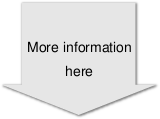
You can create a variety of text notes in novelty templates, such as a sticky note or a thought bubble. You can optionally include a title line in the note.
These notes have a fixed size; they will not grow or shrink to accommodate the size of your text.
Syntax
chst=d_fnote_title OR chst=d_fnote
chld=<note_type>|<note_size>|<text_color>|<text_alignment>|<text_line_1>|...|<text_line_n>
- chst
- Specify either
d_fnote_titlefor a note with a title, ord_fnotefor a note without a title. In a note with a title, the first line of text will be formatted as a title (larger and boldface). - <note_type>
- A string describing the note shape. Choose one of the note type strings in the table below.
- <note_size>
- 1 (one) for a large note, or 2 for a small note. Template sizes are fixed; templates do not grow or shrink to fit text. Experiment with both sizes to see which holds your text better.
- <text_color>
- The text color, as a six-digit hexadecimal color; alpha values are not accepted.
- <text_alignment>
- The alignment for all text, including the header. Choose one of the following
values:
- l - ('L') Left-aligned
- h - Center-aligned
- r - Right-aligned
- <text_line_1>| ...|<text_line_n>
- The text for the note. Use the | character to indicate a newline. When
chst=d_fnote_title, the first line of text is formatted as a title.
Note Type Templates
The following templates are supported for note templates. The note_type string for each is shown below the template.
Note: Text strings are case-sensitive!
 arrow_d |
 balloon |
 pinned_c |
 sticky_y |
 taped_y |
 thought |
Examples
| Description | Example |
|---|---|
Note with a title: chst=d_fnote_title. The first
line of text is used as the title. Size is large note (1). |
 chst=d_fnote_title |
Note without a title: chst=d_fnote.Text is centered. |
 chst=d_fnote |
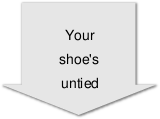
A useful template for an old joke. |
|
Weather Forecast Notes
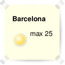
You can create a note with a weather indicator icon. Similar layout to fun style notes, but text color is always black, text is always left-aligned, and you can only have from one to three lines of text.
These notes have a fixed size; they will not grow or shrink to accommodate the size of your text.
Syntax
chst=d_weather
chld=<note_type>|<weather_icon>|<title>|<line_2>|<line_3>
- chst
d_weatherindicates a weather note.- <note_type>
- The template to use for this note. Use one of the note strings listed in the fun style note list above.
- <weather_icon>
- One of the weather icon strings in the table below. A note can take a single weather icon.
- <title>|<line_2>|<line_3>
- The title, plus up to two more lines of text (these extra text lines are optional). The title is larger and boldface.
Weather Icons
Here is a list of supported weather icons, showing the weather_icon string for each.
Note: Text strings are case-sensitive!
 clear-night-moon |
 cloudy-heavy |
 cloudy-sunny |
 cloudy |
 rain |
 rainy-sunny |
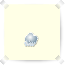 snow |
 snowflake |
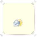 snowy-sunny |
 sunny-cloudy |
 sunny |
 thermometer-cold |
 thermometer-hot |
 thunder |
 windy |
Examples
| Description | Example |
|---|---|
A weather note with a title and two lines on a taped_y style
template. |
|
| A wishful thought for winter. |
|
Outlined Font Text Blocks (Text Only)

You can create a block of outlined text with a white background. If you want an text + icon, consider using the single line variety, which supports an icon.
Syntax
chst=d_text_outline
chld=<text_fill_color>|<font_size>|<text_alignment>|<outline_color>|<font_weight>|<text_line_1>|...|<text_line_n>
- <text_fill_color>
- The text fill color. This is a six-digit hexadecimal color; alpha values are not accepted.
- <font_size>
- A number specifying the font size, in pixels.
- <text_alignment>
- The alignment for all text, including the header. Choose one of the following
values:
- l - ('L')Left-aligned
- h - Center-aligned
- r - Right-aligned
- <outline_color>
- The text outline color. This is a six-digit hexadecimal color; alpha values are not accepted.
- <font_weight>
- Normal or bold text. Underscore ' _' for normal text, and 'b' for bold text.
- <text_line_1>| ...|<text_line_n>
- The text for the note. Use the | character to indicate a newline. When
chst=d_fnote_title, the first line of text is formatted as a title.
Examples
 chst=d_text_outline |
 chst=d_text_outline |
Outlined
Font Text Blocks (Text + Icon) 
You can create a single line of outlined text plus an icon on the top, left, bottom, or right of the block. If you don't need an icon, use the outlined font text block.
Syntax
chst=<icon_position_string>
chld=<text>|<font_size>|<font_fill_color>|<icon_name>|<icon_size>|<icon_fill_color>|<icon_and_text_border_color>
- <icon_position_string>
- Specifies where the icon appears in the text
box. Choose one of the following values:
d_simple_text_icon_below- Places the icon on the bottom of the box:
d_simple_text_icon_above- Places the icon on the top of the box:
d_simple_text_icon_left- Places the icon on the left of the box:
d_simple_text_icon_right- Places the icon on the right of the box:
- <text>
- The text to show. One line only; use + for spaces.
- <font_size>
- A number specifying the font size, in pixels.
- <font_fill_color>
- The fill color for the text, as a six-digit string. Alpha values are not supported.
- <icon_name>
- One of the icon names listed at the bottom of this document.
- <icon_size>
- The height of the icon, in pixels. The following values are supported: 12, 16, 24.
- <icon_fill_color>
- The color of the icon, as a six-digit string. Alpha values are not supported.
- <icon_and_text_border_color>
- The color of the border around the icon and the text, as a six-digit string. Alpha values are not supported.
List of Available Flags and Icons
The following images can be used in dynamic icons using the appropriate parameter.
Note: Text strings are case-sensitive
Note: Icons are available only in the following sizes: 12, 16, 24.
Basic icons
Icons from Glyphish.com
These icons are by Joseph Wain / glyphish.com. This work is licensed under the Creative Commons Attribution 3.0 United States License.
Flags
Here are flags for some countries and territories.
Text Strings
All display text sent in the request must be UTF-8 encoded and then URL-encoded.
This affects only non-URL-safe characters (URL-safe characters are mostly the
English letters a-z both upper and lower case, plus plus a small
set of punctuation). For example, the UTF-8 and URL-encoded value for
the letter "è" is "%C3%A8", and for the Chinese
character 駅 is "%E9%A7%85". Most browsers will let you use an unencoded value
in the URL string (for example, 駅) and will encode it for you behind the scenes.
However, it is possible that someone viewing your image URL is using a browser
that doesn't do this, so it is usually best to UTF-8 and URL-encode all non-ASCII
characters in text strings. Note that this is only for the text shown in bubbles
or pins, not for the &,
|, or other characters that are part of the URL syntax.
Shadows
You can add shadows to many icons, or even draw shadows for some icons without the icon itself!
Shadowed Icons 
Many of these icons can be drawn with or without shadows. If shadowing
is an option, the icon name will have a version that ends in _withshadow and
another version without that ending. You can specify an icon with either ending,
depending on whether you want the shadow or not.
Here's an example of a medium text bubble and a pin with and without shadows:
 chst=d_bubble_icon_text_big |
 chst=d_bubble_icon_text_big_withshadow |
 chst=d_map_pin_icon |
 chst=d_map_pin_icon_withshadow |
Freestanding Shadows 
Some icon types allow you to draw their shadow by itself. You might want to do this if you are using several overlapping shadowed icons on a graphic, and they are so close that the shadow from one falls across another graphic. See the documentation of your specific icon type to learn whether you can draw its shadow alone.
All rights reserved. Java is a registered trademark of Oracle and/or its affiliates.
Last updated 2023-11-16 UTC.

