# Grid template
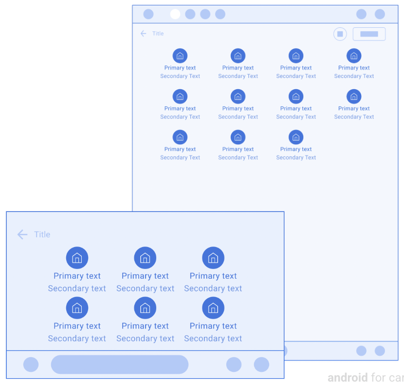
Grids present items in a grid layout.
This template is useful when users rely primarily on images to make their
selections.
This template can be embedded in the
[Tab template](https://developers.google.com/cars/design/create-apps/apps-for-drivers/templates/tab-template)
to provide tabbed navigation.
This template can be included in the
[Map + Content template](https://developers.google.com/cars/design/create-apps/apps-for-drivers/templates/map-content-template)
to provide a grid on a map.
**Includes:**
- Optional [header](https://developers.google.com/cars/design/create-apps/apps-for-drivers/components/header) (header is replaced with tabs when this template is embedded in the [Tab template](https://developers.google.com/cars/design/create-apps/apps-for-drivers/templates/tab-template))
- Grid items (see the [note](https://developers.google.com/cars/design/create-apps/apps-for-drivers/templates/grid-template#grid-note) below), each containing an icon or a large-size image
- Primary text for each grid item (optional)
- Secondary text for each grid item (optional)
- Optional [floating action button](https://developers.google.com/cars/design/create-apps/apps-for-drivers/components/fab)
> [!NOTE]
> **Note:** There is a limit on the number of grid items allowed to be shown, but the limit will not be less than 6 and may be higher in some vehicles. To retrieve the item limit for a given vehicle, use the [ConstraintManager API](https://developer.android.com/training/cars/apps#constraint-manager).
## Grid template examples
The following Android Auto and Android Automotive OS (AAOS) examples were built
using the Grid template.
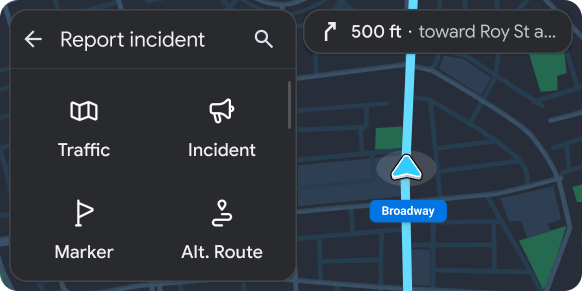 Grid of actions embedded in a Map + Content template 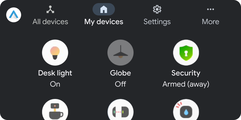 Grid with enabled items and one disabled item
## Grid template UX requirements
App developers:
|---|---|
| **SHOULD** | Limit length of primary and secondary text strings to avoid truncation. |
| **SHOULD** | Have an action associated with each grid item (information-only items are not recommended). |
| **SHOULD** | Clearly indicate item state (for grid items that have multiple states, such as selected and unselected) by variations in image, icon, or text. |
| **SHOULD** | Include a header with an optional title and primary and secondary actions. |
| **SHOULD NOT** | Include both an [action strip](https://developers.google.com/cars/design/create-apps/apps-for-drivers/components/action-strip) and a [floating action button](https://developers.google.com/cars/design/create-apps/apps-for-drivers/components/fab) at the same time. |
| **MAY** | Show a loading spinner instead of the icon or image for a grid item when an action associated with the item is in progress. |