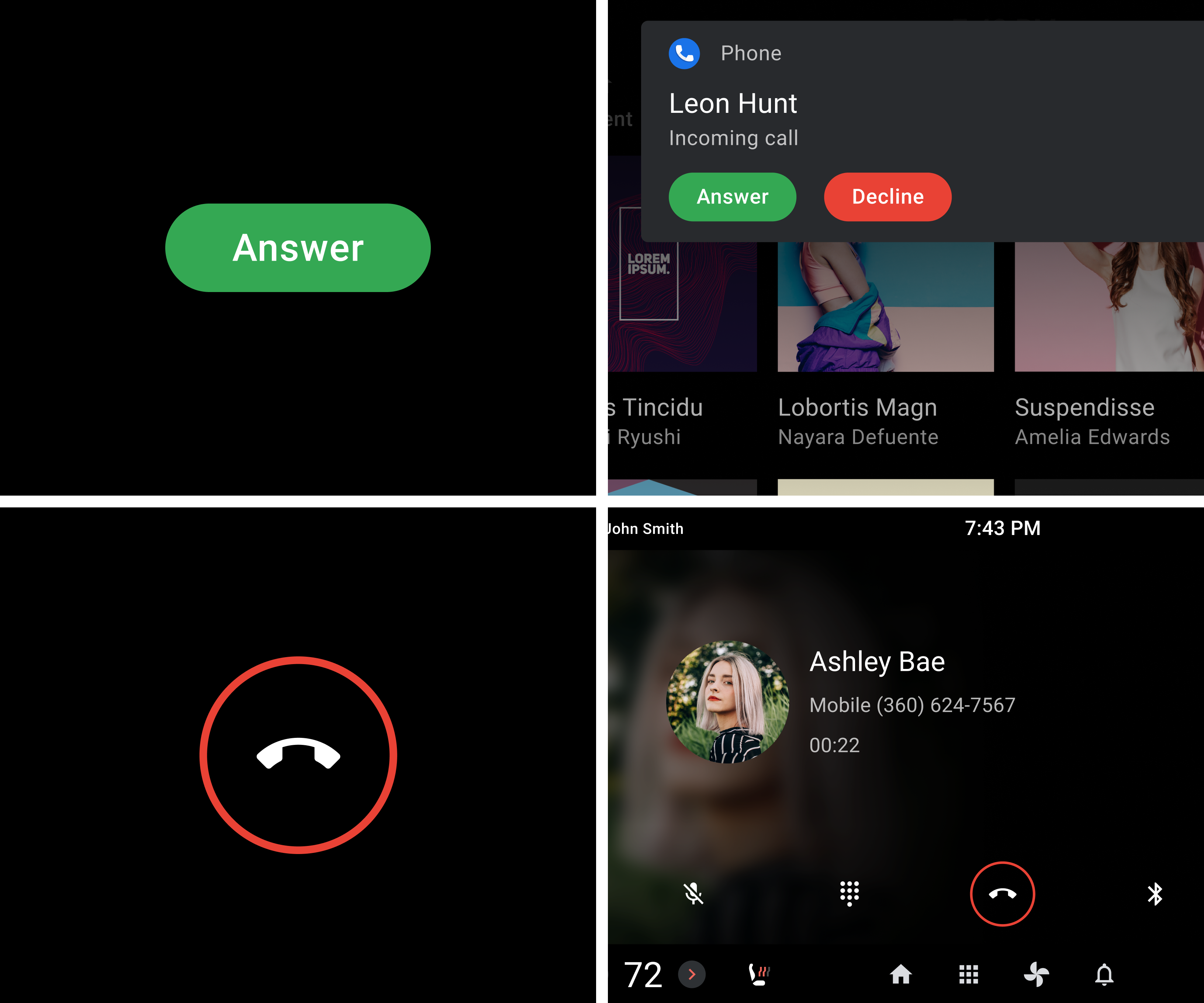
Shapes help to emphasize the importance of some screen elements relative to others.
Guidance at a glance (TL;DR):
- Use more-rounded corners (higher corner radius) for primary actions and components
- Use squarer, less-rounded corners (lower corner radius) for low-emphasis elements
Corner radius values
Android for Cars provides a set of corner radius values intended to emphasize the importance of various screen elements relative to others.
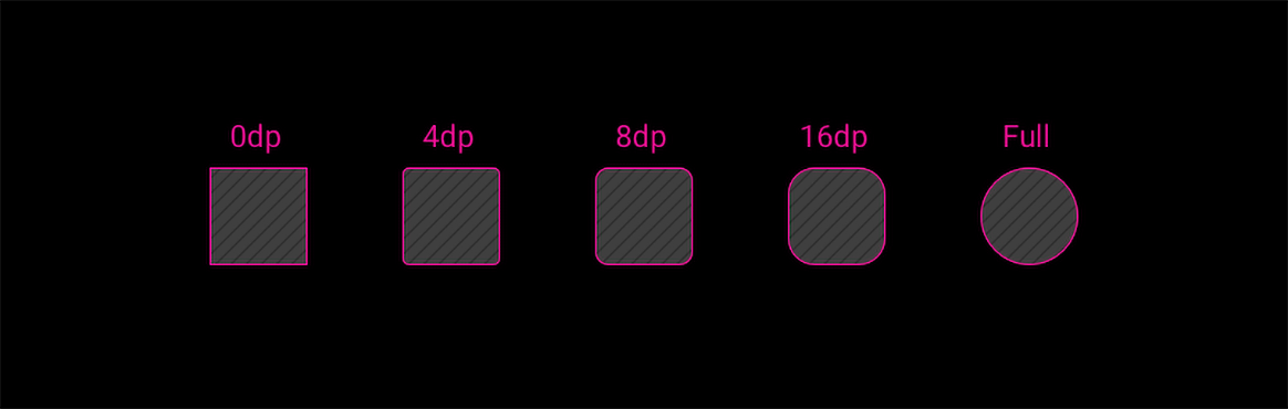
| R0 | R1 | R2 | R3 | R4 |
|---|---|---|---|---|
| 0dp | 4dp | 8dp | 16dp | Full |
Using rounding for emphasis
Rounded and square-cornered shapes in Android Automotive create a visual hierarchy that draws user attention to higher-emphasis elements. Higher-emphasis elements have corners that are more rounded, with a larger corner radius. Lower-emphasis elements have corners that are less round, with a smaller corner radius.
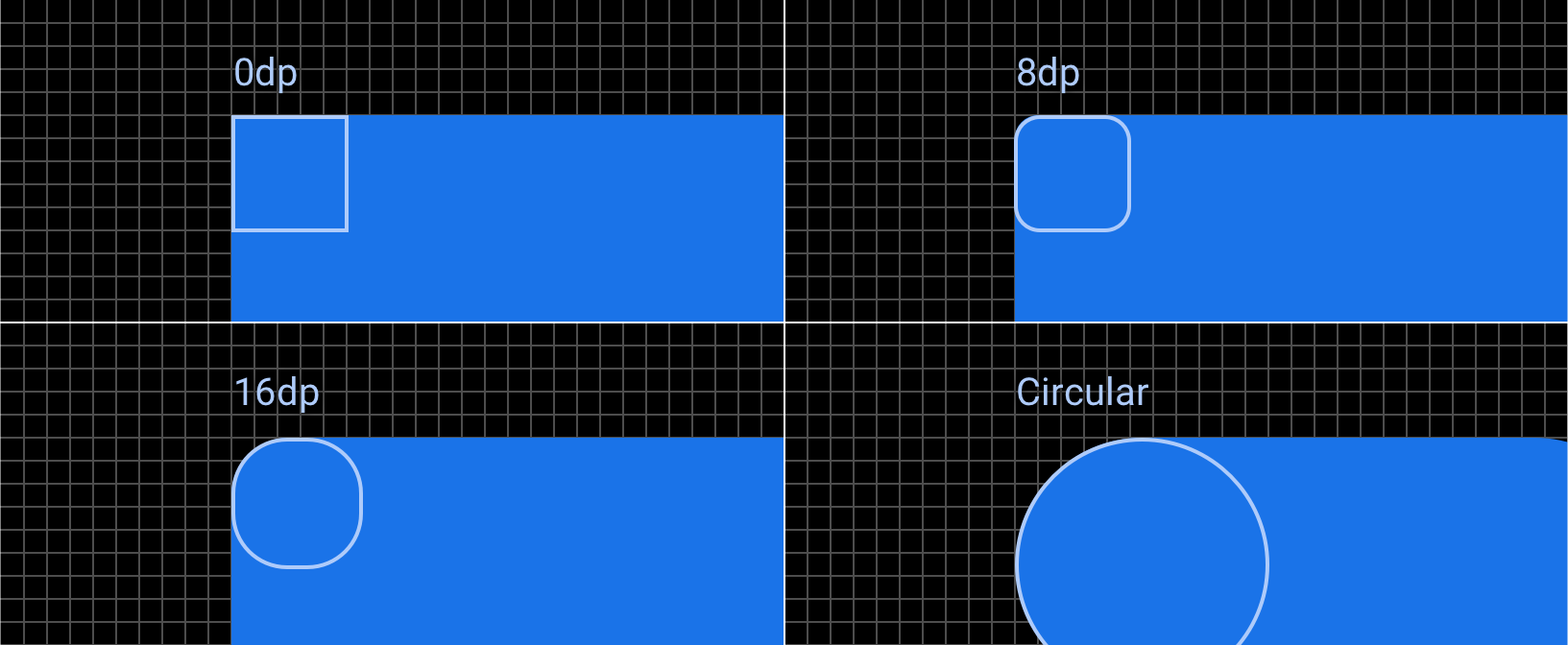
0dp — Baseline
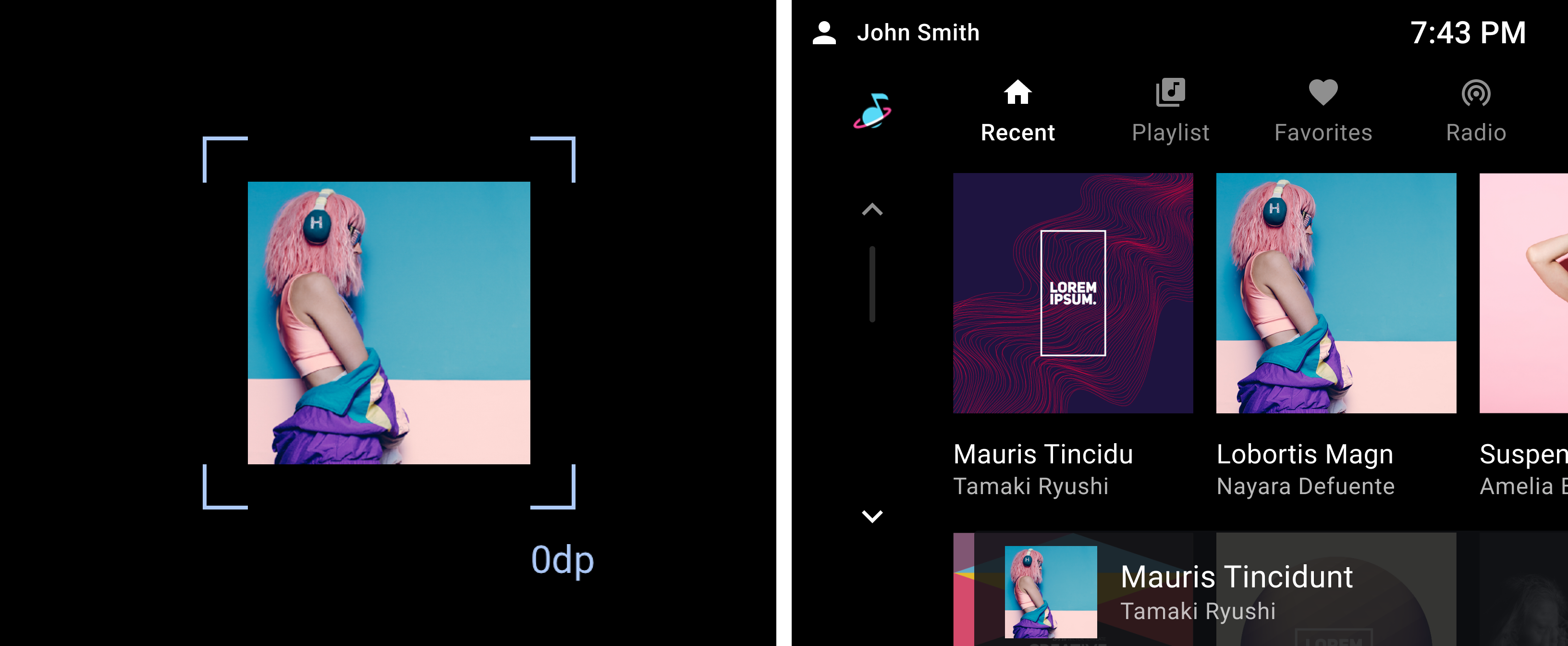
Use 0dp (square) corners for baseline elements that don’t need any extra emphasis. Basic layout structures such as toolbars or lists should use 0dp corners. Images should also have 0dp corners, unless they are masked by a rounded container (such as a card) or are in a selected state.
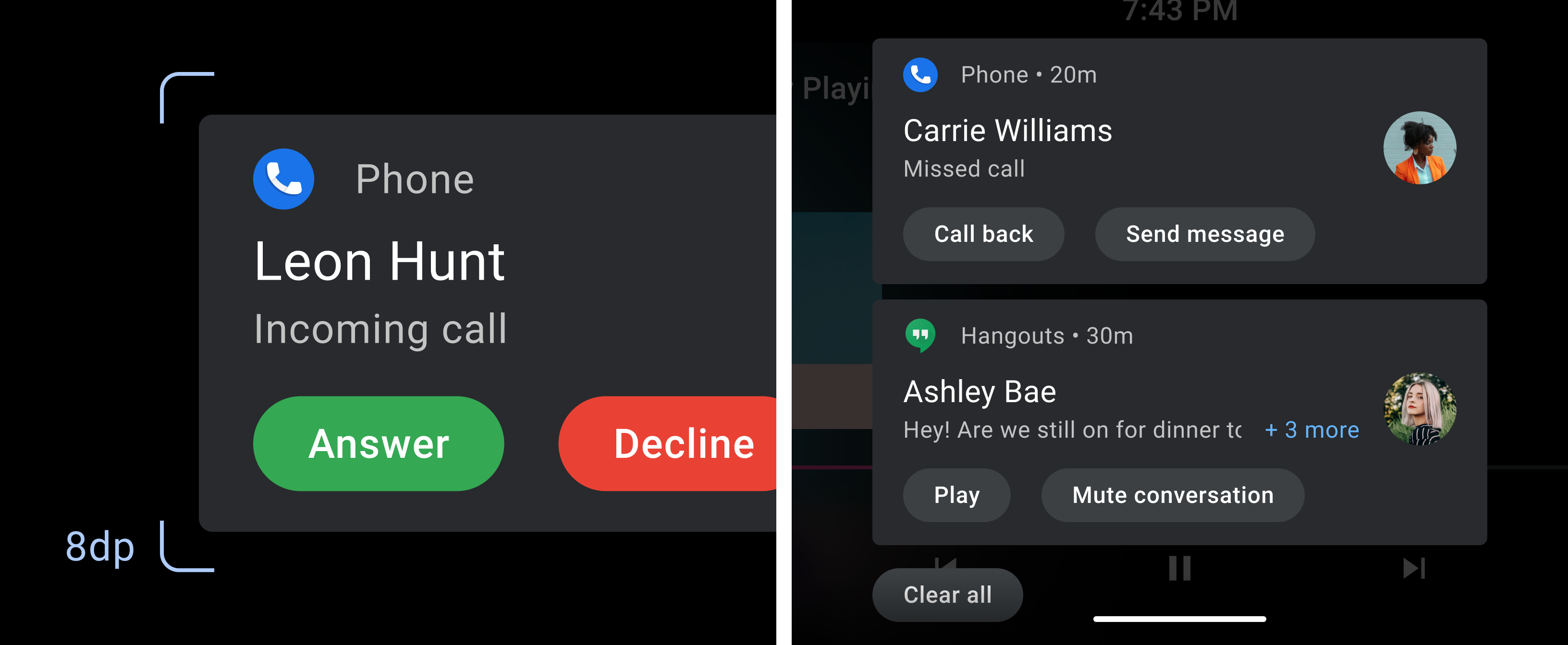
8dp — Low emphasis
8dp is the default corner radius for rounded shapes. Use this shape to indicate low-emphasis interactive elements, such as cards and containers.
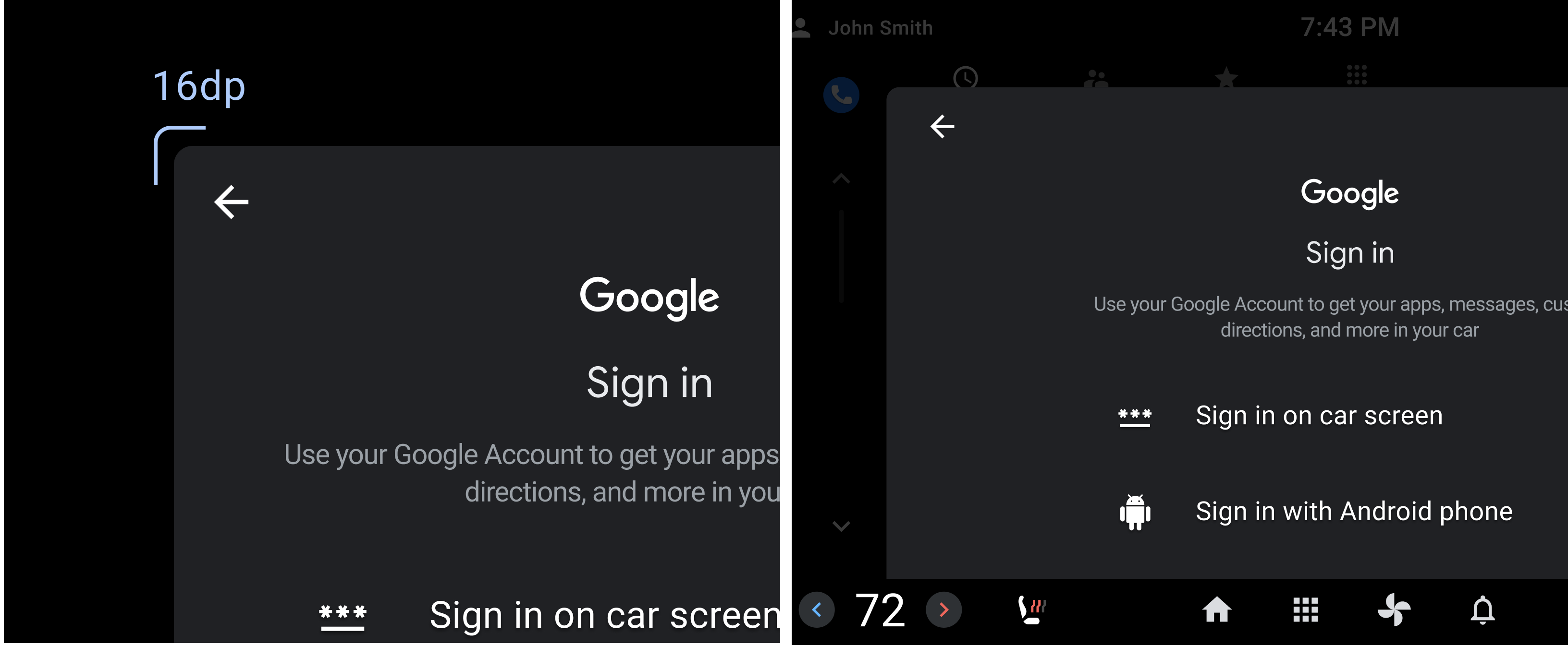
16dp — Medium Emphasis
Use a 16dp corner radius for components with medium emphasis, including interactive elements and expandable components.
Circular — High Emphasis
Circular shapes have a greater visual impact against mostly rectilinear shapes. They should be reserved for high-emphasis components, such as FABs, Chips, and widgets.