Scrollbars indicate a user’s location in a document that is larger than the viewing space. They allow the user to navigate to the rest of the document by moving the window viewing area up or down.
Users interact with scrollbars using touch, rotary wheel, or touchpad. Tapping on the arrows in the scroll bar will move the content by “pages” – that is, increments equivalent to the height of the screen. However, if users quickly fling to scroll (dependent on the touchscreen sensitivity), the fling motion can create inertial momentum that scrolls farther than one page. Regardless of how scrolling is initiated, the scrolling motion should always snap to an item.
Anatomy
The scrollbar is made up of the scroll-up and scroll-down affordances and the scroll progress indicator. Chevrons are used in scroll affordances to indicate the direction of scrolling. The scroll progress indicator is an optional element that indicates the visible content and scroll position in relation to the total amount of content on the page.
Note: The scroll progress indicator is not designed to be draggable.
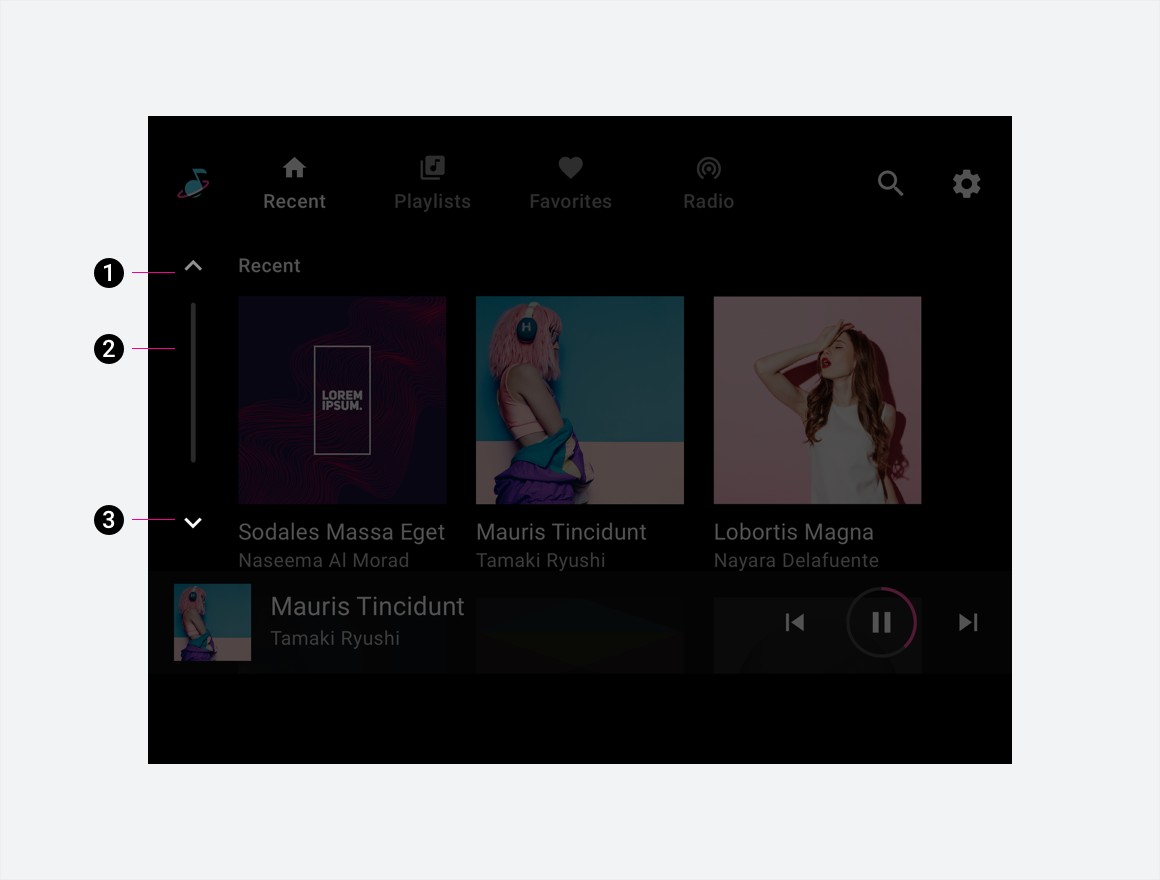
2. Scroll progress indicator
3. Scroll-down affordance
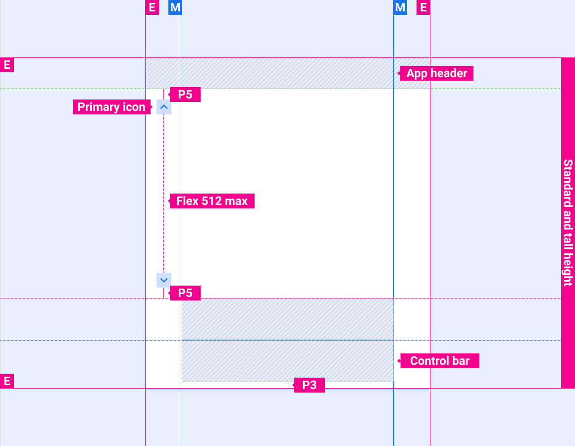
Specs

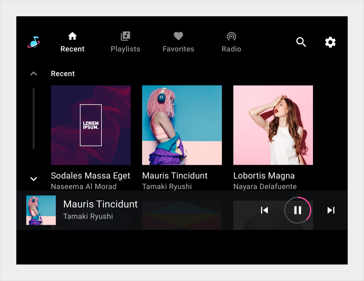
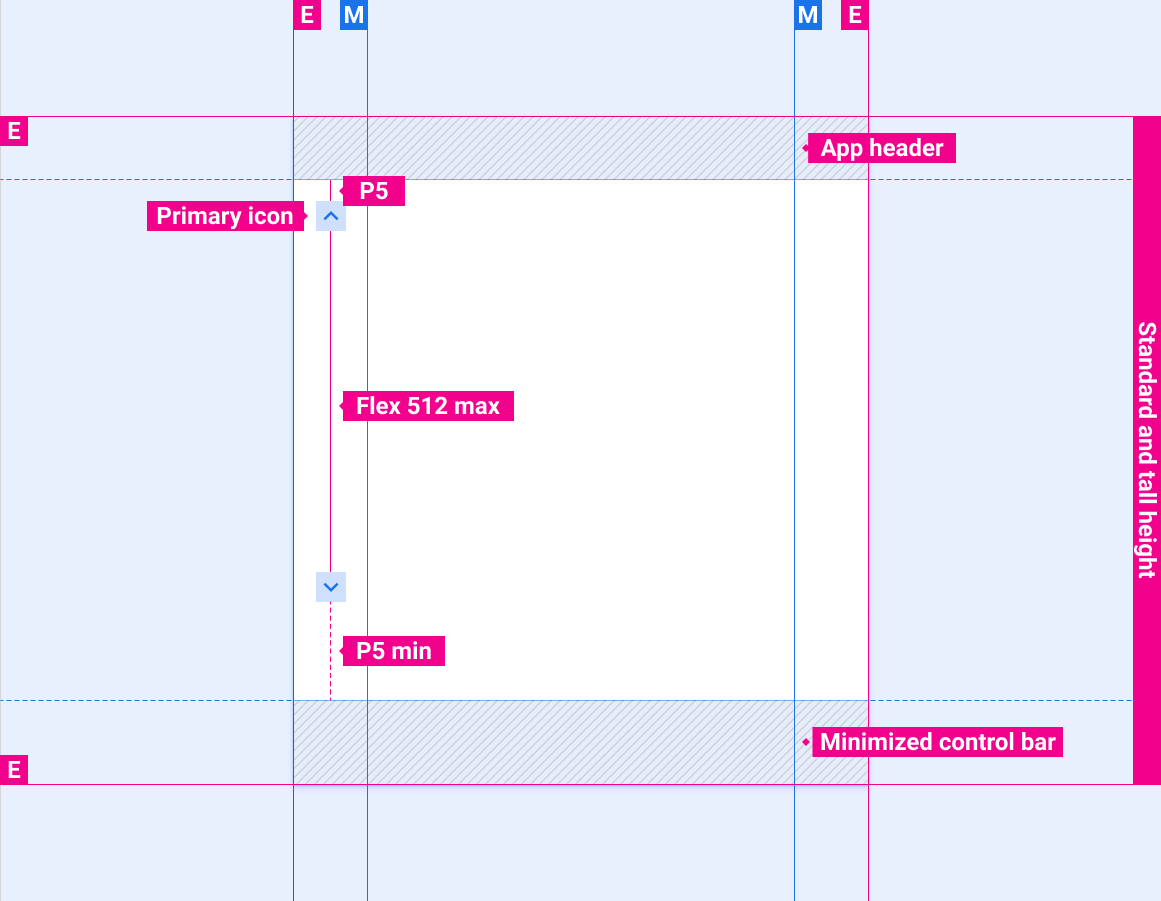
Scroll bar position with stacked primary navigation and minimized control bar
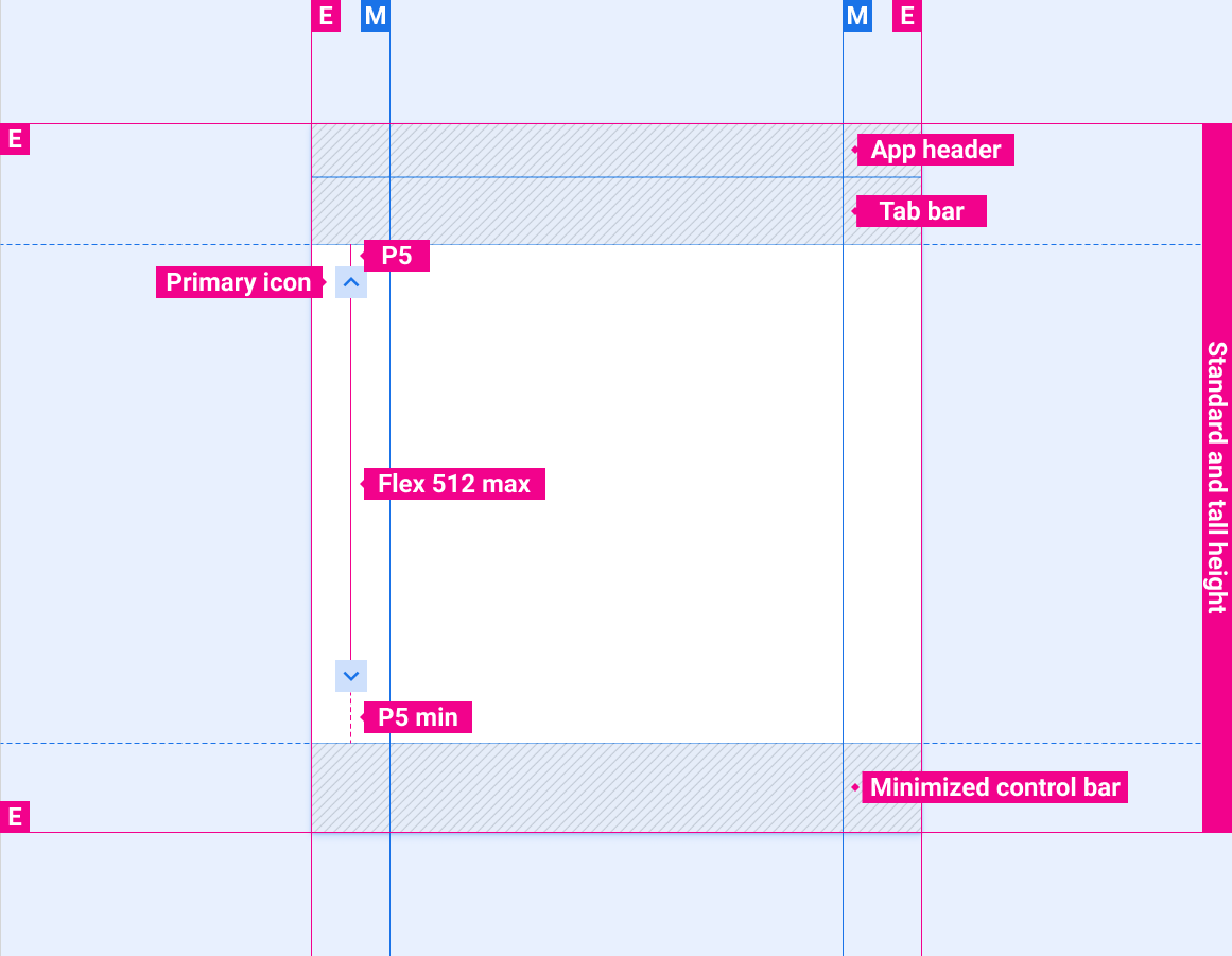
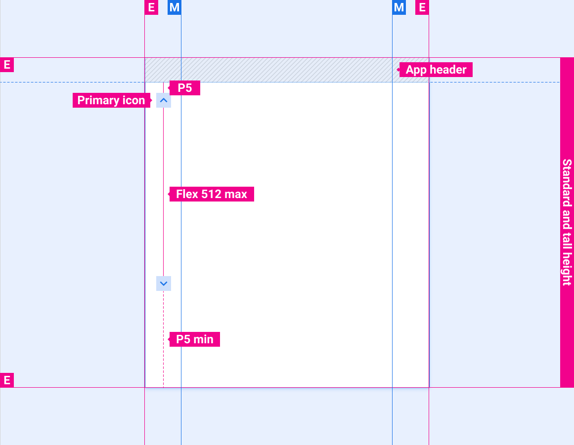
Scroll bar position with app header only
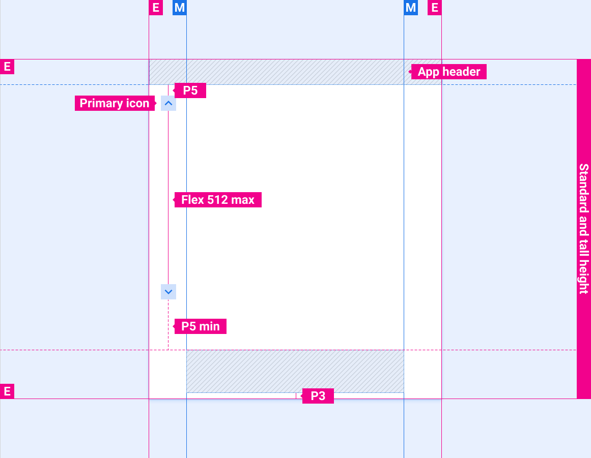
Scroll bar position with app header and control bar
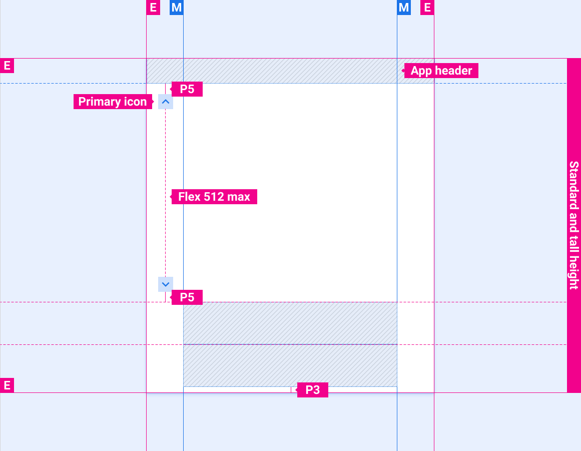
Scroll bar position with app header and expanded control bar
Scroll bar position with app bar/header and minimized control bar
Scroll bar position with app bar/header only

Scroll bar position with app header and control bar

Scroll bar position with app header and expanded control bar
Scroll bar position with short screen height

Optional scroll progress indicator

Styles
Color
| Element | Color(day mode) | Color (night mode) |
|---|---|---|
| Primary icons - active state | White | White @ 88% |
| Primary icons - inactive state | White @ 56% | White @ 50% |
| Scroll progress indicator | White @ 16% | White @ 12% |
Sizing
| Element | Size (dp) |
|---|---|
| Primary icon | 44 |
| Touch target | 76 |
| Scroll progress indicator width | 6 |
| Rounded corner radius (R4) | Full |
Examples