This introduction to the media app template describes its main elements, the basic functions they provide, and the architecture that holds them together.
More detailed descriptions of how each element works are provided in the sections that follow this one. For a guide to these sections, refer to the overview for this section.
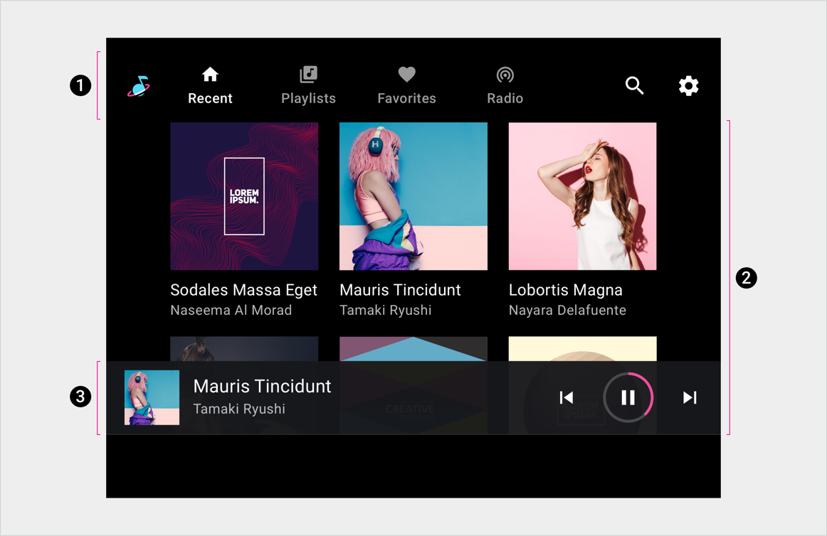
Anatomy
The media template includes the following:
- App bar – Features primary app navigation and app controls (for in-app search and settings) and includes an app icon
- Browseable content space – Displays content in either a grid view (shown here) or a list view
- Playback controls – The minimized control bar shown here includes basic media metadata and playback controls, and it also provides access to a playback overlay with more controls
2. Browseable content space
3. Playback controls (shown here on minimized control bar)
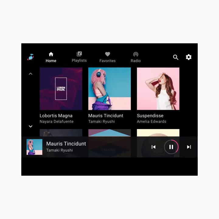
This sample layout shows just one possible arrangement of these elements. For example, car makers can decide to stack primary navigation and app controls rather than keeping them in a single horizontal bar, depending on the screen dimensions. The navigation hierarchy is described in more detail in the sections that follow.
Primary navigation
The primary navigation in the app bar consists of exposed tabs (except in rare cases where the screen is too small).
This example shows a typical tab arrangement:

App controls
App controls (shown at upper right in the example below) occupy the portion of the app bar not used for branding or primary navigation. They provide access to in-app search and settings functions for the current media app.
Selecting an app control opens an overlay. For example, the Settings affordance shown here opens an overlay that displays the Settings interface. When users close the overlay, they return to their previous location in the app.

Browseable content space
Within the browsable content space, users can scroll through content and navigate through z-space into individual items, down consecutive levels of hierarchy.
Because navigating through multiple levels increases the driver’s cognitive load, Google recommends keeping the information architecture relatively flat, with as few levels as possible.


Playback controls
Playback controls in media apps can appear in either of two forms, depending on the circumstances:
- Minimized control bar (available across views)
- Playback view (overlay with full control bar)
These two forms alternate along the bottom of the screen in the animated example that follows.
Minimized control bar
The minimized control bar floats at the highest level of the browsable content space, above the content. It provides information about what's currently playing, along with basic affordances for user control of playback.
Once content begins playing, the minimized control bar remains available while a user is browsing media content. It persists until a new media app is selected or until the user taps the minimized control bar to display the playback view.
Playback view
The full control bar is available only in playback view, and it also floats above the content. In addition to the affordances available from the minimized control bar, the full control bar can provide more extensive controls defined by each media app.

