Typography, or the styling of text, is used to express text's hierarchy and how it functions in a UI. Typography used for the driving environment should prioritize legibility.
At a glance:
- Use display, body, and subtext from the Android Auto typographic scale
- Minimum body text size is 24dp – reserve subtext sizes for non-crucial information
- Use a 4-dp grid for alignment
- Apply style attributes to create effects (support hierarchy, focus attention)
- Use medium font weights sparingly – and avoid bold
Scale and grid references
The Android Auto typographic scale and typesetting grid provide a consistent, easily glanceable set of text styles for a range of display text, body text, and subtext sizes.
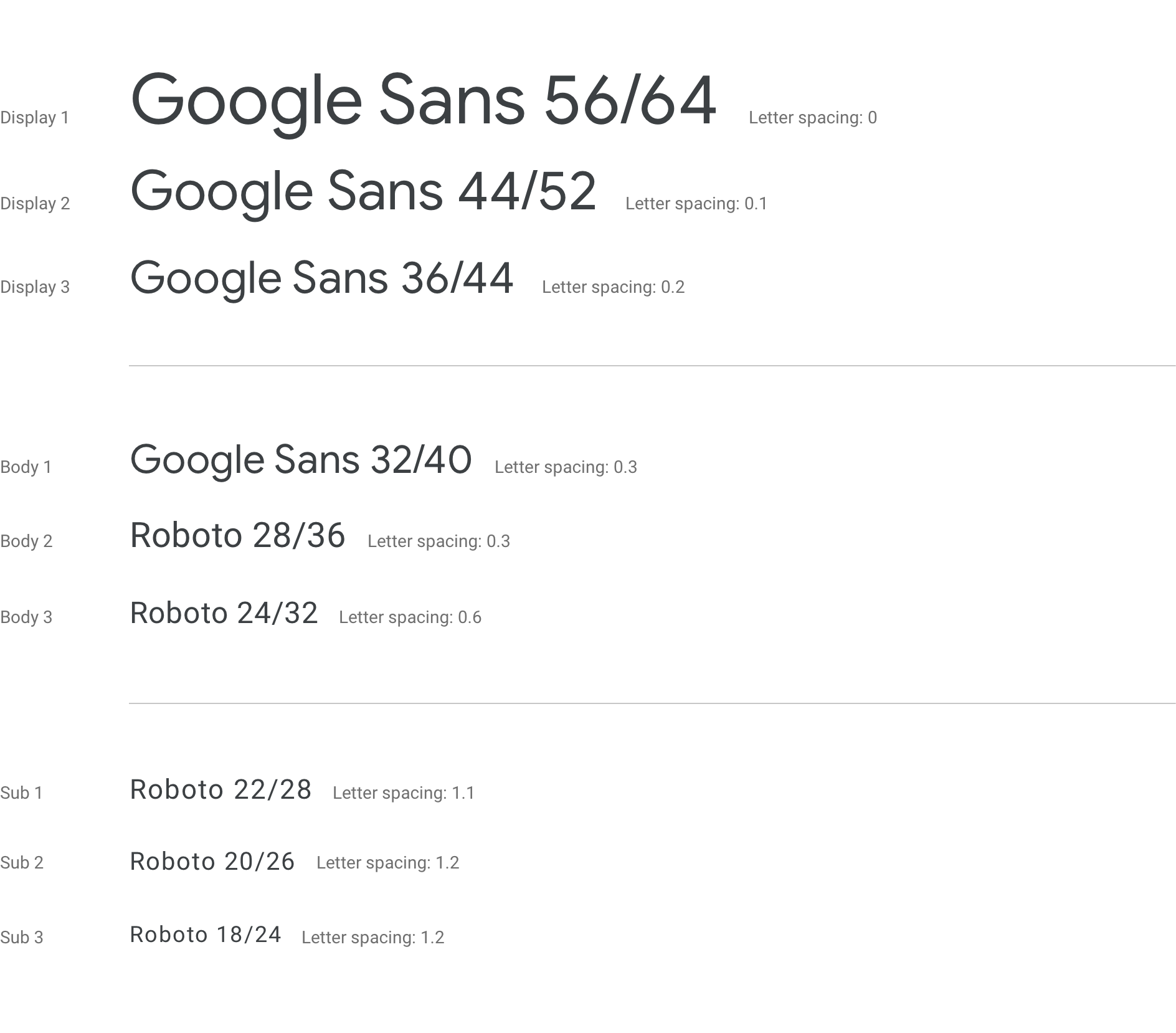
Android Auto typographic scale
The type scale provides nine styles for display text, body text, and subtext – each with a specified font, font size, and line height.
While the smallest body text size for Android Auto is 24dp, subtext type sizes below 24dp can be used sparingly. Because this subtext size is not easily glanceable, it should be reserved for non-crucial information, such as status bar content.
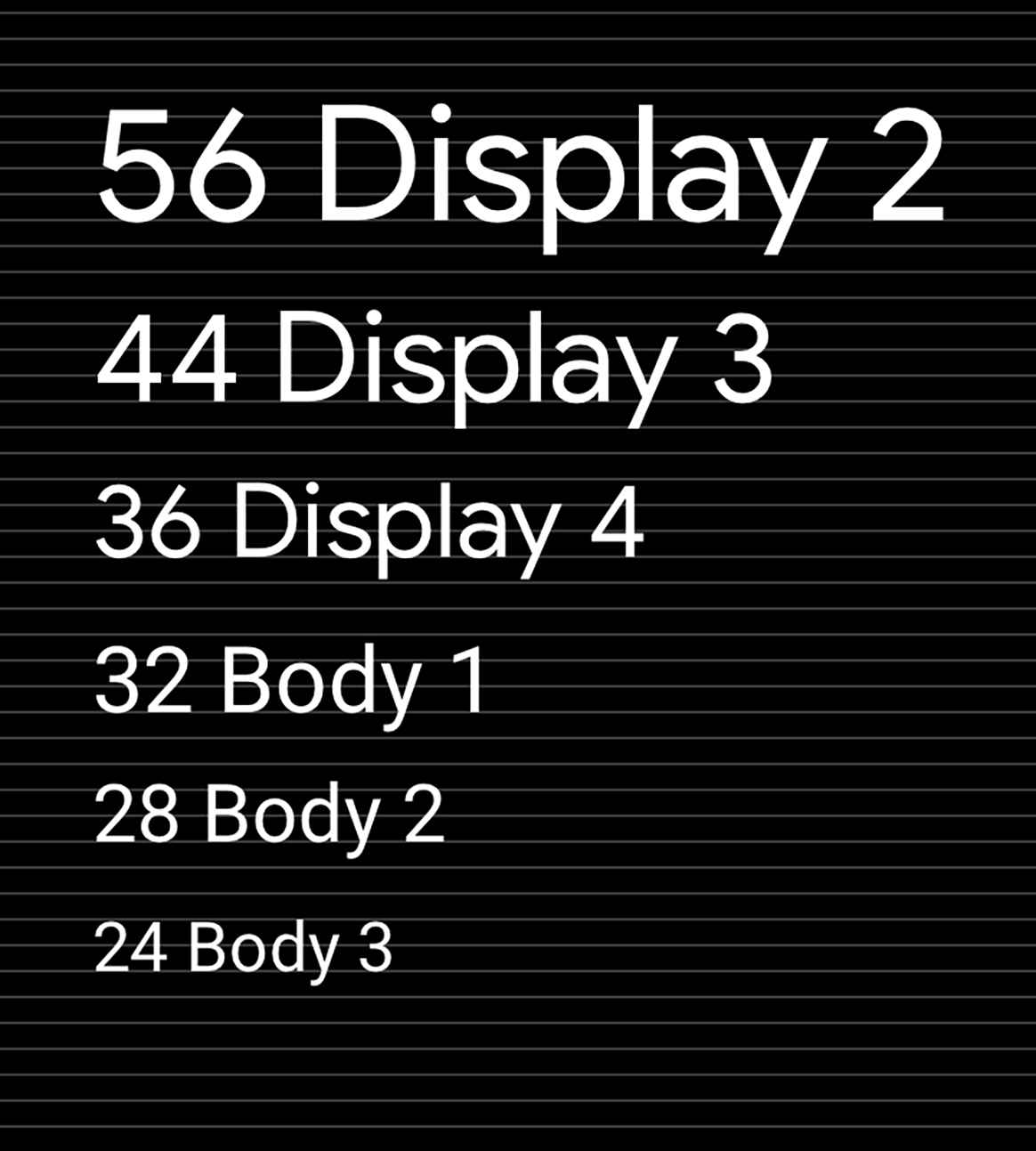
Typesetting grid and baseline reference
All type styles are displayed on the 4dp grid. This grid ensures even that text is evenly scaled and vertically spaced, creating a consistent visual hierarchy based on 4dp increments.
Guidance and examples
Applying a consistent scale and style to your UI text can help:
- Keep all text legible
- Convey a visual hierarchy across text elements
- Focus attention in the most important spots
The following guidance demonstrates how to apply the Android Auto scale and styles appropriately.
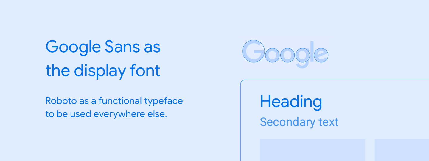
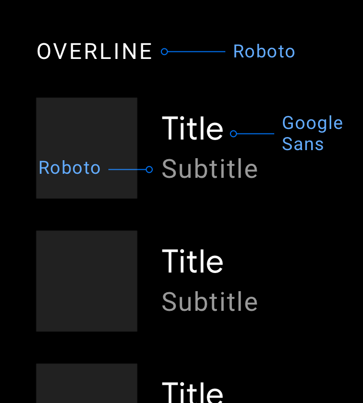
Applying scale
Google Sans should be used for type sizes 32dp and larger. Roboto is used everywhere else because it is legible in smaller sizes.
Examples
Do
When using a display font best suited to large text, such as Google Sans, keep it at type sizes of 32dp or larger. Use Roboto for smaller, secondary text because it maintains good legibility at sizes below 32dp.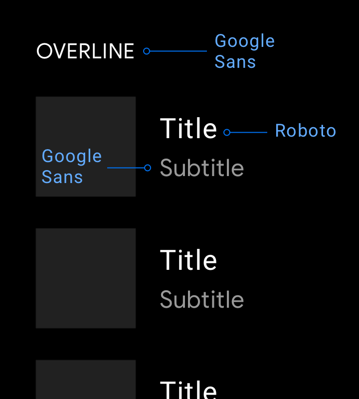
Don't
Don't use Google Sans for smaller text sizes at which its legibility is not optimal.Applying style
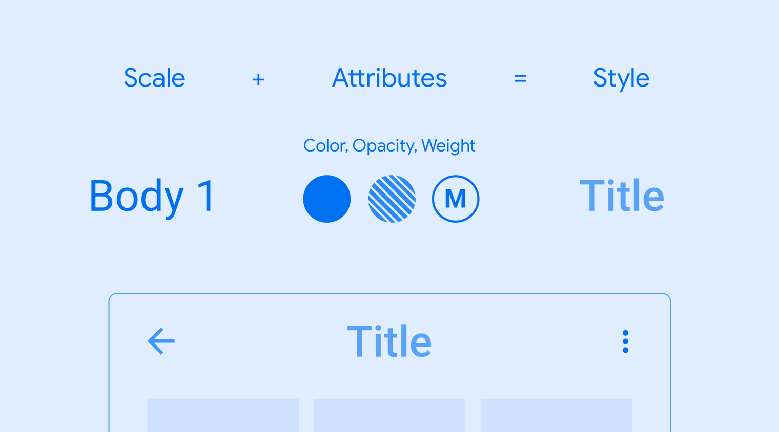
Each typographic style consists of a set of scales and attributes such as color, opacity, and font weight. These attributes can be added to any type style to create an effect, whether the intention is to focus attention or reduce emphasis.
Examples

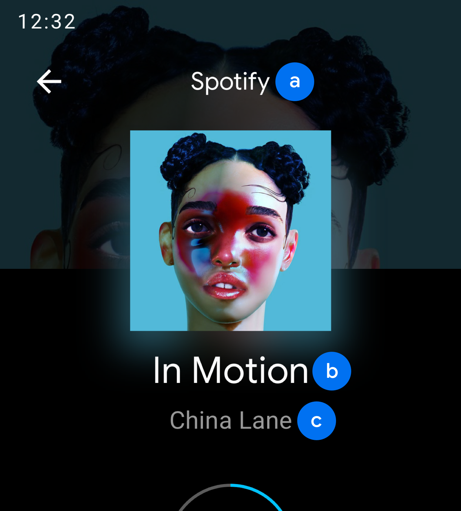
b. Body 2
c. Body 1
b. Display 3
c. Body 2

Do
Use the medium font weight sparingly. Save it for when you need to emphasize the primary or active text, such as the Recents tab in this example, or to establish visual hierarchy.
Don't
Bold font weights (applied to all text in this example) are less legible than medium weights and should be avoided.