সেভ করা পৃষ্ঠা গুছিয়ে রাখতে 'সংগ্রহ' ব্যবহার করুন
আপনার পছন্দ অনুযায়ী কন্টেন্ট সেভ করুন ও সঠিক বিভাগে রাখুন।
দিন এবং রাতের থিম জুড়ে একই রঙের সাথে আরও সামঞ্জস্যপূর্ণ ব্যবহারকারীর অভিজ্ঞতা তৈরি করতে অ্যান্ড্রয়েড অটো সমস্ত সামগ্রীকে কালো পটভূমিতে রাখে।
একটি কালো ব্যাকগ্রাউন্ড সাধারণত গাড়ির ভিতরে সবচেয়ে ভালো কাজ করে, কারণ গাড়ি নির্মাতারা প্রায়ই গাড়ির অভ্যন্তরীণ, ড্যাশবোর্ড এবং UI-এর জন্য গাঢ় উপাদান এবং রং ব্যবহার করে।
এক পলকে
দিন এবং রাত উভয় ড্রাইভিং সমর্থন করার জন্য একটি কালো ব্যাকগ্রাউন্ড ব্যবহার করুন
পটভূমি এবং আইকন বা পাঠ্যের মধ্যে কমপক্ষে 4.5:1 এর একটি বৈসাদৃশ্য অনুপাত বজায় রাখুন
ন্যূনতম এবং উদ্দেশ্যমূলকভাবে রঙ ব্যবহার করুন
ধূসর বিভিন্ন শেড ব্যবহার করে উচ্চতা দেখান
চাক্ষুষ ফোকাস গাইড করতে স্বচ্ছতা এবং অস্বচ্ছতা ব্যবহার করুন
প্যালেট এবং গ্রেডিয়েন্ট
অ্যান্ড্রয়েড অটোর জন্য অন্ধকার থিম একটি গ্রেস্কেল রঙ প্যালেট ব্যবহার করে। আপনার UI-তে যোগ করা যেকোন অতিরিক্ত রঙগুলিকে তীব্রতায় নিঃশব্দ করা উচিত, উপাদান ডিজাইনের রঙ প্যালেটগুলির গাঢ় রঙের বৈকল্পিকগুলির মতো৷
মেটেরিয়াল ডিজাইন
রঙের ব্যবহার এবং প্যালেট
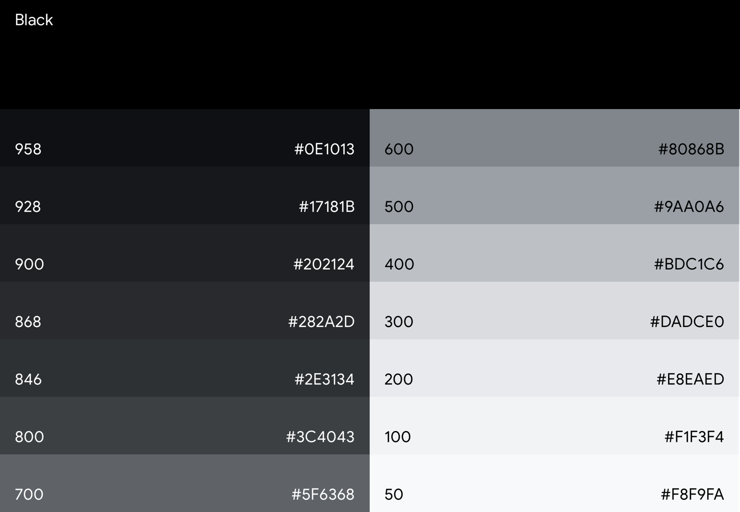
Android Auto এর গ্রেস্কেল প্যালেট
অ্যান্ড্রয়েড অটো গ্রেস্কেল রঙ প্যালেট ব্যবহার করে, আপনি পাঠ্য এবং আইকন সহ সমস্ত উপাদানগুলিতে রঙ প্রয়োগ করতে পারেন৷
এই প্যালেটটি ডিজাইন করা হয়েছে:
প্রদত্ত শেডের পরিসর দিয়ে প্রতিটি UI উপাদানের স্তরবিন্যাস প্রতিফলিত করুন
সমস্ত অন্ধকার থিম UI ব্যবহার ক্ষেত্রে ঠিকানা
এই গ্রেস্কেল প্যালেট হল ডিফল্ট অ্যান্ড্রয়েড অটো কালার প্যালেট, ইন্টারফেসের গাঢ় থিম সমর্থন করে৷
অ্যান্ড্রয়েড অটোতে, ধূসর রঙের বিভিন্ন শেড ব্যবহার করে গভীরতার অনুভূতি প্রকাশ করা হয়। প্রতিটি শেড উচ্চতার একটি ভিন্ন স্তরের প্রতিনিধিত্ব করে, যেখানে গাঢ় শেডগুলির উপাদানগুলির (যেমন তালিকার উপাদান) হালকা শেডগুলির (যেমন ফ্লোটিং অ্যাকশন বোতাম)গুলির তুলনায় কম উচ্চতা থাকে৷
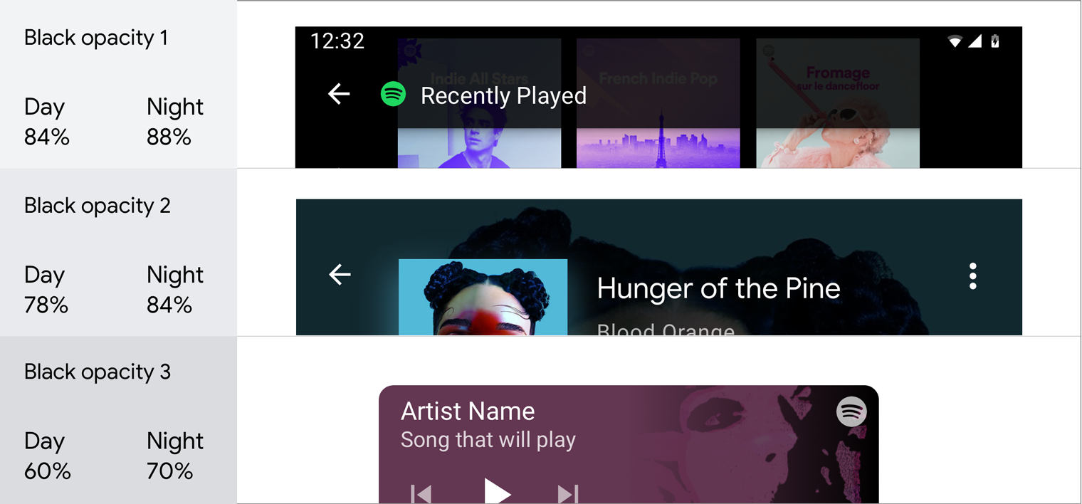
সমস্ত উপাদান একটি সত্যিকারের কালো পটভূমিতে প্রদর্শিত হয় যেখানে ছায়া দেখা যায় না। এই উপাদানগুলির মধ্যে যথেষ্ট বৈসাদৃশ্য প্রদান করতে, Android Auto গ্রেস্কেল প্যালেটে ধূসর রঙের বিস্তৃত পরিসর রয়েছে। এটি মেটেরিয়াল ডিজাইনের বেসলাইন কালার প্যালেটের তুলনায় ধূসর রঙের আরও ধীরে ধীরে অগ্রগতি, কারণ ধূসর 900 এর নীচের উপাদানের শেডগুলি স্বয়ংক্রিয় প্রসঙ্গের জন্য খুব উজ্জ্বল।
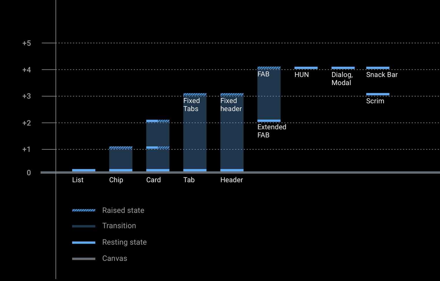
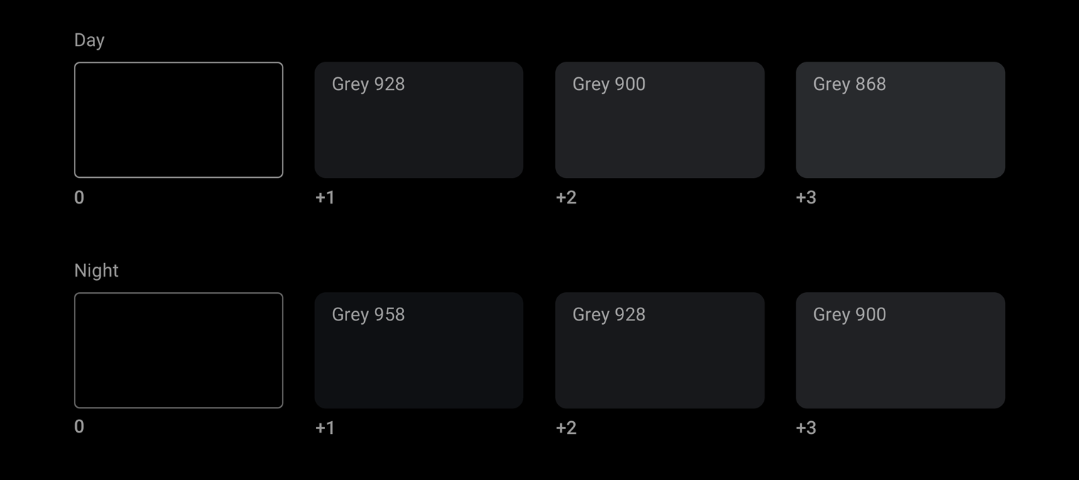
বিভিন্ন উপাদানের জন্য প্রতিটি বিশ্রামের উচ্চতা স্তর একটি অনন্য ধূসর মানের সাথে যুক্ত। এই চার্টটি দিন এবং রাতের মোডের জন্য বিভিন্ন উচ্চতা স্তরের সাথে যুক্ত ধূসর মানগুলি দেখায়।
সুরের ধাপের রঙ
অ্যান্ড্রয়েড অটোর গ্রেস্কেল প্যালেট ছাড়াও, ব্যবহারকারীর ফোকাস আঁকার মতো উদ্দেশ্যে একটি অ্যাকসেন্ট রঙ অল্প ব্যবহার করা যেতে পারে।
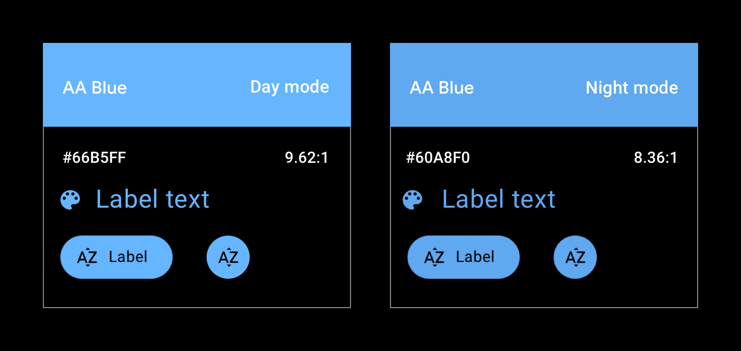
বর্তমানে, অ্যান্ড্রয়েড অটোতে একটি অফিসিয়াল অ্যাকসেন্ট রঙ রয়েছে, নীল রঙের একটি ছায়া যা সমর্থন লাইব্রেরিতে "কার অ্যাকসেন্ট" হিসাবে উল্লেখ করা হয়েছে। UI এর অন্ধকার পৃষ্ঠে আরও ভাল দৃশ্যমানতার জন্য এই নীলটি স্ট্যান্ডার্ড Google নীল থেকে স্যাচুরেশন এবং প্রাণবন্ততা বাড়িয়েছে।
অ্যান্ড্রয়েড অটোতে নীল "গাড়ির অ্যাকসেন্ট" রঙটি স্ট্যান্ডার্ড Google নীল রঙের চেয়ে বেশি স্যাচুরেটেড, যা দিনে এবং রাতের গাড়ি চালানোর সময় অন্ধকার-থিমযুক্ত ইন্টারফেসে ভালভাবে কাজ করার জন্য ডিজাইন করা হয়েছে।
অস্বচ্ছতা চার্ট
মেটেরিয়াল ডিজাইনের স্থানিক মডেলটি একটি UI-তে গভীরতার অনুভূতি জানাতে অস্বচ্ছতার বিভিন্ন মাত্রার উপর নির্ভর করে। এটি কার্যকরভাবে ব্যবহার করতে, আপনার ব্যবহারের ক্ষেত্রের উপর ভিত্তি করে একটি অস্বচ্ছতা স্তর নির্বাচন করুন।
গাঢ় অস্বচ্ছতা মান
আধা-স্বচ্ছ অন্ধকার পৃষ্ঠের জন্য সবচেয়ে সাধারণ ব্যবহারের ক্ষেত্রে একটি স্ক্রিম (এটি "ওভারলে" নামেও পরিচিত)।
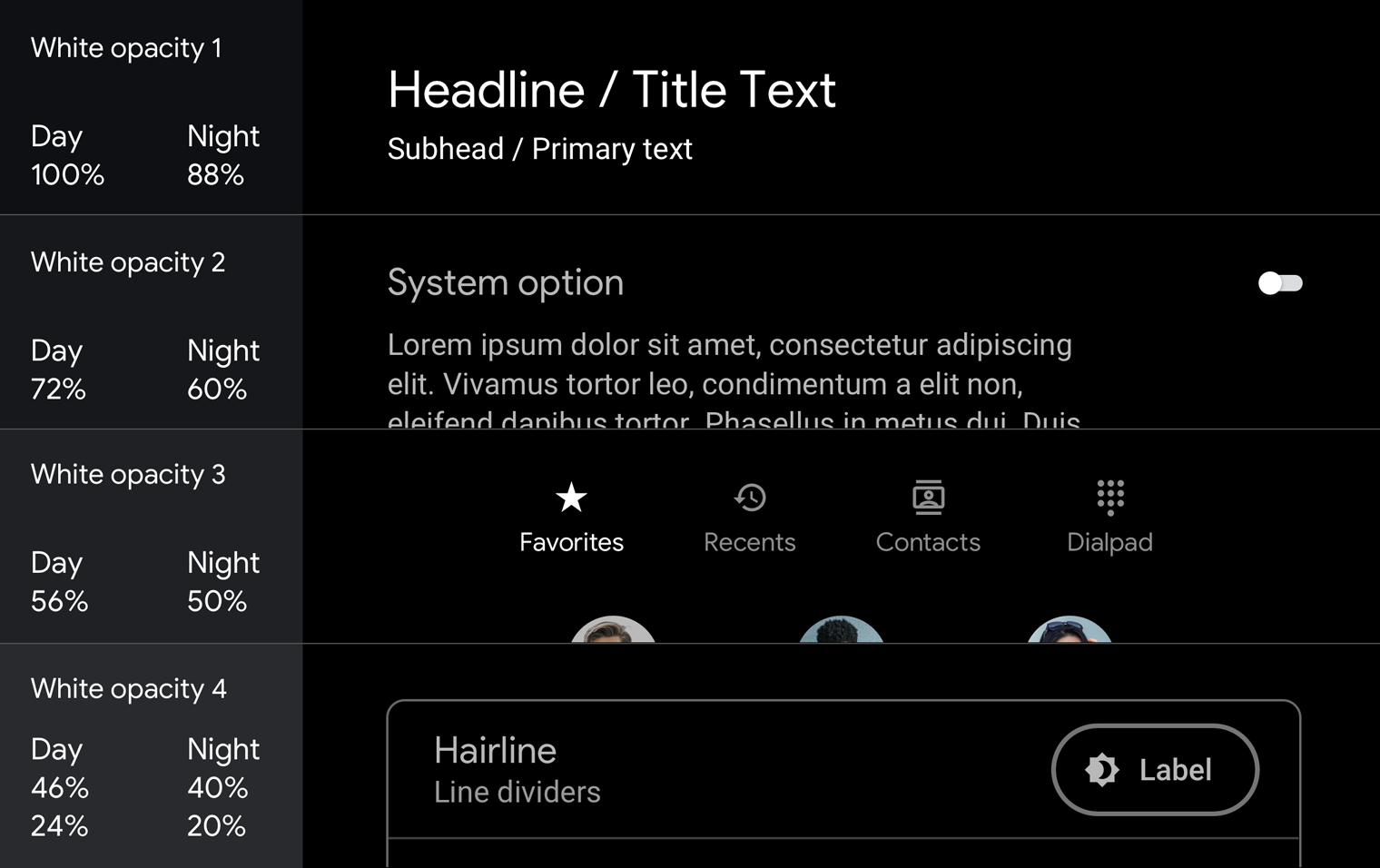
সাদা অস্বচ্ছতার মান
আধা-স্বচ্ছ সাদা মানগুলি বেশিরভাগ পাঠ্যের জন্য ব্যবহৃত হয়, বিশেষ করে যখন পটভূমিটি রঙিন হয়, পরিবর্তে কঠিন ধূসর ব্যবহার করে।
স্ক্রিম এবং টেক্সট হায়ারার্কিতে কীভাবে অস্বচ্ছতা ব্যবহার করবেন তার উদাহরণের জন্য, নির্দেশিকা এবং উদাহরণ দেখুন।
বৈপরীত্য
উপযুক্ত রঙের বৈসাদৃশ্য ড্রাইভারদের দ্রুত তথ্য ব্যাখ্যা করতে এবং সিদ্ধান্ত নিতে সাহায্য করে।
ড্রাইভিং করার সময় স্পষ্টতার জন্য ফোরগ্রাউন্ড (টেক্সট বা আইকন) এবং ব্যাকগ্রাউন্ডের (রং, অ্যালবাম আর্ট, ইত্যাদি) মধ্যে ন্যূনতম ভিজ্যুয়াল কন্ট্রাস্ট প্রয়োজন। অ্যাপের রং অবশ্যই WCAG 2.0 লেভেল AA সাধারন টেক্সট কন্ট্রাস্ট প্রয়োজনীয়তা পূরণ করবে, যা 4.5:1 এর বৈসাদৃশ্য অনুপাত নির্দিষ্ট করে)। একটি কনট্রাস্ট চেকার ব্যবহার করুন, যেমন WebAIM কালার কনট্রাস্ট চেকার , আপনার স্ক্রিনগুলি কনট্রাস্টের প্রয়োজনীয়তাগুলি পূরণ করে তা নিশ্চিত করতে৷
স্পষ্টতা, দৃষ্টিযোগ্যতা এবং বৈসাদৃশ্য অনুপাত সম্পর্কে বিশদ।
করবেন
এই আইকনগুলি রঙের বৈসাদৃশ্য অনুপাতের সুপারিশগুলি অনুসরণ করে এবং তাদের ব্যাকগ্রাউন্ডের বিপরীতে আরও সুস্পষ্ট
করবেন না
এই আইকনগুলি রঙের বৈসাদৃশ্য অনুপাতের সুপারিশগুলি অনুসরণ করে না এবং তাদের ব্যাকগ্রাউন্ডগুলির সাথে পার্থক্য করা কঠিন
নির্দেশিকা এবং উদাহরণ
অ্যান্ড্রয়েড অটোর জন্য অন্ধকার UI পরিষ্কার এবং সহজ, রঙের ন্যূনতম ব্যবহার সহ। UI উপাদানগুলির জন্য উপযুক্ত রং, টোন এবং অস্বচ্ছতার মান ব্যবহার করার পাশাপাশি ( প্যালেট এবং গ্রেডিয়েন্ট দেখুন), রঙের প্রতিটি ব্যবহার এবং বৈচিত্র্যময় অস্বচ্ছতার একটি উদ্দেশ্য থাকা উচিত।
এই বিভাগটি বিভিন্ন লক্ষ্য অর্জনের জন্য অস্বচ্ছতার বৈচিত্র এবং রঙ প্রয়োগ করার জন্য নির্দেশিকা এবং উদাহরণ প্রদান করে, যার মধ্যে রয়েছে:
অস্পষ্ট পটভূমি
ধারাবাহিকতা বজায় রাখা
একটি চাক্ষুষ শ্রেণিবিন্যাস স্থাপন করা যা ব্যবহারকারীর ফোকাসকে প্রাথমিক ক্রিয়াকলাপে আকর্ষণ করে
একটি তালিকায় আইটেম আলাদা করা
scrims সঙ্গে পটভূমি অস্পষ্ট
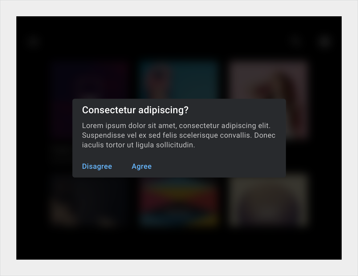
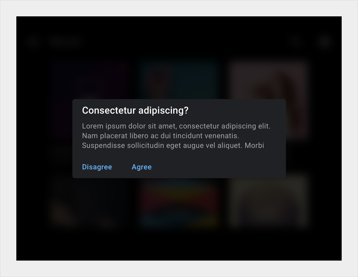
পূর্ণ-স্ক্রীন স্ক্রিম (ওভারলে) ব্যাকগ্রাউন্ড কভার করার জন্য ব্যবহৃত হয় যখন উচ্চ-অগ্রাধিকার বিষয়বস্তু অগ্রভাগে উপস্থিত হয়, যেমন একটি ডায়ালগ যা ব্যবহারকারীকে একটি পদক্ষেপ নিতে হয়। আংশিক স্ক্রিমগুলি উপাদানগুলির পরিবর্তনের দিকে মনোযোগ আকর্ষণ করতে ব্যবহৃত হয়, যেমন বিজ্ঞপ্তিগুলির প্রবেশদ্বার৷
দিনের মোডে সম্পূর্ণ স্ক্রিম (ডায়ালগ কার্ডের পিছনে) নাইট মোডে সম্পূর্ণ স্ক্রিম (ডায়ালগ কার্ডের পিছনে)
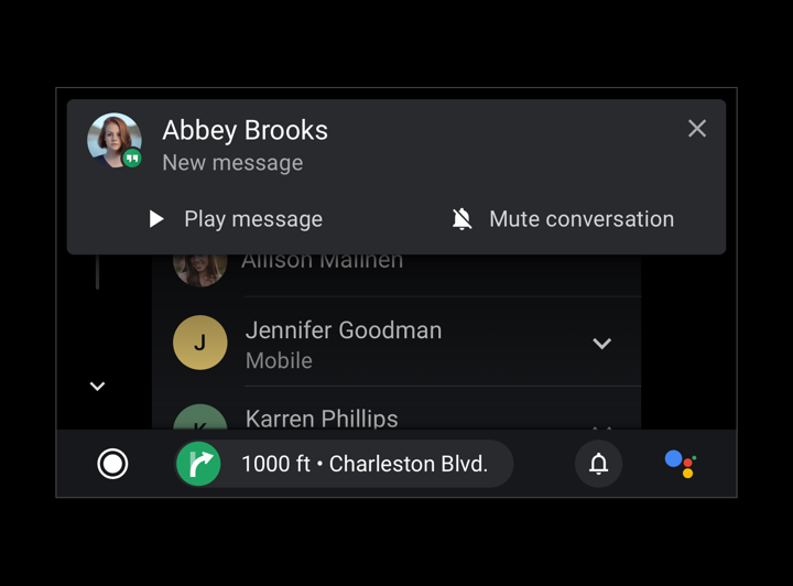
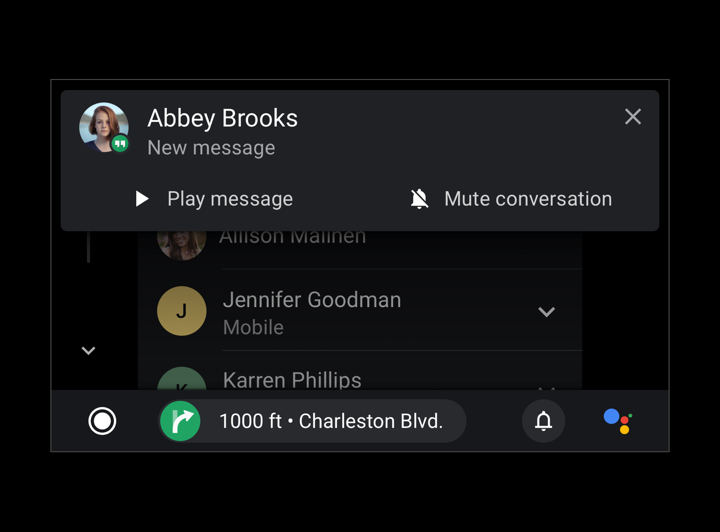
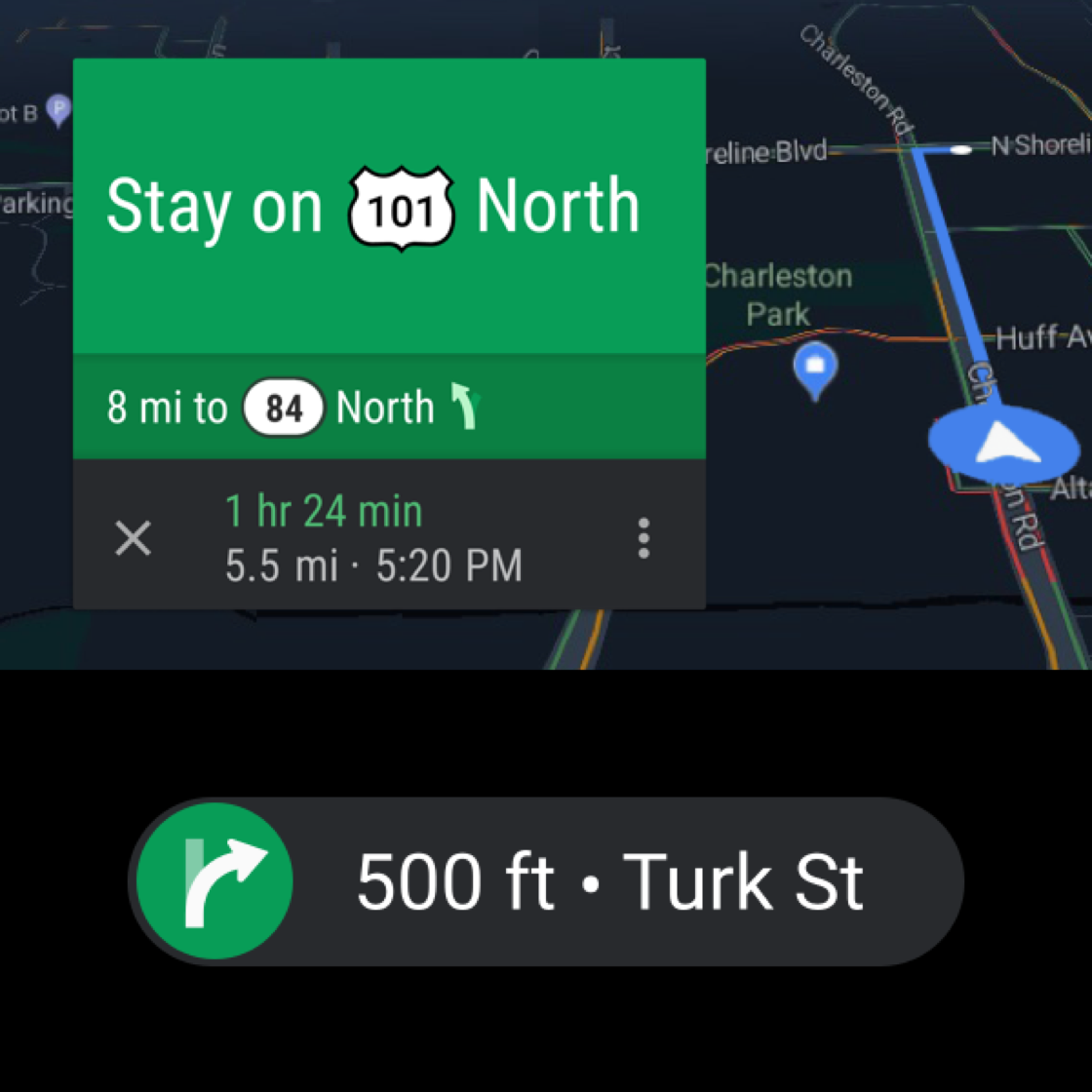
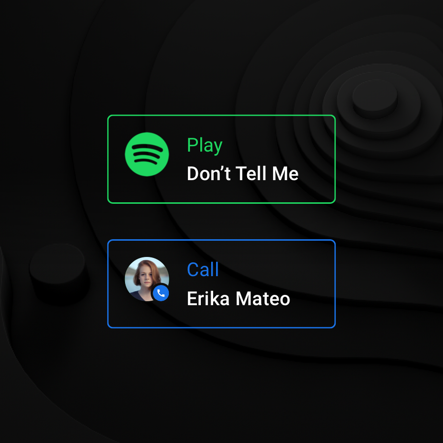
ব্যবহারকারীর প্রবাহ জুড়ে মূল উপাদানগুলির মধ্যে সংযোগকে শক্তিশালী করার জন্য রঙ একটি শক্তিশালী সংকেত, যেমন সমস্ত নেভিগেশন-সম্পর্কিত উপাদানগুলি সবুজ রঙের। এই ধরনের রঙের ধারাবাহিকতা মেমরি এবং স্বীকৃতিতে সহায়তা করে যে কোন UI উপাদানগুলি সংযুক্ত রয়েছে এবং তারা কীভাবে একে অপরের সাথে সম্পর্কিত। আপনি পর্দা থেকে পর্দায় একটি সুসংগত অভিজ্ঞতা তৈরি করতে এটি ব্যবহার করতে পারেন।
করবেন
একাধিক ভিউ জুড়ে একটি আইটেমের জন্য একই রঙ ব্যবহার করে চাক্ষুষ ধারাবাহিকতা বজায় রাখুন, যেমন সবুজ রঙ এই পালাক্রমে নেভিগেশন দৃশ্যের জন্য ব্যবহৃত হয়।
করবেন
সম্পর্কিত উপাদান এবং ফাংশনগুলিকে দৃশ্যত সংযোগ করতে রঙ ব্যবহার করুন, যেমন এই লাল হ্যাং-আপ CTA গুলি৷
করবেন
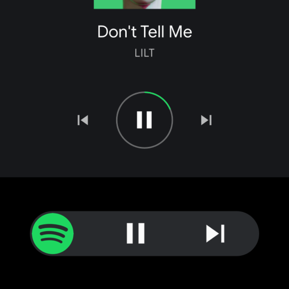
অ্যালবাম শিল্পের প্রভাবশালী রঙ বা একটি অবিচ্ছিন্ন ভিজ্যুয়াল সামর্থ্য হিসাবে সম্পর্কিত উপাদানগুলিতে একটি অ্যাপের নির্ধারিত রঙ ব্যবহার করুন। বিরতি বোতামের চারপাশে এই বৃত্তটি Spotify সবুজ দিয়ে উচ্চারিত।
করবেন না
একটি একক স্ক্রিনের মধ্যে বারবার উপাদানগুলিকে নির্বিচারে আলাদা করতে বিভিন্ন রঙ ব্যবহার করবেন না। রঙ ব্যবহার করার বিষয়ে সতর্ক থাকুন যখন তারা মান যোগ করে না - যেমনটি সারাংশ কার্ডের চারপাশে এই রঙিন রূপরেখার ক্ষেত্রে, যা অ্যাপ আইকনের রঙের নকল করে।
একটি চাক্ষুষ শ্রেণিবিন্যাস প্রতিষ্ঠা করা
সাদা অস্বচ্ছতার একটি পরিসীমা ব্যবহার করে পাঠ্য রঙ করার মাধ্যমে একটি সামঞ্জস্যপূর্ণ এবং শক্তিশালী চাক্ষুষ শ্রেণিবিন্যাস তৈরি করা যেতে পারে। সাদা টেক্সটের জন্য 88%, 72% এবং 56% এর অস্বচ্ছতার মানগুলি অন্ধকার পটভূমিতে একটি আরামদায়ক পড়ার পরিবেশ তৈরি করার সময় অ্যাক্সেসযোগ্যতার প্রয়োজনীয়তাগুলি পূরণ করার জন্য যথেষ্ট বৈপরীত্য রয়েছে। নাইট মোডের জন্য সমস্ত সাদা টেক্সটে 96% অপাসিটি ব্যবহার করুন।
করবেন
একটি ভিজ্যুয়াল শ্রেণিবিন্যাস বজায় রাখতে বিভিন্ন অস্বচ্ছতা এবং বৈসাদৃশ্য মান ব্যবহার করুন।
করবেন না
সম্পূর্ণ অস্বচ্ছতা বা বৈপরীত্য মানগুলিকে অনেকগুলি উপাদানে প্রয়োগ করে অতিরিক্ত ব্যবহার করবেন না। প্রাথমিক এবং মাধ্যমিক তথ্যের পার্থক্য করার জন্য অস্বচ্ছতার মানগুলির একটি বৈসাদৃশ্য প্রয়োজন।
[[["সহজে বোঝা যায়","easyToUnderstand","thumb-up"],["আমার সমস্যার সমাধান হয়েছে","solvedMyProblem","thumb-up"],["অন্যান্য","otherUp","thumb-up"]],[["এতে আমার প্রয়োজনীয় তথ্য নেই","missingTheInformationINeed","thumb-down"],["খুব জটিল / অনেক ধাপ","tooComplicatedTooManySteps","thumb-down"],["পুরনো","outOfDate","thumb-down"],["অনুবাদ সংক্রান্ত সমস্যা","translationIssue","thumb-down"],["নমুনা / কোড সংক্রান্ত সমস্যা","samplesCodeIssue","thumb-down"],["অন্যান্য","otherDown","thumb-down"]],["2025-07-29 UTC-তে শেষবার আপডেট করা হয়েছে।"],[[["\u003cp\u003eAndroid Auto utilizes a dark theme with a black background and muted colors for optimal visibility and consistency in car environments.\u003c/p\u003e\n"],["\u003cp\u003eA grayscale color palette with varying shades is employed to indicate elevation and hierarchy of UI elements.\u003c/p\u003e\n"],["\u003cp\u003eMinimum contrast ratios of 4.5:1 between foreground and background are essential for legibility and driver safety.\u003c/p\u003e\n"],["\u003cp\u003eColor should be used sparingly and purposefully, primarily for accents, maintaining consistency, and establishing visual hierarchy.\u003c/p\u003e\n"],["\u003cp\u003eOpacity variations, particularly with white text, are crucial for creating a comfortable reading experience and highlighting key information.\u003c/p\u003e\n"]]],[],null,["# Color\n\n\u003cbr /\u003e\n\nAndroid Auto places all content on a black background to create a more consistent user experience, with similar colors across day and night themes.\n\nA black background typically works best inside cars, since car makers often use dark materials and colors for car interiors, dashboards, and UIs.\n\n**At a glance** \n- Use a black background to support both day and night driving\n- Maintain a contrast ratio of at least 4.5:1 between the background and icons or text \n- Use color minimally and purposefully\n- Show elevation using different shades of gray\n- Use transparency and opacity to guide visual focus\n\n*** ** * ** ***\n\nPalettes and Gradients\n----------------------\n\nThe dark theme for Android Auto uses a grayscale color palette. Any additional colors added to your UI should be muted in intensity, similar to the darker color variants from the [Material Design color palettes](https://material.io/design/color/the-color-system.html#color-usage-palettes). \n[Material Design\nColor usage and palettes](https://material.io/design/color/the-color-system.html#color-usage-palettes)\n\n### Android Auto's grayscale palette\n\nUsing the Android Auto grayscale color palette, you can apply color to all elements, including text and icons.\n\nThis palette is designed to:\n\n- Reflect each UI element's level of hierarchy with the provided range of shades\n- Address all dark theme UI use cases\n\nThis grayscale palette is the default Android Auto color palette, supporting the dark theme of the interface.\n\nIn Android Auto, a sense of depth is expressed using different shades of gray. Each shade represents a different level of elevation, where components with darker shades (such as the list component) have less elevation than components with lighter shades (such as floating action buttons).\n\nAll components are displayed on a true black background where shadows aren't visible. To provide sufficient contrast between these components, the Android Auto grayscale palette contains a wide range of grays. It's a more gradual progression of grays than Material Design's baseline color palette, as Material's shades below Gray 900 are too bright for the auto context.\nEach [resting elevation](https://material.io/design/environment/elevation.html#elevation-in-material-design) level for various components is associated with a unique gray value. This chart shows the gray values associated with various elevation levels for day and night mode.\n\n### Accent color\n\nIn addition to Android Auto's grayscale palette, an accent color can be used sparingly for purposes such as drawing user focus.\n\nCurrently, Android Auto has one official accent color, a shade of blue referred to in the support library as \"car accent\". This blue has increased saturation and vibrancy from the standard Google blue for better visibility on the UI's dark surface.\nThe blue \"car accent\" color in Android Auto is more saturated than the standard Google blue, designed to work well in the dark-themed interface during both day and night driving.\n\n### Opacity charts\n\nThe Material Design spatial model relies on varying degrees of opacity to convey a sense of depth in a UI. To use it effectively, choose an opacity level based on your use case.\n\n#### Dark opacity values\n\nThe most common use case for semi-transparent dark surfaces is a scrim (also known as an \"overlay\").\n\n#### White opacity values\n\nSemi-transparent white values are mostly used for text, especially when the background is colored, instead of using solid gray.\n\nFor examples of how to use opacity in scrims and text hierarchies, see [Guidance and examples](#guidance_and_examples).\n\n*** ** * ** ***\n\nContrast\n--------\n\nAppropriate color contrast helps drivers quickly interpret information and make decisions.\n\nMinimum visual contrast between the foreground (text or icons) and background (colors, album art, etc.) is required for legibility while driving. App colors must meet the [WCAG 2.0](https://www.w3.org/TR/WCAG20/#visual-audio-contrast) Level AA Normal Text contrast requirements, which specify a contrast ratio of 4.5:1). Use a contrast checker, such as the [WebAIM Color Contrast Checker](http://webaim.org/resources/contrastchecker/), to ensure that your screens meet the contrast requirements.\n\nFor more details of how contrast ratios apply to specific UI elements, see [Design for Driving guidelines](/cars/design/design-foundations/visual-principles#make_content_easy_to_read). \n[Design for driving: Make content easy to read\nDetails about legibility, glanceability, and contrast ratios.](/cars/design/design-foundations/visual-principles#make_content_easy_to_read) \n\n**Do**\nThese icons follow the color contrast ratio recommendations and are more legible against their backgrounds\n**Don't**\nThese icons do not follow the color contrast ratio recommendations and are difficult to discern against their backgrounds\n\n*** ** * ** ***\n\nGuidance and examples\n---------------------\n\nThe dark UI for Android Auto is clean and simple, with minimal use of color. In addition to using the appropriate colors, tones, and opacity values for UI elements (see [Palettes and gradients](#palettes_and_gradients)), every use of color and varied opacity should have a purpose.\n\nThis section provides guidance and examples for applying opacity variations and color to achieve a variety of goals, including:\n\n- Obscuring backgrounds\n- Maintaining consistency\n- Establishing a visual hierarchy that draws user focus to primary actions\n- Distinguishing items in a list\n\n### Obscuring backgrounds with scrims\n\nFull-screen scrims (overlays) are used to cover backgrounds when high-priority content appears in the foreground, such as a dialog requiring the user to take an action. Partial scrims are used to draw attention to the transition of elements, such as the entrance of notifications. \nFull scrim (behind dialog card) in day mode Full scrim (behind dialog card) in night mode \nPartial scrim (behind notification) in day mode Partial scrim (behind notification) in night mode\n\n### Maintaining consistency with color\n\nColor is a powerful cue for reinforcing the connection between key elements across user flows, such as all navigation-related elements being colored green. Such color continuity aids memory and recognition about which UI elements are connected and how they relate to one another. You can use it to create a coherent experience from screen to screen. \n\n**Do**\nMaintain visual continuity by using the same color for an item across multiple views, such as the green color used for these turn-by-turn navigation views.\n**Do**\nUse color to visually connect related elements and functions, such as these red hang-up CTAs. \n\n**Do**\nUse the dominant color of album art or an app's assigned color on related elements as a persistent visual affordance. This circle around the pause button is accented with Spotify green.\n**Don't**\nDon't use different colors to arbitrarily differentiate repeated components within a single screen. Be cautious about using colors when they don't add value -- as is the case with these colored outlines around the summary cards, which duplicate the color of the app icon.\n\n### Establishing a visual hierarchy\n\nA consistent and strong visual hierarchy can be created by coloring text using a range of white opacities. The opacity values of 88%, 72%, and 56% for white text contain just enough contrast to meet accessibility requirements while creating a comfortable reading environment on a dark background. Use a 96% opacity on all white text for night mode. \n\n**Do**\nUse different opacity and contrast values to maintain a visual hierarchy.\n**Don't**\nDon't overuse full opacity or contrast values by applying them to too many elements. A contrast in opacity values is needed to differentiate primary and secondary information."]]